


More Heartbreak
 It occurs to me that the NHL, with all its meetings and committees, is trying to rebrand itself as best it can in order to put itself on the map. The NHL has looked at ways to increase scoring, make the game faster and better, and gave the players every opportunity to skate as freely as possible. The problem is that the NHL still isn't being noticed. Like the unpopular nerd in high school, he's cleaned himself up a little and made himself better, but no one notices him. That is, until he radically changes his wardrobe. And stands out like a sore thumb. And people mock him.
This simile is appropriate today considering the looks that were shown off to a degree yesterday by the Detroit Red Wings and the New York Islanders. In following the Original Six design scheme thus far, I expected Detroit to go traditional in order to be part of their Original Six brethren. Let's check these out.
First, I'll start with the eyesores. Bad before the good, right? Well, the bad are the New York Islanders. Remember when I posted the leaked photo of their new jerseys? Well, they're real, folks, although they've been tweaked a little. How do I know? The road jersey on Rick DiPietro confirms it. Doesn't DiPietro look happy in his new clothes, like a kid on his first day of school? I guarantee you that someone was making fun of him off-ice in this photo.
Looking at the Brendan Witt side profile, the white numbers stick out like a sore thumb. And what monkey decided to make the numbers on the back of the jersey as gigantic as possible?
Ladies and gentlemen, the Long Island Broncos look horrific. Why is there so much orange? Orange was the accent colour! I admit that I like that the Islanders logo stands out and looks very sharp against the white road jersey. I just am not sold on the front numbers. I wasn't sold on it when the Barney Rubble Hairpieces did it, and I'm still not happy with it today. In fact, I think it looks worse having white numbers on the front than it does having orange numbers.
According to the Islanders website, "[i]n order to keep pace with the new times, the Islanders followed in the footsteps of the extremely popular Buffalo Sabres jerseys by including the players’ numbers on the front of the jersey. The Islanders, along with four other teams, feature numbers on the front, with more likely to follow in the coming years. Besides most fans, the play-by-play broadcasters love it."
Do you have the stats to back that little fact up, Isles? I didn't think so. I never heard one broadcaster say "you know, those numbers on the front make it easy to tell who has the puck". The only reason the Barney Rubble Hairpieces had such strong merchandise sales last season is because they were brand-new jerseys and they had an exciting team. The Islanders, like the other 29 teams, have new jerseys, but their team is nowhere as good as Buffalo. What a crock that paragraph is!
What worries me more is that there are four more teams out there copying Buffalo.
Overall, I am not pleased with the Islanders who will now be called the Long Island Broncos whenever I refer to them due to their resemblance to this uniform. In fact, I find it a little hard to stomach Ted Nolan's comment of "[w]hen you look good and feel good you work better and play better." Excuse me, Ted? I'll take this look over this garbage everyday of the week. Hell, I'll even take this look over the new look. Then again, I am a fan of the Fisherman jersey.
From bad, we go to somewhat better, but not quite good.
The Detroit Red Wings did go traditional with their jerseys, but I'm not sure they should have used a specific jersey from a specific time period. The debut of Niklas Lidstrom's jersey was quiet, but done well as the Red Wings provided good views of the new uniforms.
The front is very traditional as the Red Wings kept their simple arm stripes and hem intact. The rounded edges of the hem don't look out of place here, but I'm still not going to give them a thumbs-up. The move of the captain's "C" and alternate captains' "A"s to the right side bothers me. I understand the NHL wanted the Original Six to remain traditional in their looks, but do we have to jump back to the 1950s? While Delvecchio, Lindsay, and Howe may have worn their captaincy letters on the right-side of their jersey, today's NHL fans would have no recollection of this.
Why were they moved? It's a one-word answer: Reebok. According to this article, "[t]he letters had to be moved because the new jerseys are constructed of multiple panels, more so than the old models, and there wasn’t room for them above the tip of the Winged Wheel on the left side without hitting a seam".
"It was important to everybody in the organization that our jersey look the same," said team spokesman John Hahn. "We have an 82-year history with that jersey or something very similar to it. We wanted to make sure we kept that look moving forward."
Mr. Hahn, please think before you speak. You want your look to move forward by going backwards? Despite that comment, the Red Wings really didn't mangle anything on the front. They just moved a letter. Since other teams are putting numbers there, why not throw a letter or two there?
The back of the jersey is great except for one glaringly huge problem. What tailor or company stitches a number on to a jersey across the fighting strap? That is one of the most heinous crimes on a jersey I have ever seen. The fighting strap is there for function, not fashion. It should never be seen unless you're looking for it. Come on, Reebok, screw your heads on right.
If you were hoping for some good news, just skip this part. The Flyers, on their new jersey FAQ page, posted this message:
"What colors are available?
Black and white jerseys are available this year. A third orange jersey will be released next year."
If you're reading that correctly, it actually says "alternate jerseys will be introduced next year as a cash grab for Reebok", given my rough translating skills.
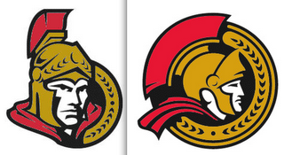
Finally, some good news. Thanks to Black Aces, who has been doing some top-notch work in his search for the Senators' new logos, we have pictures of them. This is the new side profile logo that the Senators will be featuring on their jerseys at the unveiling on the 22nd. This is the new alternate logo that the Senators will be using. Here are the colourized versions of those same two logos.
I am a fan of the modernization of the Senators' logos. They kept the modifications small, and that's always good for a brand's logo. Hopefully, their jerseys will be better than what the Islanders pulled out of their rear-end orifice.
I'm still looking for a Capital City correspondant and a Bay City correspondant. Send you applications to me via email or through the comments here.
Until the next unveiling, keep your sticks on the ice!
- a big thanks to Paul Lukas' Uni Watch blog and the readers there for some of the photos.


7 comments:
[sarcasm on] you missed the best part of the detroit design, they moved the captain/alternate designation to avoid putting it on a seam. Look at the picture its *on* the seam on the right side. [sarcasm off]
i think you may have misinterpreted the comment about the redwings sweater about "moving forward with the new look"... i think he meant that as the team moves forward in time, they want to keep the uniform the same... as opposed to moving the look of the uniform forward.
Joe - yeah, I know it's on a seam. That's why it makes no sense to move the letter to the right-hand side.
Eric - if they wanted to keep it the same, why are they going back to a 1950s design? That's what I meant. I respect the harkening back to tradition, but going back 50 years?
Well the Islanders jersey's could have been worse. I dont' know how, but they could have been.
I think it's splitting hairs on the Red Wings design... BTW the Blues jersey has been leakied. Check out " The checking Line" blog for it.
Detroit and their jersey remains a powerful force in the League. Still intimidating with a traditional look...something about that red!!?
The poor Islanders (ha ha ha ha ha). To introduce this jersey this particular season is just bad luck and bad management. The DiPietro picture is classic, the straight-on shot demonstrates clearly how happy he is (sarcasm) wearing it. The round centered logo clearly looks like a "Flava Flave" clock with two lines above it creating a 'ghetto fabulous' chain look to it. I know the Beastie Boys were from Long Island, but this is friggin ridiculous!!!
tdr
Numbers on the front are great for photographers as well.
Numbers on the front are dumb. If you're supposed to get a picture of "Player X", find out who he is and what he looks like.
You're there to do a job, not just take photos.
Post a Comment