


Canes Country
 The Carolina Hurricanes held a press conference yesterday to show off their new uniforms. Thanks to EA Sports' NHL 08, we had a pretty good idea as to what the new uniforms were going to look like as they leaked the photos a while back. Having Eric Staal as their featured player on the cover probably didn't help to keep the jerseys under wraps, but he's going to be a great player for years to come. I'd say it's a fair trade. In any case, the Hurricanes invited the press down to their arena for the press conference and some tea and cookies. Bubba, from Canes Country, is not a member of the press, but he did send me the newspaper's story from Raleigh. Here it is.
RALEIGH — When the NHL finally unveiled its new Reebok uniforms at the All-Star Game, two years of teeth-gnashing over the potential changes came to naught when the new "Rbk EDGE Uniform System" turned out to look a lot more traditional than some of the prototypes.
(Hurricanes players still cringe at the day Eric Staal modeled a skin-tight uniform complete with tucked-in jersey.)
Thursday, when the Hurricanes unveiled their version of the new uniform, a similar reaction occurred. The only significant change is contrasting piping along the shoulders and a patch honoring the team's 10th season in North Carolina.
Hurricanes general manager Jim Rutherford said back in January that the team didn't intend to make any changes to the team's look or logo.
The assembled players (Ray Whitney, Erik Cole, Justin Williams and Cam Ward, the latter a late replacement for Eric Staal, who is attending an EA Sports event in Toronto on Friday) were pleased to see the Canes stayed true to that intention.
"I like the fact we didn't get too far away from the traditional look that we've always had," Hurricanes forward Erik Cole said. "I don't know if it's going to make me any faster out there. If they say it will, we'll just have to believe them."
Progress isn't cheap. The jerseys will go on sale on Sunday, Sept. 16, at the Caniac Carnival. (The Canes will wear them for the first time against the Washington Capitals that afternoon.)
Authentic models retail for $250, replicas for $120. The 10th anniversary patch is an extra $20, and if you're shelling out for the real thing on Day 1, it's tough to pass that up. So basically, if you want what the Canes wear on the ice, you're looking at $270 plus personalization.
Thanks for the article, Bubba!
Now, in regards to the new jerseys, I'll break them down a little more. The home jersey looks a lot like like last year's jersey, as stated above. The white shoulder yoke piping is noticeable, but it doesn't detract from the overall aesthetics of the jersey. The rear of the home jersey looks similar to last season as well, meaning anyone with an old jersey won't look out of place.
The road jerseys look just as good as the home jerseys do. The striping on the jerseys look good, and I am especially happy with the Hurricane warning flag stripe being incorporated in the jerseys. The rear of the jersey looks good, but the numbers look slightly too big on both uniforms. However, that's a minor blip on the radar screen when it comes to these jerseys.
The Hurricanes will be wearing a new shoulder logo this season as well. The secondary logo looks good on the shoulder. The Hurricanes will also be celebrating their 10th anniversary in Carolina as stated above. The patch on the jerseys looks pretty good. The "X" in the patch could be a little smaller, but I can live with this.
These jerseys look good. I am happy that Carolina didn't try and overdo anything by adding half-stripes or side panels or apron outlines. Carolina will still rank high on the scale of new jerseys. Good work, Hurricanes!
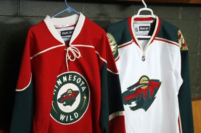
The Minnesota Wild also gave us a quick peek at their new jerseys today. I have to say that they look similar to last season, and that's good as I was a fan of their look. The alternate red jersey is their new home jersey as sales of that uniform were way ahead of the sales of the green jersey. These jerseys still feel like Minnesota hockey, and that's good.
Here are the jersey-aesthetics rankings, according to me and only me, in reverse-order.
17. New York Islanders - home and road.
16. Los Angeles Kings - home and road.
15. Florida Panthers - home and road.
14. Nashville Predators - home and road.
13. Calgary Flames - home and road.
12. Vancouver Canucks - home and road.
11. Tampa Bay Lightning - home and road.
10. Washington Capitals - home and road.
9. Minnesota Wild - home and road.
8. Ottawa Senators - home and road.
7. Columbus Blue Jackets - home and road.
6. Pittsburgh Penguins - home and road.
5. Carolina Hurricanes - home and road.
4. Detroit Red Wings - home only.
3. New York Rangers - home and road.
2. Montreal Canadiens - home and road.
1. Boston Bruins - home and road.
There's the updates. Until next time, keep your sticks on the ice!


7 comments:
I'm glad the 'Canes didn't change anything much. The jersey's look good, and I've always liked the hurricane warning flag strip along the bottom. The price is cheaper than what I paid for my Preds jersey, but at least there isn't a $20 patch involved. Granted, I've not bought a single patch probably ever, but that seems high. I hope that price of for parts and installation. :)
Personally, I think I'd slot the Canes in just below the Caps. (The fact that I'm a Caps fan, not withstanding).
I just don't think that the shoulder piping does anything for the jersey, myself. It'd be cleaner without it.
Overall, not bad at all. I think that any of your top 9 are solid jersey designs...but that gap between 9 and 10 (Caps and islanders) is a chasm! 10 and down is not a good neighborhood, in that ranking.
Personally, the Los Angeles Kings and Calgary flames would be up in the 5 - 10 slot somewhere in my own rankings. The Kings' only real flaw IMO was making the wrong choice on what to keep on the him of the jerseys, and the lettering isn't enough to really drop them that far.. but to each their own. Calgary has two faults, but I saw the players walking around with the uniforms on on TV, and I have to say.. outside of photos that still-time things, they look pretty darned nice. You don't even really notice those goddawful socks unless they're standing still for a long time, and that's not going to happen during a game much.. Overall, the jersey/uniform on the ice for the Flames will look pretty sleek I think.
Sage - from what I've seen, that the price of the patch only.
Dan - the gap between good and bad is large. I'll admit that. :o)
Art - the reason I don't like the Kings is that they took a decent-looking jersey and made it boring. Also, the Kings removed almost all the purple which goes against their tradition. Calgary needs to remove the stupid side panelling, complete the hem stripe, and lose the flags. The black Flaming "C" also annoys me a little.
For the most part, Caniacs seem happy with the new threads. Although feelings are mixed about the new "piping". At least they didn't make any drastic changes!
Cheers!
I'm glad the Canadiens kept their awesome, red sweaters. Probably one of my favorites, they look so sharp. I suspect they would have had a riot in their hands if anything had changed.
They're just happy that Matty Cullen is back on the bench -- and in Canes country, they feel this is enough to get hockey big again in Raleigh. Ticket sales are up -- that's a good thing.
We miss him dearly. ;)
The Dark Ranger
Post a Comment