


Blue For The New Year
 Despite looking a lot like Darth Vader walking through the corridors of the Death Star, the man to the left is Evgeni Malkin of the Pittsburgh Penguins. Yesterday, we got our first glimpse of the new uniforms the Penguins will be wearing on January 1, 2011 against the Washington Capitals at the Bridgestone Winter Classic. As we saw in the first Winter Classic, the Penguins went back throuhg their past to come up with a gorgeous baby blue jersey, and have continued to use that uniform as their alternate jersey for their fifteen selected dates. If you're collecting Penguins jerseys, here is the next jersey for your closet as the 2011 Winter Classic will be blue again in Steeltown.
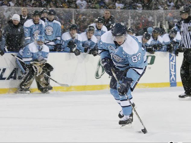
The Penguins have worn dark blue in their past, and the baby blue is slightly passé now that they have worn it for the past three seasons. I still like the baby blue uniform, but this is a step forward for the Winter Classic. There were other options that the Penguins could have used, and they certainly could have returned to Robo-Pigeon, but the Penguins are introducing a historical mash-up for this year's Winter Classic.
The logo chosen by the Penguins for this jersey is one of their very first logos. As you can see, the skating penguin is quite rotund and drawn in very simple lines unlike the vast majority of logos today. It is also quite happier than the current skating penguin, something that seemed to change as the Penguins evolved throughout the years. Overall, though, I like this older logo for a one-off jersey. And if they plan on using this jersey as an alternate, it is an excellent historical logo for throwback games.
The new Winter Classic jerseys are a mash-up of various other uniforms that the Penguins wore in their history. The arm and hem stripes are clearly from their original 1967-68 jerseys, but have been changed from dark blue to baby blue. The lace-up collar also remains from that jersey, but I'm really starting to wish that teams would move away from that trend. There is nothing wrong with the V-neck jersey that has been worn for a long time.
The font on the back is from the 1967-68 uniform as well, but the Penguins seem to have added gray to the white numbers to make them more subtle. I'm not sure why this was done, but perhaps there have been complaints about glare off the bright white jerseys when playing outdoors. Aside from that, there aren't really any other reasons I can think of in terms of graying the number font.
The names on the back of the jersey didn't appear on the dark uniforms until 1977 when navy became the dominant colour, so it appears the names are appearing due to the jerseys being mostly navy. Incidentally, the home white jerseys had names in 1970, but it took seven years for names to be added to the dark jerseys. Much like the numbers, however, the names are also that subtle gray rather than white. The captaincy designations are brand-new as far as I can tell since that font was never used on a Penguins jersey to designate captaincies.
Overall, I think this jersey does the trick, but I'm not overly happy about it being a mash-up of various blue jerseys throughout the Penguins history. One thing that did impress me was Reebok's usage of the collar to commemorate the game. However, the three million Reebok logos right below the collar still bothers me quite a bit. While I would have preferred the Penguins to choose one jersey from their history and go with it, I think this one does the trick for the Winter Classic.
Comparatively to the last Winter Classic, I much prefer the baby blue jersey. Here's hoping it will still be used in the future by the Penguins.
Until next time, keep your sticks on the ice!


1 comment:
Bah! Those stripes are huge and clunky. If they had been done like the ones in the older jersey it would have looked a lot better. I just don't understand why they were compelled to include a six inch stack of stripes.
Caps will win anyway. :)
Post a Comment