


Leaking Black And White

I have an Islanders Fisherman jersey, and I have to say it is one of my favorite jerseys of all-time. I've been offered hundreds of dollars by those seeking one to take it off my hands, but it remains in my collection. Islanders fans, though, nearly burned down the Nassau Veterans Memorial Coliseum when it was introduced in the mid-1990s, and they didn't relent until the Islanders went back to their traditional look. Needless to say, it was chaos when the Islanders went to make a change.
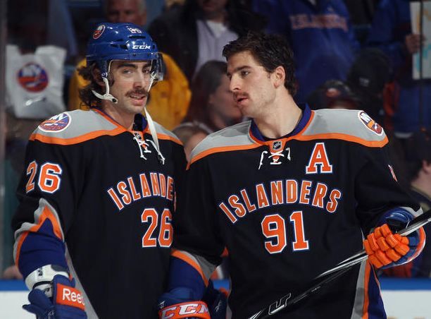
Since then, the Islanders have had a few questionable alternate uniforms. The orange pylon look that brings back memories of Alexei Yashin for which Islanders fans have yet forgive the team. There was the throwback uniform that drew rave reviews from the fans. There was this hot mess of a black uniform that seemed to polarize fans one way or another - you know which side I stand on regarding this alternate. In seeing how the Islanders have worn all three colours - orange, blue, and black - as alternates, it makes sense to take one of these colours to the next level.

There's a lot of reason to believe this is the uniform the Islanders will unveil on September 21. First, there are the four stripes on the "Y" like there was on their Stadium Series jerseys, representing the four Stanley Cups the franchise has won. Second, there are also four stripes on the sleeves for those four Stanley Cups. Third, the logo looks pretty familiar. Fourth, there are orange and blue stripes inside the neckline, representing the team's normal colours. Finally, there are more in bags below the hanging jersey if you look carefully. That would indicate that these were received as a shipment or they are on the verge of being shipped out.
In light of those five pieces of evidence, I'd say we have a pretty credible leak on our hands. Let me be the first to say that I'm not a fan. In fact, the only thing that's a positive on this entire uniform is that it can only be worn twelve times per season as an alternate. I was never a fan of their black alternates, and these don't change that opinion. They aren't traditional, they aren't interesting, and they aren't the Islanders in these uniforms.
Huge fail on these jerseys, Islanders. I'm disappointed.
Until next time, keep your sticks on the ice!


2 comments:
Nice Article. Anytime you try to change something there will be controversy for sure, especially something that so many fans love.
I'd like to point out that the color is a shout out to Brooklyn. I'm a fan of identifying through a city. I always thought it was cool all of the Pittsburgh teams have the same colors. If I had a complaint, it's that it's really bland. They could make that jersey pop so much more
Post a Comment