There is absolutely nothing wrong with an NHL team celebrating a major anniversary with a logo like the one to the left. Both the Detroit Red Wings and the New York Rangers will celebrate their 100th anniversaries this season, and the Red Wings are getting a solid jump on the events by releasing the 100th anniversary logo and, yesterday, their new 100th anniversary jersey. If you know me, you know that I'm never in favour of a team wearing a birthday jersey, but the Red Wings are going to do that. Let's see what they designed to commemorate 100 years of existing as a franchise.

We'll start with the overall aesthetic as modelled by Patrick Kane. There's nothing overly terrible about these jerseys on first glance, but the old-time white/cream colour that every team seems to have tried once is starting to feel tired. Not every fake throwback jersey has to look like people didn't know how to get white fabric clean. Outside of that, the jersey looks pretty clean with its true red colour, easy-to-read numbering, and solid striping. However, the devil's in the details and this one needs to be examined a little closer. Let's look at Detroit's nod to the past.
According to the
Red Wings' release about these new jerseys,
"[t]he 'Cougar D' logo has been thoughtfully redrawn and reintroduced as a secondary mark for Red Wings Centennial, appearing on the front leg of the solid-red pants, the jock tag at the bottom front of the jersey and the hem loop on the back." That would be a fantastic addition to the uniform if it wasn't virtually invisible. If we're celebrating the Detroit Cougars era, why could the 'Cougar D' not be added as a shoulder patch to honour that history?
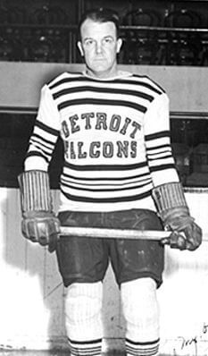
Continuing down the Red Wings' rationale tour,
"[t]he striping along the hem, sleeves and socks draws from Detroit Falcons uniforms from 1930-1932. Both the font and striping use a vintage off-white tone to reflect the heritage aesthetic." While the striping
gets close to what the Falcons wore, it's not exact and the off-white tone feels dated now. What's can't the stripes be white like the sweater that the Falcons wore? A hockey sweater needs good striping, but this element feels forced. Not every element thrown together on a jersey needs to be drawn from a historical jersey. Perhaps more importantly, the Falcons era was the only time the Red Wings franchise wore a colour other than red. That's the history that should be celebrated here.
The Unnecessary History Adventure continues with
"[p]atches on the jersey are designed to match the leather-brown hue of the Centennial uniform gloves, a nod to the traditional leather used in gloves and goalie pads". As shown to the left, the captains will wear a "diamond-shaped faux leather captain patch, honoring those worn in the 1950s" among other faux leather patches like the jock tag and hem tag. None of this is good as we've seen other teams wear faux leather-coloured gloves already, so why did Detroit go to all this trouble for things virtually no one wanted?
Finally, we get to something that does have historical value for hockey fans. The release states,
"The first chain-stitched Winged Wheel, introduced in 1932 and used through 1948, is acknowledged in the Centennial jersey’s craftsmanship," and chain-stitched logos are something that more teams need to use. The Chicago Blackhawks used chain-stitching in their logo for the longest time, and it was glorious. More teams should be looking at having chain-stitched logos created because of their aesthetics. This detail is a huge win for the jersey.
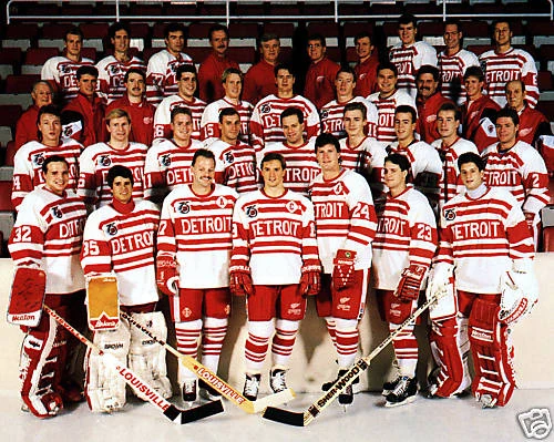
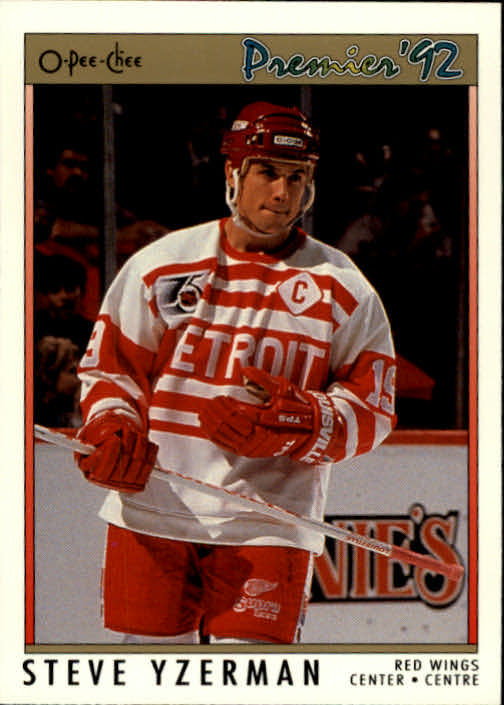
The font for the numbers was apparently "inspired by the Detroit Cougars' 'Barber Pole' uniforms, worn in 1927-28," and you may remember those jerseys fondly when the Red Wings wore them in
1991-92 for their 75th anniversary. Without a doubt, the 1991-92 jersey are the best specialty jerseys that the Red Wings have worn to date by a large margin, and they should be an alternate jersey moving forward. Instead, we get a font that
no one alive remembers the team wearing, and it seems like taking a font from a jersey kind of misses the point of honouring that team. After all, we're not honouring a font, are we?
The added details from this jersey don't change anything outside of the logo to the right. As per the release,
"For the first time in franchise history, the Red Wings will wear a matte red helmet featuring a vintage Meijer logo (1957–1966) decal," and, despite ads never being worn historically, that logo should look pretty good on the helmet. Outside of that, the lace-up collar, the 100th anniversary logo, the interior stupidity, and the jersey ad on the shoulder are reminders that a true throwback will never be worn and a solid homage to the past can never be designed.
The good news is that the Red Wings will only wear this Centennial jersey twelve times this season, and they'll debut it on October 9 when they host the Montreal Canadiens. It's hard to be excited for a jersey that jumbles together elements from multiple teams when something like the
1991-92 jerseys hit the mark so well for their 75th anniversary. For whatever reason, that design simplicity is gone.
There's nothing wrong with these jerseys when viewing them from the seats in an arena. The aesthetics work, they look pretty good, and they celebrate the Red Wings' centennial anniversary without needing the explanation from where each element comes. And maybe that's the lesson to be learned here: less marketing speak and rationalizing ideas when jerseys are being introduced because the details certainly detract from the overall aesthetic in this jersey's case.
The Detroit Red Wings have withstood the test of time for 100 years. There's no marketing needed to rationalize that history. Roll this jersey out, and stop trying to explain the idea behind every thread.
Until next time, keep your sticks on the ice!


No comments:
Post a Comment