


Clothes Make The Man
 Since July is nearly over, and the next unveiling is not supposed to be until August 1, 2007 by the Vancouver Canucks (or so the retailers have been saying), today's entry is a review of all the possible and real jerseys that have been seen on this blog. In fact, I am going to rank them in reverse order of how I view them. Honestly, there have been some bad ones so far. There have been a few good ones too. The good, however, has been few and far between. At least the NHL made concessions and allowed the Original Six teams of the Boston Bruins and New York Rangers remain traditional. Someone is using their head at the NHL Head Offices. Surprisingly.
Here's my list. You may not agree, and that's alright. I'll justify as much as I can as to why the team is placed where they are on the list so you can gain some insight. Again, you may not agree, and that's ok. That makes us all fans, doesn't it? The Florida Panthers are also included after they unveiled their jerseys this weekend.
Alright, here we go. Here are the ten leaked and/or unveiled jerseys for the 2007-08 NHL season, sponsored not in any way by the Rbk Edge Hockey Uniform System.
10. The New York Islanders. I know the Barney Rubble Hairpieces started the New York trend of numbers on the front right of the jersey, but why copy it? And since the orange alternate jerseys that the Islanders wore made them look like pylons, it must be a good idea to reproduce that idea. Excuse my sarcasm. I'm glad these dark jerseys are worn at home. The fans of the Islanders should get the first crack at burning the Nassau Coliseum down if the Islanders truly wear these eyesores next season.
9. The Los Angeles Kings. The Kings went with a black home jersey rather than a purple one. The problem is that is looks ridiculously plain. It's far from being kingly at all. And why does the name "Los Angeles" float at the bottom of the jersey hem? Can they not add a stripe? Did Rbk Hockey not allow them? Who is calling the shots here? Just so the Kings didn't feel so plain at home, they decided to go just as plain on the road. Great job, Kings - zero improvement, and plainer than ever!
8. The Nashville Predators. Call it what you will - aprons, onesies, NBA jersey - the Predators' players look like they are at the wrong event. Personally, they look like aprons to me, but that's my take. The Predators added their city's name across the road jersey (as if you have no clue where they're from) and made the logo on the road jerseys smaller than on the home jerseys. Ryan Suter looks comfortable in his T-shirt-and-apron combo for the next Nashville block party. Oh, and the alternate logo has all but gone extinct on the jerseys, replaced by the skull logo on the shoulder. Is that called "evolution"? Disappointing, to say the least, about this entire jersey unveiling.
7. The Florida Panthers. If this is how all the new uniforms are going to look, I might just start following another sport. The new Florida Panthers jerseys also appear to be an apron over the chest of the players. However, what is with the cloak-like look of the sleeves? Are the players supposed to look like superheroes? The home jerseys would look fine without that stupid yellow piping down the front of them. The road jerseys, however, are entirely too white. I also hate those stupid elbow stripes. In case you missed the instructions on how to put these jerseys together, insert Tab A into Slot B to get a highlighted Reebok logo on the neckline. What purpose do the sleeve stripes and broken shoulder yokes serve? Did Nashville and Florida collaborate on their designs? I am highly disappointed in Florida's design, especially considering they needed a major overhaul. [Teebz - Huge thanks to the Panthers Daily Puck blog for their invaluable photos, and to Paul Lukas' Uni Watch blog for the back photo of the jersey]
6. The Washington Capitals. The Capitals went back to the future with their logo and jersey re-design. The re-design included combining the eagle logo and the Capitol Building logo of their former jerseys into this new eagle logo which will be worn on the sleeves of their new jerseys. The home jerseys are far too red for me, and could use some additional blue to break up some of that blinding red. The road jerseys are quite nice, though, and I have little problem with the Captials' road jersey being as white as it is. It's crisp and clean. The red needs to be toned down, though.
5. The Pittsburgh Penguins. The Penguins didn't change much on their new jerseys, except for adding more Vegas gold which shouldn't have been done, in my opinion. While more needs to be seen as to what may have been mangled on the front, the rear of the new Penguins jerseys are alright.
4. The Carolina Hurricanes. I'll admit it: I was a fan of the old Carolina Hurricanes jerseys. I like the combination of the red, black, white, and silver. The fact that the Hurricanes didn't change much on their jerseys received a thumbs-up from me.
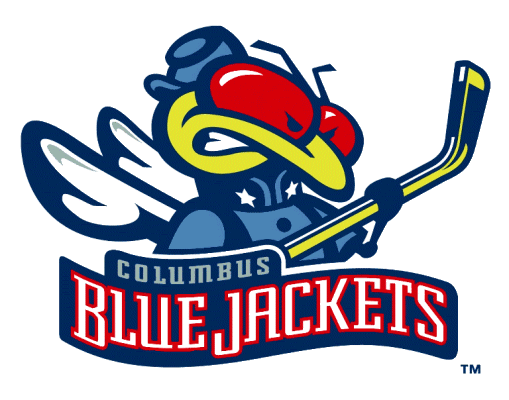
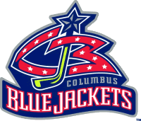
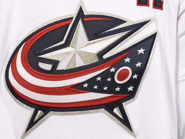
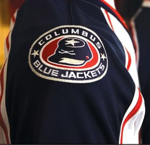
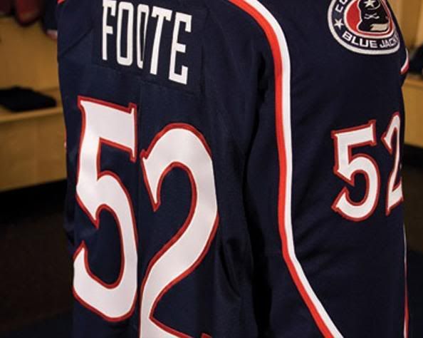
3. The Columbus Blue Jackets. Gone are the insect logo and the CBJ logo, having been replaced with the alternate logo. They kept the military shoulder patch on these new uniforms as well. The Jackets didn't mess with their current font either, and that's good for everyone with an older jersey in their closets. The only complaint about these jerseys in the tiny hemline stripes, but these are solid otherwise. Simple, elegant, and gorgeous - not much more I can ask for.
2. The New York Rangers. The home jersey feels slightly incomplete. I think it's because there is no shoulder patch or colour around the collar, but it feels incomplete to me. The road jersey seems to be pretty good, but these jerseys definitely need to have a name and numbers on them. The Rangers opted to not include the NYR shield or the Lady Liberty logos on these jerseys, a harkening back to their traditional jersey days. Tradition, on this blog, gets high marks, as do these jerseys.
1. The Boston Bruins. The Bruins added a few small serifs to their old logo to give them a new look. The Bruins, in contrast to their new logo, went traditional with their new jersey design. The home jerseys look similar to their alternate jerseys last year, a look this writer loved from the moment they wore their alternates. The road jerseys followed the same traditional design, and this writer commends the Bruins for being ahead of the game on their design. The secondary logo of the Bruins has two looks: the home patch and the road patch. The road jersey can be seen here on Denis Reul, a 2007 Draft Pick. The home jersey can be seen here and here on Brandon Bochenski, as well as on 2007 Masterton Trophy winner Phil Kessel. The Bruins may not be able to win the Stanley Cup, but they get high marks from this writer for their upcoming fashion sense.
In conclusion, these rankings will change as more and more teams unveil their new looks. There are still 20 teams to do so, and with the Islanders, Penguins, Hurricanes, and Rangers unofficially being leaked, there may still be more changes to these rankings.
Until the next unveiling, keep your sticks on the ice!


7 comments:
Hey Teebz, I know why some of the teams are putting those weird half-stripes on the elbow area (and probably more to come). It's because of the construct of the jersey itself. Having seen the new CBJ jerseys up close and personal, there's a different fabric (stretchy) right at the elbow area that separates the upper sleeve from the lower sleeve materials as well as along the shoulder area. Your picture of the white Panthers jersey is a perfect example. Where the half stripes are located is exactly where that different material is located. These jerseys may have better performance, but up close they look like a hodge-podge of fabrics sewn together, almost like something your grandparents would have made during the Great Depression
In fact, looking at the Islanders prototypes, the navy and white strips on the sleeves look about the same place where the fabric changes
Interesting development, Jeff! And good call on that!
I still hate it, though. But it would also explain the LA Kings and Nashville Predators elbow problems. Great insight, Jeff!
the Florida jerseys would be fine without the yellow front piping and the horizontal half-stipes
Teebz,
I will nominate you to the NHL's version of What Not To Wear next summer during the off-season. Excellent analysis - and boy, do we need the season to start!
;)
tdr
Teebz, thanks for the site!
So far the Bruins,Rangers and Wings are the only ones I can handle.It looks like Carolina may be ok.... As bad as most of these designs are, the real problem is the actual cut of these uniforms. NO TEAM is going to look good in these things.I wish they had just used the "so called new material" with the same cut as before. I hate the neck line, the rounded hem line, the tight fit, those mesh panels everywhere and even the socks, which make the players look like they are wearing 5 pair.
All of the templates suck!
It is just a another step in Bettman's pursuit to change the game. He is trying to transform it, so it is unrecognizable from what it once was. Although fighting is not my favorite aspect of the game, I still think it belongs in the NHL.
I believe that there was some thought to the fact that with these new uniforms,it will be harder to grab/pull off and may result in less fighting. Remember that they originally wanted the uniforms to be tucked in. At some point I think Bettman will try to abolish fighting as well. He knows he can't do it in one swoop, but over time..........
I've even heard that the NHL is considering having the goalies wear a different color jersey, like soccer.Bettman is a menace and an idiot!!
Even though I've seen the new Kings jerseys for awhile, I didn't realize till you pointed it out that the home jerseys are black not purple! I guess I just didn't care all that much about the redesign. Your analysis was dead-on. While some teams put in too much flair the Kings made it too plain. I'm glad I already have an older purple jersey because it looks way better than the new black ones.
Post a Comment