


Jerseys, Juniors, And Garters
 Being that today was August 29, there was another unveiling. The Vancouver Canucks showed off their new jerseys and tweaked their logo, as shown to the left. As you may know, I had written a previous article entitled Freeing Willy about the Canucks and the search for leaked images of their new duds. In that article, I had linked to an article written by Jim Jamieson in The Province about the Canucks' new look. He had suggested several changes to the Canucks' look, so I'll review these here.
Mr. Jamieson had written:
- "the new look will retain the Free Willy logo, but with fewer colours and Vancouver spelled in an arc out over the top of it. The same source said the 'hockey-stick-in-rink logo' that is the Canucks' original and adorned the team's retro-jersey will be used as shoulder patches, but with some modifications".
- "[i]t's expected the main colours will be changed to the lighter blue and green of the aforementioned retro-jersey".
I'd say that Mr. Jamieson was dead-on with his analysis of the Canucks' new jerseys. In fact, I would consider his analysis to be accurate to the point of him breaking the gag order, but that's not for me to decide.
In any case, here's my take. First, I suspect that not many people know that the Canucks are from Vancouver. In fact, the Canucks must have done research and found out that people in Vancouver don't know that the Canucks represent their city. Why else would you include the city's name on both the home jersey and the road jersey? Nashville only put it on the road jersey. Is Vancouver trying to say that they're better by putting it on both? It's twice as dumb in this case.
Secondly, I don't mind the lack of colours in the new Canucks logo. However, the old logo simply wasn't as bland and boring. While I realize that the blue-logo-on-blue-jersey may not work, the white portion of the "C" looks terrible. The thing I don't understand is that if the retro jersey was such a hot seller, why not swap the stick-in-rink logo with the Orca Bay logo on the front? Why not put the Orca Bay logo on the shoulder? Willie Mitchell is wondering the same thing.
Finally, the last thing that bothered me was the proximity of the word "Vancouver" to the captain's "C" on Markus Naslund's jersey. After hearing about how Detroit couldn't have the "C" on the right side due to the seams and the closeness to the logo, it appears Vancouver said "screw it" and did what they wanted. Is there no uniformity between the uniforms this season? Is this a Brave New NHL World?
It's not all bad, though. I am fan of the retro Canucks jerseys, so this colour scheme works for me. The stripes are traditional and look good on the new jerseys as well. The Canucks also tweaked the font on the back of the jerseys, but it doesn't take away from the jerseys at all. It's more modern, and it looks alright.
Much like Tampa Bay's new jersey, these fall somewhere in the middle of the pack. They are not outstanding, but they are not horrible. The traditional elements of the jerseys will push the value of the new look of the Canucks up, and tradition is always good on this blog.
In other news:
- Team Canada has improved to 2-0 against the Russian youngsters in the Super Series. Standouts so far include goalies Steve Mason (CBJ) and Jonathan Bernier (LAK), forwards Stefan Legein (CBJ), Kyle Turris (PHO), and Brandon Sutter (CAR). Also to be noted is the penalty killing unit of the Canadians which has held the Russians to zero goals on 19 attempts, including two 5-on-3 powerplays. Game three of the eight game series goes Friday at 8am ET from Omsk, Russia.
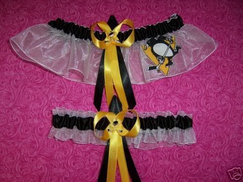
- I'm not sure how much you can love a hockey team, but in spending some time on Ebay today, I came across something that the most-devoted woman could ever want. I thought maybe Elly of No Pun Intended would be the only woman to want Pittsburgh Penguins garters for her wedding, but I could be wrong. Care to watch Hockey Night In Canada on your wedding night? I didn't think so. I didn't bid on them either.
- A big thank you is going out to The Yankee Canuck. I think, thanks to all the hockey fans searching for leaked Canucks' jerseys, I might have scored about 250 page hits in the last month due to his linking me on his blog. So I say, with the utmost respect and appreciation of the link, thank you. I appreciate the link, and certainly look forward to writing more articles that mat be linkable.
The next official unveiling is Calgary on September 4. Once they've unveiled their new jerseys, I'll do a recap on all of them again.
Until then, keep your sticks on the ice!


7 comments:
that garter is unreal....it's giving me ideas but I think that would be a bit too much.
I watched the unveiling online from the Canucks web site. I have always made myself clear on how I feel about the whale, but the jerseys are brilliant...until you notice the HUGE letters spelling out Vancouver. I was so hoping that part of Mr Jamieson's description was untrue.
The thing I found most amusing was that the guy who introduced the jerseys said that they would take note of the fact that Orca Bay no longer owned them. Duh! You have an orca on there! Orca Bay is the one who started that nonsense.
As for the whale, I like the silver inlaid on the blue on the home jersey. The silver on the white hardly shows up though. It needs to have some kind of depth to it; perhaps an outline.
The colors are fabulous and unique in the league. That was obviously the right move.
I had never thought about it, but I completely agree with your assessment that the whale should be on the shoulder and the stick in rink on the chest. THAT jersey would be right up there with the Bruins' new one.
kms2 - you have no idea what my reaction was. I think my jaw seriously hit the desk. Who would come up with a garter???
Sage - That's exactly why you're a correspondant, Sage - great comment.
If they had made the stick-in-rink their primary logo on the jersey, they would have a timeless jersey. You could even incorporate the word "Vancouver" into the rink. It would solve both problems. Sometimes, I fail to see how these teams expect to sell merchandise.
I did notice on the slide show they have up that some folks were wearing T-shirts in the design of the jerseys. That looks fine.
By the way, my new Predators jersey should be in soon. I was told mid September. I will definitely get some close up pictures of it so we can all see the patchwork quilt design Rbk has gone to.
Wow...that's... I don't know, Elly bought a Penguins apron based on how ridiculous it was, but those take the cake.
I think I am a little scarred, lol.
My future husband (the nice brain surgeon I'm waiting on with shoulders like the Rocky Mountains) will of course appreciate hockey and all the goodness that is the Pittsburgh Penguins. Not quite sure I would put him through that though, haha. Interesting catch.
Hey man, glad I could help send some traffic your way. I think it's hilarious if you google "new canucks logo" my bullshit post about it from a month ago is first.
But yeah, the new uni's are so...meh. I'm still searching for the point to all the press about it...other then it's a good reason to talk about hockey in the summer.
Post a Comment