


You're Wearing That? - Scary Day Edition
 Happy Halloween everyone! Being that today is All Hallow's Eve, I thought about what I should write while snacking on some inexpensive tooth decay. I have another book review ready to go, but that's going to wait until tomorrow. Instead, I am going to bring you another round of "You're Wearing That". The Scary Day Edition will introduce you to more jersey offenses made by professional hockey teams. The term "professional" is used loosely, though. In any case, like the other "You're Wearing That" articles, this one has some jerseys that may not be suitable for all readers. Viewer discretion is advised.
Please note that you can find the four previous editions on the right under the category of "Highly-Clicked Articles". Here we go with the new addition to the family.
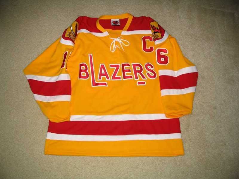
The WHA's Philadelphia/Vancouver Blazers have to get mention on here, mainly because of their name. Blazers makes me think of fire, and they certainly have the colours right. Honestly, though, could that logo be any more boring? Add a flame or two to a few letters, and it would be better than what is currently shown. These jerseys only lasted from 1972-74 - in 72-73 as a team in Philly, and in 73-74 as a team in Vancouver.
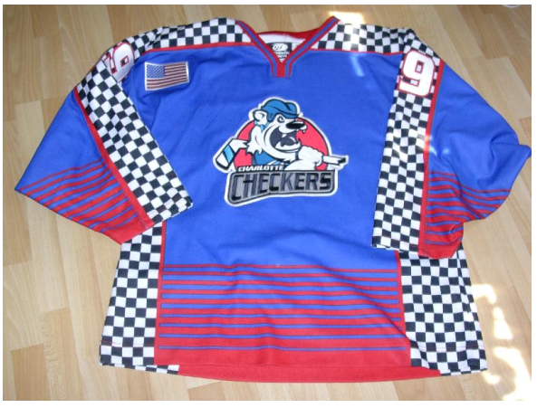
The ECHL's Charlotte Checkers decided that a jersey to commemorate Race Night would be a good idea. I have said it before, and I'll say it again: cross-promotion of sports is a terrible idea. These jerseys are horrible, making this one of the worst promotional jersey ideas ever, in my humble opinion, due to their hideous colours and the stupid promotion.
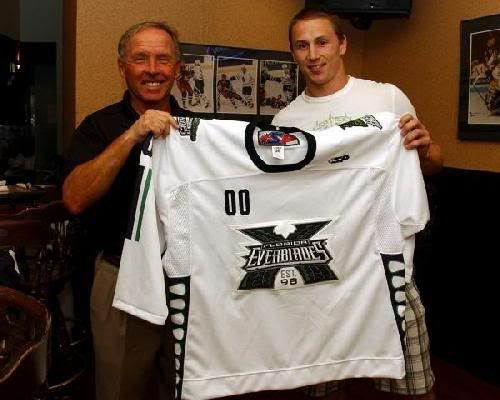
The ECHL's Florida Everblades are celebrating their tenth anniversary this season with a jersey. How many times do I have to repeat myself on this one? Anniversaries are meant for patches, not for jerseys! The fact that they complete the jerseys with some Barney Rubble Hairpiece numbering on the shoulder only makes this jersey even worse.
The WHL's Saskatoon Blades are going to be honouring the men and women of the Emergency Services with their own night and promotional jersey on November 10th this season. The jerseys are alright, and they are honouring real-life heroes, so these jerseys will not get a bad word from me. Like previous instances, good on the Blades for honouring the men and women who risk their lives to save others.
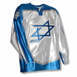
The national Israeli ice hockey team is working towards becoming a hockey power in the IIHF world. Did you even know Israel had an ice hockey team, let alone being an IIHF member? Well, they do, and they played in the 2006 IIHF World Championship Division I Group A pool at Amiens, France from April 24 to April 30, 2006. I'll give the Israelis credit - they showed up and played hard, despite losing all five games while being outscored 47-3. I'm not saying that their home jersey or road jersey had anything to do with it, but they don't look like hockey players wearing those jerseys. At all. Whatsoever.
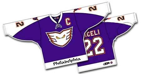
The AHL's Philadelphia Phantoms wore a purple jersey as an alternate jersey during the 03-04 season. If you ask me, they aren't that special. Yes, they are an alternate colour of the Phantoms, but they don't really come across as anything I'd be proud to wear.
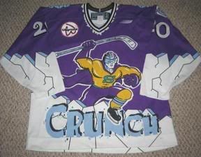
The AHL's Syracuse Crunch also wore an interesting alternate jersey in their history. These jerseys were worn during the 1999-00 season. Apparently, the Crunch players are some sort of superhero or something. However, their average win-loss record from that season of 35-35-9-1 seems to indicate differently. Oh, and they were outscored 294-290 on the season. The Crunch don't seem like they are of superpowers when you look at that season at all. Thankfully, those alternates are gone.
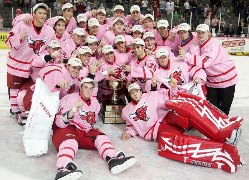
The University of Nebraska at Omaha recently donned pink jerseys to help with Breast Cancer Awareness month in October. The UNO hockey team raised over $10000 auctioning off the pink jerseys in support of breast cancer research. Kudos to the UNO hockey program for doing something that can affect each and every one of us. I may not like the colours, but the promotion gets a thumbs-up from me. For more info, please read the full story at The Gateway, UNO's newspaper.
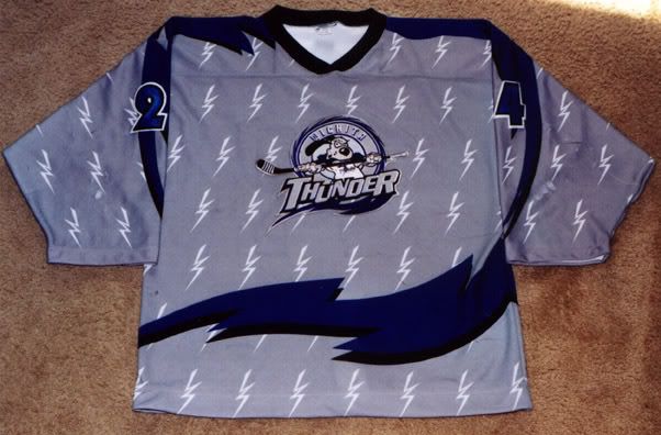
THe CHL's Wichita Thunder decided that they needed an alternate jersey. Unfortunately, what they got wasn't very pretty. Gray? Crappy little lightning bolts? A wave of colour that does absolutely nothing? Numbers that are hard to read? Yeah, you know I'm not a fan of these.
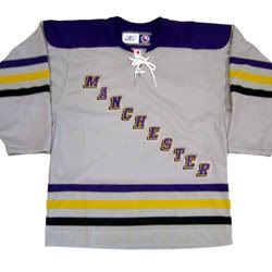
The AHL's Manchester Monarchs also thought they could use an alternate jersey. Why is it that it seems that teams need an alternate jersey, only to deliver the crappiest alternate jersey ever? These are horrible! Three-coloured stripes? A ripoff of the New York Rangers' diagonal lettering? No logos on the shoulders for identification that this is an actual professional team? What is going on here? However, the Monarchs will honour the men and women of the military with their own night on November 17, 2007. This jersey is decent, and should be used a replacement for that horrible alternate piece of crap.
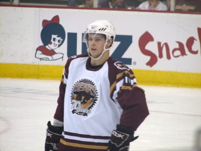
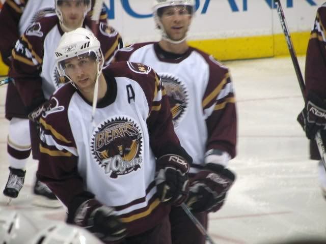
In keeping with the AHL, the Hershey Bears wore jerseys to commemorate 70 years of hockey in Hershey. I can't tell you how disappointed I am in Hershey for making their anniversary more important than their logo. Hershey, why would you make the most blatent of jersey offences? Especially when you are so steeped in hockey tradition? What bothers me even more is that the nameplate is allowed to spread over the coloured shoulders. That's brutal! Woe is me over these jerseys.
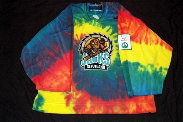
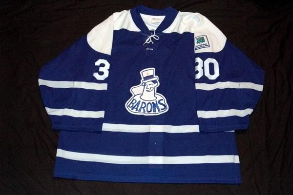
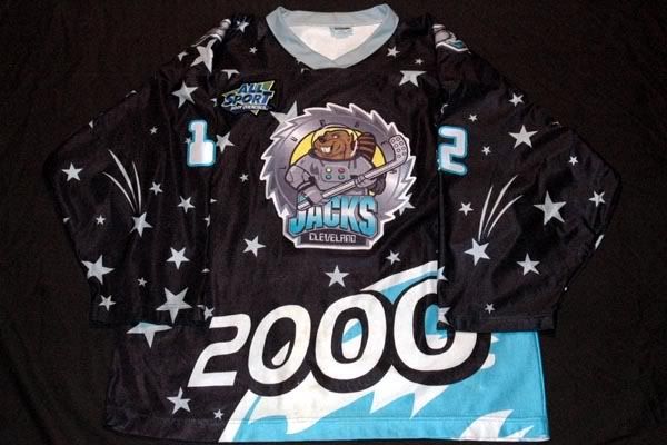
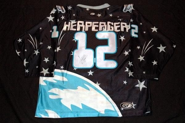
The IHL's Cleveland Lumberjacks had some eyesores, but one very beautiful jersey in their short time. In 1998-99, they came out with two jerseys - one good, and one bad. The bad one was the Turn Back The Clock jersey which nearly blinded me when I first saw it. Tie-dyed jerseys are never good, especially when they turn out as badly as this one did. However, during that season, the Lumberjacks held a Heritage Night as well. During that night, they sported these classy and elegant Cleveland Barons throwback jerseys. I am a fan of these jerseys, and even more of a fan of that logo. These are impressive. Unfortunately, the Lumberjacks went back to their cartoonish ways with their Millenium Night jerseys. They even tried to sci-fi the font on the back which only adds to their cartoonish appearance. I'm not sold on these jerseys, but I would take a Heritage Night jersey in a heartbeat.
The NHL's Dallas Stars wore these alternate jerseys last season. For the longest time, they were simply known as the Dallas Fallopian Tubes in these jerseys. That's not very intimidating at all. And would explain why they didn't keep the alternate logo this season.
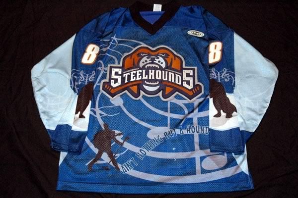
And lastly in this look at some questionable jerseys, we feature the CHL's Youngstown Steelhounds. The Steelhounds held an Elvis-themed night in the 06-07 season, and wore jerseys for the event. I am not particularily impressed with these jerseys, but they could have been so much worse. With that fact alone, I'll give these jerseys a passing grade. They aren't bad, but they certainly are not that great either.
There's a little fun for your Halloween web searches. I don't expect many people to be actively searching for these jerseys, but you never know when you can use a funny Halloween costume. Or hockey jersey. In any case, there are certainly some horrible jerseys shown here, and any and all comments will be welcomed below.
Until next time, brush your teeth after all that candy, and keep your sticks on the ice!


4 comments:
The Hershey jersey was a one-time thing for a charity auction. You won't be seeing those jerseys again, except for on those individuals that paid $1,000 - $3,000 for the jerseys.
Good call, Anonymous. I just read that on their website.
However, it doesn't take away from the fact that they wore an anniversary jersey. I have never liked that idea, and never will.
I know you dont like that idea. But it is a neat thing to commemorate for a one time thing. their jerseys with the anniversary patch are definately much better.
I don't think I've ever seen anything shinier than the Israeli jerseys. They were amazing...
I know you already put a warning at the beginning of this post, but I definitely got a blast in the face by the picture of the pink jerseys. Maybe that needs its own warning. haha
I didn't think the Hershey Bears jersey was THAT bad. But I agree with the name going over the shoulder colors. That just looks weird. But it's what happens when you have a long ass last name.
Thanks for this post; I feel so much more educated on jerseys outside of the NHL.
Post a Comment