


The Return Of Classic Auctions
 There is no quantitative limit with regards to the respect and admiration I have for hockey history. There are so many great stories and so much fascinating imagery from the game that it should be celebrated as often as possible. Thankfully, Classic Auctions is holding another one of its fabulous sports memorabilia auctions, so I think it's time we revisit some of the great history seen in the game of hockey and some of the associated stories that have come along with these small glimpses into the annals of the game. Let's take a look at some of the more interesting pieces up for auction this time.
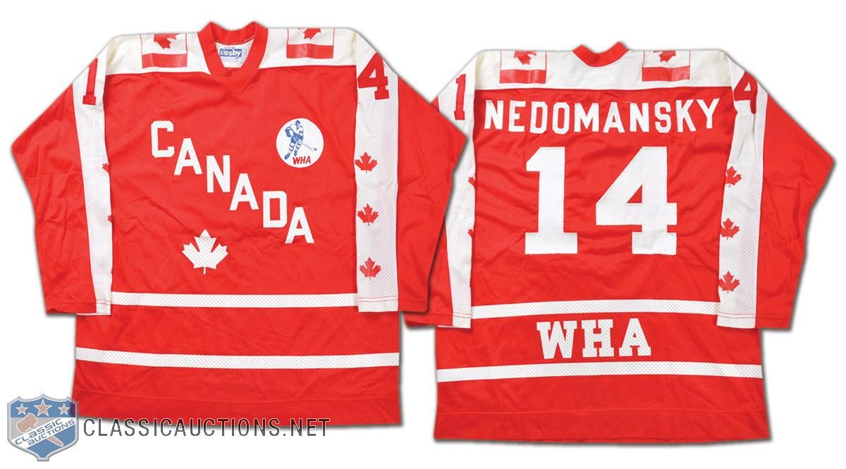
- We'll start this look into hockey history with a glimpse back at a jersey from an all-star. Vaclav Nedomansky was chosen as a WHA All-Star in 1976, and he played on Team Canada for the game in Cleveland, Ohio despite being from Czechoslovakia! The reason for this is that the WHA chose players for their all-star teams based upon where they played rather than where they were born! The Canadian-based WHA teams sent players as part of the Canada All-Stars and the American-based WHA teams sent players as the United States All-Stars. In 1976, Toronto Toros' star Nedomansky and the Canadian WHA All-Stars beat the US WHA All-Stars by a 6-1 score on January 13 at Richfield Coliseum!
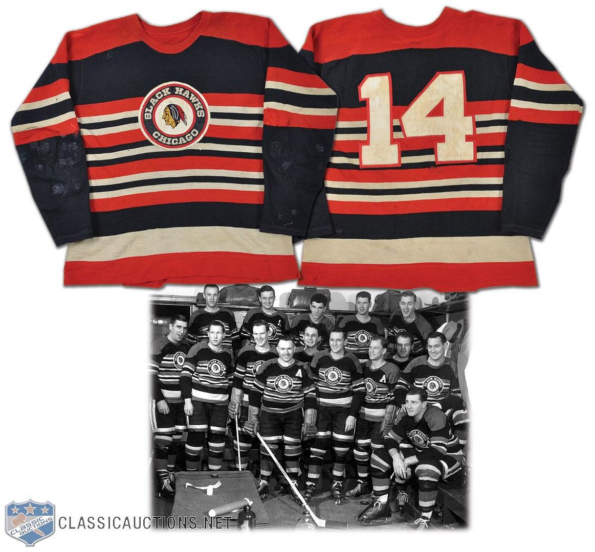
- We move on to an Original Six team. I have to say that I am a huge fan of this Blackhawks sweater from the 1950s. The colours, the stripes, the logo, the font... it truly is a thing of beauty! If there was ever an opportunity to bring back a different alternate jersey for the Blackhawks, this one gets my vote.
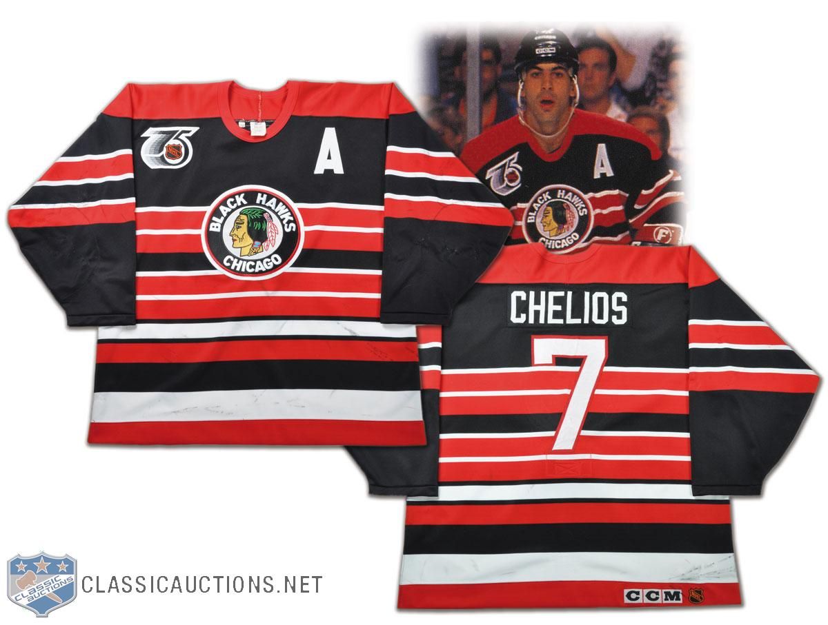
- Strangely enough, the Blackhawks have worn this look closer to the future. In 1991-92, the NHL had the Original Six teams wear a throwback jersey, and the Blackhawks decided on a jersey that looked remarkably like their sweaters from the 1950s. Two things I don't like: the rear font they decided on, and the name on the back. The font is just too skinny, and if you're going to throwback to a previous incarnation, go all the way or don't go at all.
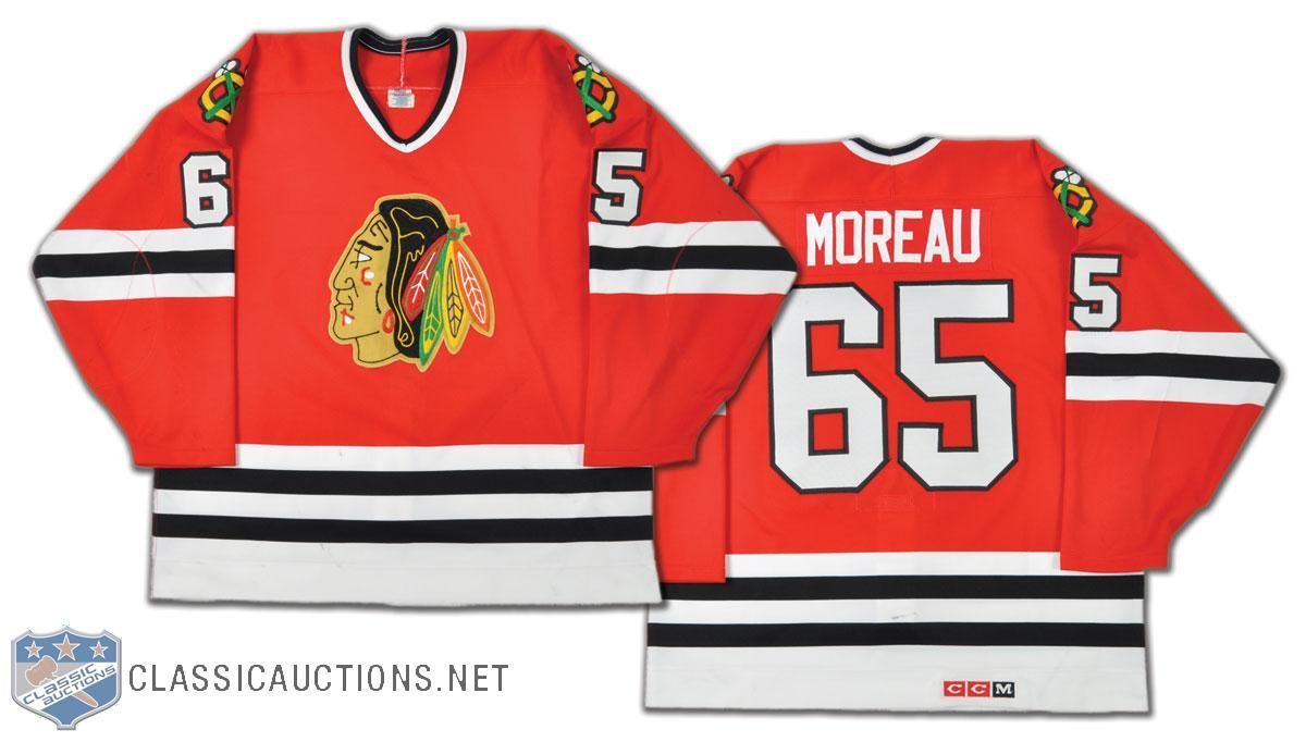
- This is a rare find, but I'm always intrigued when I come upon a number that I've never seen a player wear. Ethan Moreau apparently wore #65 during the 1994 preseason! If you're a Moreau fan, this number is one of those rare finds - much like Joe Sakic's #88 jersey when he played with the Nordiques!
- When you think of the Vancouver Canucks, does anyone else miss this look? I'm sorry, but as good as the current look is, there is still something about the skate logo that I truly miss about the Canucks. Maybe we'll see these beauties come back as an alternate one day? No one did yellow-orange-black like the Canucks did.
- As much as I hated them as a Penguins fan, there is something magical about the red-white-and blue of the Capitals. But I do have one question about this Doug Jarvis jersey from the early-1980s: why are the hem stripes so huge? They literally go right to the logo which is mid-torso! That's a little crazy.
- Just because there aren't enough Sutters in Calgary, here is more proof that the Sutter bloodline runs through the Flames. That's Shaun Sutter's jersey from the 1999-2000 season. Shaun is the son of Brian Sutter, and was drafted by the Flames when his dad coached there. Currently, Shaun serves as an assistant coach with the WHL's Regina Pats.
- I've looked at this before, but there was something going on with the Philadelphia Flyers in the late-1970s and early-1980s. Check out the location of the captain's "C" on Bob Clarke's jersey from 1976-77. It's nearly in the middle of his chest! And it's still pretty close to his mid-line in 1980-81! What gives? Why is it so close to the middle of his chest?
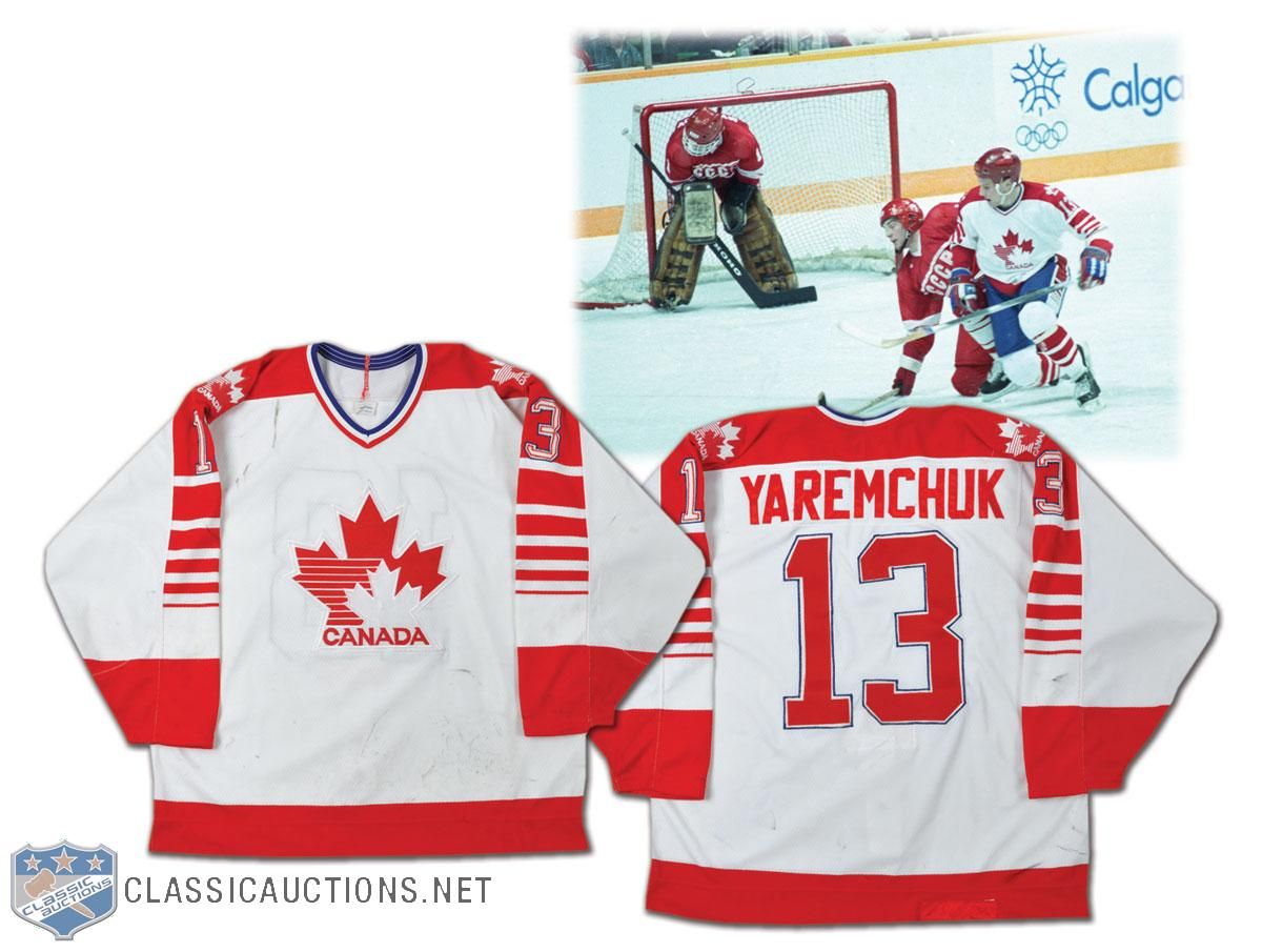
- We move to the international scene. There's a big story surrounding the 1988 Canada Olympic jerseys that I wasn't aware of before reading the story on the Classic Auctions site. This is Ken Yaremchuk's jersey, and he played alongside NHL players like Sean Burke and Andy Moog as they prepared to represent Canada at the 1988 Winter Games in Calgary. Here's the kicker: "An embroidered CCM crest on the rear hem has been covered with a patch of red tackle twill, obviously to comply with advertising guidelines. Canada received a fine of $100,000 for refusing to wear uniforms made by Tackla at the Games". I never knew that! Corporate America already had a hold on the Olympic Games back then! How cool is that little gem of hockey history? I'm hoping your answer was "very".
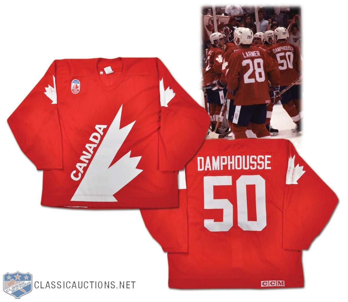
- Here's a number that wasn't seen on the ice at the 1991 Canada Cup, but Vincent Damphousse played during the selection camp. He wore #50 through the camp as he worked to play his way onto the team, but he was cut days before the Canada Cup started. It's another one of those number cameos by a player who never wore #50 again. We'll see more of Damphousse later in this article as he has another jersey in this exposé.
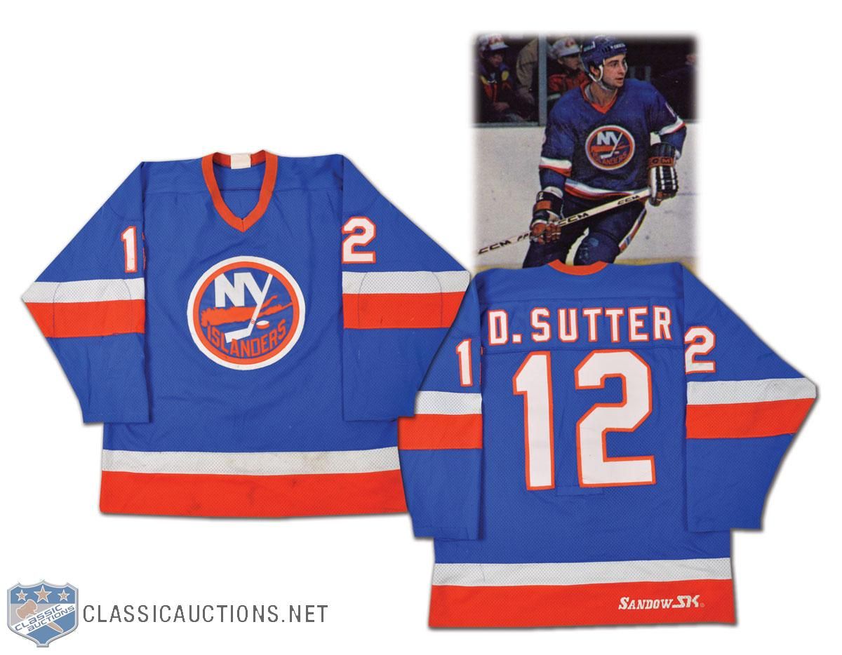
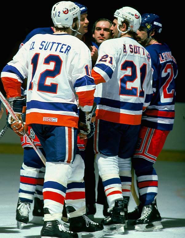
- We mentioned a couple of Sutters already, so let's bring a couple more onboard in this article. We get a good look at Duane Sutter's jersey with the Islanders from '81-82, and I'm always a fan of the first initial on a jersey. However, as we look at this photo with both Duane and Brent Sutter in it, does anyone see a major difference in the lettering? Duane's appears as single-colour font while Brent's font is double-coloured. It appears this was corrected as of 1981-82.
- With the Lightning changing their jerseys next season, it's always interesting to look back at some of their previous jerseys. Their inaugural jersey was interesting. Steve Kasper's jersey has that ridiculous font on it. I'm quite happy that it went the way of the dodo and was never seen again.
- I have to say that I always loved the colours of the Minnesota North Stars. We get to see that gorgeous green colour of the North Stars jersey here on Basil McRae's uniform from the 1987-88 season. This is what Minnesota hockey looks like. Bring back the green!
- Bob Rouse's jersey from his stint with the North Stars shows the addition of black to the colour scheme. This is how I think most people remember the North Stars. There were so many great memories of that Stanley Cup run in 1991 that ended at the hands of Mario Lemieux and the Pittsburgh Penguins in the final, but these great uniforms will stand out vividly in my mind.
- The jerseys that the North Stars wore in 1991-92 really took leaps and bounds in the wrong directions with their "re-design". Nothing about that design even comes close to giving off that great North Star vibe, and it feels pretty bland as a hockey jersey. Little did the hockey world know that the "north" part would soon be a thing of the past.
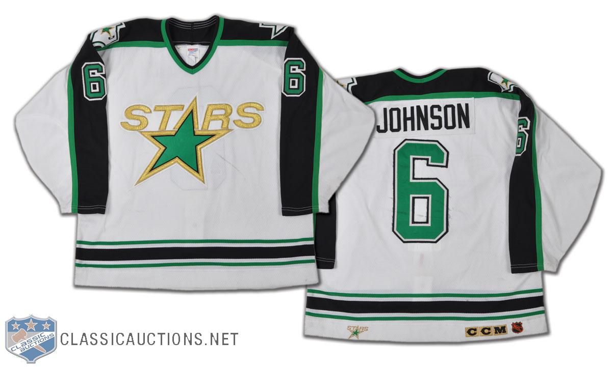
- By 1993-94, the Stars would be playing in Dallas, and they would be wearing uniforms that seemed to have a lot in common with the earlier re-design. Note to self, fans: if your team suddenly begins to remove the parts of the uniform that make you distinctly unique like, say, part of the team name, I'd be suspicious.
- Even the officials got in the act with some distinct designs. We've seen this image of Ron Ego calling a penalty in the WHA and discussed his red-striped officials jersey. I never scoured the internet for a picture with much intent because the referees seem to get lost in the shuffle of history. However, Wayne Mundey's referee sweater is a joy to behold!
- The NHL officials showed that they wore the NHL colours for a long time as this official's sweater from the 1970s has orange numbering to match the NHL shield on the front! Wasn't it nice when NHL All-Star teams and NHL employees all represented the league by wearing the league's colours? The "good ol' days", I suppose.
- The California Golden Seals seemed to miss the boat in the 1970s when they went pastel instead of staying true to their gorgeous green looks as the Oakland Seals. Bob Girard's uniform looks great, but it just doesn't have the same "pop" as the Oakland jersey does.
- The 1975-76 Kansas City Scouts jersey is a nice blend of colours, but that logo really draws the eyes to it. That logo features chain-stitching, a favorite of Mr. Paul Lukas over on Uni Watch Blog. I'm not saying the colours should return in the same fashion, but I really think someone needs to come up with a new "Scouts" ensemble. Any takers?
- Check out the logo on Nelson Pyatt's Colorado Rockies jersey from 1976-77. It looks a little off, doesn't it? That's because the Rockies didn't have their jerseys ready when the season started in 1976. The Kansas City Scouts had moved in the off-season before the 1976 season started to Denver, but they didn't have their jerseys ready in time for the start of the season. Thus the Rockies began the 1976-77 season with an odd-looking Rockies logo instead of their normal logos.
- Speaking of another jersey that just doesn't seem right, here is a Penguins jersey from the late-1960s. The stripes being light blue just don't seem right after having seen them in yellow-and-black for so many years. Another of the jerseys lost in the annals of history, I suppose.
- Don Maloney had an interesting career with the New York Rangers. While he wasn't officially the captain, he worked as acting captain whenever the Rangers saw their captain injured. Thus, he routinely is seen with the "C" on his sweater. However, Maloney is probably more well-known for his full name on the back of his sweater. I always thought that was pretty cool.
- How many people remember Guy Lafleur's tenure with the Broadway Blueshirts? The original "Flower" laced up the skates with the Rangers for 67 games in 1988-89, netting 18 goals and adding 27 assists. I don't remember this, but Lafleur wore #44 while with the Rangers.
- I found that the Detroit Red Wings did something as they evolved through the 1980s. In the late 1970s (and probably further back), the Red Wings used to use the wheel as the center point for their logo on their chests. The result? Greg Carroll's jersey looks seriously skewed because of the logo.
- Another gorgeous throwback jersey from the 1991-92 season was worn by the Detroit Red Wings. Doug Crossman played with them that season, and the stripes make this jersey look amazing. This is still one of my favorite hockey jerseys of all-time.
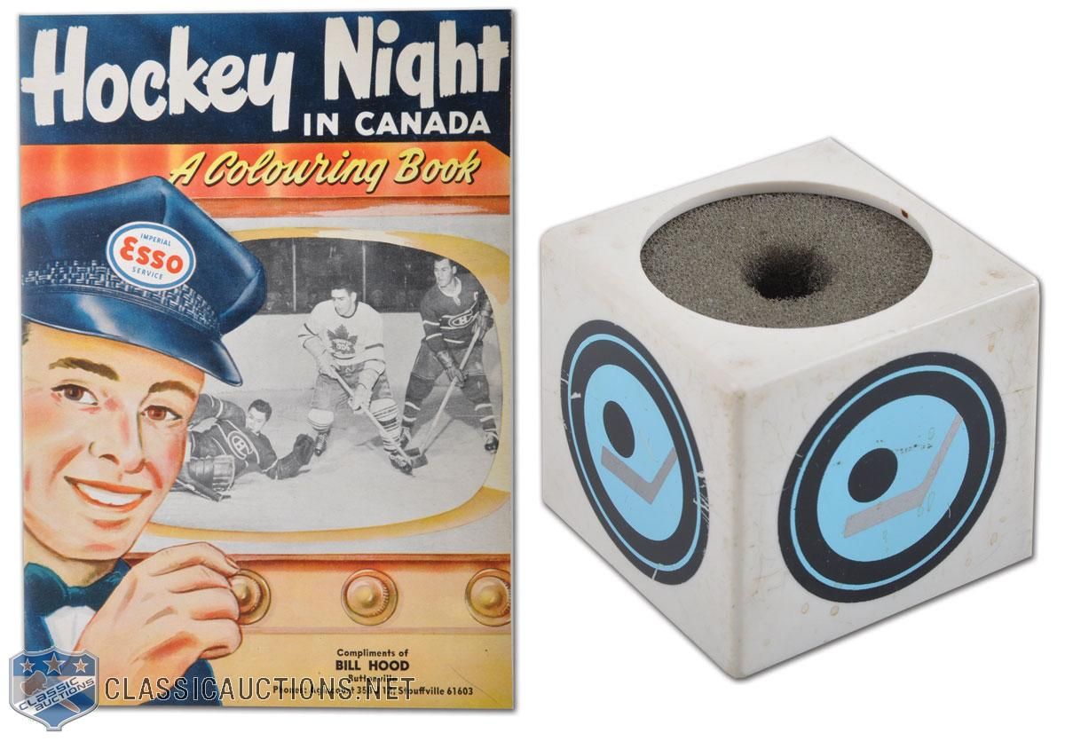
- How cool is this Hockey Night In Canada microphone cover and book? Ok, the book isn't all that important, but how awesome would it be to have that microphone caddy? I might want one of those more than I want a fabled HNIC towel!
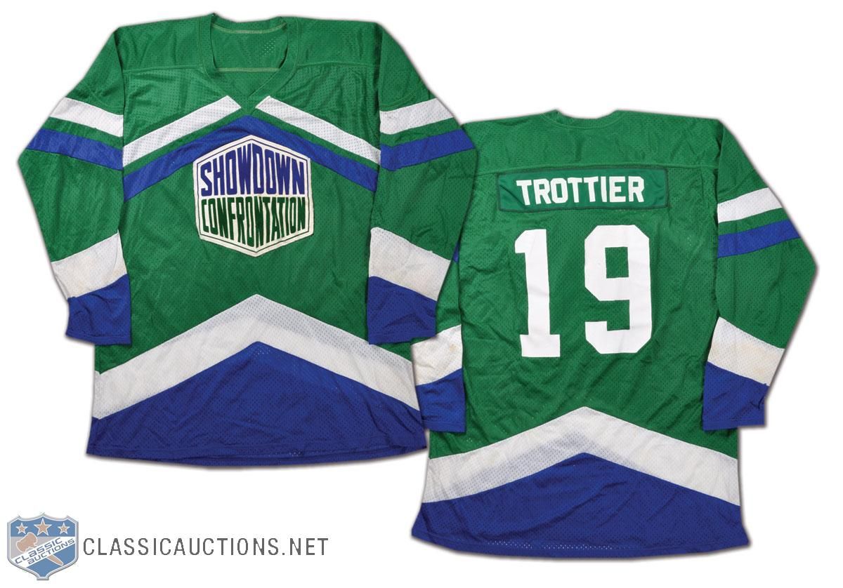
- We've seen a number of the NHL Showcase Confrontation jerseys in the past, but there's another one in the auction this time around. Bryan Trottier's jersey is up for grabs this time, and I must admit that I really like the colours on this jersey. I may have to research these Showcase Confrontation games a little more!
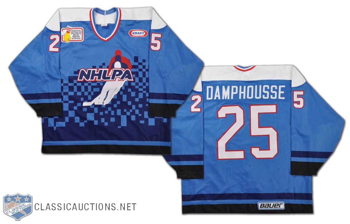
- There are lots of people who saw the NHLPA 4-on-4 Challenge from Hamilton, Ontario in 1995, but there seems to be zero tape of these games online anywhere. During the strike, the players got together at Copps Coliseum in Hamilton to play some four-on-four hockey while representing their respective regions: Western Canada, Ontario, Quebec, and the USA. Vincent Damphousse was invited, and he played for Team Quebec at the event in this gorgeous NHLPA jersey. I want it!
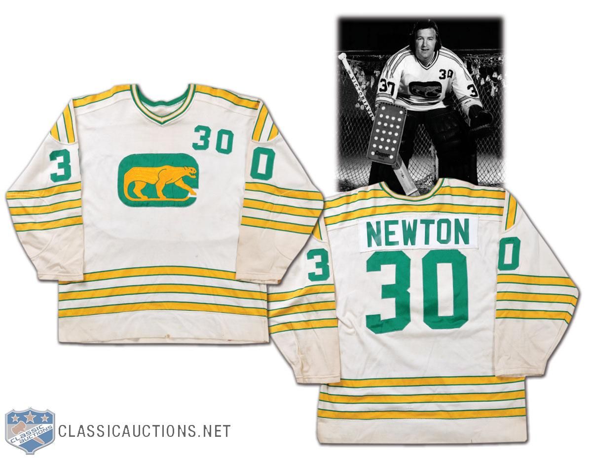
- We started with the WHA, so let's end it with a few WHA sweaters as well. The original team with the number on the shoulder was the Chicago Cougars, and Cam Newton's jersey from 1973-74 shows the number clearly. I'm still not a very big fan of having the number on the front of the jersey in hockey, but it seems to have made a comeback with some of the NHL teams today.
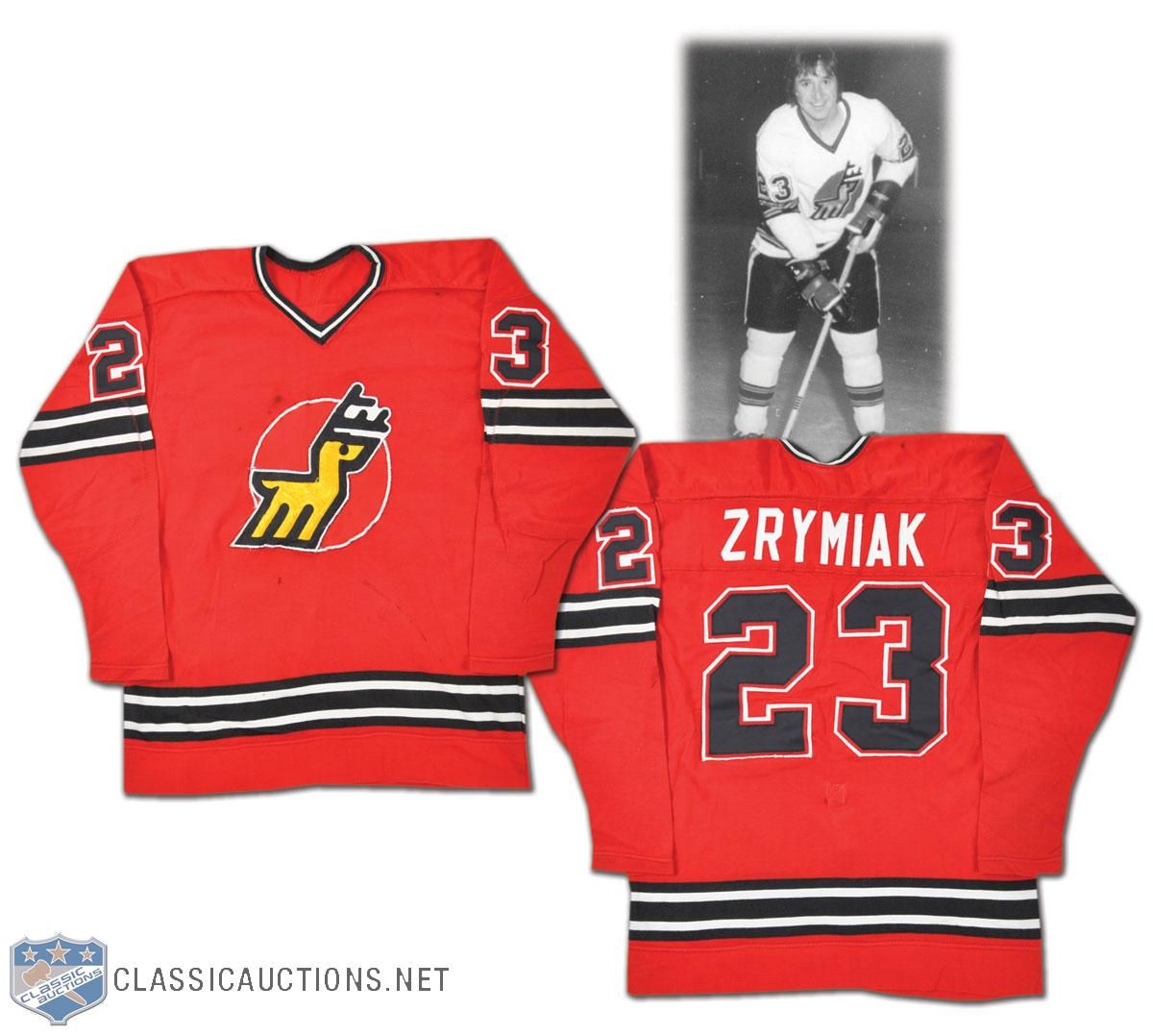
- Journeyman defenceman Jerry Zrymiak bounced around the WHA for a while, but he played with the Michigan Stags for a while during the '74-75 season. I'm not sure about you, but the name "Michigan Stags" just sounds like a manly name. The colour is a little less manly, though. I love the Stags' logo, though.
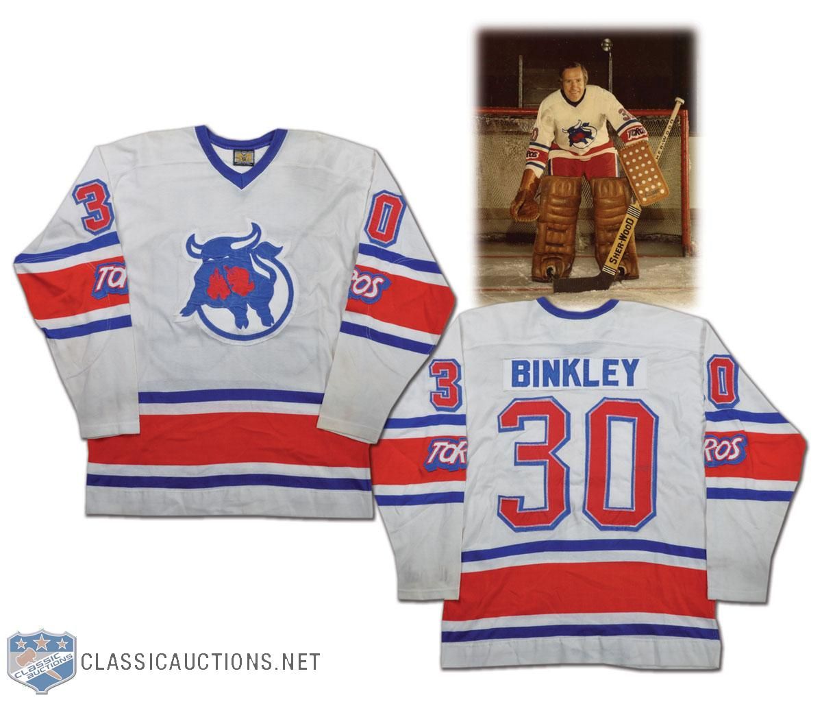
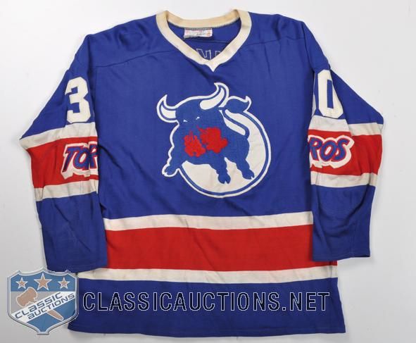
- Les Binkley starred in net for the Toronto Toros in 1975-76. I like the colours of the Toros' jerseys, but the important part is the "Toros" mark on the sleeve stripe. That's a huge detail on these jerseys, especially when you consider that the team moved after the '75-76 season and became the Birmingham Bulls. Why is this important? Check out the similarities in the Bulls' jersey to the Toros' jersey. The only thing missing is the "Toros" wordmark from the sleeve!
Until next time, keep your sticks on the ice!


2 comments:
When it comes to the Canucks' skate logo jersey, it was one of those underappreciated things within a specific time period. For me personally, I didn't think too much of it until after they changed to the whale logo. Looking on it now, and wearing the black skate logo jersey, it's one that brings back fond memories from the early teen years.
I also miss the 'Star Wars' Canucks logo jersey. Not to mention that Mogilny is one of my favorite players, I´d love to have this jersey in my collection.
The Chicago sweatshirt looks awesome too, but I would prefer Mikita´s 21.
Post a Comment