


I've Seen This Before...
 The man to the left is Cory Schneider. This photo was taken before the game started at MTS Centre on a night where the Moose honoured the brave men and women of the armed forces by wearing this Royal Canadian Air Force-inspired jersey. Honestly, I have always been a fan of the Moose jerseys that reflected the branch of the military they were representing because of how classy they looked. This RCAF jersey is one of those jerseys, and it does look very good for a one-night performance. While Winnipeg does have a large military airbase located within the city limits, it seems as though the NHL Jets are looking to the RCAF for some inspiration. Besides all the "flying high" comments and puns you can make about jets and the Jets, the new Jets logo should give you a lot to talk about when you're discussing design merits.
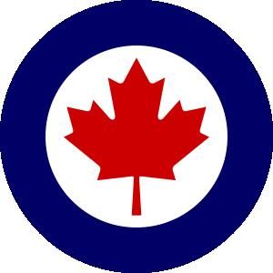
Here, in rather large fashion, is what the new Jets will represent when it comes to the designs on their chests and shoulders starting in 2011-12. Let's start with the obvious in terms of the primary logo. The jet is clearly visible, and the maple leaf gives the team its Canadian flavour. The white triangle that is omitted from the circular outline is indicative of a compass pointing north, entirely suitable for Winnipeg.
Most obvious, however, is that this logo has a very distinct RCAF look to it. While I'm all for honouring the bravest men and women in the world, I'm not sure why True North Sports and Entertainment feels it has to more or less "borrow" the RCAF logo for their own purposes. While the logo does has a throwback feel to it, I'm not entirely onboard with using the RCAF logo as the basis for the franchise's identity despite the team consulting with the Department of National Defence on the logo. While they have the DND's blessing, I just think they should have gone more original.
From there, the shoulder logo, or secondary logo, looks like something a pilot would wear in terms of him getting his wings. If we're continuing the military theme on these uniforms, this is completely appropriate. I like the look of the wings that will be "pinned" to the shoulder, and this gives the uniform a little character in terms of "making the team". What I'd really like to see is the captain, Andrew Ladd, and his alternate captains wear the appropriate sleeve stripes indicating their individual "ranks" in terms of their captaincies. That would be cool.
The wordmark? I'm not fond of it. I don't like the font chosen for the "Jets" portion of the wordmark. This one may need a re-design at some point simply because it removes the throwback feeling used on the other two logos. It feels like Sesame Street: "One of these things is not like the others...".
Overall, I think these logos are starting to grow on me. At first, I was a little annoyed with True North settling on something that looks like the honoured RCAF's logo, but I think the primary and secondary logos are pretty good. I'm hoping that the uniforms are classy and understated so that the circular chest logo will stand out, but only time will tell as True North and the Jets get closer to opening night.
"True North Sports & Entertainment felt it was important for the new Winnipeg Jets to develop a strong new identity," said Mark Chipman, chairman of True North Sports & Entertainment, in a press release.
"We felt it was important to authenticate the name Jets and we believe the new logo does that through its connection to our country's remarkable Air Force heritage, including the rich history and relationship that our city and province have enjoyed with the Canadian Forces."
Honestly, who knew that Cory Schneider was ready for the NHL a few years ago? In associated news, Mark Chipman told Adrian Morrow of the Globe & Mail that "the team would consider issuing a vintage jersey in its second season, but did not have time to do one immediately". So don't mothball those old Jets jerseys just yet, Winnipeggers! Perhaps True North could just re-issue the Jets jerseys worn by the Moose for one of their heritage nights since it seems the Moose were the test subjects for the new NHL squad's looks?
In all fairness, I think that the logo will definitely grow on fans and be accepted. I know that the more I examine it, the more it seems to be growing on me. Even some of the well-known hockey minds are finding it to be acceptable. CBC's Elliotte Friedman tweeted, "That Jets logo is very well done. Nice work".
I think I agree with Mr. Friedman on this one in that the logo is very well done. I just have higher hopes for the uniforms that will sport these logos. Nice work, True North. You've found a fan in me with this design, and I suspect more fans will adopt the team's new look if you combine the logo with a solid background.
Until next time, keep your sticks on the ice!


4 comments:
From far away, or when really small like on the nhl.com website, the Winnipeg Jets' logo looks like the one for the 2000 NHL ASG in Toronto. They both use a circle and a maple leaf, and the jet looks like a star sometimes. You know what I mean?
You're right, Mike. It does look a lot like that. I may have to comment on that over the next few days.
Nice Blog. Keep it up!
someone needs to update their website logo...
Post a Comment