


Welcome To The Dark Side
 It's official, folks: the leaked New York Islanders alternate jersey is now a reality. In their 40th anniversary season, the Islanders have proven that senility can occur at a young age. And I'm not making fun of senile individuals because it is a tragedy, but the word "tragedy" is the only way to describe these horrendous new uniforms. I won't lie to you, readers, when I say that I'm proud of my Fisherman Islanders uniform. Seeing these new alternates only makes my pride swell in knowing that these uniforms officially take over as the worst in franchise history.
I'm not even going to break these down like I normally do because they will forever be labelled as STUPID. I'm just going to break down the article posted by Brian Croce on the Islanders' website. Don't expect me to be gentle either.
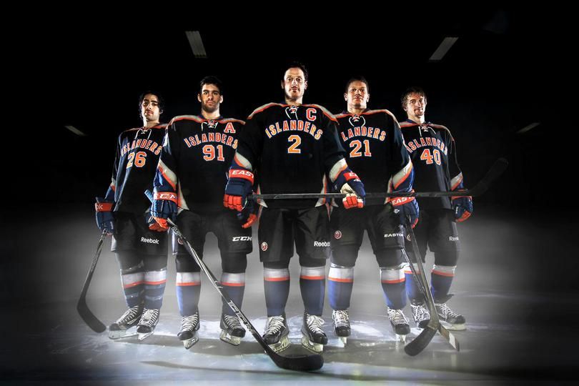
"When the Islanders unveiled their new Third Jersey Wednesday night at Nassau Coliseum, they showed off a look unlike any that’s ever been worn in the franchise’s 40-year history."Um, yeah. DUH. The Islanders have never worn a black, NCAA-inspired uniform ever. That is, until now.
"Islanders fans are most accustomed to the royal blue or white sweaters with the classic emblem on the front consisting of an outline of Long Island and 'NY Islanders' creatively displayed. The new Third Jersey, which is set to debut Nov. 23 against the Philadelphia Flyers, is predominately black and has gray, blue and orange along the sleeves, sides and shoulders."In other words, the uniforms most closely associated with any sort of success and pride in this sorry franchise are the ones the fans demanded be worn by this up-and-coming team. The new uniform, which has no traditional elements of the Islanders' design, will take over as a reminder of why this franchise is a bottom-dweller.
"Terry Goldstein, The Islanders Director of Retail Operations, said the Islanders started working on the Third Jersey prototype a year ago and ultimately landed on the Black Jersey after getting feedback from the Islanders organization and players."Terry Goldstein is probably a pretty smart man who does his job well, but he's clearly in the wrong line of work as "Director of Retail Operations". Why would he consult the organization and players as "Director of Retail Operations"? Does that position not indicate that he should have some idea as to what the fans want? Maybe I'm confused here, but why would the "Director of Retail Operations" be in charge of designing an alternate jersey at all?
"'We view this (Third Jersey) as just a fun, alternative jersey,' Goldstein said. 'With our white and our blue jerseys we look back at our history, and with the black jerseys, we’re looking forward.'"Then sell it as a fashion jersey, and don't make the team take the ice in it. You, Mr. Goldstein, are telling the world that you're just moving into the 1990s when black alternate jerseys were all the rage. You've just told the world that your franchise is two decades behind everyone else since you went with a collegiate design on a black jersey. Well done, Mr. Goldstein, on forcing this franchise to redesign their alternate uniforms in a few years yet again. Nothing like preserving one's job by redesigning the wheel every few years, right?
"The Black Jersey has the team’s name across the front with the player’s number below. The numbers also appear on each sleeve as well as on the back. The top of the jersey is gray with the traditional Islanders logo on each shoulder. The collar and edges of the sleeves are royal blue which matches the team's royal blue helmets and gloves. The jersey has a gray, orange and blue triangle under each arm and matches the new black pants that will feature an inverted triangle directly below, creating a diamond."Mr. Croce gives a pretty accurate recap of what the new uniforms will look like, although that triangle under the arm leading into the diamond formation with the pants seems superfluous given the IDIOTIC DECISION TO DRESS THIS TEAM IN BLACK! Of all the colours this team could have chosen to dress in, black had to be it?
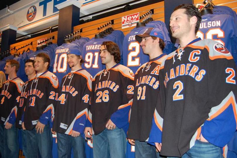
"The National Hockey League allows teams to introduce a new jersey idea every three years. Originally, there were nine designs for the Third Jersey."Wait, there were NINE designs submitted, and this idiocy was the best of the bunch? Are you kidding me? Is everyone working in the Islanders' front office colour blind? Or were the designs not submitted in braille? Because, to me, it's clear that the Islanders' front office doubles as the American Foundation for the Blind.
"'The jersey has to fit the personality of the team,' Goldstein said. 'Currently, the personality of our team and our fans is that they love the traditional Royal and White and we’re not changing that for a long time, but on a couple of games we wanted to have some fun with something different.'"Look, I get that the vast majority of the stars would be college undergrads at this point in their lives had they not chosen hockey as their career paths, but this "personality" crap that Goldstein is spewing is nothing more than rationale for this uniform. This uniform is entirely "something different", but I guarantee you that these will be mothballed sooner rather than later because no proud Islander supporter will "have some fun" in a black, collegiate-inspired uniform. They want to wear the traditional Islander logo proudly, and this uniform gives nothing to that pride. NOTHING.
"He added, 'It’s going to be a different look. Hopefully we win in these jerseys and our fans will love it.'"If Mr. Goldstein crapped in one hand and hoped in another, which would fill up first? By delivering these uniforms, he's delivering a lot of crap. The Islanders are dead-last in the Eastern Conference, and sit a mere five points up on the lowly Columbus Blue Jackets. Introducing a new uniform and hoping for wins is about the only positive news the Islanders have right now. Make no mistake: if the team loses in these uniforms, the fans will rally against them like they did against the Fishermen.
Comments on NBC's Pro Hockey Talk have fans lukewarm to it at best. The comments on Puck Daddy are definitely ice cold over the Isles' new look. Personally, I hate this attempt the Islanders are using to generate revenue and interest in their team. But my opinion is only one man's voice, so what say you, readers: are you a fan of the Islanders' alternate jersey, or should these jerseys have been better used as fashion jerseys if at all? Sound off in the comments!
Until next time, keep your sticks on the ice!


1 comment:
I personally softened my stance on this jersey since the design was first leaked, but I would still not buy this jersey. Never mind the fact that the jersey is black, but rather the unoriginality of the design itself. Three of the most widely panned jerseys today are the Dallas Stars home and away jerseys and the Atlanta Thrashers' third jerseys. Care to figure out the common thread among those three are ? That's exactly where the Isles' third unis are heading.
Post a Comment