


Tasteful Yet Questionable?

This year's Mastercard Memorial Cup saw the Cataractes eliminate the Edmonton Oil Kings in the first elimination game before sending the St. John's Sea Dogs home in similar fashion. In the final, the OHL champion London Knights will face the hometown Cataractes for the right be called Canada's best junior team for one year. But while there may be one game yet to play after last night's Shawinigan win over St. John's, HBIC wants to take a look at Shawinigan's commemorative jerseys that they wore this year as well as the controversy that seems to be brewing from everywhere but Shawinigan in regards to their current look.
We'll start with a little history. Shawinigan is an Algonquin word meaning "portage on the ridge". The Cataractes team name translates to "waterfalls", and there is a 50-metre high waterfall which helped found the city of Shawinigan Falls, the home of NHL legend Jacques Plante. The waterfall prompted several power plants to be built in Shawinigan, and allowed the city to become the first city in all of Quebec to have public electric lighting. The 2504-seat Jacques Plante Arena, which sits a block from the Cataracte's current arena, still stands today, and remains virtually unchanged from when it was built in 1937. The Cataractes called the Jacques Plante Arena home until the QMJHL team moved into the larger and more modern Centre Bionest in 2008. The Cataractes, founded in 1969, remain as the only founding QMJHL team to have remained in the same city since the league's inception. Pretty cool little bit of history, right?
So how did a team with waterfalls, a legendary goaltender, and some great league history on their side end up with a logo that looks like this? We'll come back to that question in a second. First, let's take a look at a Memorial Cup tradition that I am finding myself liking more and more each year.
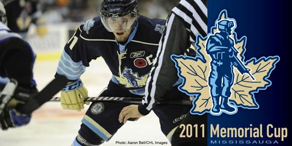
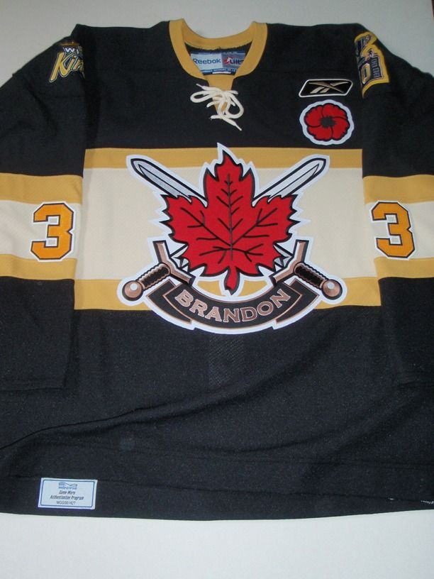
Every year since 2008, the host team of the Memorial Cup has taken part in the Theme Jersey Program that helps benefit the Dominion Command Poppy Trust Fund. From the CHL website, the "[p]oppy funds are spent to support veterans and their families, buy hospital equipment, support cadet groups, and provide student bursaries". The emblem for the Poppy Trust Fund is a poppy, and the host teams honour a significant military presence by changing at least their logo for the respective branch of military they are honouring - Mississauga St. Michael's wore these uniforms in 2011, Brandon wore these uniforms in 2010, Rimouski wore these uniforms in 2009, and Kitchener wore these uniforms in 2008. Clearly, there are some excellent uniforms there, and all of them have significant meaning in terms of the money they raise through the CHL auction site for the trust fund and to the military divisions they represent.
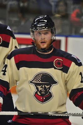
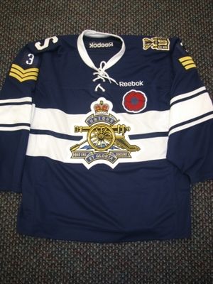
This year, the Shawningan Cataractes honoured "the 62nd Field Artillery Regiment. The 62nd Field Artillery Regiment is is a militia unit of the Canadian Army that is located in Shawinigan, Quebec. It recruits primarily in Shawinigan, Joliette and Victoriaville. Its oldest and most notable subunit is the 81st Field Artillery Battery, which was founded in the Eastern Townships in 1912 and relocated in Shawinigan, Mauricie in 1936. The 'S' shoulder patch is a homage to the 1945-46 Shawinigan Junior Team that had numerous war veterans playing for them." While the cannon on the front looks like they might be more suited for the Blue Jackets, I think the idea of honouring this historical regiment located in the heart of Shawinigan is classy. Well done, Cataractes, on this jersey!
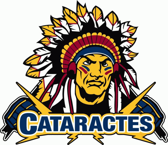
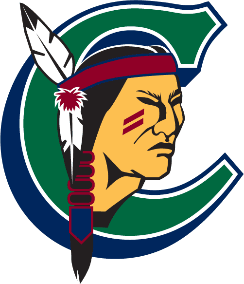
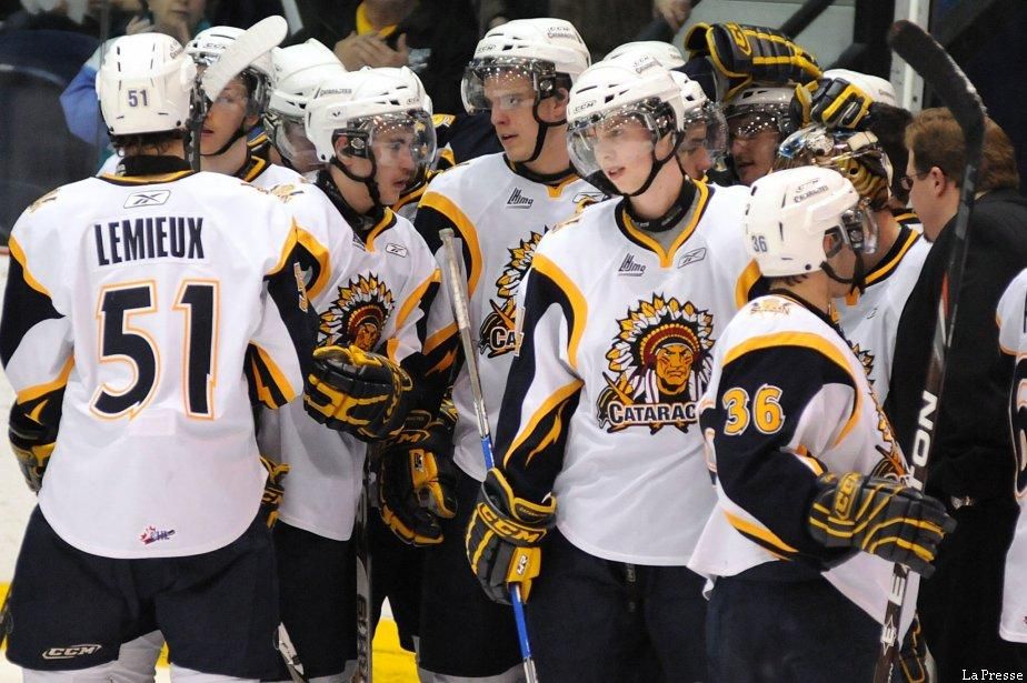
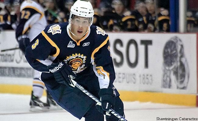
Where things start to get murky is when we see what the Cataractes normally wear during the season. There has been some significant outrage towards racially-insensitive names and imagery recently on one prominent website, but I'm not so sure if the outrage extends north of the border simply because there seems to be no one complaining about Shawinigan's logo or associated branding that goes along with it. The new logo is definitely an upgrade compared to the previous logo the Cataractes employed, but it seems as though the race card is being played by everyone but the First Nations people in Quebec on this one. So the question needs to be asked: if the group that it supposedly offends is not complaining publicly about the logo, why should the Cataractes change anything?
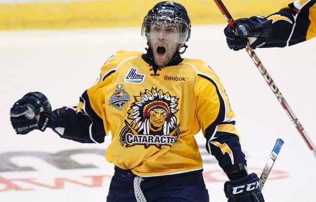
Here's what I know: the Cataractes have worn three variations of their current logo on jerseys: white, yellow, and navy blue. All three have the new logo on it which, admittedly, is much less offensive than the old logo in my opinion. Their mascot, Thomas Hawk (Tommy Hawk... get it?), could once more be deemed as offensive, and they could have just followed the Chicago Blackhawks' "Tommy Hawk" route to have avoided any question with regards to insensitivity with their mascot. Honestly, if you're a hawk, can you really be racially-insensitive with the name "Tommy Hawk"?
I'm not going to start in with the fans who dress like First Nations people with the headdresses of feathers and the face paint and all that. Fans will still do whatever they want when it comes to supporting a team, so there's not sense in railing against the Cataractes' fans in this case. If you want to dress like the Cataractes logo, that's fine with me. Personally, I wouldn't dress like that, but I also don't paint my face for the sake of Halloween costumes either.
While there have been no shortages of racism in the game of hockey, I'm just not convinced this is one of them. While the imagery might be offensive to some, the First Nations people of Quebec seemingly have said nothing about the issue nor has the CHL found any reason to ask the team to change its logo or imagery. Without any of the people involved making a stink about the name, I say this is a non-issue, and one that shouldn't be addressed again unless one of the respective parties involved has reason to speak up on it.
Enjoy the hockey if you happen to have a way to catch London and Shawiningan battle it out for the Memorial Cup. These are two proud teams with long histories, and they'll put on a show tomorrow night in Quebec. As for the logo, just let it be. It's not an issue in Canada, and it shouldn't be for an American website or its writer that is covering the tournament.
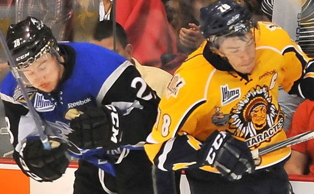
If you really need something to write home about in terms of its offensiveness, how about this hot mess of logos on the front of the Cataractes' uniforms? Yikes. Can the Reebok logo on the chest not be covered up by the Memorial Cup patch for aesthetics' sake? Wow. And if that doesn't strike you as terrible, perhaps not raising racial questions the day before this team's biggest game in its history would be a better idea.
Until next time, keep your sticks on the ice!


2 comments:
Teebz,
Please don't say your on the "anti-pc-logo" campaign too...Uni-Watch is taking it too far for no good reason... am glad you clearly point out that it IS a non-issue, because someone else at Uni-Watch is ultra combative with that very idea making it an issue...and it is why I haven't been back there and won't be back anytime soon...
Just another reason Canada is better: if it's a non-issue, it will stay a non-issue!
Beautiful Sweater
Post a Comment