


The Golden Air-Knit Fleece

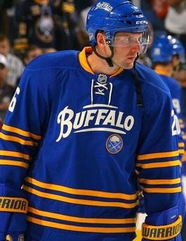
The Sabres have historically had some poor choices when it came to alternate jerseys, so there's a good chance that these new alternates for the 2013-14 season won't be any worse than anything we've seen in the past. The teaser, though, shows off a number of design elements that make me wonder if the Sabres are just trying to too hard. It seems there are a few things that may push this one from good to "maybe next time". Here's the video.
Ok, so we know that Buffalo will be wearing gold for sure, and I'm actually in favor of this idea as they can now wear the uniform both on the road and at home. The only team that won't see this new alternate in their building is Nashville as they wear yellow at home, but there shouldn't be that many meetings between the two teams to warrant an alternate jersey appearance in Music City. But any other team is fair game when Buffalo is on the road, and that could make for some great color-on-color games within their division.
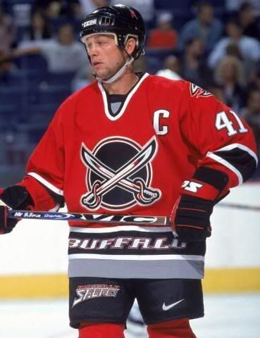
As seen in the video, the team will wear "Buffalo" below the neckline and, from appearances, "Buffalo Sabres" somewhere near the rear hemline, I'm guessing. Both of these additions are entirely unnecessary. It's not like Buffalo is an expansion team and needs to remind fans from where they hail. In fact, they have one of the most iconic logos in sports, and fans demanded its return after the failed bison head experiment and the Buffa-Slug calamity. Let's leave the logo to speak for one's team, shall we?
Again, we find a team writing an essay on the inside of the neckline. Why? What purpose does this serve? It's not like the players are stopping and reading the word "EXCELLENCE" every time they put the jersey on. Let's stop this design. I didn't like it in Nashville with the piano keys, I hated the idea when the Rangers did it, and I'm still not fond of it here. Enough with the interior messages.
I do applaud the Sabres for using a color that is also sorely missed in hockey. Yellow, while often represented in society as the color of cowards, is highly under-utilized in hockey much like the color green. I'm not saying that Buffalo is the right team to wear yellow, but I'll give them a vote of confidence for being bold with their alternate uniform. It will only be seen for a maximum of sixteen games, so I'm not going to rain all over Buffalo's parade at this point. Sight unseen, I'm a fan of bold colors.
We'll probably see a handful of additional teasers come out over the next month and a half before the team takes to the ice in September for training camp, but I think Buffalo's choice for a yellow alternate is the right move after having seen their past iterations. While I was a fan of the red alternate during their black era, Buffalo's choice to go yellow in this era is the right choice. The only thing that appears to drag them back down to earth, though, are the overuse of elements that aren't necessary in making a classic jersey.
Until next time, keep your sticks on the ice!


No comments:
Post a Comment