


The Least Amount Of Risk
The New York Islanders have an interesting franchise history, but their fans have always been partial to the original logo which the team wore in establishing its dynasty from 1979-1983. We know they rallied hard against the Fisherman logo in the 1990s before it was replaced with the original logo, and we've seen other logos land with thuds as Islanders fans made it clear as to which logo they prefer. When the third jersey contest was announced for the 2027-28 season, every option was back in play for fans to choose, and the hope was that the Islanders would see an awesome winner.
The results of the eight-jersey, bracket-style voting ended today, and the Islanders now have themselves a winner for that third jersey.
I'm not unhappy with how the vote ended, but this was literally the best of the eight options and even it's not great. This jersey is the safest option of the eight presented when it comes to the design, and the lighthouse logo has been in demand for a third jersey for quite some time by Islanders fans. The New York Islanders took zero risks.
Am I against this jersey? Not at all. That lighthouse logo is a great logo, and it should look good on the chests of players as a fully-embroidered mark for the New York Islanders. It's infintely better than the "NY" logo, and it certainly has as much charm and fun as the Fisherman. Everyone thinks of islands when one sees a lighthouse.
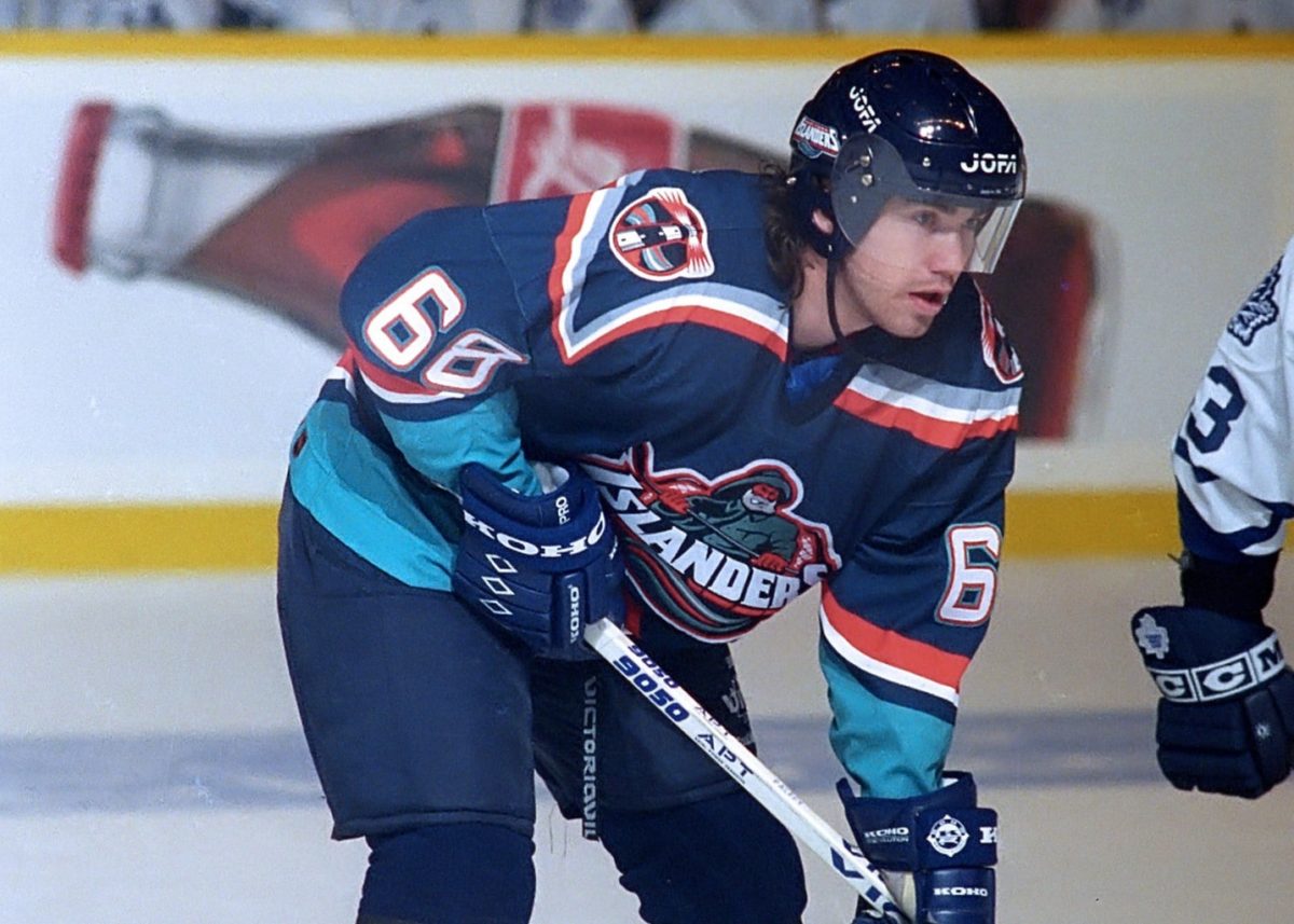
As you can see on Zigmund Palffy, this lighthouse logo was the shoulder patch on the original Fisherman jerseys, and it has always stood out as one of the better secondary logos, in my opinion, in NHL history. It's colourful, it catches the eye, and it needed to be used again by the Islanders. Whether it works as a long-term primary logo will be a question answwered in 2027-28 when they don these new third jerseys, but it certainly has a shot at warming fans' hearts.
Perhaps this was the jersey that the Islanders needed, though, after taking a big swing with the Fisherman in the 1990s. As was written by Nicholas Hirshon in We Want Fish Sticks, "the logo quickly became a scapegoat for the Islanders' poor play," so the Islanders are going to want to win in the Lighthouse jersey. Otherwise, this new third jersey could establish its own legacy of poor results which the Islanders don't want. Nothing hurts sales more than having a losing team.
I look at the uniqueness of this jersey compared to others in my collection, and there simply isn't enough for me to consider it as one that needs to be added. It's certainly not the Fisherman, it doesn't have that cool factor like the Oilers' alternate jersey did, it doesn't have that eye-catching quality that the Pooh Bear did, and it's not quite as bizarre as the Stars' alternate jersey was. It's solid, but it's going to take something special for the Islanders to see this jersey celebrated as much as their traditional home and road jerseys are.
The popular saying of "no risk, no reward" means that one has to step out of one's comfort zone if one wants to be successful. The Islanders didn't do that here as they stayed safe with colour, stripes, and logos. Yes, they can still make changes to these jerseys before they debut in 2027, but the Lighthouse jerseys feel safe which fits the overall brand of the New York Islanders. Former GM and noted alternate jersey hater Lou Lamoriello would be proud of the effort here.
Until next time, keep your sticks on the ice!
The results of the eight-jersey, bracket-style voting ended today, and the Islanders now have themselves a winner for that third jersey.
I'm not unhappy with how the vote ended, but this was literally the best of the eight options and even it's not great. This jersey is the safest option of the eight presented when it comes to the design, and the lighthouse logo has been in demand for a third jersey for quite some time by Islanders fans. The New York Islanders took zero risks.
Am I against this jersey? Not at all. That lighthouse logo is a great logo, and it should look good on the chests of players as a fully-embroidered mark for the New York Islanders. It's infintely better than the "NY" logo, and it certainly has as much charm and fun as the Fisherman. Everyone thinks of islands when one sees a lighthouse.
As you can see on Zigmund Palffy, this lighthouse logo was the shoulder patch on the original Fisherman jerseys, and it has always stood out as one of the better secondary logos, in my opinion, in NHL history. It's colourful, it catches the eye, and it needed to be used again by the Islanders. Whether it works as a long-term primary logo will be a question answwered in 2027-28 when they don these new third jerseys, but it certainly has a shot at warming fans' hearts.
Perhaps this was the jersey that the Islanders needed, though, after taking a big swing with the Fisherman in the 1990s. As was written by Nicholas Hirshon in We Want Fish Sticks, "the logo quickly became a scapegoat for the Islanders' poor play," so the Islanders are going to want to win in the Lighthouse jersey. Otherwise, this new third jersey could establish its own legacy of poor results which the Islanders don't want. Nothing hurts sales more than having a losing team.
I look at the uniqueness of this jersey compared to others in my collection, and there simply isn't enough for me to consider it as one that needs to be added. It's certainly not the Fisherman, it doesn't have that cool factor like the Oilers' alternate jersey did, it doesn't have that eye-catching quality that the Pooh Bear did, and it's not quite as bizarre as the Stars' alternate jersey was. It's solid, but it's going to take something special for the Islanders to see this jersey celebrated as much as their traditional home and road jerseys are.
The popular saying of "no risk, no reward" means that one has to step out of one's comfort zone if one wants to be successful. The Islanders didn't do that here as they stayed safe with colour, stripes, and logos. Yes, they can still make changes to these jerseys before they debut in 2027, but the Lighthouse jerseys feel safe which fits the overall brand of the New York Islanders. Former GM and noted alternate jersey hater Lou Lamoriello would be proud of the effort here.
Until next time, keep your sticks on the ice!


No comments:
Post a Comment