Let's be honest right off the bat here in HBIC and say that this is the day that all of us have been waiting for since the New York Islanders announced their contest where anyone - fans, fashion designers, blind people, or players themselves - could design the Islanders' third jersey that they'll wear during the 2027-28 season. Today marked the day that the Islanders unveiled their eight finalists in their jersey design contest, and there was high hope that the new jerseys would be the best Islanders jersey in history. Of course, I may have set the bar a little high, so let's see what the Islanders gave us.
I'm going to look at each of these jerseys through an objective lens being that I own
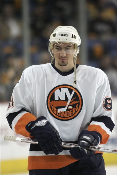
both a home and
road Islanders jersey, a
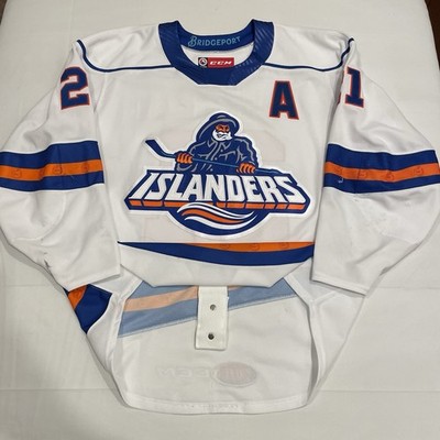
home Fisherman jersey, and a
Stockton Thunder "Heritage Hockey" jersey from 2014 when the Thunder were an Islanders' affiliate. I'll also be conjuring the
ghosts of the Bridgeport Islanders and that
Islanders' Reverse Retro jersey when looking at the candidates, so let me be clear that I want to see original designs for this third jersey!
Without further adieu, let's check out these potential third jerseys!
NAVY LIGHTHOUSE: For as much of a fan as I am of the lighthouse logo, this jersey feels woefully incomplete. The lack of a shoulder yoke seems like an easy fix, but the teal colour isn't needed as a stripe. These are decent, but they could have been more.
JERSEY SCORE: ★★★☆☆
ORANGE LIGHTHOUSE: When did the Islanders
become the Edmonton Oilers? Sure, there are minor differences, but this one is automatically disqualified for being an Oilers knockoff and for the awful 2014 Stadium Series shoulder logos. No orange jerseys.
JERSEY SCORE: ☆☆☆☆☆☆ (extra empty stars for awfulness)
NAVY FISHERMAN: This is the 2022-23 Reverse Retro, but the hemstripe is now a modified wave stripe. I do like the lighthouse shoulder patches, but the name and number fonts leaves a lot to be desired. These jerseys need more colour and contrast to have that Fisherman logo pop off the chest. On this jersey, it does not.
JERSEY SCORE: ★★☆☆☆
ORANGE FISHERMAN: We finally got some contrast, but there's just way too much orange here. I wanted a Fisherman jersey, not a beacon on the ice. Is that hemstripe supposed to be a wave? I'm getting Edmonton Oilers vibes off this jersey as well. Not good.
JERSEY SCORE: ★☆☆☆☆
NAVY NY LOGO: This jersey is all sorts of awful and it starts with that garbage logo. The contrast on the stripes is good, but no shoulder yokes nor shoulder patches make this jersey feel incomplete. As such, this jersey can show itself out of the contest. Hard "no" from me.
JERSEY SCORE: ☆☆☆☆☆
ORANGE NY LOGO: I should have said off the top that all Stadium Series jerseys in NHL history have been total garbage, and this proposed jersey follows those ill-conceived jerseys with only two colours, the awful NY logo, and a terrible orange base colour. Let me correct myself: this is the worst jersey of the bunch by far.
JERSEY SCORE: ☆☆☆☆☆☆☆☆ (lots of extra empty stars)
NAVY WORDMARK: Where the heck is the logo? It's a stupid nickname jersey, not a New York Islanders jersey. Was the designer making knockoff jerseys for Wal-Mart and Target? The stripe contrasts are nice, but this is not an NHL-calibre jersey by any measure.
JERSEY SCORE: ☆☆☆☆☆☆☆ (plenty of extra empty stars)
NAVY RUGBY: What the hell is this? Does this designer
have a vested interest in rugby? The design is identical! This jersey commits the faux pas of having a chest stripe only on one side the jersey and the NY shoulder patches need to be outlawed. If the Islanders were a rugby team, they'd be ready for the pitch! Except they're not.
JERSEY SCORE: 🏉🏉🏉 (3/5 rugby balls)
Assuming that the Islanders received more than 80,000 submissions for their new third jerseys, these eight jerseys are some of
THE WORST designs I have seen. And if you were paying attention while reading my scores, how is it that every front-facing jersey is wearing #62? Go back and look because it's not #26 based on the numbers that are visible. How did no one from the Islanders notice that detail?
Based on the jerseys chosen, it's clear that these alternate jerseys will only be worn at home since none of them have a white base colour. Frankly, the Islanders' white jerseys have, in my view, always looked better than the dark jerseys because the Islanders logo pops off the chest and has excellent contrast with the stripes. That was also true of the Fisherman jersey with its mix of colours and stripes, but I don't work for the Islanders when it comes to jersey design.
What I can tell you is that the eight designs above leave a lot to be desired. I get that the colour schemes and logos of the Islanders don't allow for a lot of variation when one is trying to come up with a snazzy third jersey, but there should have been an option for something other than navy and orange base colours. I took the liberty of desiging my own jersey which I kept upder wraps until now, so here's my design that the Islanders excluded from the final.
You might be thinking, "Teebz, those are just as bad as the jerseys above them," and you're entitled to your opinion. My thought process, however, was to recreate the arm and wave stripes in the same pattern as the background of the lighthouse logo, thereby tying the entire jersey together with the lighthouse logo being "on an island" in the middle of the jersey. I tried not to overthink this one.
I just don't see how any of the eight finalists they picked are remotely close to representing Long Island, the New York Islanders' history, nor the future of the franchise. I'd imagine these jerseys aren't one-and-done jerseys, but it sure feels like the Islanders are trying to make that happen with the eight finalists they chose. In any case, feel free to leave your takes in the comments below. I'm curious to see what people think of the finalists, but feel free to add your critique my jersey design if you like. I can handle it.
Based on my love for the Fisherman jersey, my design might be the ninth-best design shown here! Either way, Long Island is becoming Shudder Island with these frighteningly bad third jersey options.
Until next time, keep your sticks on the ice!











 Posts
Posts





1 comment:
The jersey Teebz created is actually visible and has variety! - PK
Post a Comment