Showing posts with label logo. Show all posts

Thursday, 13 August 2026

The Hockey Show - Episode 725

The Hockey Show, Canada's only campus-produced radio show that strictly talks hockey, is back in the UMFM studios with all sorts of hockey stories that need discussing and examining. There are a handful of stories that once again cast shadows onto the sport, and we're not about to shy away from these stories because they have to be made part of the normal conversations if we're going to make a difference. There will be some tough stories to hear tonight along with our normal chatter about dumb stuff, so get yourself ready for The Hockey Show at 5:30pm CT!

Tonight, Teebz and Jason will discuss a disturbing local hockey hazing story that saw a player lose his suspension appeal, an OHL team billet on trial for terrible crimes, Hockey Canada's acceptance of a decision made on five of its former players, the insanity surrounding the USHL franchise that is supposed to be expanding into Phoenix, an AHL team likely moving, an NHL getting radio back, the same team having its TV broadcast get worse, the horrible ending to a contest, and anything else we can squeeze into the hour! It should be a fast-paced show, so make sure you're set and ready for The Hockey Show at 5:30pm CT on one of 101.5 FM, Channel 718 on MTS TV, or via UMFM.com!

If you live outside Winnipeg and want to listen, we have options! The UMFM website's streaming player works well if you want to listen online. We also recommend Radio Garden if you need an easy-to-use online stream. If you're more of an app person, we recommend you use the TuneIn app found on the App Store or Google Play Store.

If you have questions, you can email all show queries and comments to hockeyshow@umfm.com! Tweet me anytime with questions you may have by hitting me up at @TeebzHBIC on Twitter! I'm here to listen to you, so make your voice heard! And because both Teebz and Jason are on the butterfly app where things are less noisy, you can find Teebz here and Jason here on Bluesky!

Tonight, Teebz and Jason chat about unremorseful players, criminal billets, codes of conduct, arena problems, relocation foreshadowing, radio noise, TV noise, bad jerseys, and much more exclusively on 101.5 UMFM and on the UMFM.com web stream!

Until next time, keep your sticks on the ice!

Tuesday, 11 August 2026

Shudder Island

Let's be honest right off the bat here in HBIC and say that this is the day that all of us have been waiting for since the New York Islanders announced their contest where anyone - fans, fashion designers, blind people, or players themselves - could design the Islanders' third jersey that they'll wear during the 2027-28 season. Today marked the day that the Islanders unveiled their eight finalists in their jersey design contest, and there was high hope that the new jerseys would be the best Islanders jersey in history. Of course, I may have set the bar a little high, so let's see what the Islanders gave us.

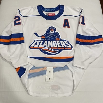
I'm going to look at each of these jerseys through an objective lens being that I own both a home and road Islanders jersey, a home Fisherman jersey, and a Stockton Thunder "Heritage Hockey" jersey from 2014 when the Thunder were an Islanders' affiliate. I'll also be conjuring the ghosts of the Bridgeport Islanders and that Islanders' Reverse Retro jersey when looking at the candidates, so let me be clear that I want to see original designs for this third jersey!

Without further adieu, let's check out these potential third jerseys!

NAVY LIGHTHOUSE: For as much of a fan as I am of the lighthouse logo, this jersey feels woefully incomplete. The lack of a shoulder yoke seems like an easy fix, but the teal colour isn't needed as a stripe. These are decent, but they could have been more.

JERSEY SCORE: ★★★☆☆

ORANGE LIGHTHOUSE: When did the Islanders become the Edmonton Oilers? Sure, there are minor differences, but this one is automatically disqualified for being an Oilers knockoff and for the awful 2014 Stadium Series shoulder logos. No orange jerseys.

JERSEY SCORE: ☆☆☆☆☆☆ (extra empty stars for awfulness)

NAVY FISHERMAN: This is the 2022-23 Reverse Retro, but the hemstripe is now a modified wave stripe. I do like the lighthouse shoulder patches, but the name and number fonts leaves a lot to be desired. These jerseys need more colour and contrast to have that Fisherman logo pop off the chest. On this jersey, it does not.

JERSEY SCORE: ★★☆☆☆

ORANGE FISHERMAN: We finally got some contrast, but there's just way too much orange here. I wanted a Fisherman jersey, not a beacon on the ice. Is that hemstripe supposed to be a wave? I'm getting Edmonton Oilers vibes off this jersey as well. Not good.

JERSEY SCORE: ★☆☆☆☆

NAVY NY LOGO: This jersey is all sorts of awful and it starts with that garbage logo. The contrast on the stripes is good, but no shoulder yokes nor shoulder patches make this jersey feel incomplete. As such, this jersey can show itself out of the contest. Hard "no" from me.

JERSEY SCORE: ☆☆☆☆☆

ORANGE NY LOGO: I should have said off the top that all Stadium Series jerseys in NHL history have been total garbage, and this proposed jersey follows those ill-conceived jerseys with only two colours, the awful NY logo, and a terrible orange base colour. Let me correct myself: this is the worst jersey of the bunch by far.

JERSEY SCORE: ☆☆☆☆☆☆☆☆ (lots of extra empty stars)

NAVY WORDMARK: Where the heck is the logo? It's a stupid nickname jersey, not a New York Islanders jersey. Was the designer making knockoff jerseys for Wal-Mart and Target? The stripe contrasts are nice, but this is not an NHL-calibre jersey by any measure.

JERSEY SCORE: ☆☆☆☆☆☆☆ (plenty of extra empty stars)

NAVY RUGBY: What the hell is this? Does this designer have a vested interest in rugby? The design is identical! This jersey commits the faux pas of having a chest stripe only on one side the jersey and the NY shoulder patches need to be outlawed. If the Islanders were a rugby team, they'd be ready for the pitch! Except they're not.

JERSEY SCORE: 🏉🏉🏉 (3/5 rugby balls)

Assuming that the Islanders received more than 80,000 submissions for their new third jerseys, these eight jerseys are some of THE WORST designs I have seen. And if you were paying attention while reading my scores, how is it that every front-facing jersey is wearing #62? Go back and look because it's not #26 based on the numbers that are visible. How did no one from the Islanders notice that detail?

Based on the jerseys chosen, it's clear that these alternate jerseys will only be worn at home since none of them have a white base colour. Frankly, the Islanders' white jerseys have, in my view, always looked better than the dark jerseys because the Islanders logo pops off the chest and has excellent contrast with the stripes. That was also true of the Fisherman jersey with its mix of colours and stripes, but I don't work for the Islanders when it comes to jersey design.

What I can tell you is that the eight designs above leave a lot to be desired. I get that the colour schemes and logos of the Islanders don't allow for a lot of variation when one is trying to come up with a snazzy third jersey, but there should have been an option for something other than navy and orange base colours. I took the liberty of desiging my own jersey which I kept upder wraps until now, so here's my design that the Islanders excluded from the final.
You might be thinking, "Teebz, those are just as bad as the jerseys above them," and you're entitled to your opinion. My thought process, however, was to recreate the arm and wave stripes in the same pattern as the background of the lighthouse logo, thereby tying the entire jersey together with the lighthouse logo being "on an island" in the middle of the jersey. I tried not to overthink this one.

I just don't see how any of the eight finalists they picked are remotely close to representing Long Island, the New York Islanders' history, nor the future of the franchise. I'd imagine these jerseys aren't one-and-done jerseys, but it sure feels like the Islanders are trying to make that happen with the eight finalists they chose. In any case, feel free to leave your takes in the comments below. I'm curious to see what people think of the finalists, but feel free to add your critique my jersey design if you like. I can handle it.

Based on my love for the Fisherman jersey, my design might be the ninth-best design shown here! Either way, Long Island is becoming Shudder Island with these frighteningly bad third jersey options.

Until next time, keep your sticks on the ice!

Thursday, 30 July 2026

The Hockey Show - Episode 723

The Hockey Show, Canada's only campus-produced radio show that strictly talks hockey, is diving into the financial side of the game tonight with a significant look at what's been happening over the last week when it comes to hockey and media. You likely know about Amazon getting into Canadian hockey broadcasts, but there are a number of other money-related stories from the hockey world that need some discussion tonight. We'll dive into those stories because, as fans, our hosts see problems on the horizon in the game that need addressing tonight on The Hockey Show at 5:30pm CT!

Tonight, Teebz and Jason will take a look at the deal between Rogers and Amazon and discuss why it happened, why Amazon's day moved, and what we might be seeing as a bigger problem in hockey. Beyond that discussion, they'll chat about Columbus cutting its radio play-by-play in favour of simulcasted TV play-by-play, Hamilton Hammers ticket prices, a new Hall-of-Famer, a contest coming to a close, and the insanity that will be travel for one league this season. There's a lot of topics tonight that will have a money theme to them, so you'll want to be ready for an hockey's untrained finanical audit by two radio hosts on The Hockey Show at 5:30pm CT on one of 101.5 FM, Channel 718 on MTS TV, or via UMFM.com!

If you live outside Winnipeg and want to listen, we have options! The UMFM website's streaming player works well if you want to listen online. We also recommend Radio Garden if you need an easy-to-use online stream. If you're more of an app person, we recommend you use the TuneIn app found on the App Store or Google Play Store.

If you have questions, you can email all show queries and comments to hockeyshow@umfm.com! Tweet me anytime with questions you may have by hitting me up at @TeebzHBIC on Twitter! I'm here to listen to you, so make your voice heard! And because both Teebz and Jason are on the butterfly app where things are less noisy, you can find Teebz here and Jason here on Bluesky!

Tonight, Teebz and Jason chat about financial bubbles, bad deals, bad broadcasts, inflated prices, honoured players, elimination processes, unnecessary travel, and much more exclusively on 101.5 UMFM and on the UMFM.com web stream!

PODCAST: July 30, 2026: Episode 723

Until next time, keep your sticks on the ice!

Thursday, 23 July 2026

The Hockey Show - Episode 722

The Hockey Show, Canada's only campus-produced radio show that strictly talks hockey, is back in the confines of the UMFM studios tonight for some chatter about the state of hockey once more! Usually, you expect the summer to be a little slower when it comes to news stories, but there seems to be significant news happening each and every week this summer so we're going to keep talking about it! We'll get into more stories tonight on The Hockey Show at 5:30pm CT!

Tonight, Teebz and Jason will attempt to make sense of a number of stories from the hockey world including the City of Ottawa potentially changing directions with respect to the Charge, the NHL taking over production of game broadcasts and why that's a terrible idea, the FPHL going completely insane, some new logos, the Aquilinis making more crazy demands, and anything else we can get into the hour. It's a busy show with lots to discuss, so make sure you're ready for The Hockey Show at 5:30pm CT on one of 101.5 FM, Channel 718 on MTS TV, or via UMFM.com!

If you live outside Winnipeg and want to listen, we have options! The UMFM website's streaming player works well if you want to listen online. We also recommend Radio Garden if you need an easy-to-use online stream. If you're more of an app person, we recommend you use the TuneIn app found on the App Store or Google Play Store.

If you have questions, you can email all show queries and comments to hockeyshow@umfm.com! Tweet me anytime with questions you may have by hitting me up at @TeebzHBIC on Twitter! I'm here to listen to you, so make your voice heard! And because both Teebz and Jason are on the butterfly app where things are less noisy, you can find Teebz here and Jason here on Bluesky!

Tonight, Teebz and Jason talk big mistakes, bad broadcasts, league madness, new looks, bad teams, and much more exclusively on 101.5 UMFM and on the UMFM.com web stream!

PODCAST: July 23, 2026: Episode 722

Until next time, keep your sticks on the ice!

Saturday, 18 July 2026

The Icemen Evolved

Some may see this title and think that I've gone into human anthropology, but I assure you that I have zero training in that subject. That's not to say I wouldn't be interested in it, but I simply have no claim to being any sort of subject matter expert. It won't matter here, though, because this article is about the ECHL's Jacksonville Icemen and not ancient ancestors. The ECHL Icemen have been busy thus far this summer as they're going to look different next season with an assortment of new logos to prepare for the franchise's upcoming 10th Anniversary Season in Jacksonville, Florida! So what do these new Icemen look like?

"This rebrand is about more than a new look - it's a reflection of how much this community has embraced the Icemen over the last decade," Icemen Owner and CEO Andy Kaufmann said on Thursday. "Jacksonville has given us so much, and as we head into our 10th Anniversary Season, we wanted a brand that truly represents the city and the fans who've supported us every step of the way."

Personally, it never made much sense to have a parka-clad hockey player as a logo for a team that plays in Florida. Those two things - parkas and Florida - just don't go together normally, and it looks like this rebrand will take the Icemen in a whole new direction visually!

The Icemen are now yetis rather than being parka-clad hockey players, and one has to wonder how much effort The Barn Creative put in when coming up with this "new idea". I get that abominable snowman are known for existing in cold climates, but the legend came from the Himalayas where they lived in mountains. The last time I checked, there are no moutains in and around Jacksonville.

However, it seems that one needs to notice the details for this redesign to make sense. The Barn Creative's Nick Matarese explained that the "Yeti foot transforms into the shape of the state of Florida" while ECHL Commissioner Ryan Crelin pointed out that "the prior logo was carried forward from the membership in Evansville, Indiana before relocating to Jacksonville."

The fun part is that no one has ever complained about the Icemen being in Jacksonville with that name, and that's what makes minor-professional hockey so fun. For a state that has ECHL teams called the Solar Bears and the Everblades, having a team that regularly sees 80F days in December and January embracing the cold and ice is fun. And minor-pro hockey should be completely about having fun.

The team will likely have newly-coloured jerseys at the very least as iceberg blue, black, and snow white at the new colour palette with gray and navy blue being removed. With a newer, fiercer logo, there likely will be a mascot update at some point as well, but the Icemen can improve their marketing and visual recognition with this fun redesign. It doesn't fit Jacksonville's persona as a city, but that's why it works so well. It's fun, it's modern, and it belongs to Jacksonville.

Overall, I don't hate it, but I appreciate the Icemen putting their own spin on the logos to make it Jacksonville's own. The Barn Creative did good work updating the logo and converting the old logo into the new yeti while coming up with the state-shaped footprint. I'm curious to see what the jerseys will look like in the new colour palette, but the Icemen should look pretty good with their new logos next season!

And we didn't need an anthropology degree to explain this evolution!

Until next time, keep your sticks on the ice!

Tuesday, 7 July 2026

Hamilton Goes Nuts And Bolts

There was a pile of news that happened today across this great country when it came to sports radio, but I don't want to dwell on the negative brought on by Rogers Communications and their buffoonery. Instead, I want to head down the road from Toronto to one of the cities that make up the Greater Toronto Area - the GTA - in the southeast portion of Ontario. For as muc as Hamiltonians will tell anyone that they're different in all walks of life compared to Torontonians, they still occupy space in the GTA. Like Toronto, though, they're now an AHL city once again as the Hamilton Hammers will begin play this season. Today, we got to see their jerseys!

I want it on record that I still hate the team name. I'm not here to win any points with Hamilton or its fans, though, so seeing the rest of the jerseys could potentially improve the logo's overall aesthetic or it could drag them down to 1994 levels of hate like the Islanders' Fisherman jerseys got. So what do they look like, you ask?

The design isn't actually that bad if I'm being honest. Simple arm and hem striping keep the hockey sweater look alive, there's good contrast with that horrific logo, and the numbers are easily readable. I'm not a fan of the drawstring necklines anymore, but I don't see a lot of problems here with the Hammers' jersey. The absence of the shoulder yoke isn't even a problem as it allows that solid blue colour to really stand out against the white ice in arenas, so I think the Hammers and, by proxy, the Islanders did a fairly good job here by keeping it simple. There's no wave jersey template, so it's not like they're going to get Fisherman hate spewed at them.

The back of the jersey is just as clean in its design with easily-readable block letting for the name and a standard block font for the number. The two-colour sewing allows the blue to pop with a little more colour from the orange outline, so that works nicely. I'm not fan of the AHL and CCM logos in the middle of the hemstripe as that's all sorts of gaudy and self-aggrandizing, especially when you consider that CCM's logo is already on the neckline as well. If the league dropped the AHL logo back down to the bottom of the jersey and eliminated the second CCM logo, things would improve drastically for the back of the Hammers' jerseys. Because that they don't allow me to do AHL corporate deals, my opinion is simply that the logos look terrible placed where they are.

Hamilton likely won't look bad next season when they take the ice as long as no one is focused on their logo. These are clean, simple jerseys that look like traiditonal hockey sweaters, and that's a good start to the Hammers' legacy in Hamilton. They aren't going to move a lot of jerseys because they have catchy colours or an awesome design, but the Hammers will look like a hockey team anytime they wear their jerseys. That's a win despite the logo on the front.

Should Hamilton be wearing colours that aren't the same scheme as the New York Islanders? Yes, absolutely. However, the limited scope of their colours works well in this design, so here's hoping the Hammers can rise to the occasion in spite of their logo. They aren't flashy, but they're the nuts and bolts of what a hockey jersey should look like.

Until next time, keep your sticks on the ice!
Saturday, 20 June 2026

No Butting Heads Here

When it comes to team branding, we've see a number of minor-professional hockey teams use unconventional names - Knight Monsters? Ghost Pirates? Hammers? - for their franchises. The key to these franchises is that they can save their weird names by having good jerseys, a solid mascot, and an ability to have fun with their names. That's where the New Mexico Goatheads come into play because their choice of team name was, in a word, questionable. I get the tie-in to local flora with which people of the Rio Rancho area are familiar, but it's just not a great name. Today, the team held an event where the jerseys would be shown, so let's see how this party went!

I don't know how the jersey reveal actually went because I can't find a lot of great images of the event, but we did get to see the jerseys.
At first glance, these aren't bad at all. I like the simplicity of the jersey as the logo pops off the chest without the shoulder yoke. The colours are bold with enough striping on the sleeve and jersey hems to complement the logo, but I'm not certain the added colours on the neckline were needed. It doesn't detract from the jersey, but it feels little unnecessary. The thorn logo above the Athletic Knit logo is entirely unneeded, and these jerseys would be improved if there was only one logo on the neckline. That's the only major problem I see.

I went to the Goatheads' store to see if I could dig further into the jerseys when it came to secondary patches and fonts used, but they only had the white replica jerseys up for sale. More on that in a moment, but you can see the Colorado Avalanche logo on the right shoulder while the New Mexico state wordmark logo is on the left shoulder. This is pretty standard with the NHL affiliate being represented, and I have no problem with the New Mexico state logo being used as representation of the community they represent. Again, the major thing that sticks out to me are the two logos above the Goathead logo. Someone needs to do something about that. It's going to bother me every time I look at these jerseys despite the AK logo needing to be there.

Regarding the lack of photos at the event and just the white jerseys in their online store, Jared Chester of KRQE Sports spoke to Goatheads GM Jared Johnson who said, "Unfortunately, we were only able to get 100 of each color here today, but we're expecting to get the rest here in the next couple of weeks to a month. They turned out unbelievable. We're really excited to get those out to the fans. That's been one of the biggest requests we’ve had so far."

Clearly, there's a demand from fans for their new team's threads, so that's a good sign for the expansion franchise. Of course, having a winning team helps to sell tickets and merchandise, and the Goatheads made an announcement at the event as to who will guide this franchise in their inaugural season with a head coach unveiling! The man to the left is who will take the reins this season as former NHLer Zach Stortini is the team's first head coach! The former hockey pugilist was an assistant coach with the OHL's Sudbury Wolves before joining the AHL's Tucson Roadrunners as an assistant coach in 2022. This will be his first head coaching gig in professional hockey, so we'll see how the 40 year-old handles the pressures of managing and deploying his ECHL roster!

Before I wrap this up, I do want to bring attention to one thing that I noticed in the Twitter photos posted by the New Mexico Goatheads. I'm not here to question anyone's jersey choices, but there was a fan at the event today that was wearing a jersey that caught my attention. As you can see to the right, there was a gentleman at this event wearing what looks like a Paul Shmyr California Golden Seals jersey with #22 on the back. Except Shmyr didn't wear #22 and it's not a California jersey because someone needs to appoint this guy as New Mexico's greatest hockey fan. That jersey he's wearing is a Dean Shmyr jersey from the Albuquerque Chaparrals from either 1996-97 or 1998-99 when the CHL's New Mexico Scorpions wore those throwback jerseys! That is some awesome jersey history! Good on that dude!

Amazing historical jerseys aside, the Goatheads should look pretty solid next season. The jerseys are simple, they don't get crazy with colours or added features, and the double logo on the front above the main Goatheads logo is my only major quibble. Yes, there was no font shown for names and numbers, but we'll get there. Of course, these may look different once the Goatheads take the ice, but the initial jersey unveiling looks pretty good. It's certainly not the greatest of all-time, but the Goatheads are ready for business!

And yes, I despise the GOAT acronym. People need to stop using it.

Until next time, keep your sticks on the ice!
Saturday, 13 June 2026

Mixing All The Eras

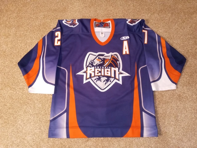
When the franchise was founded in Manchester, New Hampshire in 2001, the Manchester Monarchs had their own distinct look and colours. The franchise was actually awarded to Howard Baldwin in 1999, but the Los Angeles Kings bought the franchise from Baldwin's ownership group on June 14, 2000 to operate as their AHL club. When the AHL pushed for western expansion in order to bring the teams closer to their NHL west coast affiliates, the Manchester Monarchs and Ontario Reign swapped leagues as they traded places in the AHL and ECHL. That's when the Kings rebranded the Reign in their own look, introducing a variation of the logo above. Today, they unveiled their new look.

As we know, the Kings have worn purple, gold, black, and silver throughout their history, and the Reign have strictly been a black and silver team. I am thoroughly against the idea of an AHL team adopting an NHL team's identity simply due to the fact that the AHL team should have its own culture within its community. Earning the NHL colours should be something that a player aspires to get, so having an NHL team and AHL team look nearly identical has never made sense.

Today, the Ontario Reign unveiled its rebranding, and it's something!
From a historical standpoint, the Ontario Reign are now officially adopting the Los Angeles Kings' colour scheme and original logo as their own. I am fully aware that the Reign are owned by the Kings, but this is royal narcissism that very few teams have ever attempted to pull off in a rebrand. Honestly, I'm almost impressed if I wasn't so confused as to why the Reign are weaing Kings alternate jerseys.

According to the team's website, there's an explanation.
"The primary logo pays homage to the Inland Empire and Ontario, while tying the Reign to the LA Kings’ legacy through the crown and royal-inspired elements, including a nod to the Kings original color scheme. At the peak of the crest stands the 'O', a reminder that this identity belongs to the people who call it home. At its core, there are five pistons that represent the spirit of Ontario: power, precision, pressure, unity, and relentless forward movement. Beneath it lies the ground it was built on, a mark inspired by the Ontario Motor Speedway, where speed defined the past and motion built a legacy of this land."
Ok, I have many questions like "how does the 'O' remind anyone of anything other than 'Ontario'?" or "why are there pistons on a crown?" or "where do you see ground?" because this crown, while slightly modified, looks a lot like the Los Angeles Kings' alternate crown logo they wore. In looking at the new Reign logo, I wouldn't have guessed that any of those things written above were true or even relevant.

I actually like the white jersey with the black shoulder yoke and significantly-noticeable yellow-and-purple stripes, but the black base for the dark jersey still bothers me in that it has no shoulder yoke when it's begging for more colour. Kudos for the triple-colour numbers as the "inland blue"-on-yellow-on-black looks good on the white jersey while the "inland blue"-on-silver-on-yellow pops off the dark jersey. Silver block lettering works nicely for the player name.

Shockingly, the overall aesthetic isn't terrible, and I suspect the Reign will move some merchandise with this rebranding as the pop of colour will appeal to fans. The Reign still should go back to their ECHL look as it was entirely superior, but these new uniforms are an improvement over the entirely-boring, Kings-lookalike Reign jerseys.

I'm not convinced that the Kings and Reign should be mixing their colour schemes and logos, but it seems they'll do whatever they want. The Reign can use all the marketing garbage they want to justify wearing the crown logo, but I need less "Kings" in the Reign logo. I like the use of colour, but the logo is still a royal failure.

Until next time, keep your sticks on the ice!

Thursday, 4 June 2026

The Hockey Show - Episode 715

The Hockey Show, Canada's only campus-produced radio show that strictly talks hockey, is doing a little clean-up tonight as there are a pile of stories that we said we'd tackle on previous shows and never got around to discussing. With hockey news seemingly being hot off the presses each week, things change quickly when deciding what topics to cover. Add in the fun we've had meeting and chatting with some of the great contestants on Survivor: NHL Playoffs and it makes some of the stories far less important. However, they still need to be discussed at some point, so our hosts will engage in a little housekeeping tonight and get all of these random stories off the books! We're going all over the place with stories tonight on The Hockey Show at 5:30pm CT!

Tonight, Teebz and Jason will flip a coin over who sends Buffalo home after scheduling conflicts with Fiona prevented us from chatting with her. Tyler will drop in for an exit inverview for the Colorado Avalanche. Travis is off on an adventure, so he gets to skip Montreal's exit interview tonight, but he's clearing his schedule for next week. After those get done, our hosts will begin the housekeeping with a discussion about Hockey Canada's women's program making changes, an old ECHL team is new again, a discussion on the Hamilton Hammers, the USHL expanding, the Dallas Stars trying to bully their way to a new arena, the 2026 Spengler Cup schedule, and anything else we may have missed from our notes over the past few weeks. It's another busy show with lots to discuss, so lock in tonight for The Hockey Show at 5:30pm CT on one of 101.5 FM, Channel 718 on MTS TV, or via UMFM.com!

If you live outside Winnipeg and want to listen, we have options! The UMFM website's streaming player works well if you want to listen online. We also recommend Radio Garden if you need an easy-to-use online stream. If you're more of an app person, we recommend you use the TuneIn app found on the App Store or Google Play Store.

If you have questions, you can email all show queries and comments to hockeyshow@umfm.com! Tweet me anytime with questions you may have by hitting me up at @TeebzHBIC on Twitter! I'm here to listen to you, so make your voice heard! And because both Teebz and Jason are on the butterfly app where things are less noisy, you can find Teebz here and Jason here on Bluesky!

Tonight, Teebz and Jason chat with Tyler before looking at big changes, new identities, bad logos, bad expansion, ridiculous owners, fun schedules, and much more exclusively on 101.5 UMFM and on the UMFM.com web stream!

PODCAST: June 4, 2026: Episode 715

Until next time, keep your sticks on the ice!

Thursday, 28 May 2026

The Hockey Show - Episode 714

The Hockey Show, Canada's only campus-produced radio show that strictly talks hockey, returns tonight with a look at a pile of stories that have emerged in the hockey world over the last week or so. There's news from Europe, news from the southern US, new from Russia, and news from across Canada that needs to be discussed in greater depth as our hosts tackle a number of stories. There are no Survivor: NHL Playoffs exit interviews today as we're saving them for next week, so get ready for a pile of news and discussion about everything happening in hockey on The Hockey Show at 5:30pm CT!

Tonight, Teebz and Jason jump into the hockey stories by discussing the results at the IIHF Men's World Hockey Championship being played in Switzerland including who is being relegated and promoted for next year's tournaments. Beyond those scores and stories, our hosts will discuss Hockey Canada's women's program making changes, an old ECHL team is new again, a more thorough discussion on the Hamilton Hammers, Jordan Tourigny trying to join the musical group Stomp, the Ottawa Charge getting close to announcing what arena they'll play in next season, Russia's return to international hockey, the KHL's winner and an interesting fact, and there was more science revealed about a player we lost last season. It's a busy show with lots to go over, so get ready to roll tonight for The Hockey Show at 5:30pm CT on one of 101.5 FM, Channel 718 on MTS TV, or via UMFM.com!

If you live outside Winnipeg and want to listen, we have options! The UMFM website's streaming player works well if you want to listen online. We also recommend Radio Garden if you need an easy-to-use online stream. If you're more of an app person, we recommend you use the TuneIn app found on the App Store or Google Play Store.

If you have questions, you can email all show queries and comments to hockeyshow@umfm.com! Tweet me anytime with questions you may have by hitting me up at @TeebzHBIC on Twitter! I'm here to listen to you, so make your voice heard! And because both Teebz and Jason are on the butterfly app where things are less noisy, you can find Teebz here and Jason here on Bluesky!

Tonight, Teebz and Jason chat about international results, program changes, reborn cats, disappointing logos, stepping on toes, relocating teams, a returning foe, Russia's winners, head trauma, and much more exclusively on 101.5 UMFM and on the UMFM.com web stream!

PODCAST: May 28, 2026: Episode 714

Until next time, keep your sticks on the ice!

Wednesday, 27 May 2026

The Cats Came Back

This might seem like a historical piece abhHL in Augusta, Georgia from 1998 until 2009 in front of rather modest crowds during that era. The Lynx's best season came in 1999-2000 when the team was eliminated in the third round of the Kelly Cup Playoffs, but that history may get a chance to be overwritten by the ECHL's 32nd franchise that will begin play in 2027-28. This new team will be called the Augusta Lynx, but the logo, colours, and branding for these cats will be completely new and wholly separate from the original Augusta Lynx franchise.

Before we get into this new Lynx identity, there's some background that's needed. This new version of the Lynx is owned by former NFL quarterback Tim Tebow and David Hodges, Chairman of 925 Partners. These two collaborated together to bring the Knight Monsters to the southern side of Lake Tahoe, and they'll join forces once again to make this iteration of the Lynx work in Augusta. The team will be managed and operated by Zawyer Sports and Entertainment who has built a massive minor-pro hockey empire in a relatively short time.

As stated, the Lynx failed once in Georgia already as people stopped showing up to games. Every year from 1998-99 until 2005-06, there was a decline in average attendance at Lynx games, and the final four seasons saw them average around 2700 fans. Obviously, that's not going to be anywhere close to being profitable, but it seems that Tebow and Hodges know better than I do. With a metro population of around 611,000 people, there should be enough fans to fill the new 10,500 seat arena currently under construction in downtown Augusta.

Whether or not fans show up for Lynx hockey will be the big question.

A good way to get fans interested in the team is having a good logo, and the logo to the right might just be enough to get casual hockey fans in and around Augusta to buy into this new team! It would appear that the Lynx will play up the "Links" name even more than the previous team by going with the green and yellow colours as the "Lynx" name honours Augusta National Golf Club which hosts The Masters golf tournament every year. The new cat's face on the logo looks more like a lynx does as well, and that playful smirk on the lynx's face should appeal to both kids and adults when it comes to merchandise. This logo is an upgrade over the old one, and that's a good start for this franchise.

The secondary logos seen above are all pretty good as well. Clearly, the lynx face on the left and the wordmark next to it are just the individual pieces of the full logo above, but cat's claw around the state of Georgia is a great secondary logo that likely will be worn on the shoulder of the jerseys. It feels a little like the AHL Bakersfield Condors' talon logo, but I'm not complaining here. The "A" logo on the right seems a little more formal, so we'll see how that gets used.

"We're so excited to bring this team to Augusta and introduce something truly special for our fans," Tebow said on Tuesday. "Our hope is to create an experience that brings families together, builds lasting memories, and reflects the heart of this community."

Co-owner David Hodges seemed to be looking at the bigger picture for Augusta, stating, "Being part of this new chapter in Augusta is incredibly meaningful to us. We're committed to investing in this community and building something that goes beyond the game."

Outside of the logo, there was nothing else shown off by the Lynx today when it came to their brand. The jerseys and mascot will be unveiled at a later date, and the team will announce affiliations and a head coach in the coming months. If you're wondering, the logos above were created by The Barn Creative who, in my humble opinion, did a pretty good job in getting the new Augusta Lynx a brand around which they can build. I may have to get some snazzy merchandise!

The Lynx are back in Augusta beginning in 2027 as the ECHL adds its third Georgia-based team to the map. It's going to take some work to fill that 10,500-seat arena every night, but the branding for the Lynx is the cat's meow! It will be up to Tebow and Hodges to find the right personnel and players to make sure the Lynx are a purr-fect fit and as popular as that big PGA golf tournament is in Augusta, Georgia!

Until next time, keep your sticks on the ice!

Friday, 22 May 2026

Hammered In The Hammer

The image to the left is supposed to be of Mjölnir, the hammer carried by Norse god Thor. According to Norse legend, Thor, the god of thunder, used Mjölnir to defeat the enemies of Asgard and in ceremonies such as weddings and births. If you're a Marvel fan, you know that the hammer was only wielded by those who were deemed "worthy" as only select Avengers were able to lift the hammer from where it rested. In short, the marketing options would have been endless for a hockey team who wanted to call themselves "Hammers", but it seems these eay wins aren't even in consideration for the city of Hamilton.

With the Islanders and the city of Hamilton coming together for their press conference yesterday to introduce the world to the Hamilton Hammers while promoting this logo to the right, I was left wondering who approved this logo and name and why it needed to be rushed. It's been known for a couple of weeks that "Hammers" was one of the names that the AHL Hamilton franchise had applied to trademark, and I wasn't fond of it then. Seeing this "clipart" logo they introduced yesterday only makes me hate the name more. It's total garbage.

The explanation of the logo is nothing more than marketing rhetoric.
"Rooted in Hamilton's history as a resilient steel town, the team's logo features crossed hammers symbolizing the strength, grit and togetherness of the community, embodying both the city's steel-working heritage and the spirit of the game. The design reflects Hamilton's pride and determination, showcasing the unique character that defines the city, while bold, angular lettering evokes the spirit of Steel Town."
Nothing in that logo above shows any of Hamilton's characteristics or traits regarding the city's background. If it didn't say the word "Hamilton" in the logo, the image could be used for any other city and sport on the planet. Whoever designed this and whoever approved this should be fired immediately because this has to be one of the worst logos in the history sports. And an AHL team will wear it.

Ready for some more marketing garbage? Here's a second serving!
"Subtle hockey puck details on the hammer knobs pay homage to the iconic puck in the New York Islanders logo, linking the sport's identity with the craftsmanship of the tools and nodding to the franchise's origins, including the fisherman logo era. The orange-and-blue color palette is also drawn from the Islanders' classic team colors, reinforcing the connection to the club's history and evolution. The logo was created by the New York Islanders, while the broader brand identity was developed by Canadian creative agency Recess Creative."
If you had told me the knobs on the hammer's handles were pucks, I would have called you a "knob". Those look nothing like pucks, and this verbal diarrhea about linking identity and craftsmanship and the Fisherman logo is the biggest pile of manure I have seen. The only good thing in that entire paragraph was the information about the Islanders creating the logo because now I know exactly who to hate moving forward after unveiling and hyping this train wreck of a logo.

The only positive I see that came with the logo unveiling today is that the team won't have any issues rebranding for its new city after it relocates from Hamilton sometime over the next decade. As much as I dislike teams moving, Hamilton's track record with AHL franchises is terrible, and there's no reason to believe this time will be any better for the AHL in Hamilton as most Hamiltonians cannot name a single player who suited up for the Bridgeport Islanders last season.

Will the Hammers have time to grow on Hamiltonians? Absolutely. After all, the franchise signed a lease agreement to play in the newly-renovated TD Coliseum for a handful of years, so they'll be part of the winter sports scene in Hamilton for a while. Whether or not they succeed will be completely on the New York Islanders because they won't have many fans attending games if they're perennial underachievers. In five years in Bridgeport, the AHL Islanders made the playoffs only twice, bowing out in the first round both times.

What won't grow on me is this calamity of a logo that the Hamilton Hammers will wear. Good luck to the Hammers marketing team in selling the Hammers to The Hammer. It might be "Hammer time" in Hamilton, but selling this team as a winner will be tough as nails.

Until next time, keep your sticks on the ice!
Thursday, 21 May 2026

The Hockey Show - Episode 713

The Hockey Show, Canada's only campus-produced radio show that strictly talks hockey, sets everyone up for more exit interviews tonight as three of the four teams and Survivor: NHL Playoffs entrants will deliver their thoughts on what happened with those teams! It's always fun to chat with the people who participate in the contest about hockey, so our hosts will have a little fun doing that tonight. Of course, there will be some hockey chatter as well so get yourself settled in for The Hockey Show at 5:30pm CT!

Tonight, Teebz and Jason will chat with Derek (Philadelphia), Dave (Minnesota), and Colin (Anaheim) tonight as those three are available for their interviews. Fiona already had the evening booked, but we will bring her on a future show because we have Fort Wayne Komets playoff chatter to discuss with her as well! Beyond that, our hosts will talk about the WHL situation in Chilliwack, the new AHL Hamilton team name and logo, the Golden Knights fine and penalty for being dumb, and both Montreal and Niverville bringing home championships! It should be a fun show chatting with three great people and about some crazy news, so tune in tonight for The Hockey Show at 5:30pm CT on one of 101.5 FM, Channel 718 on MTS TV, or via UMFM.com!

If you live outside Winnipeg and want to listen, we have options! The UMFM website's streaming player works well if you want to listen online. We also recommend Radio Garden if you need an easy-to-use online stream. If you're more of an app person, we recommend you use the TuneIn app found on the App Store or Google Play Store.

If you have questions, you can email all show queries and comments to hockeyshow@umfm.com! Tweet me anytime with questions you may have by hitting me up at @TeebzHBIC on Twitter! I'm here to listen to you, so make your voice heard! And because both Teebz and Jason are on the butterfly app where things are less noisy, you can find Teebz here and Jason here on Bluesky!

Tonight, Teebz and Jason send Derek, Dave, and Colin back to the mainland before talking arena deals, new names, complete stupidity, winning teams, and much more exclusively on 101.5 UMFM and on the UMFM.com web stream!

PODCAST: May 21, 2026: Episode 713

Until next time, keep your sticks on the ice!
Wednesday, 13 May 2026

Canada's New Look?

It should be no secret that Hockey Canada has changed their jersey designs repeatedly over the last number of years. Hockey Canada essentially has made their market when it comes to hockey jerseys because there seems to be a new design every couple of years based on emerging fashion trends and shrinking jersey sales. The jerseys to left, which cannot be worn in the Olympics due to Hockey Canada's logo, were fairly iconic for most of the IIHF tournaments, but Canada has changed that design that was last seen in 2022 a few times since it was worn. Not surprisingly, they've designed and are looking to trademark another iteration for future use on the ice.

Before we look at the new design, I just want to reiterate that the black Canada jersey seen above and any black colouring on any other jersey is completely unnecessary. I get that black is part of Hockey Canada's colour palette, but Canada is red and white in terms of national colours. I hate when Canada wears black at tournaments, and those black jerseys in the past and any future jerseys that are black should be scrubbed from Hockey Canada's design options.

That being said, here's Canada's new "eleven point maple leaf" jersey.
You may be wondering about that "eleven point maple leaf" name, and it seems that it comes from the Hockey Canada logo itself which has eleven distinct points and the three small maple leaves in gold on the rear neckline. The design itself leaves a lot of wanting for additional colours splashes despite four colours - red, white, black, and gold - being shown on the above jersey. According to the trademark filing, there's a "middle arm band pattern on each sleeve that consists of maple leaves and stylized maple leaf designs with a hockey player with the word Canada underneath is in white."

If I'm being honest, the design shown above has 2018 vibes all over again as seen with Finland. The shoulder yokes are sublimated into some design while the rest of the jersey is the base colour, allowing the logo to be the main focal point. Hockey Canada's logo shouldn't necessarily be the main focal point, though, as the players are representing their country, not Hockey Canada exclusively. In theory, there's nothing wrong with this design, but seeing how it looks on the ice and in graphics leaves Canada looking a little barren. A hem stripe would add that spalsh of colour and adding one more stripe of colour below that middle arm band pattern would be ideal.

I'm still puzzled by the three gold maple leaves on the rear neckline. If it's to represent the men's, women's, and parahockey programs overseen by Hockey Canada, I can live with that, but that designation seems to ignore the Canadian women's parahockey team that participated at the first Women's World Championship last season. The national women's parahockey team doesn't fall under Hockey Canada's umbrella at this time, but they have approached Hockey Canada about future funding and support. I'm hoping that happens.

Because of the Hockey Canada logo, though, this jersey can't be worn at the Olympics nor the Paralympics, so having the three stars representing the men's, women's, and parahockey programs doesn't make a lot of sense. While the jerseys can be worn annually at each program's World Championship, the Olympics are the big tournament where everyone wants to play. Why would Hockey Canada create a jersey that they can't wear at the most-watched tournaments on the planet? That seems short-sighted from a merchandise standpoint.

It's becoming harder and harder to understand the decisions being made at the Hockey Canada offices. Combined with their idiotic decision to not participate in the Spengler Cup this season, this is the second complete and total miss they've had in the last two weeks. I'm not saying that anyone needs to be fired over this new jersey design, but it should have never been submitted for a trademark application.

2026 is proving to be a rough year for Hockey Canada as the World Junior team was eliminated in the quarterfinals, they brought home three silver medals from Milano-Cortina, they got dropped from the Spengler Cup, and now they've proposed a terrible jersey trademark. I can't remember the last time that Hockey Canada piled up this many losses in one year, but 2026 is fast becoming forgettable.

Until next time, keep your sticks on the ice!

Tuesday, 28 April 2026

TBC: Fabric Of The Game

Being that I am a hockey fan, I have a bit of a hockey jersey collection that features teams from a number of leagues. Most are customized with names and numbers on the back, but some are not as I have yet to make a commitment on those jerseys. In saying that, though, there's a pile of history and market research that goes into the logos and colours that a lot of people sweep aside because "it looks cool". Today, we dive into the history a little more as Teebz's Book Club is proud to review Fabric of the Game written by Chris Creamer and Todd Radom and published by Sports Publishing. Chris and Todd are big players in the world of sports logos and designs, so getting their takes on 32 NHL teams was something I had to read!

From his bio on the Sports Publishing website, "Chris Creamer is a writer, historian, and world-renowned expert on sports logos and uniforms based in the Toronto area. His passion for logos resulted in the creation of SportsLogos.Net, an ongoing 20+ year project dedicated to the history of team logos and uniforms. He has worked closely with the National Hockey League acting as a historical consultant for their centennial season celebration, written for NHL.com, the Buffalo News, and has been featured or quoted in several publications including The Hockey News, Washington Post, Toronto Star, and Sporting News."

Also from his bio on the Sports Publishing website, "Todd Radom is a graphic designer, sports branding expert, and writer. His work includes the official logos for Super Bowl XXXVIII, the 2009 NBA All-Star Game, the graphic identities of multiple Major League Baseball teams — including the Washington Nationals and Los Angeles Angels — and league and team identity and branding for the BIG3 basketball league. He has provided commentary about sports logos and branding for ESPN, National Public Radio, and the New York Times. In addition, he has been profiled or quoted in numerous publications including the Washington Post, Philadelphia Inquirer, Chicago Tribune, Sports Illustrated, The Athletic, and Sporting News. Radom is the author of Winning Ugly: A Visual History of Baseball's Most Unique Uniforms." Radom also contributed to Paul Lukas' Uni-Watch.

Being that I like jerseys and history, Fabric of the Game seemed like a perfect book for me as those two subjects intersected thanks to the knowledge possessed by authors Creamer and Radom. They delivered in a big way with good chunks of history added for each team, some excellent photographs depicting the logos and jerseys for each team, and other interesting tidbits of information that hockey historians will love. In short, Fabric of the Game delivers nicely on its subtitle of "The Stories Behind the NHL's Names, Logos, and Uniforms".

If there is a quibble, the history-loving side of me wanted more. I know that may not have been possible in order to prevent Fabric of the Game from turning into a set of encyclopedias, but there were small snippets that needed deeper analyses for some of the teams. The authors make reference to Seattle nearly being the landing spot for the Pittsburgh Penguins in their chapter on the Kraken, but that's not explored in any way. HBIC went down that path, but I was hoping for more interesting facts about this topic and others in the book.

Don't let that discourage you from reading Fabric of the Game, though. There are so many good pieces of information contained between the covers that it's worth the read, and the photographs of older NHL jerseys may have you asking why some teams changed designs at all. One of the fun facts that Creamer and Radom included in the book about each team are the names they almost chose, and the Columbus Blue Jackets almost had another name. They write,
"A Name the Team Contest, sponsored by the Central Ohio-based restaurant chain Wendy's, launched in July 1997, with more than ninety Columbus-area restaurants distributing entry blanks. Dave Thomas, the chain's ubiquitous founder and pitchman, watched 'Frostys' according to a Wendy's spokes-person, a joking tribute to their signature frozen dessert."
How funny would that have been has the Blue Jackets debuted as the Columbus Frostys? All jokes aside, the two names that came back from the NHL that were approved were Blue Jackets and Justice, and we know which option the franchise chose. Facts like this are littered throughout the book about team names, logos, and jersey design, making Fabric of the Game a great addition to a hockey fan's library.

Overall, Fabric of the Game has enough information and images on its 280 pages to satiate hockey jersey fans, hockey history fans, and hockey jersey history fans. Creamer and Radom don't go into 100 years of history for the Original Six teams, but they give you enough to understand how the team name was chosen, the designs worn and the history behind them, and how the logos came to be. Again, it's not an encyclopedic look at the teams, but it's a fantastic resource for hockey fans to have at their fingertips. Because of the history, photographs, and information on its pages, Fabric of the Game absolutely is deserving of the Teebz's Book Club Seal of Approval!

Fabric of the Game was first printed in November 2020, so you should be able to find copies at libraries and local bookstores. Online retailers also have the book if you're seeking a copy. Everything contained within the book is easy to read without any concerns for parents of younger hockey fans if they were thinking about getting this book for a younger reader. Parents may end up with lots of questions about some of the older hockey topics, but Fabric of the Game is recommended reading for all hockey fans of all ages!

Until next time, keep your sticks on the ice!

Wednesday, 22 April 2026

Zero Creativity

From what I've gathered, the logo to the left is the logo used by the city of Hamilton, Ontario on its letterheads and on official documents. I have no way of verifying this as I have no official documents from Hamilton, but it seems reasonable to assume that this logo would be the city's chosen graphical representation. Knowing how important a logo is for any business, one would assume that those businesses seeking a new image would aim for a great logo. With the AHL's Bridgeport Islanders moving into Hamilton next season, they also needed a new team name on which that logo can be based, and it seems the AHL franchise has chosen three potential team names as finalists.

I made the case back on March 31 that they could ressurect the Hamilton Tigers name as the AHL franchise would pay respects to the NHL team that existed from 1920-25, and it would work well with the city's CFL team who are the Tiger-Cats. It's clear that they can't be the Islanders any longer since they're not on an island, but they conceivably could be the Islanders since Bridgeport was mostly on solid land as a city. In any case, I was hoping they'd go with "Tigers".

According to today's trademark filings, they will not use that name.

Hamilton Mustangs

The first trademark that was filed was for "Mustangs" which seems like a complete sellout considering that the fictional Ontario Hockey League team in the 1986 movie Youngblood were the Hamilton Mustangs. With the new Youngblood movie featuring the same team, I assume the AHL franchise owners thought they could cash in with this name somewhat being in the pop culture spectrum. To me, this is pandering to the easiest name. I know it worked for the Mighty Ducks of Anaheim, but the fictional teams names can remain fiction.

For the record, Hamilton did have an OHL team in 1986 called the Steelhawks who, in 1996, became the Erie Otters after a stop in Niagara Falls. The Mustangs were never a Hamilton-based OHL team.

Hamilton Havoc

Ok, this name has a little more creativity, but this isn't a unique name by any means as the SPHL's Huntsville Havoc should be filing a cease-and-desist when it comes to this name being used. I can see the owners wanting the alliteration of "Hamilton Havoc" where they can emphasize both words, but I think of Huntsville when I hear "Havoc hockey". It'll take some time for that to change in my brain.

Hamilton Hammers

For a city that is commonly referred to as "The Hammer", using "Hammers" as the team name seems a little derivative. The sports headlines will write themselves with this name, so it makes me wonder why they wouldn't have gone for "Mjölnir" as the name while using Norse god Thor as a mascot. Maybe this imagery was too close to that of the ECHL's Adirondack Thunder, but having the mightiest hammer would set them apart from other teams. Marvel may contest my choice of name and its images, but having players skate out to MC Hammer saying "It's Hammer time" would be an interesting twist.

Ok, so those three names aren't great by any means, so there has to be other ones. I mentioned Tigers and I do like Steelhawks, but it was suggested on a Reddit thread that the team should be called "Lakers" in honour of freighters that cross the Great Lakes and use Hamilton as a port city. I'm not sure the logo would be very inspiring based on the linked image, but "Lakers" could be a team name option as well.

A fun name could be "Isotopes" which would ruin the theme night that the Springfield Thunderbirds hold, but McMaster University produces medical-grade isotopes used to treat cancer! As McMaster's website states, the isotopes produced at the Hamilton-based university are used for "treatment for more than 70,000 cancer patients every year" around the world! Could the AHL franchise be the Hamilton Isotopes?

While the three names highlighted above will likely end up as the franchise's new name, Hamilton clearly has alternate options as good or better than the three they chose to trademark. We know they won't be the Islanders which means that the Fisherman logo can be used by the New York Islanders again if they chose, so I'm hoping these three names were trademarked to throw people who were hunting for a scoop off the trail because those are terrible names.

I had high hopes that Hamilton would get a great team name and logo to use, but it doesn't seem like The Hammer will nail this one.

Until next time, keep your sticks on the ice!