


Mixing All The Eras

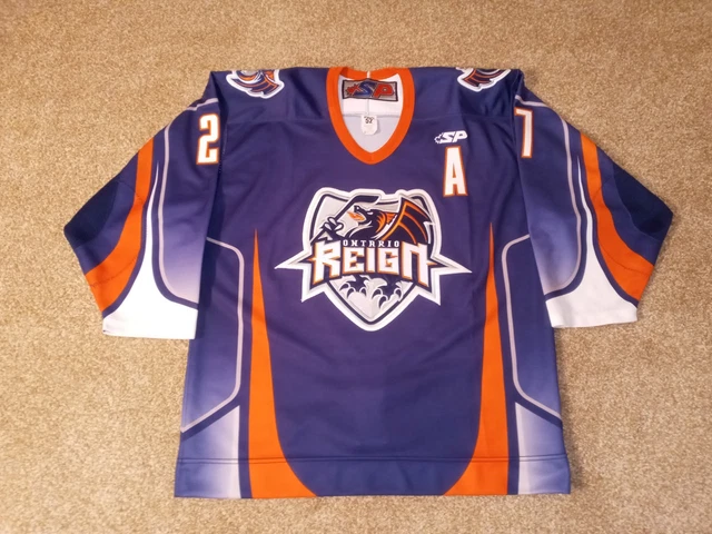
As we know, the Kings have worn purple, gold, black, and silver throughout their history, and the Reign have strictly been a black and silver team. I am thoroughly against the idea of an AHL team adopting an NHL team's identity simply due to the fact that the AHL team should have its own culture within its community. Earning the NHL colours should be something that a player aspires to get, so having an NHL team and AHL team look nearly identical has never made sense.
Today, the Ontario Reign unveiled its rebranding, and it's something!

According to the team's website, there's an explanation.
"The primary logo pays homage to the Inland Empire and Ontario, while tying the Reign to the LA Kings’ legacy through the crown and royal-inspired elements, including a nod to the Kings original color scheme. At the peak of the crest stands the 'O', a reminder that this identity belongs to the people who call it home. At its core, there are five pistons that represent the spirit of Ontario: power, precision, pressure, unity, and relentless forward movement. Beneath it lies the ground it was built on, a mark inspired by the Ontario Motor Speedway, where speed defined the past and motion built a legacy of this land."Ok, I have many questions like "how does the 'O' remind anyone of anything other than 'Ontario'?" or "why are there pistons on a crown?" or "where do you see ground?" because this crown, while slightly modified, looks a lot like the Los Angeles Kings' alternate crown logo they wore. In looking at the new Reign logo, I wouldn't have guessed that any of those things written above were true or even relevant.
I actually like the white jersey with the black shoulder yoke and significantly-noticeable yellow-and-purple stripes, but the black base for the dark jersey still bothers me in that it has no shoulder yoke when it's begging for more colour. Kudos for the triple-colour numbers as the "inland blue"-on-yellow-on-black looks good on the white jersey while the "inland blue"-on-silver-on-yellow pops off the dark jersey. Silver block lettering works nicely for the player name.
Shockingly, the overall aesthetic isn't terrible, and I suspect the Reign will move some merchandise with this rebranding as the pop of colour will appeal to fans. The Reign still should go back to their ECHL look as it was entirely superior, but these new uniforms are an improvement over the entirely-boring, Kings-lookalike Reign jerseys.
I'm not convinced that the Kings and Reign should be mixing their colour schemes and logos, but it seems they'll do whatever they want. The Reign can use all the marketing garbage they want to justify wearing the crown logo, but I need less "Kings" in the Reign logo. I like the use of colour, but the logo is still a royal failure.
Until next time, keep your sticks on the ice!


No comments:
Post a Comment