 Since Thursday evening, there have been six more NHL jersey unveilings that have happened, officially or not. The teams that decided to wear their new clothes included the Anaheim Ducks in their exhibition games against the Kings, the Chicago Blackhawks, the Dallas Stars, the Philadelphia Flyers, the Phoenix Coyotes, and the St. Louis Blues. Of course, some miss the mark as to what a hockey jersey is supposed to look like. In other cases, teams went way off the map. The Original Six team should be expected to stay the course, but no one was sure how the Blackhawks would end up, especially since their owner seems to enjoy screwing everything else up about the Blackhawks. In any case, let's take a look at each of the new jerseys for these six teams.
Anaheim Ducks
The Anaheim Ducks really had no reason to change their jersey redesign from last season, and
it appears that they didn't. The jerseys didn't change much which is good, although I wasn't a huge fan of them last season either. The striping on
the socks and
the sleeves is alright. The font on the back is the same as last year too, although
this picture makes the Ducks appear to be wearing full-body unitards. The part of the jersey that did irritate me to no end was
the jersey hemline. Why does it end? How come that side panel doesn't allow the hem stripe to wrap around it? That is the definition of stupid. The
road jersey is an identical jersey to the home jersey, only in white rather than black. Another problem I've noticed is pants striping. Where the hell does
this stripe start? If it starts under the jersey, why have it at all? It serves no function or purpose whatsoever.
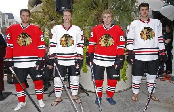
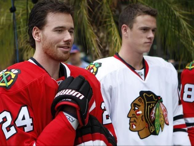
Chicago Blackhawks
The Chicago Blackhawks had one of the classiest and timeless jerseys before Reebok came long with their "new" ideas. The red Blackhawks jersey was iconic, and should be revered for its elegance and beauty. The Hawks unveiled their jerseys on Friday afternoon, and it appears that
the Blackhawks understand what their logo and look means. Nothing has changed, and this gets a major thumbs-up from me. I've always been a fan of their jerseys, and own an "Amonte" Blackhawks jersey myself.
The shoulder logo remains the same on the jerseys, a major highlight since it was an excellent patch already.
The hem stripes and socks look good, another major highlight. Like the other Original Six teams,
these jerseys are gorgeous.
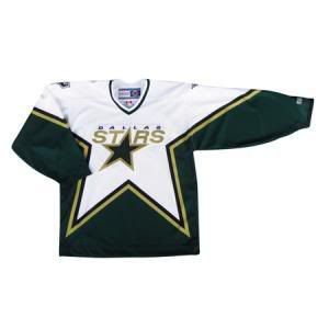
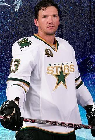
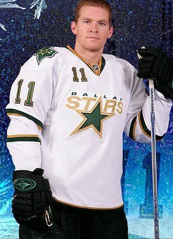
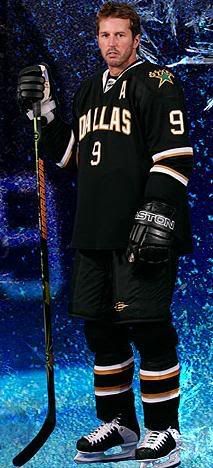
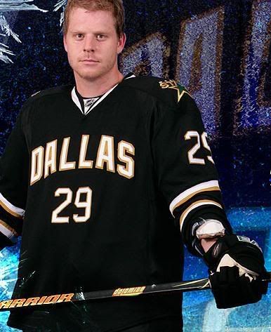
Dallas Stars
The Dallas Stars were informed that their old jerseys weren't going to fit on the new Rbk Edge Uniform System template, and would have to redesign them. Dallas had
a very recognizable jersey, and it was suitable as they are the Stars. Well,
the road jersey now looks like this. If you've been reading this blog for some time, you already know I don't like the shoulder numbers. The
Texas logo on the shoulder isn't bad, and I can live with that. However, these jerseys are entirely too white. They feel more like practice jerseys. The
home jerseys, though, are
entirely collegiate. It's a highly unique jersey in that it has no logo, but I'm sure
the people of Dallas know where they live. Looks like the Stars are going to rival
Vancouver and
Nashville in testing their fans' knowledge of where they're from. The Stars logo on the shoulder is alright. What really scares me is the new padding that
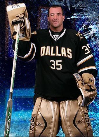
Marty Turco appears to be using this season. What's up with the gold? What happened to
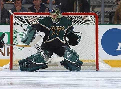
these pads? Or
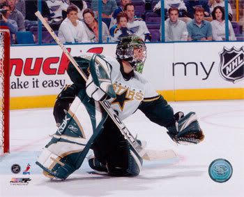
these pads? Heck, I'd even take
the Reebok pads or
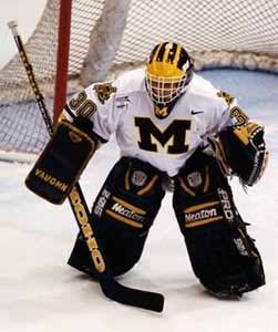
his Michigan gear over those gold pads. Absolutely horrific to the eyes. The jerseys, however, aren't that bad, but they still don't rank that highly.
Philadelphia Flyers
Can someone remind me when the primary colour of the Philadelphia Flyers went from orange to black? I could have sworn they wore
good-looking orange jerseys at some point in their existance. Well,
the Flyers went black with their home jerseys again this season, basically erasing almost all the orange from their jerseys.
The back font is the same as last season, but white-on-orange-on-black is nothing to be excited about.
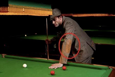
Looking at Simon Gagne from the side reminds me of those old suit jackets with
the elbow patches.
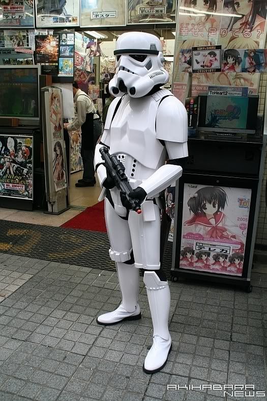
The road jersey appears to make Daniel Briere into
some sort of storm trooper. At least
the socks and road fonts look ok. Otherwise, I hate the Flyers jerseys. Just to make sure they did everything wrong, they
made a mockery of Ben Franklin too. You don't humiliate history, Flyers. Ever.
Phoenix Coyotes
The Coyotes had one of the better jerseys in the NHL in recent memory. Their brick red colouring was highly-recognizable, and the howling coyote logo had replaced the whatever the heck
this thing was. In any case, the Coyotes showed off
their new jerseys on Friday, and they look pretty good. Granted, the
jersey overall is pretty plain due to there being no hem stripe, but they are simple and elegant. The Coyotes kept their
Phoenix shoulder patch from their previous jerseys. The
home jersey, worn by their mascot Howler, looks pretty good too. I assume the "M" on the front of Howler's jersey stands for "mascot". Shane Doan
just has an "A". Overall, these jerseys are not bad, but not great. No hem stripes are a huge loss on these jerseys.
St. Louis Blues
The Blues have always had
fairly good jerseys. Their only mistake was
the inclusion of red during the Mike Keenan era, but that's
since been washed away. Saturday, the Blues unveiled
their new jerseys, and they are
less than appealing. I understand that the Blues have a colour in their name, but is there any need for the two different colours of Blue that look like fabric swatches rather than stripes? Were these jerseys made out of pieces of left-over fabric found on Reebok's floor? Oh, speaking of Reebok, thanks for
highlighting your logo. We had no clue
who made these jerseys. Back to the jerseys, there's no point in having the additional colour swatch below the shoulder yoke, especially when Reebok breaks up it up with their highlighted logo. Something else that caught my eye was the pants stripe. It looks stupid when
the jersey is untucked, and even worse when
the jersey is tucked in. Why does it stop at the hip? Why doesn't it match up with the yellow piping on the jersey? Who the heck is designing these uniforms?
Paul Kariya's expression indicates he realizes he made a mistake signing with the Blues. These will not rank highly on my list.
Speaking of the list, here it is, based solely on my opinion only and in reverse-order:
25. New York Islanders -
home and
road.
24. Los Angeles Kings -
home and
road.
23. Florida Panthers -
home and road.
22. Nashville Predators -
home and road.
21. St. Louis Blues -
home and
road.
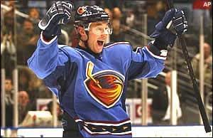
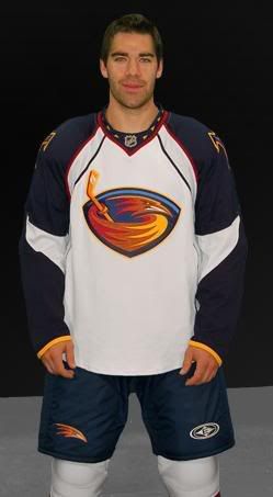
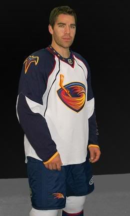
20. Atlanta Thrashers -
home and
road.
19. Philadelphia Flyers -
home and road... and Ben Franklin.
18. Calgary Flames -
home and road.
18. Vancouver Canucks -
home and
road.
17. Colorado Avalanche -
home and
road.
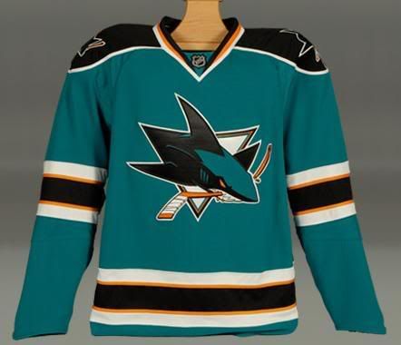
16. Anaheim Ducks -
home and
road.
15. Dallas Stars -
home and
road.
14. Tampa Bay Lightning -
home and
road.
13. Washington Capitals -
home and road.
12. Phoenix Coyotes -
home and
road.
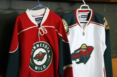
11. Minnesota Wild -
home and road.
10. Ottawa Senators -
home and road.
9. Columbus Blue Jackets -
home and road.
8. Pittsburgh Penguins -
home and
road.
7. Carolina Hurricanes -
home and
road.
6. Detroit Red Wings -
home only.
5. Toronto Maple Leafs -
home and road.
4. New York Rangers -
home and
road.
3. Chicago Blackhawks -
home and road.
2. Montreal Canadiens -
home and road.
1. Boston Bruins -
home and
road.
Edmonton is supposed to show off their jerseys on Sunday. I'll keep my eye on them and post when I can. I hope to have my Mark Bell article up by Sunday night, but it still requires a little tweaking.
Until then, keep your sticks on the ice!


 The NHL came down with their ruling today, and Steve Downie is being forced to sit for twenty games after his hit on Dean McAmmond. It's the fifth-longest suspension handed out by the NHL, and, quite frankly, I think it sets an excellent precedent for headshots. However, I do have some concerns about this suspension which I'll outline below. The suspension, in the eyes of this writer, is suitable for the offense committed by Mr. Downie, though. While I am surprised that the NHL came down hard on Mr. Downie, it has to be seen as a positive, especially when it comes to making the game of hockey much safer for the players.


