


You're Wearing That? - IceCats Exposed
 Having exposed the growing problem of promotional jerseys last week, there were some clearly hideous designs that teams wore on the ice. Whether it was the colour scheme or the jersey design itself, some of these jerseys were an assault on the eyes. Others, however, were well-designed and incorporated many different features such as background changes, colour scheme changes, and logo changes to reflect the promotion featured on the jersey. Of the promotions seen, St. Patrick's Day, Valentine's Day, Christmas and Halloween were the most common themes featured on the promotional jerseys. Today, however, I want to focus on one franchise that seems to have outdone itself with a myriad of changes in their decade-or-so of existance.
If I've learned anything from the esteemed Paul Lukas, author of the highly popular Uni Watch feature on ESPN.com and the immensely popular Uni Watch Blog, it's that uniformity is important. Changing your jerseys year after year makes you look like a beer league team in hockey, and the Worcester IceCats seemed to be the biggest beer league team in minor pro hockey. I'm going to run through these jersey changes year by year.
1994-95: The Worcester IceCats join the AHL. The IceCats got their start when original New York Islanders owner Roy Boe purchased the Springfield Indians AHL franchise and moved it to Worcester in the summer of 1994. The team began play in the fall of 1994 with a collection of free-agent players, but as yet with no National Hockey League team affiliation. Late in the 1994-1995 season, Boe and head coach/general manager Jim Roberts negotiated a deal with the St. Louis Blues to be the Blues' primary minor league affiliate.
Nothing spectacular here in terms of the jerseys they wore. I hate that gigantic stripe across the hem and sleeves. Note the nameplate font, and the little claw marks on the numbers. These will be little details that the IceCats can't decide on whether they like or don't like.
1995-96: The IceCats, in their first full-year as the Blues' minor league affiliate, decided that a jersey change was necessary in their second year of existance. As much as I abhor that font for lettering, it closely resembles Anaheim Mighty Ducks' Wild Wing alternate jersey font, right down to the vertically-arched lettering. They also added a patch to the front right shoulder. There was a problem on this jersey. They appeared to take a page out of the Indianapolis Colts' book by not having the sleeve striping go all the way around the sleeve.
If you're keeping score at home, that's four completely different jerseys (two home and two road) in two seasons.
1996-97: No changes!
1997-98: The IceCats held strong with the jersey design, but there were changes made on the back of the jersey. The fonts for both the name and numbers changed on both the home and road jerseys. They also added a patch to the hem in the middle of the jersey.
In four seasons, the IceCats have changed their jerseys six times. Ridiculous? Yes. Does it get worse? Read on.
1998-99: The IceCats design team decided to change the name font yet again. They also added a five-year/five season patch in the middle of the hem on the back of the jersey, replacing the patch from the year before. They also introduced a third jersey this season with a totally different font from their normal jerseys.
Still following? That's nine different jerseys in five seasons.
1999-2000: The IceCats changed patches on the front of their jerseys to Peterson Oil, marking another change on all their jerseys. They also changed their third jersey for the second time in two seasons from black to white as the primary colour, and altering the design to look more like the St. Louis Blues jerseys. The font for the name and number is clearly St. Louis Blues' font.
Still keeping count? Twelve jersey changes in six seasons.
2000-01: The powers-that-be in the IceCats organization decided that the third jerseys looked good, and made them their primary home jerseys for this season. However, they changed the number font again on the reverse by adding the claw marks. They also had to come up with a road jersey that looked similar to the home jersey. As a promotion, the IceCats did a St. Patrick's Day jersey as well. The fonts on the back remained the same.
Adding three more jersey changes to the total, that's fifteen jerseys in seven seasons.
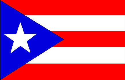
2001-2002: The IceCats actually stuck with a design for longer than seven months. They didn't change their home or road jerseys this season, but they did add a shamrock patch to both shoulders on the home jersey, and an American flag on the right shoulder of both the home and road jerseys. They did, however, add one promotional jersey: the USA jersey. However, when viewing the font on a single-digit jersey, it kind of feels like Puerto Rico's or Texas's flags. A jersey with double-digits doesn't solve the problem either.
Eighteen jerseys in eight seasons. We're not even close to being done.
2002-03: In this season, Worcester added something else to the hem of their jerseys on the back side: a St. Louis Blues logo on the left side. They also added a third jersey again - the third time in the franchise's nine seasons. Once again, it looked a lot like the St. Louis Blues jerseys at the time. The IceCats also went back to a St. Patrick's Day promotional jersey. Regardless of whether it is a single-digit jersey or a double-digit jersey, this one is extremely boring for a promotion.
Twenty-two jerseys in nine seasons. Was this franchise made of money, or did it just expect the fans to keep paying through the nose for current jerseys?
2003-04: Once again, Worcester changed the jersey sponsor patch on the front right shoulder of both the home and away jerseys as it appears that Peterson Oil changed their logo. The IceCats also introduced a tenth anniversary jersey which, to me, is a little unnecessary. A patch? I can live with that. A jersey? Give me a break. The number and letter fonts on the back of the jersey are actually the same as the St. Patrick's Day jersey font from the previous year. And like always, the IceCats celebrated St. Patrick's Day with another jersey showing off the Roman Numeral "X". Seriously, you have one jersey for your ten-year celebration. Don't combine a promotion with a promotion. That's terrible. I do like the fonts used on the St. Patty's Day jersey, though. Those are solid.
Twenty-six jerseys in ten seasons. And it keeps going.
2004-05: Worcester went all-out in their last season of being the "IceCats". They introduced a brand new logo on their jerseys. They decided to have another St. Patrick's Day promotion, but completely missed the mark in having silver for the main font colour. Why not white? They had a "Turn Back the Clock" promotion. Have you seen these jerseys before? They wore the same jersey as they did in their first season as a third jersey this season. And to top all the promotions off, they wore these W6 jerseys. The W6 jerseys were worn for two games (12/3/04 and 12/11/04) in honor of six Worcester firefighters who were killed battling a fire on December 3, 1999. The rear of the jerseys were as beautiful as the front of the jerseys. Within days of the tragedy, the team’s jerseys were adorned with the initials “W.F.D.” in 1999. Every year the team had a memorial tribute of some sort, including this jersey for the fallen heroes. Denis Leary is a cousin of one of the fallen firefighters, and, to this day, he still holds a charity/celebrity hockey game. It was started primarily for the families and charities of the Worcester Fire Department, but has since grown to include the Boston and New York Police and Fire Departments.*
That's a total of 31 jerseys in eleven seasons. 31! There are NHL teams that have been around for 100 years that haven't had that many jersey changes!
After the 04-05 season, the Peoria Rivermen owners bought the franchise, and moved it to Peoria. The Rivermen and IceCats joined the AHL as the Peoria Rivermen in 2005-06.**
The IceCats have some very nice jerseys, but all these changes seem unnecessary. I am a fan of the W6 jerseys, though. Good for the IceCats franchise to honour the heroes of that city. Keep your sticks on the ice!
*Thanks to "Original Jim" for the additional info on the W6 jerseys.
**Thanks to "RaoulDuke" for the info about the Rivermen and IceCats.


No comments:
Post a Comment