


Eureka!
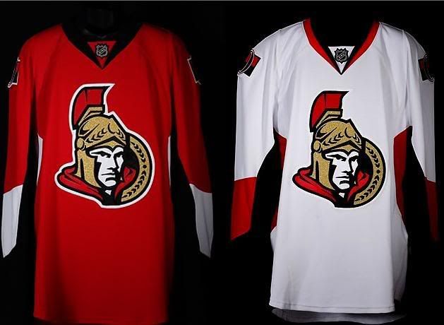
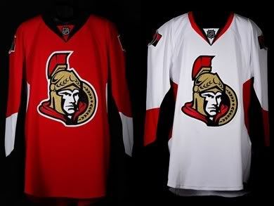
 It has been a while since my eyes have been as happy as they are in terms of the new Rbk Edge Uniform System that was unveiled on Wednesday at Scotiabank Place. I'm not sure if there is a competition among the NHL Divisions, but the Northeast Division is certainly heads and shoulders ahead of the other divisions. First, the Boston Bruins came out with an excellent traditional design. The Ottawa Senators, not to be outdone by their Northeast rivals, have come up with an excellent jersey design, and they have moved to the head of the class.
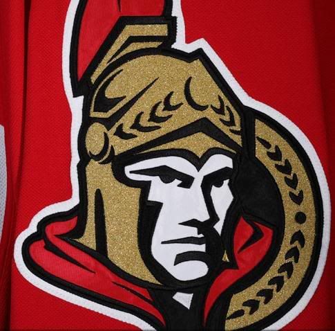
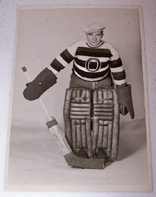
The Ottawa Senators decided that they would change their primary logo from the old side profile of the Roman legion to the half-facing legion known as the Warrior. As you can see, the new primary logo has been updated since it used to look like this.
In keeping with the changes, the Senators decided that traditional was the way to go, and this writer fully commends and salutes the changes. As you may or may not know, I've been very critical of some of the changes made so far by some of the teams.
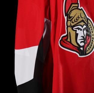
The Senators did a complete U-turn in terms of their design. First, they kept the new jersey design simple. There's no piping along the seams, there's no awkward blocks of colours on the sleeves, and there's no stupid hem or sleeve striping to be found. The design is simple and elegant, and looks great on the players. The font on the rear of the jersey appears to copy that of Team Canada's old jerseys, but it doesn't detract from the jersey. I am slightly concerned about breaking up the blocks of colour on the lower sleeve, buy it hardly affects the pleasing aesthetics of this new Senators jersey thus far.
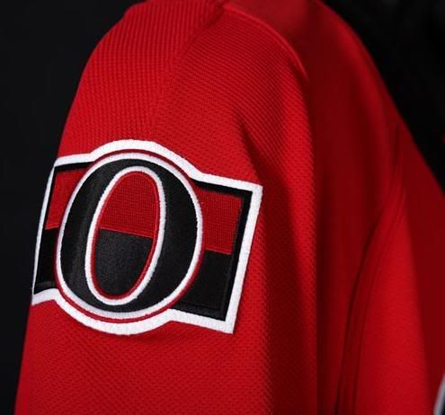
The Senators, in keeping with respecting their tradition, have honoured their teams from long ago with a classy shoulder patch. As they wrote on their gallery page, "[t]he uniforms also feature a new shoulder patch with a retro 'O' symbol on a striped background, a tribute to the original Ottawa Senators as the modern team celebrates its 15th anniversary on the ice". As you know, this writer is a huge fan of tradition in NHL jerseys, and this shoulder patch gets a huge thumbs-up for its simplicity and traditional elements.
A big "thank you" goes out to the Ottawa Senators. You've restored hope in me that someone in the NHL gets the idea of simple, classy jerseys. You don't need flash and flair to sell jerseys or make your team look modern. Both the Bruins and Senators have shown that less is more when it comes to an elegant look.
I am truly a fan of these jerseys, and the Senators certainly rank near the top with this new look. Hope has been somewhat restored.
Until next time, keep your sticks on the ice!


4 comments:
Almost a perfect redesign, just gotta lose the stupid white spots on the backs of the jerseys.
I like the vertical stripes on the pants. More NHL teams need to do that
no mention of the terrible socks? the strange, not quite wrap around sid epanels? i do love the shoulder patch but i was never into the half face logo, i liked the full profile. ah well, it's still better than most!
Nah... socks aren't a huge concern to me. They're different, but so were the socks for the Nike Swift jerseys at the Olympics. The side panels are troubling, but are far better than some of the other new jerseys.
The full profile is being used still, just not as the primary logo. I liked it better too, but this one isn't all that bad.
And yes, the jerseys still look better than most!
Post a Comment