


Look Away... I'm Hideous
 Between the ridiculous jerseys of the Northwest and Southeast Divisions that have been unveiled in this offseason, the NHL and Reebok have taken a scared institution known as the hockey sweater and turned it into a laughing stock. No longer do the jerseys evoke a sense of pride and loyalty to a team. Instead, they make me ashamed and embarrassed for the NHL. I liked Minnesota's jerseys, and was nice about Colorado's recent unveiling when I could have been much more cruel. I was critical of both Vancouver and Calgary. Carolina's was a good jersey, but Washington, Tampa Bay, and Florida could have been much better.
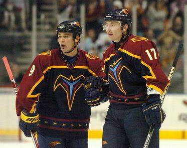
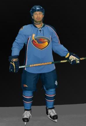
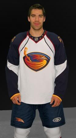
Today was the Atlanta Thrashers' big unveiling. I'll go on record right here, right now as saying that I was never, and never will be, a fan of their baby blue alternate uniforms. Bold colours work to be intimidating. Pastel colours do not. I had hoped that Atlanta would ditch the "True Blue" crap, and stick with their original home uniforms. The Quebec Nordiques are the only team that gets a pass from this due to their history with baby blue. I've never seen a baby blue Thrasher bird before.
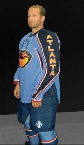
Well, their home uniform for this coming season has me extremely disappointed. I hate these jerseys! I hate them even more for that stupid "Atlanta" that runs down the sleeve. I ahted it last year, and it bothers me again right now. But I hate them even more than that because the hem stripe is gone from last season. Baby blue is the colour that you paint a baby boy's room. You do not dress men who play a physically violent game in a pastel colour. As unique as the colour is to hockey, it's also equally stupid.
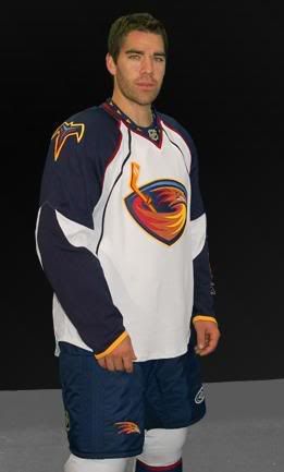
Their road uniforms incorporate some larger aprons that some of the other teams. I'm not sure if they get extra messy at their block parties, but you rarely need an apron that big for a barbecue party. The faux elbow stripes also bother me, especially since there's a tiny white line connecting the two. Why not just connect the two ends of the stripe? Is it really that hard to do? No hem striping again on this jersey either. Why is it so hard to put a hem stripe on a jersey?
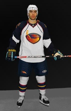
Overall, the Thrashers rank right up there with the likes of Florida and the Long Island Broncos for worst jerseys. I'm not one to ever turn off a game of hockey when watching it on TV, but I may make an exception if Atlanta's playing at home.
I plan on looking at the Mark Bell suspension this weekend. I've been going over a lot of the information out there, and getting the full story. It should be a good topic worthy of a discussion, and the points I hopefully will make should hopefully stir some comments. In any case, I'll be working on that this weekend. Also, I'll be posting the new looks of the Anaheim Ducks, Chicago Blackhawks, Dallas Stars, and Philadelphia Flyers this weekend, along with my commentary on them. I'll re-rank the unveiled jerseys as well.
Until then, keep your sticks on the ice!


2 comments:
tually like the Thrasher's unis... a lot. Yes the "Atlanta" down the sleeve is kinda dumb, but overall, I really like them
Warning, I am a complete sucker for baby blue. Complete sucker. I love the color, and think Atlanta's jersey's incorporate it well. I don't like the one sleeve thing, but at least they aren't a template jersey, and they have some originality.
I think I have a problem with the "Atlanta" that runs down the sleeve as well. And I think I have a problem with Alexi Zhitnik modeling it with baby blue socks. I know he's a veteran and all, but was there no one else?....no one else perhaps...pleasing to the eyes?
My Kings just have the crown on the front of their jerseys now, which I really like. They kept the city and name along the bottom while taking away the hem striping, which I think looks pretty good. Wait... do you have a Kings post that I haven't seen yet?
Post a Comment