


Clothes Make The All-Star
 Well, this is a big one. The NHL All-Star Game has changed its look over the years as the formats for the game being played have changed. Teams that are hosting the event had some say over the design of the All-Star jerseys in the past, but the NHL has tightened control over these designs. Some were bad, some were good, but all were available for scrutiny. Today, we wade into the realm of fashion to take a look at some of the designs worn at NHL All-Star Games.
Please note that I am not going to do this on a year-by-year basis. Rather, I will point out design elements and changes between the uniforms. It's a little easier this way, and shouldn't allow this article to become an encyclopedia of All-Star uniforms. Also, I am only going to focus on 1960 and forward. If it's beyond that timeframe, there won't be much talk about it. One jersey will stand out from the rest from pre-1960, but that's to be seen below. Anyway, stop sitting around in your skivvies, and start on the journey through the All-Star jerseys.
In 1947, the NHL All-Stars wore these classy sweaters. Colourful and vibrant, the All-Stars beat the defending Stanley Cup Champion Toronto Maple Leafs by a 4-3 score in the 1st NHL All-Star Game. The stripes make this jersey significantly different than any jersey used in the league at that point.
As a side note, the NHL All-Stars continued to use this design into the 1950s, but they added one little detail that really stands out as something unique: the year of the All-Star Game is on the NHL shield. These sweaters will be seen again.
In 1955, the NHL switched to a white jersey as they began to run into problems with the Red Wings and Canadiens looking somewhat identical in red. These are alright, and look very similar to the previous jersey, only coloured differently.
From 1960 until 1964, the NHL All-Stars wore this simple sweater as they took on the Maple Leafs in Toronto. The sweater pictured is Jean Beliveau's, and it has some very nice elements to it. The three stars (two front, one on the back neckline) representing the All-Stars is a nice touch. I'm a little confused about the shoulder element, though. It seems to serve no purpose aesthetically. I would have preferred stripes down the arm or a yoke. But that's just me.
We'll jump ahead to the 1968 All-Star Game where the NHL All-Stars battled the Maple Leafs in Toronto again. This game was played in a more sombre mood that most All-Star Games. Bill Masterton of the Minnesota North Stars had been hit by two California Seals two days earlier, and had struck his head on the ice. Word came in that Masterton had passed away the following day - one day before the All-Star festivities. Heavy hearts were evident at the game. The All-Stars wore these jerseys, as seen on Bobby Orr in his first All-Star appearance. They look somewhat similar to the 1963 version, but the stripes on the shoulder are better than the trapezoidal shape. My only complaint is that they stop at the sleeve number. Bobby Orr wore #5 in this game so that Jean Beliveau could wear #4 - a classy move by Orr in respecting his elder statesman. These jerseys were worn from 1965 until 1968.
After the 21st NHL All-Star Game in 1968, the NHL changed formats to represent the East and West. The Eastern Division, or Original Six Division, was represented by Montreal, Boston, Chicago, Detroit, New York, and Toronto. The Western Division, or Expansion Six Division, was represented by St. Louis, Oakland, Philadelphia, Los Angeles, Minnesota, and Pittsburgh. This meant that two All-Star teams could be derived from the two divisions, and that's precisely what the NHL did. The white jersey, worn by the Original Six teams, remained the same. The dark jersey was simply a differently-coloured version of the same jersey. This new dark jersey lasted until 1973.
In 1973, the NHL updated its All-Star looks. The league had grown to sixteen teams by this point, so there was a larger pool of players to choose from. The West Division wore orange in the 1973 All-Star Game, while the East went white. Two divisions, two teams, two stars on the shoulders? Perhaps. The stars on the hem stripe are a nice touch, and the little star in the elbow stripes is an added bonus. The NHL stuck with these uniforms until 1982. Kings' goalie Mario Lessard shows a little flair at the 1981 All-Star Game in his stylish uniform.
At the 1982 NHL All-Star Game, someone lost their mind. I'm not sure who approved this design, but NASA had to be involved with this many stars on the jerseys. The NHL stuck with the league colours of orange, white, and black, so that's a plus. However, the number of stars make me wonder if each star represented a roster spot on the All-Star Team. Wow. The Campbell Conference wore orange, while the the Wales Conference wore white.
Someone must have realized that the 1982 jerseys were a mistake. The 1983 NHL All-Star Game saw sanity found as the Wales Conference wore this design, while the Campbell Conference wore this design. While they have a very New York Rangers-feel on the front, the stars around the hem are a nice touch. Three stars down the arm will come back into play later on. Surprisingly, the manufacturer's logo on the rear of the jersey is that of Kappa, an Italian-based sports apparel company. I have no idea how they got involved in manufacturing the 1983 NHL All-Star jerseys. Gretzky celebrates in his Kappa-made jersey.
In 1984, the NHL went away from Kappa, and changed the font used on the front of their All-Star jerseys. Otherwise, the jerseys remained entirely the same.
At the 1985 NHL All-Star Game, the NHL made another slight change to the jerseys. The front of the jerseys remained the same, but gone from the rear numbers and name is the drop-shadow.
The 1986 All-Star Game saw the drop-shadow return with the jerseys remaining the same. It seems the NHL can't make up its mind on whether or not the drop-shadow lettering and numbers work for the All-Star Game. Lemieux and Gretzky faced off in a dramatic battle of superstar scorers.
Gretzky and Lemieux show off what the NHL chose for them to wear at Rendez-Vous '87. It harkens back to the jerseys worn in the 1970s for All-Star Games and the Challenge Cup against the USSR, but it still has that NHL-feel with the white, black, and orange.
The NHL decided it liked the look of the NHL Shield on the front of the jersey, and decided to add it to the 1988 All-Star Game jerseys. The jerseys themselves are the exact same design as the 1986-style, but the font on the back changed - no drop-shadow (go figure!) - and the logo is different. NHL All-Star Game patches started in 1989 with each host team designing their own patch which was worn on their jerseys all season long, and appearing on both Conferences' All-Star jerseys. The first home team-inspired patch, marking the St. Louis All-Star Game, can be seen here.
The 1989 All-Star Game saw the NHL go to contrasts as the Campbell Conference wore white, while the Wales Conference went with a black jersey. The new jersey design worked the stripe around the waist back in, but the stars were removed from the sleeves. The new design is sharp, but it will only last until 1993. Lemieux flew down the boards in his white jersey.
1992, however, was a monumental season for the NHL. 1992 marked the 75th anniversary of the founding of the NHL, and the NHL celebrated their longevity in a number of ways. The All-Star Game was a huge celebration, and the NHL went back to its roots for the All-Star jerseys. The Campbell Conference took the ice in these jerseys, while the Wales Conference arrived in these jerseys. The Campbell Conference jerseys are similar to those worn in 1947, while the Wales Conference jerseys is the same style, just coloured differently. Very classy, and the game looked great in the old-style jerseys.
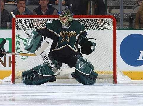
We move on to 1994 as the Campbell and Wales Conferences are left behind for the Eastern and Western Conferences. With the change comes a radical new All-Star jersey design - instead of wearing stars, the players will don a star. What do I mean? The Western Conference All-Stars skated out in this design, while the Eastern Conference All-Stars debuted in this design. Despite some people complaining about this look, it was actually adopted by an NHL team in 1997. The Dallas Stars began wearing this design as an alternate jersey in their team colours. And in 1999, the Stars adopted this design as their jerseys for both home and road games. Back to the All-Star Game jerseys, I actually own one of these jerseys, and it's a point of pride in my small collection. Ladies and gentlemen, I give to you my Teemu Selanne 1996 All-Star Game jersey. Sweet! Another patch was added to these jerseys. Along with the NHL All-Star host team patch, the players wore patches representing their respective teams. Identifying players was never this easy. Maybe it was to help in identifying which team played in which conference?
The 1998 NHL All-Star Game saw another change in formats as the NHL tried to generate interest for the Nagano Winter Olympics. The NHL switched the All-Star format to North America versus the World, despite some major complaints. The North American squad debuted in these jerseys, while the World Team skated in these designs. Fairly underwhelming designs - a trend we'll see for a while in All-Star Game fashions. A third patch was added to these jerseys as each player had the flag of his country added to the jersey. Complaints arose over the North American Team's selections since the majority of players were from Canada. To make matters worse, the number of Americans on the North American Team dropped from 1998 to 1999 from seven players to five players. These jerseys didn't make it past 1999, though.
That means that the 2000 NHL All-Star Game would look different again. And it looked very different. The North American players would wear this. The North American goaltenders would wear this. The World players would wear this. And the World goaltenders would wear this. Why the four jerseys? No clue. The thing that really irritated me was the goofy collars on the jerseys. What's the point? And why were the World players only subjected to this? By the way, check out Brett Hull's gloves in that last picture. What's up with those monstrosities? These might be the worst All-Star Game jerseys yet. No stars, no glitz, no glamour, no fun. Thankfully, they didn't get past 2001.
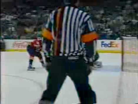
As an aside, the NHL began to experiment with what the referees were wearing by having them test new designs as well. The 2000 NHL All-Star Game saw Kerry Fraser and Don Koharski don these abominations. You're seeing that correctly - one orange stripe on the left side of the body. Absolutely stupid. It never went any further than this game, but there will be more tinkering with the referee's uniform to come.
The 2002 NHL All-Star Game in Los Angeles brought out the stars as Barry Melrose and Tim Robbins show off the extremely boring jerseys worn at this game. The World Team went maroon, but these jerseys, while simple and uncluttered, offer nothing visually to excite the viewer. Jaroslav Modry looks less than enthralled.
The 2003 NHL All-Star Game went back to the Eastern Conference versus the Western Conference, but the jerseys are still disappointing. Yeah, they look futuristic, but where's the flair? Brodeur doesn't look like an All-Star, does he? And the numbers on the lower left? Absolutely useless. At least the Western Conference has something to celebrate. What are they celebrating? No clue.
The 2004 NHL All-Star Game in Minneapolis went back to basics, and the look really was one of the best in the last 20 years. The cream-coloured Eastern Conference jersey was highlighted with red, and it looked very sharp on the ice. The green-coloured Western Conference jersey was highlighted with the cream colour, and it jumped out against the ice as well. The stars returned to the hem of the jersey - a big thumbs-up from this writer. A major change saw the removal of the flag patch worn during the North America vs. World games. However, in a statement of honouring and remembering a fallen teammate, Ilya Kovalchuk customized his All-Star jersey with the Dan Snyder memorial patch - the first time a team-specific patch has been worn on an All-Star jersey. A classy move by Kovalchuk, and one that should not be overlooked.
The 2007 NHL All-Star Game saw the Rbk EDGE uniform system introduced to the world. I'm still not a fan of what Reebok has done to NHL uniforms, but it's all we have, so what can I do? There were complaints from the players, but it didn't stop Daniel Briere from winning the 2007 All-Star Game MVP in the Rbk EDGE jersey. The Western Conference played in blue uniforms, and looked very good compared to the Eastern Conference's white-dabbled-with-red look. Sheldon Souray's gloves looked like they have a base coat of white paint on them. The stars, however, are very prominent on these jerseys despite them being hidden when the arms are down, carrying on a great detail of the All-Star jerseys. However, the introduction of the front numbers is an unnecessary move.
Speaking of unnecessary moves, the NHL decided to tinker with the referee's uniform again in 2007. The arm bands of the referees have always been orange to match the NHL shield colour. However, when the NHL shield went silver and black, the NHL thought they should update the referee's arm band as well. In fact, the NHL went as far as declaring that this new look for referees would be standard for the 2008-09 season. Needless to say, the silver arm bands fell to the wayside much like the orange body stripe did in 2000. Greg Kimmerly and Mike Leggo looked pretty snazzy in those pictures, didn't they?
The 2008 NHL All-Star jerseys featured the Eastern Conference in red and the Western Conference in white. I would have gone with white helmets on the Western Conference players as opposed to blue, but that's just my opinion. On the other hand, I would have had the Eastern Conference players in red helmets as opposed to white helmets. While I'm happy to see the stars down the sides of the jersey, the fronts of the jerseys seemed far too plain. Why not throw a star or two on the shoulders? Maybe a stripe or a shoulder yoke? C'mon NHL... you're better than this.
The 2009 NHL All-Star Game in Montreal present another look to the All-Star jerseys. The Western Conference players will appear in these uniforms. The stylized, futuristic font remains on the jersey, and the unnecessary front numbers remain. The Eastern Conference players will take to the ice in these jerseys. It's interesting to note that the Western Conference players will wear the three stars containing the three years that Montreal has hosted the All-Star Game on the right arm, while the Eastern Conference players will wear the stars on the left arm. That means that there will be one period on television where the stars will not be seen during face-offs. Not the brightest of design ideas, is it? I'm not a fan of the swooping third colour from the armpit across the bottom hem. Why is this necessary? These jerseys have such good elements, but such bad design flaws. Such is the way with Reebok jerseys, I guess.
And we're not done there. The NHL is planning to revamp the officials' uniforms yet again, despite failing miserably on the previous two attempts to revamp the referees' uniforms. The 2009 redesign looks like this. Simply horrendous. The NHL officials will now look like NFL officials. And that cone of orange on the bottom of the ref's arm? Is that some sort of penalty pylon? A dunce cap signal? Good luck to the four men who will be the first to wear the "new and improved" officials' uniforms: referees Marc Joannette and Brad Meier, and linesmen Pierre Racicot and Greg Devorski.
Here's a quick message to Reebok and the NHL: STOP SCREWING WITH THE OFFICIALS! The only acceptable change that I'll take is if they go back to these uniforms. Otherwise, stop messing with something that doesn't need to be changed.
So there you have it, kids - a look back at NHL All-Star Game fashion. Yeah, it ended up being a much longer exposé than I would have liked, but c'est la vie. See how I'm working a little French in there? That's savoir faire, mes amis. Beauty, eh? Tomorrow is NHL All-Star Game highlight day. Tune in for some of the best NHL highlights I can scrounge together before you tune into the Skills Competition tomorrow night.
Until then, keep your sticks on the ice!


4 comments:
I'm surprised you didn't mention those awful reebok edge non traditional socks the last 2 years. At least they look more reasonable this year.
The ref uniforms are a tragedy though.
I could have, Eric, but that's like beating a dead horse. Calgary, Ottawa, NYI... lots of teams have horrific socks.
But you are right in that the ASG socks the last two years have been pathetically bad.
Teebz, I love this stuff. Keep up the good work. Only comment to make is that I would recommend noting that the Wild play in St. Paul, not Minneapolis. It's unfortunate but the western twin preferred the NBA to the NHL.
"Ilya Kovalchuk customized his All-Star jersey with the Dan Snyder memorial patch - the first time a team-specific patch has been worn on an All-Star jersey."
I believe this statement is wrong. In 1986 at the Hartford Civic Center- Flyer Players playing for the Wales Conference All-Star Team wore a #31 on their left shoulder in honor of Pelle Lindberg who died in a car crash earlier that season.
Post a Comment