


Simply Red

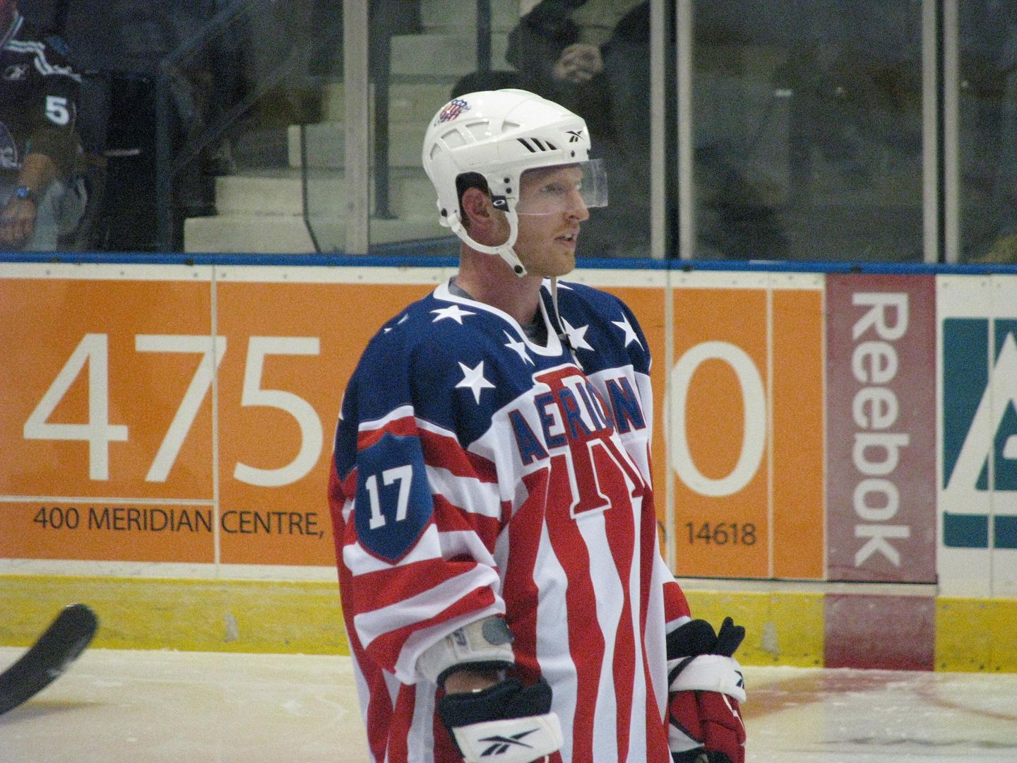
If you remember what the Americans wore as their alternate uniform in recent years, the stars-and-stripes uniform was very fitting to the Americans' name. Honestly, I really liked this uniform because of how they designed it with the stripes running vertically, but I can see how wearing the flag a dozen times per year may lose its caché. The Americans have now retired that uniform, and gone back a past alternate jersey.
This is the uniform set for the 2012-13 Rochester Americans, and, as you can see, they have re-introduced a red alternate uniform.

If we look at this Rory Fitzpatrick uniform from 2002-03, you can clearly see the similarities between the old and new alternate uniforms - same striping pattern and logo as the old alternate. Of course, there is the have-to-be-included-on-every-alternate-uniform lace-up collar on the new alternate, but I can't say that there's anything bad about the Amerks' new alternate look. It's simple, classy, and traditional.
While it may not feature any "hot new design aspect", the Amerks get a thumbs-up from me for going back to something that worked so well for them in the past. When you do things right, you never have to re-invent yourself with some idiotic, garish new design. While they may not be the best team in the AHL this season, they can at least look like they belong with the best.
And there's nothing ever wrong with that.
Until next time, keep your sticks on the ice!


2 comments:
When I see all three Americans jerseys side by side, it really does make sense. It's not flashy individually, but put all three together, and it just comes together in the best way possible.
As an Oshawa Generals Alum, I love the red MAmercs sweater!
Post a Comment