Saturday, 25 August 2012

It's Not A CBA Ticker, But...

If you're reading this article, chances are that you've noticed the new addition in black to HBIC. I now have a hockey headlines ticker running on the old blog, and you are able to click any of the news stories. If you do click a story, the story will open in a new page and you can read until your heart's content! While I wanted a CBA ticker to bring the current news on the ongoing negotiations between the NHL and NHLPA, I just couldn't find a news feed that covered just CBA topics. And since I like the look of it and, ultimately, find myself wanting to keep it, it's now a hockey headlines ticker.

Today's article is going to be a very short one. I have to get my tail to bed as I'm participating in a softball tournament all weekend, and let's just say that the sunburn I acquired today already has me in sleep mode. We have a chance to win the whole thing tomorrow, so I need some sleep to be in top form.

Now that I have the ticker and the favicon sorted out, is there anything else you, as readers, would like to see added to HBIC? Hit me in the comments with your suggestions! I will leave you with this teaser, though: something big is coming in September.

Until next time, keep your sticks on the ice!

Friday, 24 August 2012

Uni Watch Ranks Hockey

Uni Watch is a fantastic blog where everyone shares an obsession for the smallest details on uniforms. I happen to prefer the hockey chatter more than NFL or MLB, but I'm not here to rain on anyone's parade. Paul Lukas, the writer of the ESPN articles and the blog, was given an assignment by his ESPN editors to rank the 122 professional sports franchises' uniforms from the four major North American pro sports. Of course, this is a huge task, but he did it, and there were some surprises. Personally, I was really only interested in the hockey rankings, and that's why I'm writing this article today.

I'm not here to rip Paul's rankings apart. Rather, I want to know what you, readers, think of his rankings. I will tell you that I disagree with where some teams finished, but there are some teams that absolutely deserve their rankings. What I will do, though, is post the list from #30 to #1 with Paul's overall ranking out of 122 pro teams in parentheses. After that, we'll discuss. Good? Good. Here's the list.

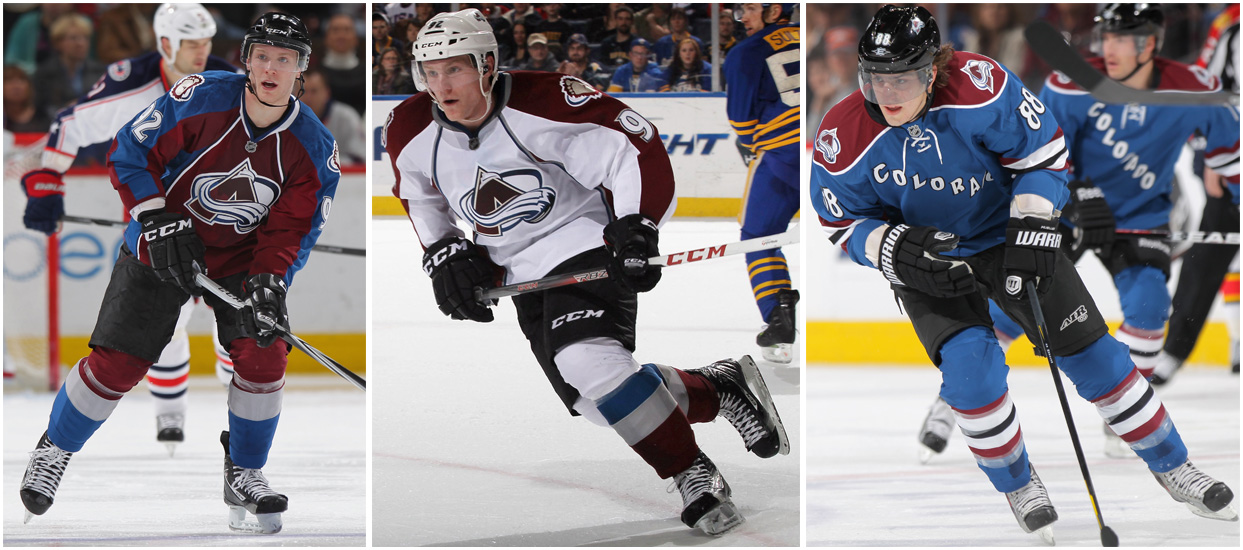
#30(118) - Colorado Avalanche: "Once upon a time, this was a passable-looking team. Not great, but passable. Now, though, it's a jumble of ill-fitting elements -- the apron-string jersey stripes, the pointless side panels, the laughable number font, the alternate jersey that's just a Rangers rip-off. If a team could get a game misconduct for its uniform, the Avs would certainly deserve one."

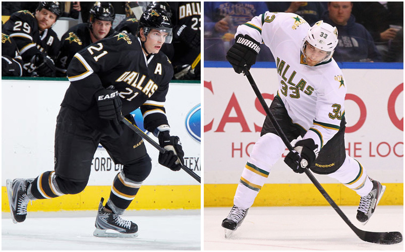
#29(117) - Dallas Stars: "You know how people like to say, 'Less is more?' It's often true -- but not always. Sometimes less is less. Granted, there's something perversely amusing about a flashy city such as Dallas being saddled with such a snoozer of a design, but come on. Did the team's graphics department go on strike or what?"

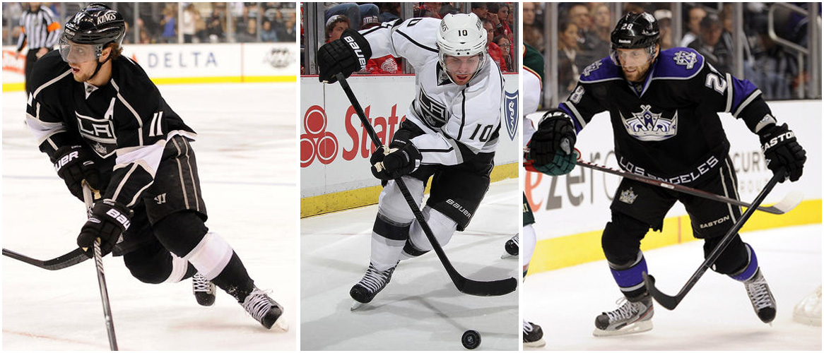
#28(112) - Los Angeles Kings: "The reigning Stanley Cup champs deserve better. The crest is too cartoonish, the stripes down the shoulders and sleeves don't work, and let's not even get started on that alternate uni. The whole set feels like what a minor league affiliate should be wearing."

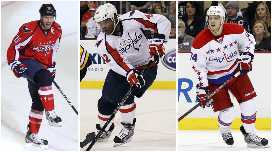
#27(107) - Washington Capitals: "Yeesh, all those apron-string stripes and sleeve panels -- way too busy. And the shoulder logo has always looked like an eagle being impaled on an oil can. The throwback alternate helps, but it's too little, too late."

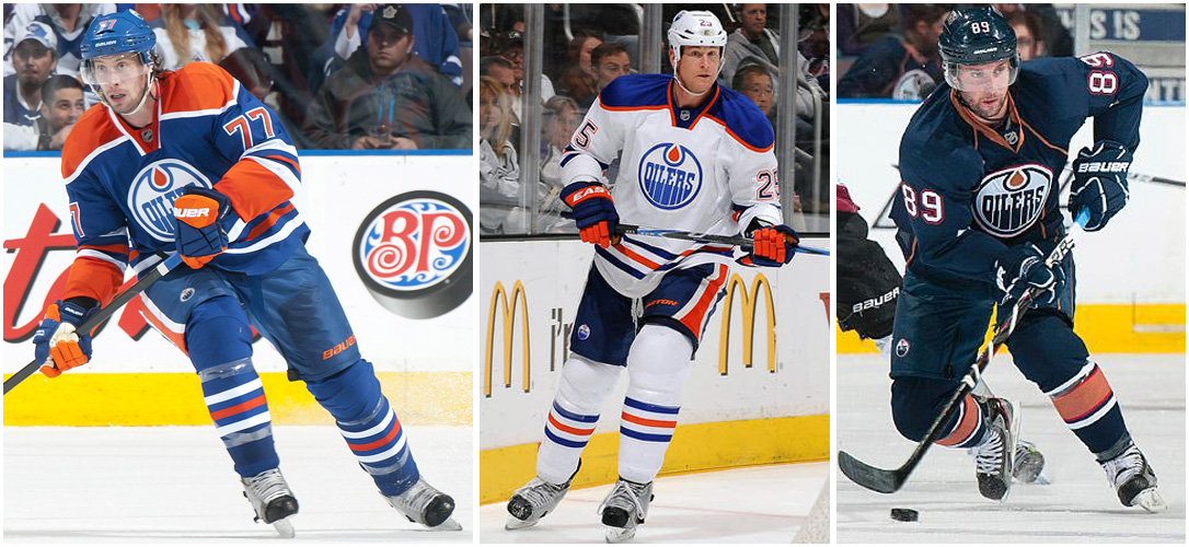
#26(104) - Edmonton Oilers: "Some logos look timeless and age nicely; others feel visually tied to a particular era and end up looking dated. Guess which category the Oilers' primary logo falls into? If there was a TV program called 'That '70s Team,' this would be its logo. Come on, guys -- you've have the exact same logo for 40 years now, and it's clearly outlived its expiration date. Surely you can update it at least a little bit."

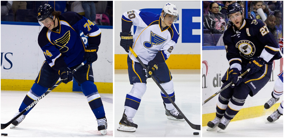
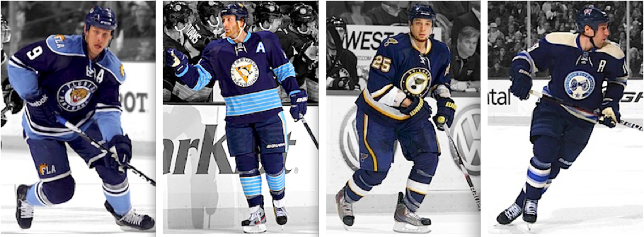
#25(100) - St. Louis Blues: "The Blues have been ill-served by Reebok's Edge template. The apron strings, swoopy stripes on the pants, the collarbone horns -- it's all too much. And the third jersey feels like a pro forma stab at traditionalism. If they want to look traditional, it's easy: Just strip all the nonsense elements from the home and road designs. A shame, because their primary logo is still among the strongest in the league."

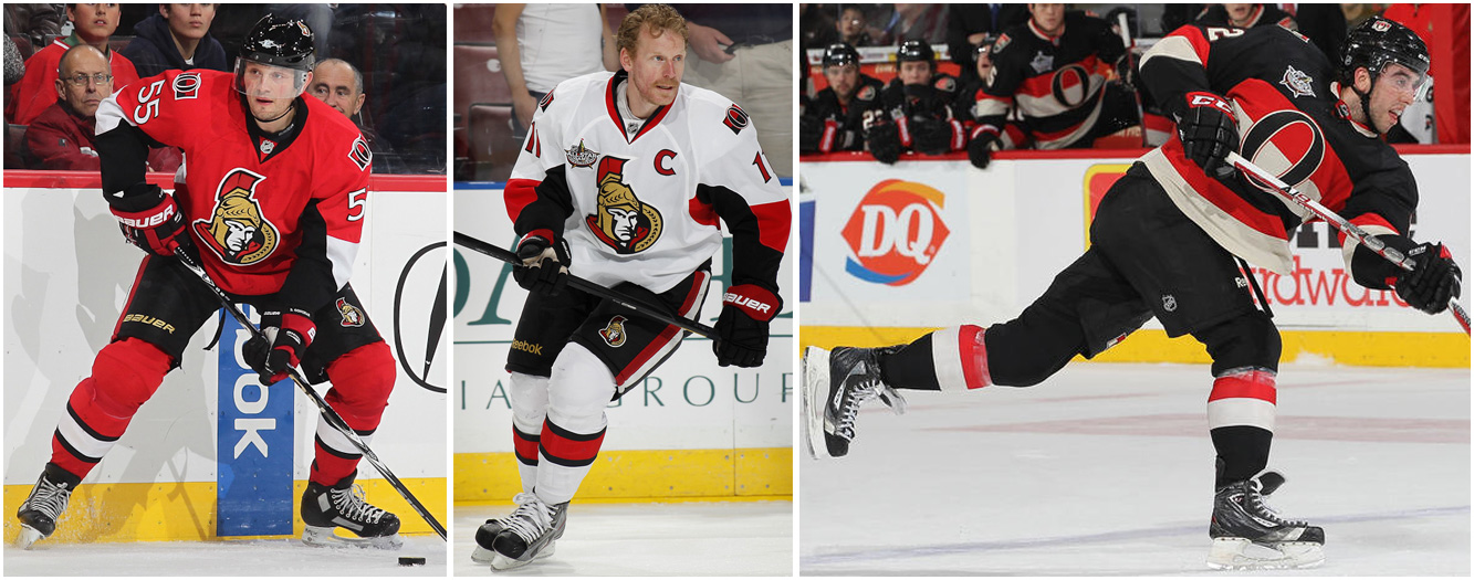
#24(99) - Ottawa Senators: "Anyone else out there think the Sens usually look like an AHL team that took a wrong turn on their way to the minor league arena? The main problem is their centurion logo character, who's always felt a bit lacking in gravitas. The black lines are too thick, especially on his face -- give him some details, some feeling, some dignity. The barber pole throwback is a hoot, though."

#23(97) - Anaheim Ducks: "There's lots of potential here: The orange and bronze tones work really well together, the giant webbed foot is an icon in the making, and the wordmark (usually a no-no for hockey jerseys) isn't bad. But the diagonal striping on the home and road jerseys feels too gimmicky, and the alternate design is weighed down by the side panels and the phony yoke outline. One day this will probably be a very good-looking team. But not today."

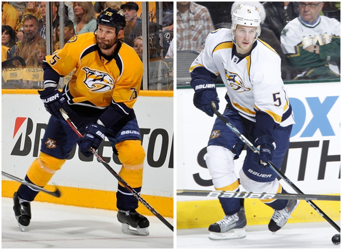
#22(94) - Nashville Predators: "The collarbone horns are somewhat defensible, since they sort of mimic the teeth on the crest logo. But the apron strings going down the length of the jersey -- front and back! -- are too much. Clean that up and then we'll talk."

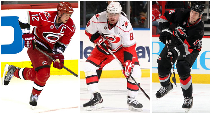
#21(91) - Carolina Hurricanes: "What's the deal with all these NHL teams that now have fake shoulder yokes? If you want a yoke, use a real one, like the Rangers or Devils -- don't just draw an outline to show where it would go. Aside from that, not such a terrible set."

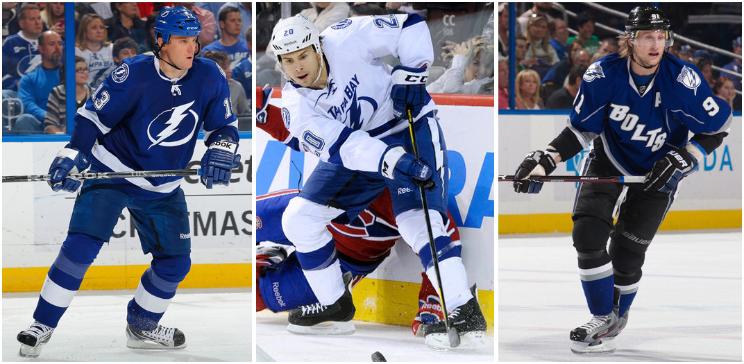
#20(81) - Tampa Bay Lightning: "Once you get all the Shazam and Grateful Dead jokes out of the way, it's not such a bad uniform. The wordmark on the road jersey is a mistake, though, and there's no need for those shoulder patches when you already have lightning bolts on the chest and pants. The bigger problem, though, is that awful alternate design. Eliminate that and you'll have the very definition of addition by subtraction."

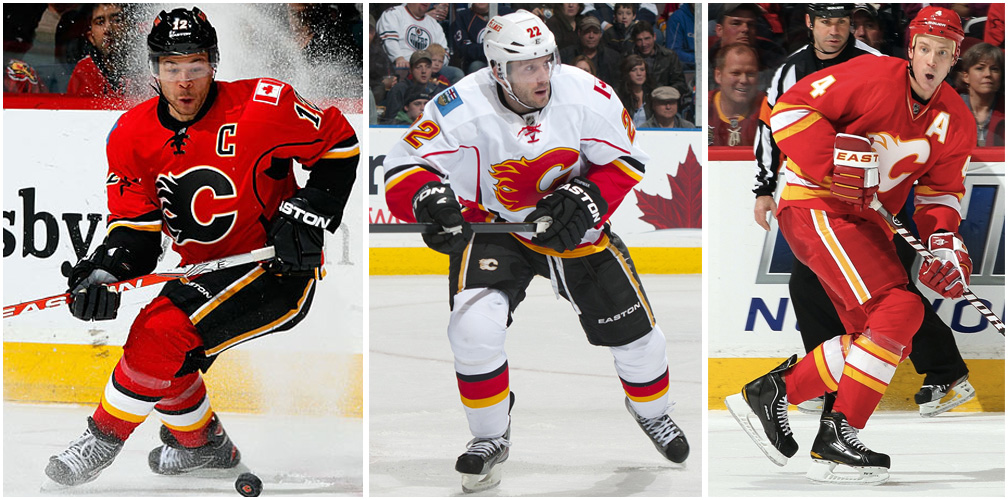
#19(79) - Calgary Flames: "Black has never felt like a good color for this team. You're the Flames, not the charred ashes! Change the black crest to white on the home jersey, and clean up the underarm area and side panels on the home and road designs, and you have a perfectly solid wardrobe. Bonus points for using the franchise's old Atlanta Flames logo for the alternate captaincy designations."

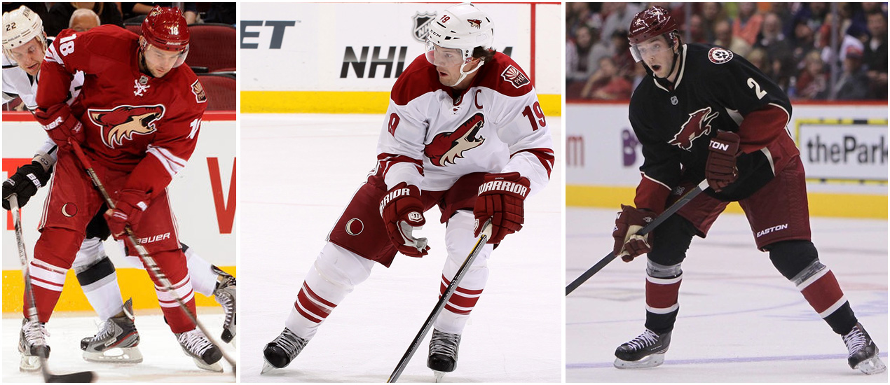
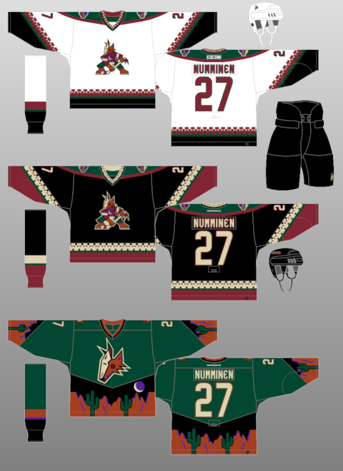
#18(76) - Phoenix Coyotes: "Admit it: You miss their Cubist phase. Sure, it was silly, but playing hockey in the desert is a silly enterprise to begin with, so why not run with that? There's nothing wrong with their current look when viewed in a vacuum, but it feels a tad unadventurous, no?"

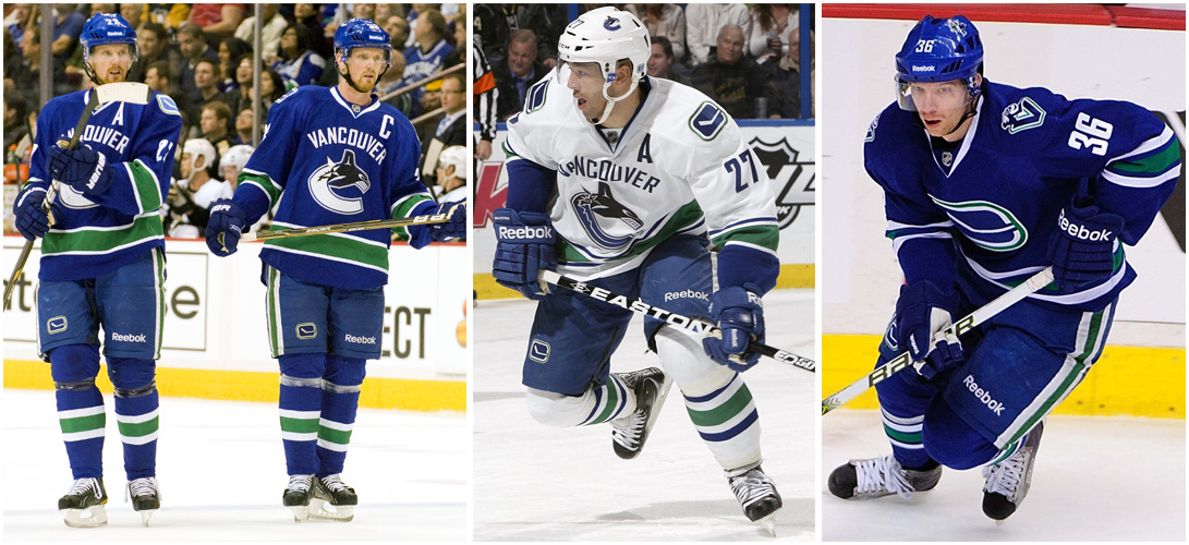
#17(73) - Vancouver Canucks: "Free Willy! The problem here isn't the Orca logo, which has actually developed a little bit of gravitas after 15 years (can you believe it's been that long?). The problem is the city name, which doesn't belong on the jersey and needs to go."

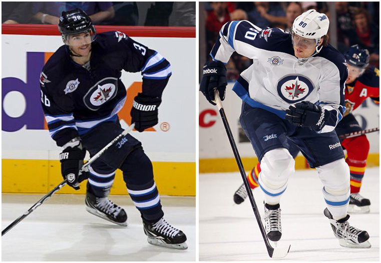
#16(72) - Winnipeg Jets: "The Jets are ahead of the curve: While every other NHL team rolls out a blue alternate uniform with a circular crest, the Jets have used that concept for their primary uniform. It's fine, but it's nothing special. Also, there's only one NHL team that should be wearing a maple leaf on its chest, and Winnipeg isn't it."

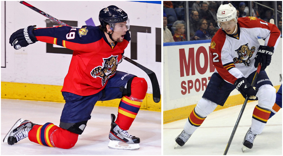
#15(64) - Florida Panthers: "Look, you can have a long panel of color running down the sleeve or you can have stripes wrapping around the sleeves, but you can't have both. Aside from that, this is a pretty good-looking team right now, especially since they've decided to retire the alternate uni, which always felt like a bad fit."

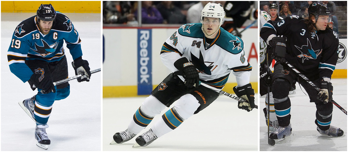
#14(60) - San Jose Sharks: "Originally part of the teal invasion of the 1990s, the Sharks have grown into their look quite nicely. The logo is starting to feel like a modern classic, and the orange trim on the home and road uniforms really enhances those designs. Now if they'd just scrap those front uni numbers."

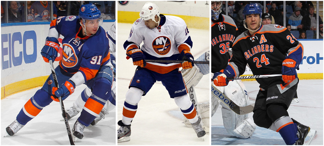
#13(55) - New York Islanders: "That logo is starting to feel dated, but they can probably squeeze a few more years out of it. For now, this is a very serviceable home and road set. They'd rank higher if not for the alternate, which might be the single worst uniform in North American sports."

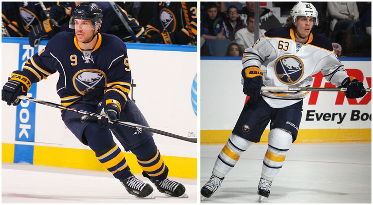
#12(54) - Buffalo Sabres: "The old-school crest is a quantum-leap improvement over the Buffaslug, but the torso stripes and front uni number are unnecessary. Docked a few notches for retiring their excellent alternate, which will be sorely missed."

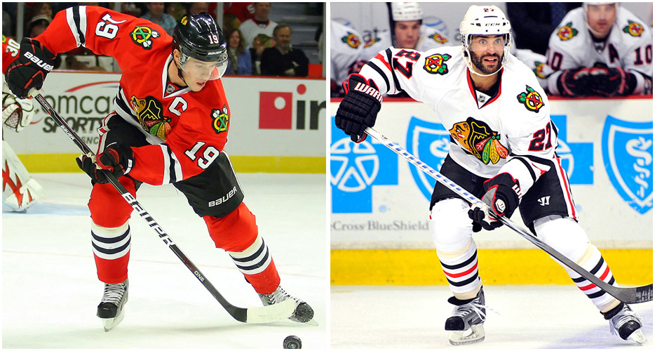
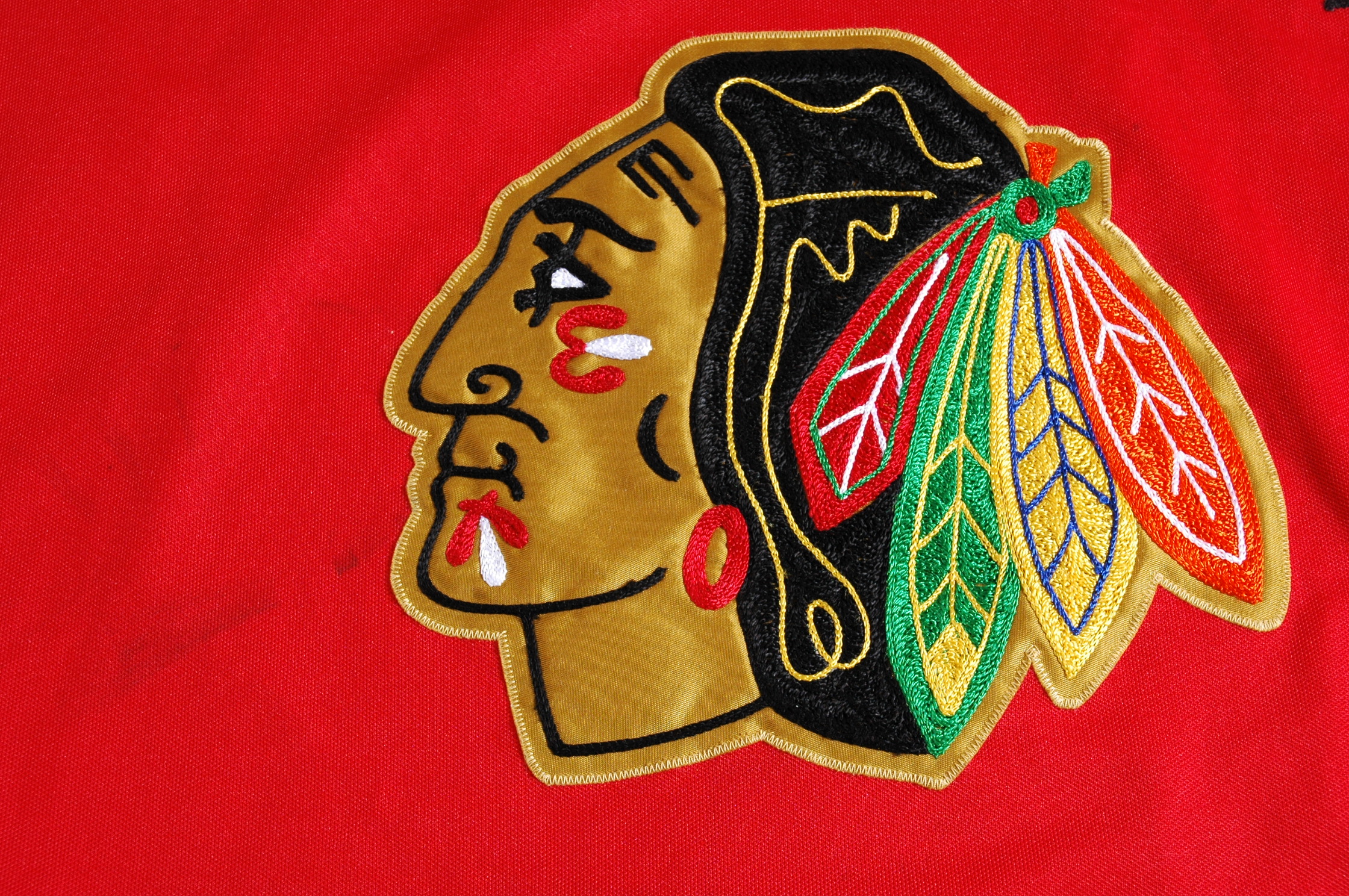
#11(49) - Chicago Blackhawks: "There are more colors in Chief Blackhawk's headdress than most teams have in their entire uniform program (all rendered in beautiful jewel-toned chain-stitching, to boot). Against the white background of the road uniform, those colors pop. But the red home uni is so loud that the chest design can't compete with it, like a pop tune that gets drowned out by a heavy metal anthem. Yet another argument for the NHL going back to wearing white at home."

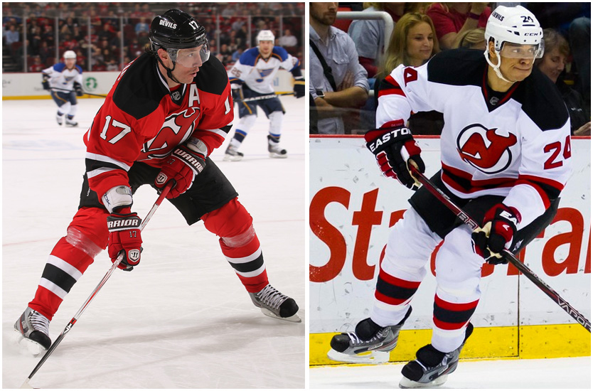
#10(43) - New Jersey Devils: "You don't think of the Devils as a bastion of old-fashioned traditionalism, but consider this: They've never had an alternate uniform. It's like they're the Yankees or something! And really, why bother with an alternate design when your basic look is as solid as this one?"

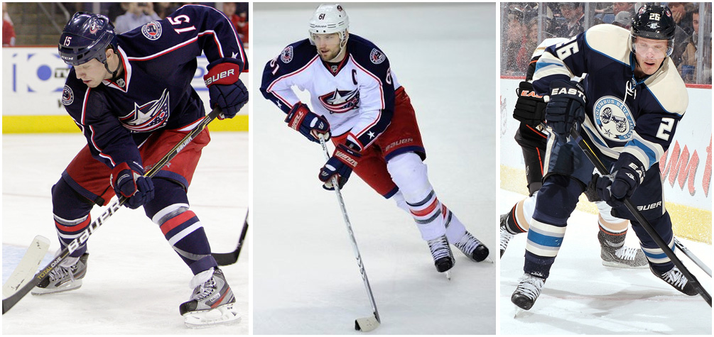
#9(41) - Columbus Blue Jackets: "America's coolest state flag (the only one that isn't a rectangle, don'tcha know) is the basis for the NHL's most interesting jersey crest. The home and road designs are excellent, but that alternate uni feels like retro-by-numbers. Circular logo? Check. Contrasting shoulder yoke? Check. Lace-up collar? Check. Off-white "wheat" tone? Check and mate. Come on, people -- if you're dead set on coming up with a third jersey to sell, try to design one with a little more thought behind it."

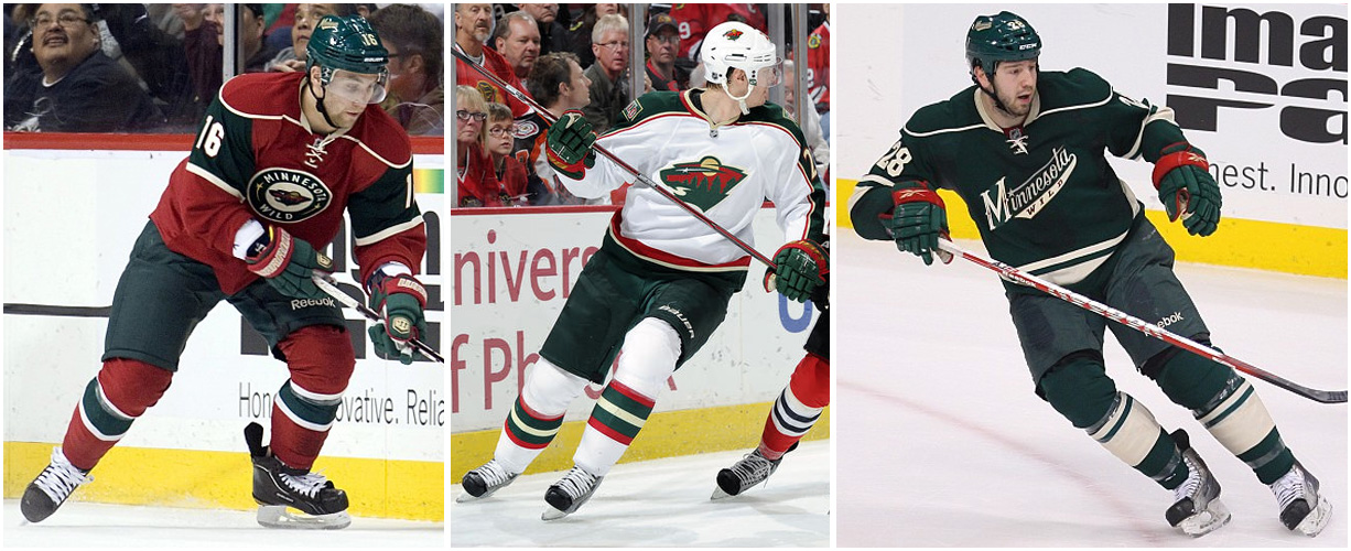
#8(32) - Minnesota Wild: "Almost every design move by this franchise has been a winner, from the primary logo (love the North Star as the bear's eye) to the handsome script on the alternate uni. The circular logo on the home uniform feels a bit forced -- it's a little presumptuous for a team to go old-school when it's existed for only a dozen years -- but it's still a good-looking design. Whoever's running the graphics program here, keep it up."

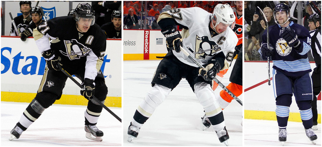
#7(26) - Pittsburgh Penguins: "How can you resist a skating penguin? That's a trick question -- everyone knows there's no way to resist a skating penguin, because a skating penguin is literally irresistible! Once you have that kind of karma going for you, the rest of the uniform falls into place pretty easily."

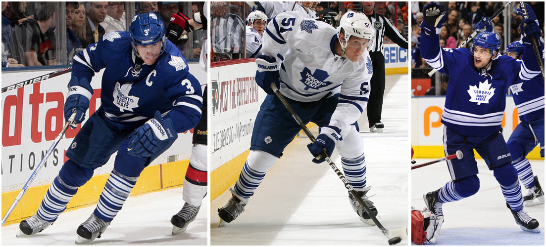
#6(23) - Toronto Maple Leafs: "If you like stripes -- especially striped socks -- then you're gonna like the Leafs. If you don't like stripes, well, the Leafs probably aren't for you. But if you don't like stripes, why are you reading Uni Watch to begin with? Another case of an Original Six team that totally gets it."

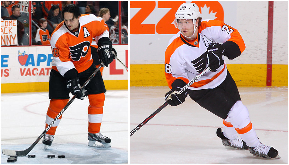
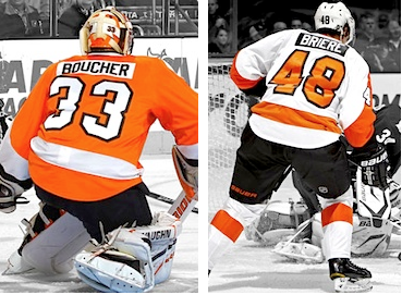
#5(17) - Philadelphia Flyers: "After an ill-advised flirtation with black uniforms, the Flyers have gotten back to basics. Their current look is a sharp update of the design from their 1970s glory days. Some fans don't dig the contrast-colored nameplates, but other observers -- including this one -- really like them."

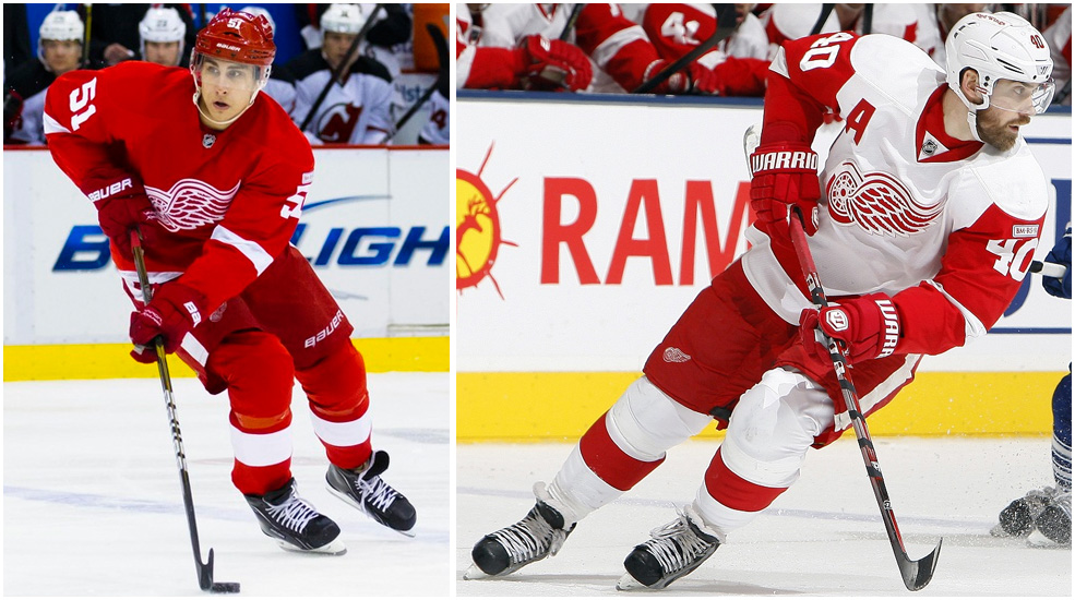
#4(15) - Detroit Red Wings: "Man, those Original Six teams got it right, didn't they? If you want to understand the difference between designing by hand and designing by computer, take a close look at the Wings' logo -- you'd never come up with that on a Mac. Bonus points for the vertically arched lettering on the player names."

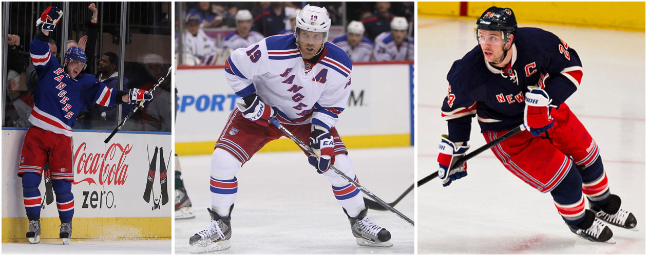
#3(11) - New York Rangers: "The Rangers present the best argument for why the NHL should go back to having teams wear white at home: Their white design crackles with contrast and crisp highlights (arguably the strongest single uni in the NHL), while the blue set -- well, it's solid, but it doesn't have the razzle-dazzle of the white. Toss in an unnecessary but unobjectionable retro alternate and you have one of the NHL's best-dressed teams. Just wish they'd wear their top outfit at home."

#2(5) - Boston Bruins: "A traditionalist's dream, the Bruins' set has everything a hockey wardrobe should have: a strong, bold crest, sharp colors, tasteful stripes and a killer throwback option. First-rate."

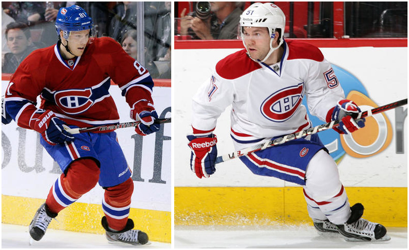
#1(1) - Montreal Canadiens: "Proud standard-bearers for a league, a sport, a nation and now for the uni-verse as well, the Habs have it all: an iconic logo, two distinct but equally classic uni designs (it's odd that the wraparound chest stripe only appears on the home jersey, but the road design works fine without it), and an ideal balance of red, white and blue. This isn't just a perfect hockey uniform set -- it's a perfect uniform set, period. Unlike the old-school classics in the other sports (Yankees, Celtics, Raiders), it has some major visual pizzazz. Puts the biscuit in the basket, and then some."


There you have it, folks. So what say you, readers? Is Montreal's iconic uniform the best in the NHL? Should Detroit or Chicago be moved up? Is Pittsburgh the NHL's seventh-best uniform set? Have your say in the comments, readers!

Until next time, keep your sticks on the ice!

Thursday, 23 August 2012

Cracking Down In The KHL

The image to the left was of a brawl between Vityaz and Avangard in the KHL. Starting this season, there will be hefty penalties served by both players and the teams involved in fracases like this as the KHL has beefed up its officiating by hiring former NHL referee and current ECAC director of officiating Paul Stewart to its ranks as a consultant and as an advisor to KHL president Alexander Medvedev on judicial matters. Following that up, a very poignant memo was sent to KHL teams by KHL Development Vice-President and Disciplinary Committee Chairman Valery Kamensky about the dangerous and reckless play that is plaguing the league. In short, expect harsher penalties for teams like Vityaz who seemingly want to win in the alley rather than the rink.

Hiring Paul Stewart is a great move by the KHL. Stewart was a fantastic referee in his time, and has transitioned nicely into managing official for both the men's and women's games in the ECAC. Stewart was a tough son-of-a-gun when he played hockey in several leagues, including the WHA and NHL, before retiring in 1980. He became an NHL official in 1985, working 1010 NHL games and 49 playoff games before retiring.

Stewart knows rough and tough play as he routinely found himself in the penalty box as a player. Because of this, rougher players in the NHL always seemed to hold him in higher respect when he was working their games. He is fiercely defensive of officials under his watch, and was even reprimanded and fined for defending his officials when a College Hockey News writer called him out about the ECAC officiating.

For an outfit like the KHL, getting a guy who has been through the wars, been in the trenches as an official, and is now helping to guide others through the same battles is something the KHL sorely needs to boost their reputation. Paul Stewart will not take players, coaches, or management trash-talking the officials, and any matter he is consulted on will probably see him wanting to issue some swift and brutal justice.

Giving him the ammo to do so is Disciplinary Committee Chairman Valery Kamensky who sent the following memo to KHL teams:
“Dear owners, coaches, players and other of hockey club employees,

On behalf of the KHL Sporting and Disciplinary Committee I would like to draw your attention to certain kinds of foul play. The analysis conducted over the course of last season by the Disciplinary Committee shows that the following violations are particularly likely to result in injury:
  • Hits to the head
  • Kneeing
  • Kicking
  • Boarding
  • Slashing, and striking an opponent between the legs
  • Charging the goalie
  • Being the aggressor in a brawl
Any occurrence of the violations listed above will come under close scrutiny by the Disciplinary Committee, which will conduct detailed investigations and take the most severe measures stipulated in the regulations. We make no apology for repeating once again that when the League is plagued by injuries, it has a negative effect on the entertainment value of the season and on the image and reputation of the entire League.

In addition to the fouls mentioned, may I draw your attention to the fact that the Committee does not only investigate incidents and foul play which take place during a game, but also those that occur during warm-ups or immediately after a game. I therefore consider it necessary to remind all that for these disciplinary violations, including abuse of the officials, the Committee has the right to impose additional sanctions on any offenders.

I wish you all a very good season and an honest, sporting contest!"
Honestly, for a league that routinely saw an average of one bench-clearing brawl per season, this kind of crackdown is for the best. Cheap shots, brawls, and general idiocy needs no place in the game, and Paul Stewart can now help the KHL issue some harsh penalties for those players who decide to play like a savage rather than playing like a star.

Good for the KHL in bringing Stewart on, and for cracking down on incidents that leave the KHL management a little red-faced.

Until next time, keep your sticks on the ice!

Wednesday, 22 August 2012

Another Think Tank?

It was announced on Monday that a number of league executives and hockey people were getting together to review and possibly suggest changes to current standards for calls regarding interference, hooking, and holding. While I certainly welcome the idea of enforcing penalties a little tighter again, I'm a little annoyed that all of these hockey minds are looking at bettering the game when the people who are in charge of the game can't agree on how to keep the game going. Hooking and holding matters little when the owners and players can't agree on how to keep the harmony in the CBA negotiations.

The NHL's senior vice-president of hockey operations, Colin Campbell, met with a number of hockey people yesterday and today to review how interference, hooking, and holding infractions were being called. Among those in attendance with Campbell include Darcy Regier, Lou Lamoriello, Ray Shero, Steve Yzerman, Mike Gillis, Joel Quenneville, Barry Trotz, Dave Tippett, and Adam Oates as well as players, officials, and other members of the hockey operations department. Clearly, this is a collection of personalities from all facets of the NHL, and all will have some input as to how the league deals with adjusting the standard in making the calls for the infractions.

"Personally, I don't think the hooking and holding has slipped," Campbell told the media. "I think we have to find out what we want with interference on the forechecking and interference off the face-off."

Anything to help the game stay exciting is definitely good, but this isn't a think tank like they had in 2004-05 when the rules dramatically changed. Instead, it appears this think tank will simply ensure the standard is being upheld, and to tweak minor instances where some of the infractions are going unpunished.

"There's lots of opinions out there," Campbell stated, "so I'd like to see us sit down and just get that opinion from particularly the three groups that are dealing with it all the time: the referees, the players and the coaches."

If this group of people can make the game better, I say go for it. There's nothing worse than seeing a clutch-and-grab game again, especially when the stakes are high in the playoffs and the "little things" go uncalled for the most part. While players, coaches, and managers certainly don't want to see an outbreak of power plays again, there needs to be a more consistent calling of interference.

As Campbell said, "Anything that stops a player from scoring" should be reviewed in terms of making the game better. Scoring is exciting. Clutching and grabbing is not. Let's hope these men can make the game a little better over these two days.

Until next time, keep your sticks on the ice!

Tuesday, 21 August 2012

Maybe It Was Mike Richards?
My brother tore off to a little town called Kenora, Ontario yesterday because there was a guest of honor in town: the Stanley Cup! Well, I guess Mike Richards of the Los Angeles Kings was the actual guest of honor, but he brought the Stanley Cup with him as he arrived home! My brother said it was "pretty cool" to meet one of his heroes as Richards came by with the Stanley Cup, but there was a strange report that came out of Kenora on Monday that someone had made off with the Stanley Cup banner commemorating the 1907 Stanley Cup Championship won by the Kenora Thistles!

I'll be the first to admit that I thought that maybe my brother did it, but he assures me he has no new wall hangings in his house. Besides, he appreciates hockey history just as much as I do, so I'm pretty certain he wouldn't have taken it even if it was available for the taking.

Ontario Provincial Police say the banner, a Canadian flag, and a Los Angeles Kings flag were stolen from the Whitecap Pavilion in Kenora on Monday. The banner is burgundy and white, and is about two metres long and a little under a metre wide. It's not like this was a little piece of fabric!

Honestly, if you know who did this, do the right thing, kids. Call the Ontario Provincial Police or Crime Stoppers and report the idiot who stole a piece of Kenora's and hockey's history. If you're reading this and you don't want to turn in the person who committed the theft, please encourage the petty criminal to return the banner to the Whitecap Pavilion.

Stealing something like this doesn't make you cool. It makes you an idiot. Do the right thing: return the banner. And don't be a complete idiot.

Until next time, keep your sticks on the ice!