


A New OHL Look And Name


I'm alright with that reasoning, I suppose. I mean, I can't really rain on anyone's parade for bringing forth heritage, a vital tributary to the city, and one of the main inhabitants of that tributary. I'm just not sold that this was the best name available. I will say this, though: it's already better than "IceDogs".
Of course, I was anticipating the release of their new look. Anytime new uniforms are introduced, there is an anticipation that teams will play it smart and keep things simple. Otherwise, there have been some unfathomable designs introduced over the years, and we don't really need to see any of those again, right? However, junior hockey has always been pretty conservative in their uniform approach, and good teams are sensible enough to know that simple is good.
I was a little shocked when the press release on June 4, 2012 had this snippet of information included on it:
"Following an approval process with the National Hockey League (NHL), the team is proud to announce that the Toronto Maple Leafs have approved the use of their iconic Blue and White uniforms for the Steelhead sweater. The team is excited to release their highly anticipated new look to their fans.Toronto has always been held as one of the better designs in the NHL with their classy stripes and crisp white-and-blue look. If the Steelheads were going to wear what the Leafs wear, that can't be bad, right?
"'The Leafs have been an iconic brand for close to 85 years and one of the most recognized sport franchises in North America and we are absolutely honoured to be wearing the Blue and White as we head into our inaugural season,' said Steelheads owner Elliott Kerr.
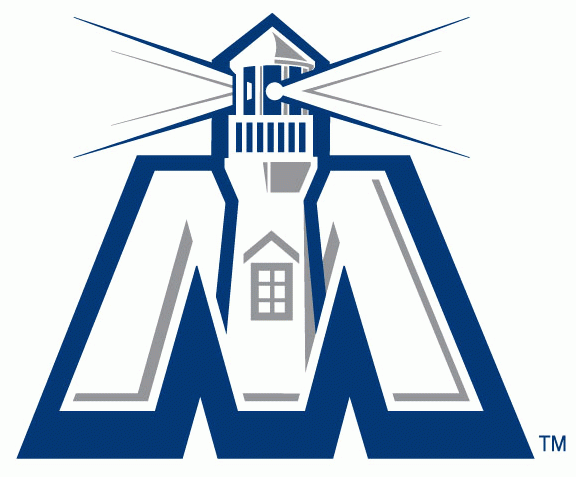
There was also some info on a secondary logo in the press release. It reads, "[T]he Steelheads will also introduce a secondary logo which will be the uniform shoulder patch for the upcoming season. The 'M' which will be worn on both home and away jerseys, depicts the Port Credit lighthouse with protruding beams of light and pays homage to one of the City’s most recognizable landmarks."
On July 27, Reebok finally delivered the product, and I must say that these uniforms look pretty good. Check them out below, and click the picture to see it bigger if need be:

Pretty solid jerseys, right? I like them, and the secondary logo isn't that bad. I have to admit that I like these uniforms, and the logo on the chest is growing on me. Thumbs-up to the Steelheads for their design!
While it remains to be seen how good the former St. Michael's Majors are on the ice this season, they will look like a professional team when they step out on the ice. I think this is one of the better looks in the entire OHL at this point, and they actually don't remind me of the Leafs at all thanks to their logo and shoulder logos. Good job, Steelheads, on creating an excellent uniform!
Until next time, keep your sticks on the ice!


No comments:
Post a Comment