


The NHL Minimalist Series

With the Anaheim Ducks and Los Angeles Kings set to battle in Dodger Stadium, those two uniforms were released this week. Earlier in the week, the New York Islanders put their newest design on display as they prepare for a pair of games in Yankee Stadium against the Rangers and Devils. However, I'm not any of these uniforms will be remembered favorably, perhaps falling alongside the likes of the Wild Wing jersey, the Burger King jersey, and the Fisherman jersey in hockey uniform lore. Although, this writer holds the Fisherman uniform in high regard.

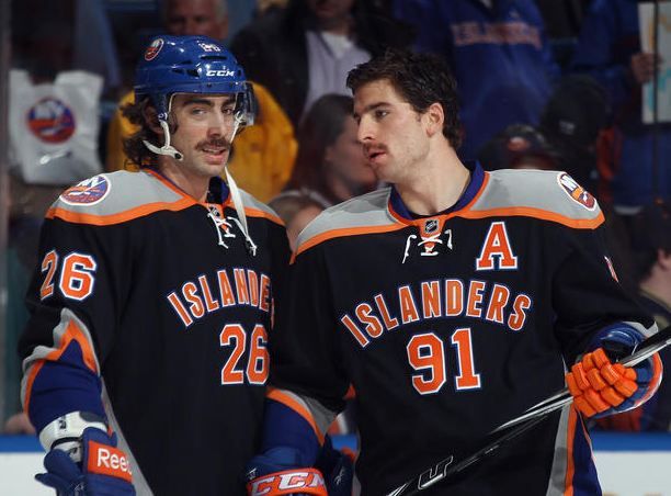
I have absolutely no idea what's going on with that logo. Generic? Yes. You wouldn't even know these are the Islanders if it weren't for the shoulder patch, and people who are new to the game wouldn't have any idea who this team was at all. If this is the uniform they are considering for their move to Brooklyn, they have missed the mark in a very large way. This is almost as bad as Dallas' collegiate look, but only slightly better.
The back of the uniform sees the Islanders employ a contrasting name bar. I've never been a fan of this look, but some teams have a history in using the contrasting bar, so I can give them a pass. The Islanders, though, have never once used a contrasting bar, so why introduce it? It's not necessary. In fact, I'd prefer the clean look of white lettering on the blue uniform. I gotta say that is a negative. Also, if you look closely, that shoulder yoke isn't actually a yoke at all, but two white shoulder pads! I'm not really into that look either. Who came up with this design?
The breezers will also use the interlocking NY logo - again, a minus in this examination since this team is now simply a generic New York team with no identifiers of their actual team name and brand outside of the little shoulder patch. And what's with the white-fingered gloves? This is unique, but it seems extremely unnecessary since most players have a brand of gloves they prefer or are signed to a contract to wear a manufacturer's gloves. Maybe this is just a Tavares thing, but it looks ridiculous.
Personally, the Fisherman jerseys would look infinitely better, as they do in most cases, and rank slightly higher than the Islanders' pylon alternate. But they're definitely not as bad as the current alternate jersey that the Islanders use. They're still bad, though. In other words, I'm not a fan.

Charles Schulz was a big hockey fan when the California Seals came about, even lending an illustration for the team to use in promotional merchandise, so it's kind of ironic that another California-based team would dress themselves as the Great Pumpkin (sorry, couldn't resist)! There is a little bit of black under the arms that goes down the sides of the uniform, but these jerseys will be beacons on the ice. The NHL may want to warn the Los Angeles Port Authority to tell boats not to sail towards the orange glow.
Ben Lovejoy made a good point that folks in the cheap seats at Dodger Stadium won't have any problem seeing the Ducks from their seats, so it's not just me making jokes. I do want to say that I thought it was a nice touch that the Ducks will be wearing an "OC" patch on the shoulder to represent Orange County, making them the first team to represent a county they play in. I guess we can call that a plus.
Simply put, this Ducks uniform may burn retinas in the bright Los Angeles sunlight, and I can't really see many fans lining up to add one of these to their uniforms unless they need it to complete their collection of Ducks uniforms or are building an ugly jersey collection. Their black alternates weren't overly memorable, but they aren't bad in comparison. Wild Wing was ugly but wearable due to its garishness and its ability to make people smile. Heck, even a Disney Mighty Ducks jersey would have been awesome. This uniform doesn't have any of those qualities going for it.


What really would have been awesome? Make this game a throwback to 1993 when the Ducks were founded and the Kings were still wearing their silver-and-black uniforms. The Los Angeles Kings could wear their home whites as they did in '93, and the Mighty Ducks could wear their eggplant beauties they've already worn this year in their 20th anniversary season. Slap the current logos on both jerseys, tweak the colours of the Ducks logo, and we'd have jerseys that would be at or near the top of their respective team histories. Honestly, how perfect would that game look? Add the two shoulder patches - the "OC" and the "LA" - and this game is spot-on with the right amount of uniqueness.
Look, maybe I'm too much of a traditionalist, but I'm really unsure why the NHL teams, Reebok, and the NHL allow for designs that the public seem to dislike. There's still hope that the Rangers, Blackhawks, and Penguins come up with something fantastic, and the rumours of the Devils wearing their red-and-green uniforms already put them at the top of the Stadium Series uniform set.
With the rich histories of each NHL team's uniform sets, small tweaks would make them look fantastic and keep them unique. Re-inventing the wheel each time for these games is an absolutely ridiculous idea, and these three uniforms comfortably fit into the "ridiculous" category.
Until next time, keep your sticks on the ice!


2 comments:
Why are the Kings routinely criticized for wearing purple and gold? I never hear anyone clobber the Lakers for the very same uniform colors.
I actually like the purple and gold, but there's a tie-in to the Lakers and previous owners much like Charles Finley had done with the Seals.
It's part of the their history, though, so I'm all for them wearing the old colours. :o)
Post a Comment