



Friday, 31 August 2007

The Rangers Hate The Sutters

If the New York Rangers were looking to ramp up the rivalry between themselves and the New Jersey Devils, they should look no further than the Canada-Russia Super Series that's going on. Canada has dominated the first two games, aside from the opening minutes of Game One. Physically, they have hammered the Russians with their aggressive play, and this is a Sutter-coached team trait.

However, the Rangers may also have another reason to be unhappy with the Sutters. Brent's son, Brandon, ended Alexei Cherepanov's Super Series with a monster check in the defensive zone in Game Two. Cherepanov will miss the remainder of the series with a concussion, and that can't make Rangers' GM Glen Sather very happy.


Now, granted, the hit by Sutter was a charging penalty, and he did spend two minutes in the penalty box for the hit. However, if you're a Rangers' fan, this may get you a little steamed. Brandon Sutter is a Carolina Hurricanes prospect, so the Rangers could get a healthy dose of Sutters next year. It will feel like the early 1990s all over again along the east coast.

Seeing as how Canada won Game Three by a 6-2 margin, it appears that the Russians may be running out of steam and running out of bodies. The Russian team is also saying forward Egor Averin is out for the remainder of the series. There's also a report that Artem Anisimov of the Rangers may be done for the series after he and Colton Gillies of Canada got tangled up. Two Rangers prospects have gone down already, one of which was expected to challenge for a roster spot.

If you're a New York Rangers fan, get used to this kind of treatment at the hands of the team from down the turnpike. Brent Sutter will have his team motivated while playing hard-hitting, uptempo hockey. It's the only way he knows the game, and the New Jersey Devils will be a reflection of him.

I'm looking forward to an exciting Atlantic Division this year. Pittsburgh, Philadelphia, the New York Rangers, and New Jersey should all provide many highlights on nights they play. Perhaps even more highlights when they play each other.

Until next time, keep your sticks on the ice!

Wednesday, 29 August 2007

Jerseys, Juniors, And Garters

Being that today was August 29, there was another unveiling. The Vancouver Canucks showed off their new jerseys and tweaked their logo, as shown to the left. As you may know, I had written a previous article entitled Freeing Willy about the Canucks and the search for leaked images of their new duds. In that article, I had linked to an article written by Jim Jamieson in The Province about the Canucks' new look. He had suggested several changes to the Canucks' look, so I'll review these here.

Mr. Jamieson had written:

- "the new look will retain the Free Willy logo, but with fewer colours and Vancouver spelled in an arc out over the top of it. The same source said the 'hockey-stick-in-rink logo' that is the Canucks' original and adorned the team's retro-jersey will be used as shoulder patches, but with some modifications".

- "[i]t's expected the main colours will be changed to the lighter blue and green of the aforementioned retro-jersey".

I'd say that Mr. Jamieson was dead-on with his analysis of the Canucks' new jerseys. In fact, I would consider his analysis to be accurate to the point of him breaking the gag order, but that's not for me to decide.

In any case, here's my take. First, I suspect that not many people know that the Canucks are from Vancouver. In fact, the Canucks must have done research and found out that people in Vancouver don't know that the Canucks represent their city. Why else would you include the city's name on both the home jersey and the road jersey? Nashville only put it on the road jersey. Is Vancouver trying to say that they're better by putting it on both? It's twice as dumb in this case.

Secondly, I don't mind the lack of colours in the new Canucks logo. However, the old logo simply wasn't as bland and boring. While I realize that the blue-logo-on-blue-jersey may not work, the white portion of the "C" looks terrible. The thing I don't understand is that if the retro jersey was such a hot seller, why not swap the stick-in-rink logo with the Orca Bay logo on the front? Why not put the Orca Bay logo on the shoulder? Willie Mitchell is wondering the same thing.

Finally, the last thing that bothered me was the proximity of the word "Vancouver" to the captain's "C" on Markus Naslund's jersey. After hearing about how Detroit couldn't have the "C" on the right side due to the seams and the closeness to the logo, it appears Vancouver said "screw it" and did what they wanted. Is there no uniformity between the uniforms this season? Is this a Brave New NHL World?

It's not all bad, though. I am fan of the retro Canucks jerseys, so this colour scheme works for me. The stripes are traditional and look good on the new jerseys as well. The Canucks also tweaked the font on the back of the jerseys, but it doesn't take away from the jerseys at all. It's more modern, and it looks alright.

Much like Tampa Bay's new jersey, these fall somewhere in the middle of the pack. They are not outstanding, but they are not horrible. The traditional elements of the jerseys will push the value of the new look of the Canucks up, and tradition is always good on this blog.

In other news:

- Team Canada has improved to 2-0 against the Russian youngsters in the Super Series. Standouts so far include goalies Steve Mason (CBJ) and Jonathan Bernier (LAK), forwards Stefan Legein (CBJ), Kyle Turris (PHO), and Brandon Sutter (CAR). Also to be noted is the penalty killing unit of the Canadians which has held the Russians to zero goals on 19 attempts, including two 5-on-3 powerplays. Game three of the eight game series goes Friday at 8am ET from Omsk, Russia.

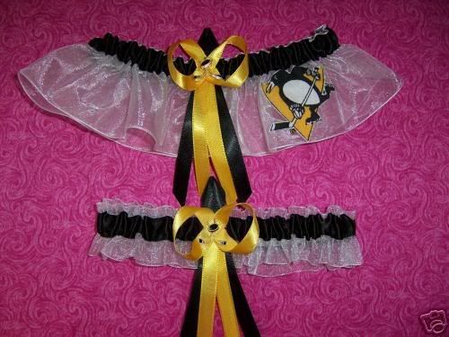
- I'm not sure how much you can love a hockey team, but in spending some time on Ebay today, I came across something that the most-devoted woman could ever want. I thought maybe Elly of No Pun Intended would be the only woman to want Pittsburgh Penguins garters for her wedding, but I could be wrong. Care to watch Hockey Night In Canada on your wedding night? I didn't think so. I didn't bid on them either.

- A big thank you is going out to The Yankee Canuck. I think, thanks to all the hockey fans searching for leaked Canucks' jerseys, I might have scored about 250 page hits in the last month due to his linking me on his blog. So I say, with the utmost respect and appreciation of the link, thank you. I appreciate the link, and certainly look forward to writing more articles that mat be linkable.

The next official unveiling is Calgary on September 4. Once they've unveiled their new jerseys, I'll do a recap on all of them again.

Until then, keep your sticks on the ice!

Saturday, 25 August 2007

Middle Of The Pack

As you can see to the left, the Tampa Bay Lightning rolled out their new logo and jerseys today. While I'm not overly thrilled with the new jerseys, they certainly aren't bad. The logo feels a little too simplistic for me, but it appears that the majority of the teams are cutting down on the thread counts in their logos. As we see more and more jerseys rolled out, it appears that teams are being grouped together in terms of their designs: Original Six are traditional jersey designs, while the first expansion teams in Ottawa and Tampa Bay have templates that are somewhat similar. In any case, here's are Tampa Bay's new jerseys.

Tampa Bay decided to change their primary logo. The old logo had an unfinished circle in it, and the two different fonts were questionable. Also, the Lightning had a bolt of lightning on their logo, and the word "Lightning" beside it as an example of redundancy. The Lightning's updated primary logo now looks like this. Not a huge improvement, but at least the redundancy is gone.

In looking at the jerseys, I'm not overly fond of the new looks. The white road jersey looks far too white. It's almost like one of those ridiculous pink fashion jerseys. Missing are the shoulder yokes that the Lightning used to wear, and the contrasting colours of the yokes made the jersey look much less plain than these new ones. The home jerseys suffer the same fate as the road jerseys in that they're missing the shoulder yokes as well.

The missing stripes on the jersey hemlines give the new blank jerseys a very empty feeling if it has no name or number on the reverse. The home jersey does nothing to help this problem either. As can be seen, the Lightning's font will continued to be used. The questionable move is on the front of the jerseys. Why are there only numbers on the front of the road jerseys? Is this like Nashville's placement of the word "Nashville" on the front of their road jerseys? The uniforms are supposed to be UNIFORM. Isn't that the whole idea?

One thing that the Lightning did keep from their previous look was the armpit striping that made their jerseys unique before. Despite the jerseys being a template for all 30 NHL teams, it's nice to see some of the NHL teams keeping with what made their jerseys unique in the first place.

I am happy that the Lightning broke free from copying their Florida cousins, the Panthers, in not having piping on their jersey. The apron look would have been ridiculous on the white jerseys, not unlike the Predators look.

The Lightning end up somewhere in the middle of the pack with these jerseys. Not overly great, but certainly not Islanders or Kings bad.

Until next time, keep your sticks on the ice!

Friday, 24 August 2007

Elite Vs. Elite

I had decided to wait on posting anything about the upcoming Canada-Russia Super Series until it was finally upon us. Well, it is upon us with the eight-game series starting on Monday in Ufa, Russia. If this series turns out to be anything like the recent World Junior Championships, it should be fast-paced and exciting. But to be honest, should we expect anything else from the best players from the most successful hockey countries to play the game of hockey?

Both teams are fielding rosters in what could be called "the NHL of the future". The Russians have 12 NHL-drafted players, plus four players eligible for the 2008 draft, playing in the series. Canada has 22 NHL-drafted players, plus three players eligible for the 2008 draft and one player eligible for the 2009 draft, playing in the series.

A few Russians to keep an eye on in this series are goaltender Semen Varlamov (WAS), forwards Alexei Cherepanov (NYR), and youngster Kirill Petrov (2008 draft). Cherepanov will attract a lot of attention from the Canadians and scouts. Varlamov will also be watched closely by scouts as he is predicted to be the next goaltending sensation in Washington once Olaf Kolzig retires.

The Canadians to watch will be forwards Sam Gagner (EDM), Colton Gillies (MIN), and wonderkid John Tavares (2009 draft). Unfortunately, Angelo Esposito will not be playing for Team Canada as he is out with a groin injury, but Canada should have enough talent to still compete with the speedy Russians.

Another concern is goaltending. There is no concern over the talent in net, but rather who will start. Jonathan Bernier (LAK), Leland Irving (CAL), and Steve Mason (CBJ) all have the talent to be the starter for Canada. My bet is on Irving due to Sutter seeing him regularly in the WHL when he played for Everett. However, Bernier did backstop the Lewiston Maineiacs to the QMJHL Championship and the Memorial Cup tournament last season, and is certainly capable of carrying the team.

No matter who is in net, I expect this series to be up-tempo and exciting. Both TSN and Rogers Sportsnet will be covering the games live on television. Peter Loubardias of Rogers Sportsnet, who normally covers the CHL games shown on Sportsnet, will be the play-by-play man calling the games. Pierre Maguire of TSN's and NBC's hockey telecasts will be the colour commentator in the booth with Loubardias. TSN reporter Ryan Rishaug will be the rinkside reporter for the series.

Here's the broadcaster, location, and time for each of the eight games. Please note that all game times are listed in Eastern Time. If you have a broadband connection, you can also watch the games at TSN's website or Rogers Sportnet's website.

Monday, August 27 @ 9AM - Ufa, Russia - TSN
Wednesday, August 29 @ 9AM - Ufa, Russia - Sportsnet
Friday, August 31 @ 8AM - Omsk, Russia - Sportsnet
Saturday, September 1 @ 6AM - Omsk, Russia - TSN
Tuesday, September 4 @ 8PM - Winnipeg - TSN
Wednesday, September 5 @ 8PM - Saskatoon - TSN
Friday, September 7 @ 10PM - Red Deer - Sportsnet
Sunday, September 9 @ 8PM - Vancouver - Sportsnet

The 1972 Summit Series was an incredible display of hockey talent. I have no doubt that the 2008 Super Series will be much the same, and that bodes well for the game of hockey for both the present and the future.

Until next time, keep your sticks on the ice!

Wednesday, 22 August 2007

Eureka!

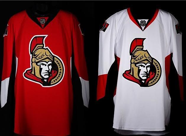
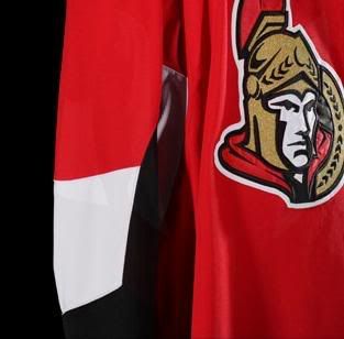
It has been a while since my eyes have been as happy as they are in terms of the new Rbk Edge Uniform System that was unveiled on Wednesday at Scotiabank Place. I'm not sure if there is a competition among the NHL Divisions, but the Northeast Division is certainly heads and shoulders ahead of the other divisions. First, the Boston Bruins came out with an excellent traditional design. The Ottawa Senators, not to be outdone by their Northeast rivals, have come up with an excellent jersey design, and they have moved to the head of the class.

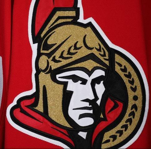
The Ottawa Senators decided that they would change their primary logo from the old side profile of the Roman legion to the half-facing legion known as the Warrior. As you can see, the new primary logo has been updated since it used to look like this.

In keeping with the changes, the Senators decided that traditional was the way to go, and this writer fully commends and salutes the changes. As you may or may not know, I've been very critical of some of the changes made so far by some of the teams.

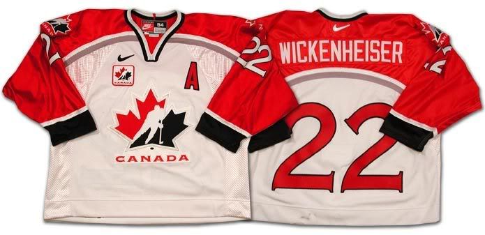
The Senators did a complete U-turn in terms of their design. First, they kept the new jersey design simple. There's no piping along the seams, there's no awkward blocks of colours on the sleeves, and there's no stupid hem or sleeve striping to be found. The design is simple and elegant, and looks great on the players. The font on the rear of the jersey appears to copy that of Team Canada's old jerseys, but it doesn't detract from the jersey. I am slightly concerned about breaking up the blocks of colour on the lower sleeve, buy it hardly affects the pleasing aesthetics of this new Senators jersey thus far.
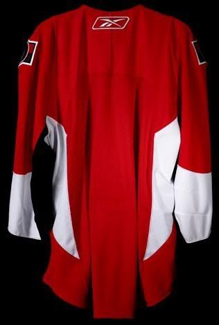
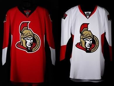
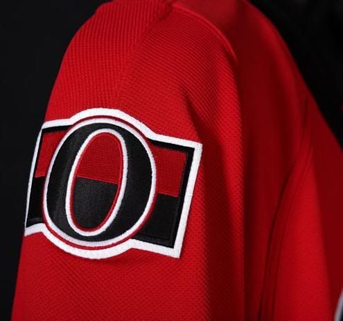
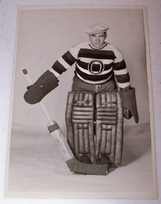
The Senators, in keeping with respecting their tradition, have honoured their teams from long ago with a classy shoulder patch. As they wrote on their gallery page, "[t]he uniforms also feature a new shoulder patch with a retro 'O' symbol on a striped background, a tribute to the original Ottawa Senators as the modern team celebrates its 15th anniversary on the ice". As you know, this writer is a huge fan of tradition in NHL jerseys, and this shoulder patch gets a huge thumbs-up for its simplicity and traditional elements.

A big "thank you" goes out to the Ottawa Senators. You've restored hope in me that someone in the NHL gets the idea of simple, classy jerseys. You don't need flash and flair to sell jerseys or make your team look modern. Both the Bruins and Senators have shown that less is more when it comes to an elegant look.

I am truly a fan of these jerseys, and the Senators certainly rank near the top with this new look. Hope has been somewhat restored.

Until next time, keep your sticks on the ice!