


Good Vs. Evil
 Two more teams trotted out their new alternate jerseys that Reebok and
 Satan franchise executives have designed. Saturday saw the Buffalo Sabres roll out their new threads, while the St. Louis Blues got into the act on Sunday. One was refreshingly different while the other has already been commented on by this writer. I just have the photos from the official event to back my statements up now. In any case, here are the next two teams to saunter down the runway in their new uniforms.
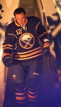
Buffalo Sabres
Let's go back to last Sunday's article, entitled Grade Nine Home Economics Class, where I spoke about the leaked image of the Buffalo Sabres' new alternate jersey.
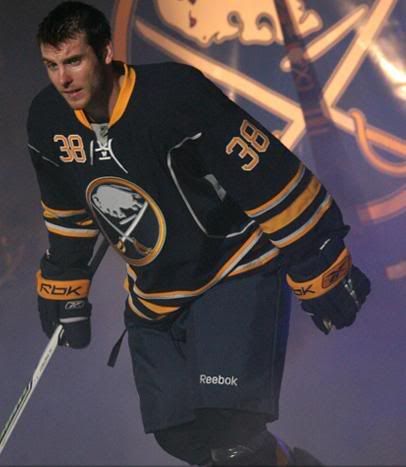
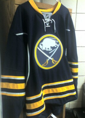
I had written that "[t]he dark blue colour, while maintaining the current Sabres' colours, ruins the effect of the yellow stripes", but I was off on that one. It's the crappy silver piping and stripes that kills the entire look of these jerseys. Honestly, why can't the Sabres leave well enough alone? The former look of the Sabres' traditional jerseys was excellent in the contrast between the blue and yellow. Instead, we get this.
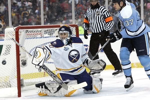
Another thing that bothers me? What the hell is up with the gray patch in Ryan Miller's armpit? What purpose does that section of fabric serve? Why can't it be dark blue? You can see it slightly on Nathan Paetsch here, meaning that the gray patch is exposed when players are skating. WHY IS IT THERE? CAN SOMEONE FROM REEBOK ANSWER THIS QUESTION?!?
There are a couple of positives to these alternate jerseys, though. I'm a fan of the old logo, despite Buffalo changing the look of it with the silver outline and dark blue colour. I'm also a fan of not having the Barney Rubble Hairpiece appear on the shoulder. That's a huge bonus for these jerseys.
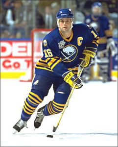
Honestly, though, the hockey gods will punish Buffalo for messing with tradition. This is how the throwback jersey looked two years ago. This is how it looked at the Winter Classic. This is an abomination in trying to combine the future with the past. The hockey gods will frown upon Buffalo for this uniform.
St. Louis Blues
And that leads us to St. Louis. The Blues have had some questionable alternate jerseys in the past, as well as one that never saw the light of an arena on an NHL player's back. The potential for these jerseys was, in my opinion, pretty low, considering the discussion of having a colour called "white gold" in the colour scheme.
Surprisingly, though, the new Blues alternate jerseys are refreshing. They have a snazzy new logo that I'm quite fond of, and they are quite simple in terms of their design.
For the first time in Blues' history, they will be wearing white numbers and they've kept the font fairly basic. The shoulders feature the Bluenote, and the lace-up neckline is a decent feature.
The only issue I have is the same one I had last year when the Blues introduced their normal Rbk EDGE jerseys. I had written, "Something else that caught my eye was the pants stripe. It looks stupid when the jersey is untucked, and even worse when the jersey is tucked in. Why does it stop at the hip? Why doesn't it match up with the yellow piping on the jersey?"
Well, the new alternate jersey does nothing to help that useless stripe on the pants. Again, I have to ask why is it there? It doesn't match up with anything on either jersey now. Let's just ditch this stripe on the pants once and for all. Whaddya say, Reebok? Can we ditch the stripe? Paul Kariya wishes the stripe was gone. Let's make Paul smile again.
There are your new threads in the NHL from this past week. Honestly, Buffalo will suffer at the hands of the hockey gods. I can't say that enough. St. Louis, though, should be alright. You look good, you play good. Simple as that. Your thoughts? Leave them in the comment section.
Until next time, keep your sticks on the ice!


1 comment:
I really like the Blues third. I've always thought they had the best uniforms in the NHL (except for that mid-90s red wedge thing), but I don't like the look of the Reebok Edge jerseys on them. This third just totally redeemed that. I may even have to go buy the jersey of a Central Division rival...
Post a Comment