


Grade Nine Home Economics Class
 After seeing the atrocious alternate jersey that Carolina will be "proudly" wearing this year, there have been a few leaks of other teams' new duds. Personally, the new threads that the Carolina Hurricanes will be wearing are perfect for a black-and-white TV since they are void of almost all colour. I guess it's kind of suitable considering all the power outages recently in the southern USA that Carolina chose black as their prevailing third jersey colour. Unfortunately, the same can't be said for the next couple of teams that have had their new looks posted on the 'Net.
Let's start with the first team alphabetically that couldn't keep their new jerseys under wraps. The Boston Bruins originally showed what was called "one of four finalists" in their alternate jersey options on March 1, 2008 (apparently, that video has been taken off YouTube). Anyway, I had said, "Personally, it isn't bad, but I'm not overly fond of the lack of colour". Well, the Bruins apparently have a fear of colour as well.
Thanks to the guys at HubHockey, we get to see exactly what they look like, and I'm not impressed. The new Bruins alternate jerseys suffer from the same fear of doing anything impressive as Carolina's jerseys do. I get that the Bruins' colour scheme is yellow and black, but this much black? The Boston Black Bears are now nowhere close to being a bruin.
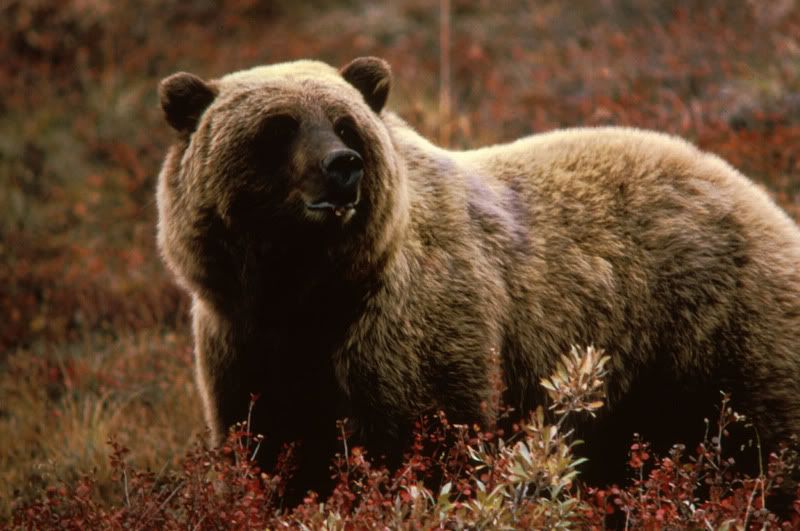
The problem is that the word "bruin" is defined as "another name for a brown bear (Ursus arctos), or for any bear, usually poetically or archaically". The species known as Ursus Arctos is actually a brown bear, specifically known as Kodiak Bears, Grizzly Bears, and Eurasian Brown Bears. Hockey isn't poetry, though, so I can't see the Bruins rationalizing this reason. And while the Bruins are one of the Original Six teams, I doubt they'd consider themselves archaic. Therefore, this jersey was actually closer to the mark in terms of representing a bruin than their new one. Does anyone actually do any research when it comes to these new jerseys?
The logo on the front is simply their home shoulder patch from last season. I'm not sold that this is a great chest logo when there were so many other jersey options that they could have chosen. Why didn't they simply go with Providence's look from last season? Providence wore "throwback" jerseys, and they look pretty good compared to the all-black alternate that Boston is planning on rolling out. Or, and here's a phenomenal idea, just copy the jerseys that Providence wore last year in the playoffs! Isn't it amazing how similar those logos are? How does Boston always seem to screw up their alternate jerseys?!?
Another one-piece uniform finds its way into the NHL, and I am downright angry about it. Why does every team want to look like the Anaheim Ducks? Personally, they look like terrible. So if you're planning on rolling out an all-black uniform, be prepared for the worst from this writer. Boston, your new look is horrible. Thumbs down. To say the least.
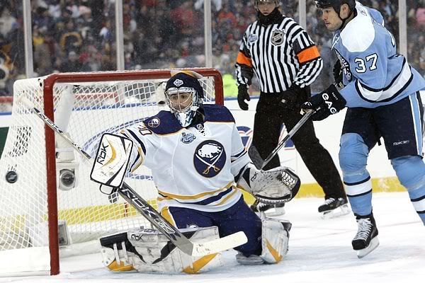
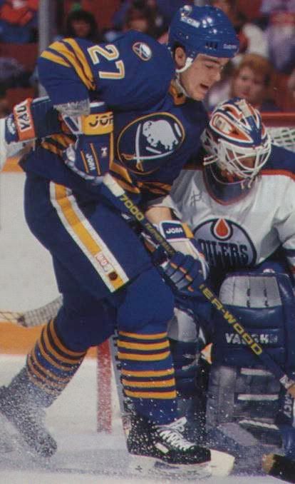
The second of the new uniforms that was leaked onto the Internet was that of the Buffalo Sabres, and this one is absolute crap in my opinion. Let's go back to the Winter Classic where Buffalo came out in these jerseys which are a thing of beauty. I can't express how much I love the look of those jerseys, and the blue jerseys were just as spectacular.
I had high hopes that Buffalo would bring back the alternates from 2006-07 before Reebok got involved in destroying everything that is pure and good about hockey, but The Buffalo News has confirmed that the Sabres will be wearing these in 15 games this season.
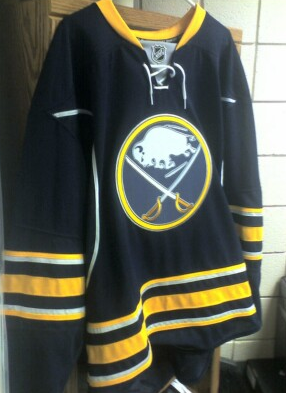
Where do I start with these? The dark blue colour, while maintaining the current Sabres' colours, ruins the effect of the yellow stripes. The royal blue and yellow were a much sharper contrast, and really made both colours stand out against one another. This new jersey? Not so much.
And why is everything outlined in silver? The stripes, the logo, the piping... is this really necessary? The yellow stripes simply don't look as yellow. The logo is enough to give me epilepsy with all the shades of colours being used. The neck flap with the NHL logo could have been yellow, couldn't it? Why is there a third colour introduced there?
This is terrible. I can't believe that Buffalo makes their jersey darker to match their pants when they could simply wear breezers over top like Carolina will for their new jerseys. This really isn't a difficult concept, yet it seems that common sense is nowhere to be found anywhere in the front offices of the Sabres franchise.
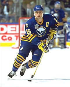
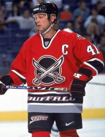
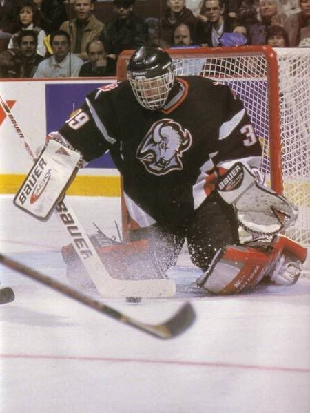
At this point, I'd take the red alternates over these jerseys. Heck, just bring back the black jersey with the angry bison's head. At least those jerseys are different than their current ones. This new alternate is the epitome of a "cash grab", and I am disgusted by it. Thanks for ruining a good look, Sabres. Well done.
I don't even want to speak about these any longer. This absolute crap that the NHL and Reebok are putting out is a mockery of the league and its traditions. I'm almost put off of hockey at this point. At least the old alternate jerseys made by CCM were colourful and different. These new jerseys look like they are half-assed, Grade Nine Home Economics projects, and I'm failing both these franchises for their total lack of effort. Thanks for not trying, Boston and Buffalo.
Until next time, keep your sticks on the ice!


2 comments:
Ugh...who knew alternate jerseys could stop being fun?
I agree with you 100% on the lack of imagination my Bruins seem to have when ti comes to Alt jerseys. Unless they're going to come out as a team that'll grind, check, and hammer the other teams, I can't see a 90% black uniform/jersey being anything other than a 'quick decision'. If they want to use it as an icon of what they'll become (hard hitting and nasty to play against) then great! Otherwise...they should have used the P-Bruins jersey or something more traditional but with a swipe of something new and modern.
Post a Comment