


Bull And Bullies
 Yesterday saw two more NHL teams roll out their newest jersey creations for this season's alternate jersey celebration. While one team went historical, following in the footsteps of the New York Islanders, Pittsburgh Penguins, and Vancouver Canucks, the other team went boring. I expected more from the Dallas Stars, and they seriously disappointed me despite all I heard about their alternates. The Philadelphia Flyers, on the other hand, went back in time to their glory days, and they look fairly sharp. Let's take a closer look at both of these new uniforms.
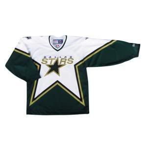
I might as well get Dallas out of the way first. I was hoping that Dallas might bring back the star-style jerseys that they had worn for so long, and were a completely unique design outside of the NHL All-Star Games for a few years. I was dreading the thought of them bringing back their previous alternate jersey. I hated it then, and I still hate it now.
However, they stuck to their word and introduced a brand-new alternate jersey that looks remarkably like a jersey they already wear.
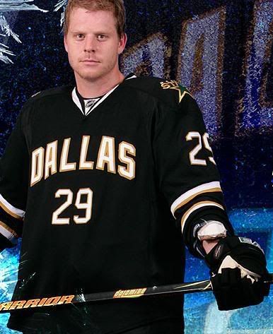
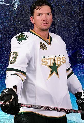
Now, I'm not one to criticize a design team, but when your alternate jersey looks exactly the same as your home jersey but has the colours reversed, we call that a "road jersey". Why the Stars decided to replicate their home jersey in road colours and call it an alternate is beyond me, but wouldn't this jersey be more appropriate as the alternate now? I mean, it looks different than the other two jerseys, right? Or maybe the new alternate was a stepping stone in the evolution of the Stars' jerseys? They have the same striping, they have the same shoulder patch... could it be the missing link?
Absolutely brutal effort, Dallas. You could have done much, much better. Except you didn't. And I'm calling "BULL" to that effort.
On the other hand, the Flyers went back in time to the golden age of Philadelphia ice hockey. Or make that the bloodiest era of Flyers hockey. Either way, the Flyers unveiled their highly-anticipated throwback ORANGE jerseys to the days of the Broadstreet Bullies yesterday, and they look excellent.
I have been longing for the Flyers to return to the orange jerseys that they wore. They are classy, and the Flyers might be the only NHL team that can pull off orange this good due to their traditional look. To be quite honest, I hated the silver elements in their old alternate jerseys.
In bringing back the traditional look yesterday, the Flyers decided to add some very nostalgic pieces to the look of their new alternates. They employed the white nameplate just as the Flyers of the 1970s did. The white-on-black numbers really jump off the orange background, making them look sharp and bold. The side view is fairly traditional with the orange TV numbers.
I like the look of these new Flyers jerseys. They get a thumbs-up from me. Dallas, on the other hand, gets a different finger up from me for their complete lack of effort in designing an alternate jersey.
Until next time, keep your sticks on the ice!


No comments:
Post a Comment