


Can I Get That In Black?
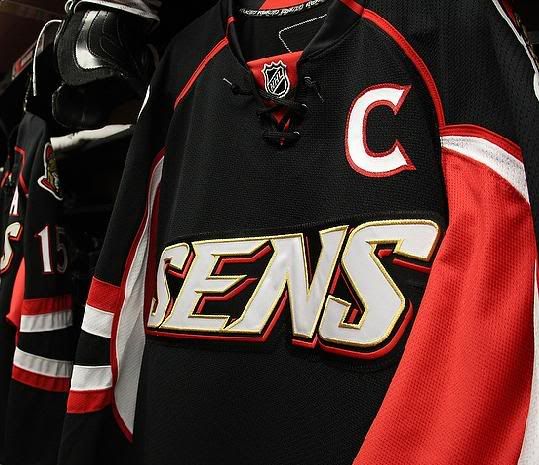
 Another day, another alternate jersey. Tonight, the Ottawa Senators rolled out their new alternate jersey for the 2008-09 season against the New York Rangers, and I'm simply baffled by how teams lack any sort of creativity. The Senators' website has AC/DC's rock anthem Back In Black screaming on their splash page, so you already know what's coming. I believe that originality scores high marks, so Ottawa's copying of Carolina's "Back In Black" unveiling already brings them in at a low score. However, this dumbing-down of the alternate jerseys has to stop. Now. It's insulting and gives the appearance of a minor-league outfit.
What am I talking about? How about the nickname on the jersey? Both Ottawa and Tampa Bay are committing this sin, and it's an abomination of anything traditional in the NHL. You don't see the Islanders plastering "Isles" across their jerseys. You don't see the Penguins promoting "Pens" on their jerseys. You don't see the Blackhawks wearing "Hawks" across their chests. What exactly is the point of this new wordmark?
Look, I get that some people that are new to hockey may not know where Ottawa is, or who the Senators are, or what this logo means. But if the new fans are interested, they'll hunt it down. Why? Because they are interested. At this point, the Ottawa "Sens" are nothing more than a local roller hockey team in this jersey. That's simply pathetic when you're playing in the best league on this planet.
There are absolutely no redeeming qualities to this jersey. None. Zilch. Zero.
The half stripes on the arms? Fail.
The patches of colour on the sleeves that go nowhere? Fail.
The apron look? Fail.
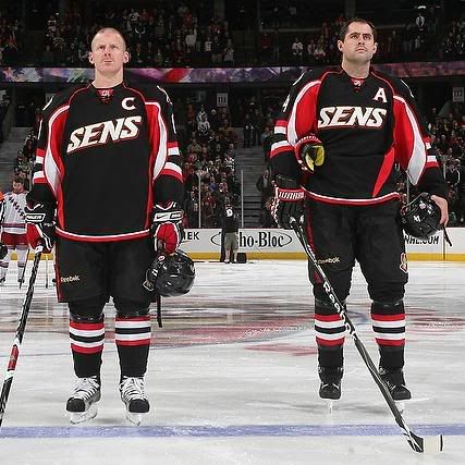
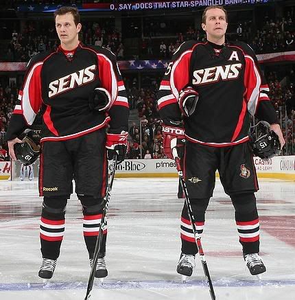
And despite all of Reebok's work to get their name plastered all over every single piece of the on-ice uniform, Dany Heatley went with Easton for his pants thanks to his contract with Easton that trumps the league's contract with Reebok.
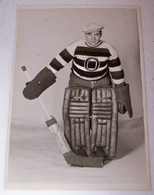
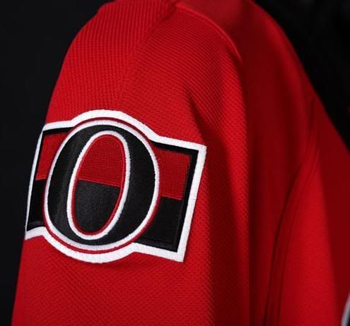
Ottawa has gone with the black alternate jerseys before. The problem isn't with the black jersey here. The problem is that they had so many opportunities to reach back to the Senators of early 20th century for an iconic look. They're already using the "O" as a secondary logo on their home jerseys. Instead, another team chose to go black, and really decided to scrap any creativity by putting their nickname on the jersey instead of a logo.
Why couldn't they have opted for this logo? They have a patent registered in Canada for it. It looks fairly modern, and it would fit into their current scheme as well.
Instead, we get this. If there is anything positive I can say about these uniforms, it's that the Senators decided to keep their font the same as their other jerseys. Honestly, that's the only positive thing I can say. Everything else about this jersey advertises a lack of creativity, imagination, and professionalism.
The less I see of this jersey this season, the better. I am infuriated as a long-time NHL fan that a team like the Senators - one who has been fairly traditional in the past - has slapped every fan in the face. They are the Senators, not the "Sens". You can get by with "Sens" if you're talking about them casually, but they are always the "Senators" in the professional world.
Perhaps the NHL really isn't concerned with being professional any longer. It appears the Senators aren't.
Until next time, keep your sticks on the ice!


1 comment:
I agree that the Senators missed a great opportunity to put out a more traditional, iconic alternate third sweater. The colors are fine, the logo and overall look and feel though miss anything even close to approaching smart branding since there is no tie in to any of the graphical elements of their existing uniforms and brands... even if "Sens" did anything for me, which like you it doesn't.
Post a Comment