


Little Black Dress
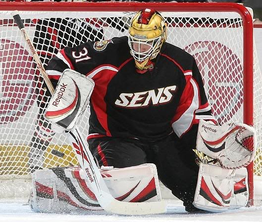
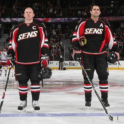
 Is it possible that there are simply just too many black jerseys in the NHL at this point? Is there anyone out there who simply is tired of black as a colour for a uniform? Last night, Ottawa rolled out their alternate atrocity, and I had a lot of photos to work with. In the late game, the Colorado Avalanche rolled into Los Angeles to play the Kings in their new threads. The Kings have used a variety of alternate jerseys since Gretzky rolled through The City of Angels, but there has long been a request for the Kings to go back to their glory days of the black-and-silver. With the Kings' new alternate worn yesterday, it appears that they are scratching the surface of that sentiment.
We're not going to bring up the alternate jersey affectionately called the "Burger King" jersey. That was a low point during Gretzky's time in Los Angeles, and it doesn't need to be re-examined. However, the logo on that jersey was one of the more comical logos ever produced, and it seems that the Kings are going down that route again with their new alternate logo. Do we need "LA" on the logo? No, not at all. But in case you were wondering who this "new" team was, it's easier to identify them now.
The Kings are back in black to a greater degree than either Carolina or Ottawa are.
As goaltender Erik Ersberg made his way on to the ice, the first that hit me was contrast. The black-vs-white contrasts really stand out, especially against Ersberg's pads. The Kings brought back the hem stripe on their alternate jerseys, something that has been sorely missing from hockey jerseys since Reebok took over. So far, this jersey is getting a passing grade.
The rear font is the same font used on their current jerseys, but I'd like to know why the shoulder yoke stripe runs into the arm stripes. They look like marionettes with the stripes in that format, and I don't think that was the intention. However, the sock stripes harken back to the days of Gretzky in his silver-and-black uniform, and that's a good look.
The one thing that I was really impressed with was the helmet sticker. That is the same helmet wordmark that the Kings used to use in the 1990s. That's a fabulous touch in bringing back the past, and I commend the Kings for making this decision.
All in all, these new Kings jerseys aren't as bad as I originally thought they might be. The logo is highly questionable, but the look of the uniform is very traditional yet modern-looking. The small details that the Kings used - the helmet sticker, the black-and-gray colour scheme, the hemline stripe - actually make these uniforms respectable. While I'm not crazy about them, the Kings may have introduced the best black jersey of the bunch that we've seen so far.
Until next time, keep your sticks on the ice!


No comments:
Post a Comment