


Cannon-izing The Jackets
 The image to the left is that of the brand-new Columbus Blue Jackets' alternate uniform to be worn during the 2010-11 season and beyond. Columbus has worn an alternate jersey in the past that had the black shoulder-to-wrist yoke, and that look eventually became their everyday uniforms in 2007 with a few minor changes. In continuing with Columbus' "new uniform" trend, a brand new logo can be seen on their new alternate jersey, and they have introduced a new colour not seen as an accent colour on their uniforms before. But the big question always remains: how does this uniform rate? There are a few things that I like on this uniform, but we'll see if they make the grade below.
The new alternate uniforms are very clean, very simple, and very easy on the eyes in terms of their look. There are no flashy designs or crazy graphics or sensational striping, and the jerseys have a very "retro" feel to them despite the team being just ten years old. I'm not against this retro feel that the NHL seems to have reverted to, but maybe this should send designers a clear message that new is not always better. The overall exterior look of the new Blue Jackets' uniform gets a thumbs-up.
The rear font used on the alternate jerseys for the players' names is still the same as before. Keeping the font the same makes it easy for fans who have grown accustomed to the Blue Jackets' font over the last few years, so that's good. Thumbs-up for that decision.
The number font, however, has taken a turn for the "blockish". The Blue Jackets wore a very unique font on their regular uniforms compared to most of the other block-lettered teams of the NHL. That, however, has fallen to the wayside with the new alternate uniforms, and I, for one, don't think this was a necessary move. Block letters are nice for companies that cut and stitch numbers onto uniforms, but the NHL is a multi-billion dollar retail business based on the each team's unique features. It's the uniqueness of each team that separates them from all the rest. This move to block letters makes the Blue Jackets' alternate uniform less unique compared to the rest of the NHL, and that's a thumbs-down from me.
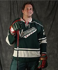
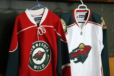
Speaking of a lack of uniqueness, what's with this colour scheme? Light blue, white/cream, and navy blue? That would be a unique colour scheme if it weren't for Nashville, St. Louis, Florida, and Pittsburgh. In fact, when looking at the last few alternate jerseys, all of Nashville, St. Louis, Florida, and, to some extent, Minnesota have been designed in the same fashion: hem stripes, sleeve stripes at the elbow, lace-up collars, and a shoulder yoke. Granted, not every one of these teams has all of these features, but the majority of them are present on each team's alternate uniform. Is Reebok simply not trying, or do the teams just not have any creativity? Thumbs-down to the overall design for the Blue Jackets because they look like everyone else.
I do like the new logo on the alternate jersey, but, like the rest of the jersey, it seems to be copying something else from someone else. The Blues, Panthers, Penguins (twice), Sabres, and Wild all opted for a change back to a circular, retro-style logo in the last few years. The cannon? A great addition and could be a great logo on its own. The circular logo like everyone else? I can do without. I'll give this a push because the cannon logo is a great idea, but the circular logo has been done.
You may have noticed that the collar of the new Blue Jackets' alternate jersey has a special insignia on it. Blown up, you can clearly read the letters of JHM on the collar as the insignia. Why is that there? Let's go to the press release.
"To honor Blue Jackets founder John H. McConnell during the team’s 10th season, the initials JHM adorn the back of the neckline.The JHM edition of the jersey will only be worn by the team during the 2010-11 season. For jerseys sold at retail, the JHM will appear only on the initial production run, making it a true collectors’ edition."Ok, so there's something to commemorate the team's founder, but I'm thinking this really isn't necessary. Yes, it will make game-worn jerseys fairly unique and recognizable through this special mark, but fans aren't really interested in a collectors' edition unless they are interested in buying every single uniform the team has worn. Making that person a "collector"! Thumbs-down.
The writing on the outside of the collar isn't the only place to find something as the Blue Jackets added stuff to the inside of the collar too! Let's go back to the press release for the reasons this was done.
"The phrase 'We Fight. We March!,' which appears on the interior of the jersey’s collar, was first introduced during the 2008-09 season to describe the Blue Jackets’ first-ever march to the Stanley Cup Playoffs. The expression continues to represent the team’s intention each year to fight and march throughout the regular season and into the playoffs. Below 'We Fight. We March!,' 10 stars commemorate the introduction of the jersey in the club’s 10th season."Here's a news flash to all designers: if you can't see it, it doesn't exist. If this stuff was really that important, why not add ten stars to the bottom hem to commemorate this jersey's addition to the Blue Jackets' wardrobe where it can actually, y'know, be seen? Adding the motto on the inside is simply adding for adding's sake. These two "features" serve zero purpose overall, and have already been done by two teams: the Pittsburgh Penguins and New York Rangers. Pittburgh gets a pass simply because it will be worn on the Winter Classic uniforms, and it commemorates that event. The Rangers, however, fail miserably because no one cares about the year the franchise was established. If you're a fan, you already know that! Therefore, the Blue Jackets fall into the latter category of "fail miserably", leaving them with a thumbs-down for this idea which seems dumber and dumber every time a team does it.
Ok, so where do we stand? Well, I count 2-4-1. These jerseys just seem too cookie-cutter to me in terms of how they look. I expected more, and some of the kids in Columbus did as well. That first image by Brittany Curry? Not bad at all! I think that, for all the hype and secrecy on this unveiling, the results leave me feeling a little underwhelmed. That's never a good thing for your fanbase, especially those who don't live in the metro area of Columbus, Ohio, because they probably won't want to be part of the "We Fight, We March!" squad. I expected some creativity after they came up with a gorgeous home and road set, but all I see are ideas stolen from other teams. And that's not very professional.
Sorry, but I expected more, Jackets. You gave us a fairly standard uniform in terms of how it looks with very little original design. What's that? You did provide something more? I'm sorry, but a new cannon mascot named "Boomer" who will only appear when the new uniforms are worn is far too kitschy, and seems very much like a marketing ploy. He's not Batman who appears when the Bat Signal comes out. And you certainly don't need a second mascot when Stinger is already wearing the new threads! What's the point of that?
Because of this, I now fear the unveiling of the new Anaheim Ducks' alternate jersey coming up.
Until next time, keep your sticks on the ice!


1 comment:
The new cannon logo looks way too much like a piece of generic clip art. It really could have been more dynamic and exciting. It's a cannon. What does it do? It shoots stuff! How about showing it shooting a puck out of the barrel in a cloud of smoke?
And where's the red? Once more Reebok decides to strip away the secondary color from a team's set for their new alt. Enlighten me, is there some sort of marketing survey that says this will drive sales through the roof? Otherwise, I guess I don't get it.
Freeing the cannon from the now ubiquitous circle would free it up to have been made larger, allowing for something with more detail and more colors - like red!
Post a Comment