


Classic Auctions Images - Part Three
 We're back today with another round of images from the Classic Auctions website. I was very impressed by what the site had to offer last time on their current round of auctions, so I went back through the archives to see if I could find some more interesting stuff. Needless to say, the archives are a treasure chest of historical items and, of course, there are a ton of NHL sweaters and jerseys that should be examined for details. With that, we have another edition of the Classic Auctions images today as we look at a number of uniforms once more.
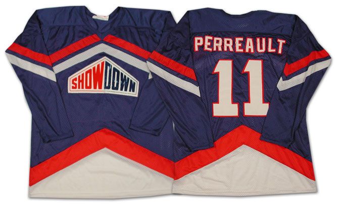
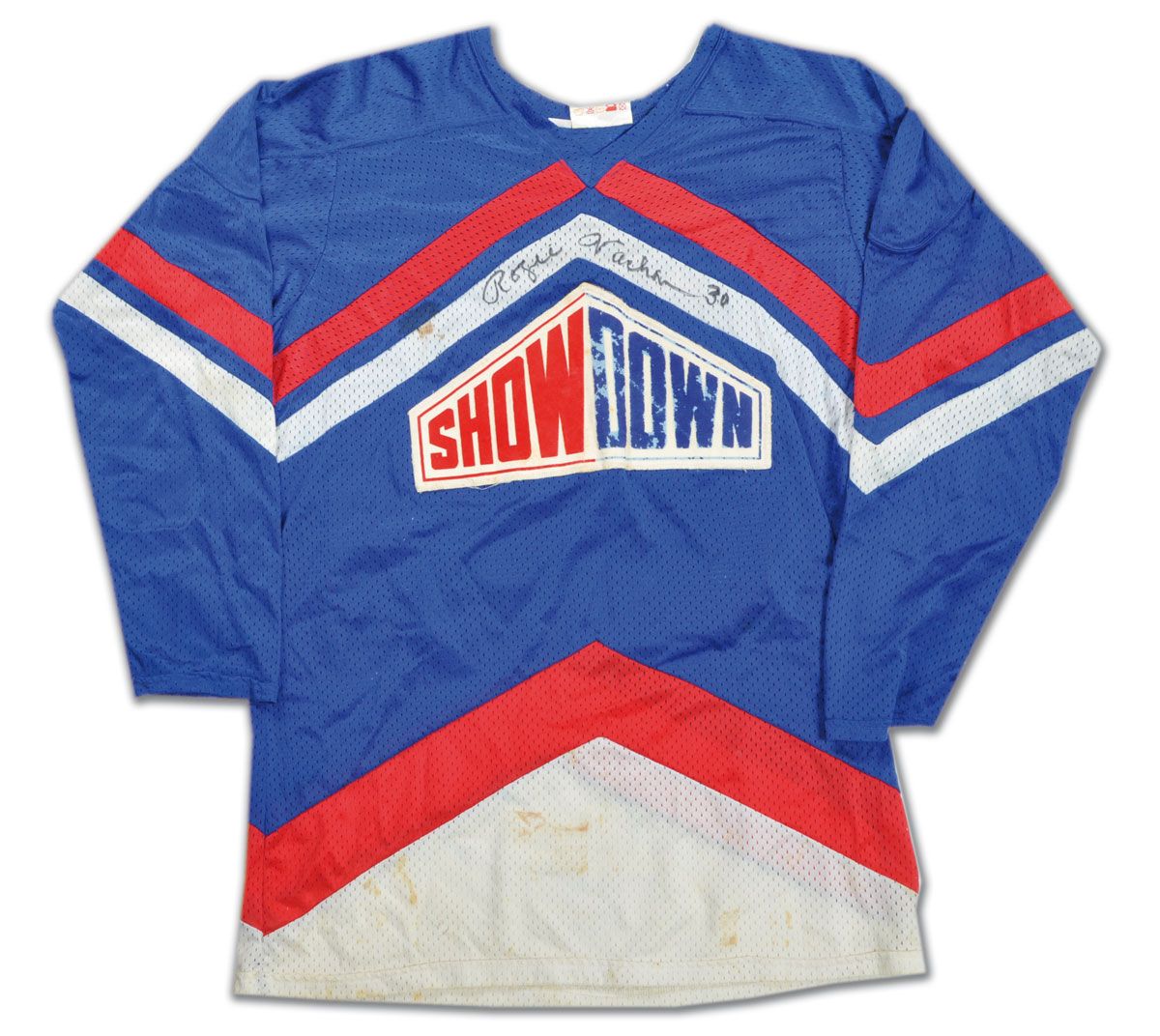
- As we saw in the most recent set of Classic Auctions images, there was an NHL Showdown segment that used to air between periods that featured a few NHL stars that went head-to-head for cash and bragging rights. I've found more players who were a part of this now. It appears that Gilbert Perreault of the Buffalo Sabres participated for at least one season in the Showdown, and he wore a sweater similar to that of Rogie Vachon! Could they have been teammates in their respective Showdown?
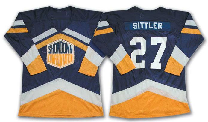
- Another player who participated was Toronto's Darryl Sittler. However, his sweater is significantly different in terms of colours than those of Perreault and Vachon, so I'm guessing he played in the NHL Showdown in a different season.
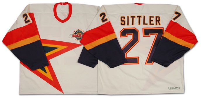
- Another Darryl Sittler jersey that the Classic Auctions website had up for auction was a Sittler "Masters of Hockey" uniform. I've never seen or heard about this before, so I had to refer to the information on the website. "As part of an important Zellers promotion, Darryl Sittler, along with many other Oldtimers, participated in the 'Masters of Hockey' program. This white hockey [was] uniform produced by 'Hattem'". Nothing like an old promotional jersey for a department store promotion!
- In the article about the New York Rangers' new alternate uniform, I had stated that there was precedence for the Rangers wearing "New York" diagonally on their uniforms thanks to their 9/11 tribute uniforms. However, there is even more precedence that shows the Rangers wearing "New York" for a much longer time on the road. Here is Bobby Carpenter's 1986-87 New York Rangers road uniform. Obviously, they wore these for at least one season, and, upon further research, they actually wore the "New York" road jerseys from 1978-1987. Lots of precedence!
- I've rarely seen the patch worn, but there is no doubt that the Toronto Maple Leafs wore the King Clancy patch on their uniforms during the 1986-87 season. Thanks to the auction, we can now clearly see that the Leafs wore the King Clancy patch above the TV numbers on their sleeves on the road that season.
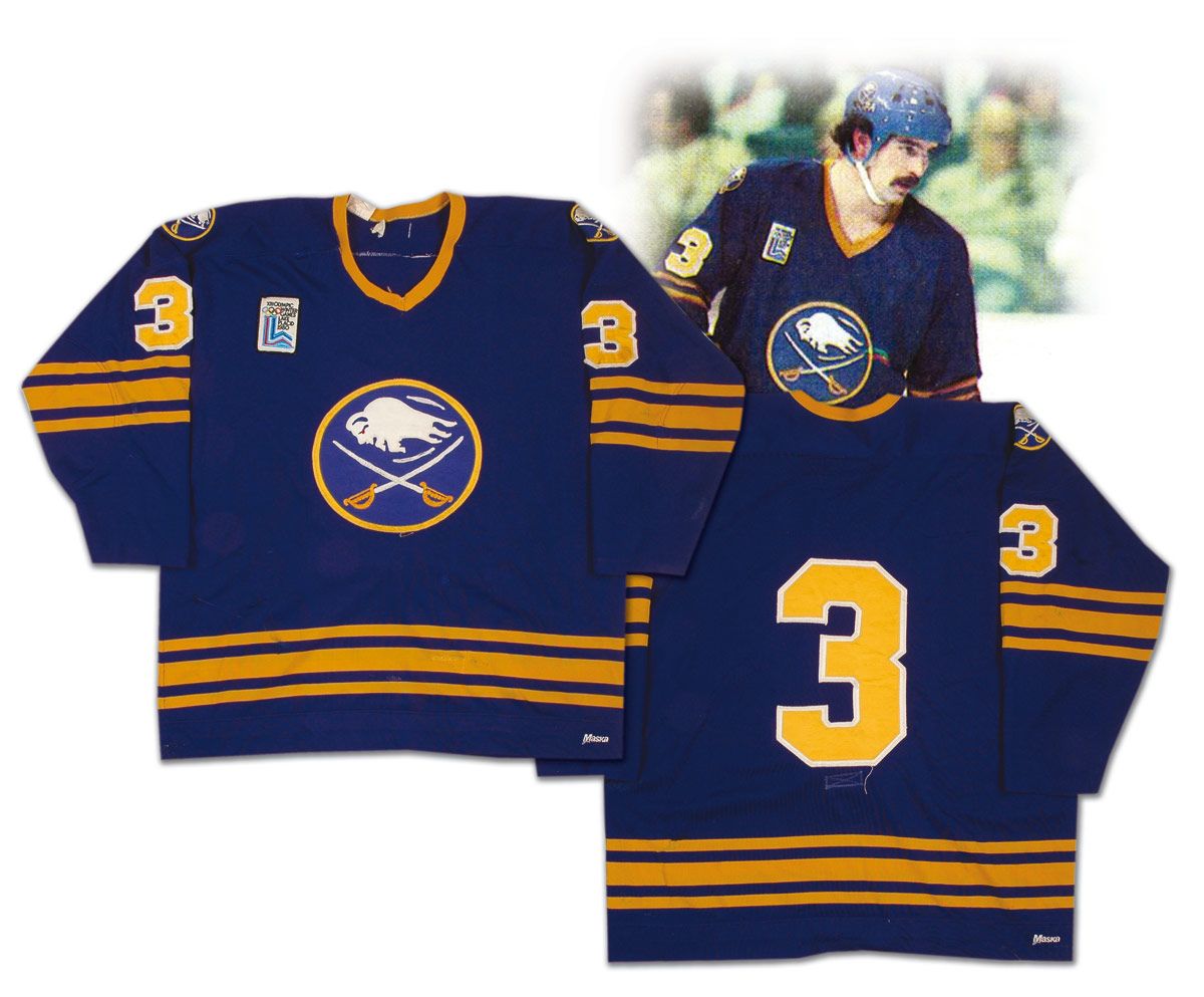
- Some of the patches worn before photography became a major aspect of the NHL world are much more difficult to find, especially affixed to an NHL uniform. The Lake Placid patch worn by the Buffalo Sabres is one such patch, but this Richie Dunn sweater from the 1979-80 season shows it clearly affixed on the right shoulder. Notice that there are no names on the Sabres' uniforms as of 1980? I had never noticed before that either.
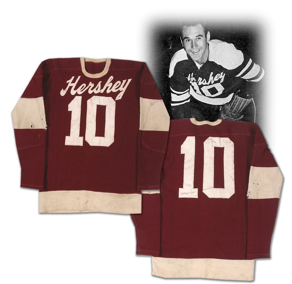
- Heading into the AHL, we find a trend that seems to have been reproduced in the NHL with the introduction of the Rbk EDGE uniforms. I've never liked the idea of having front numbers on a hockey sweater, but the Hershey B'ars decided that front numbers were fine for a hockey sweater as far back as the 1940s! Here is a sweater that was worn by Mark Marquess as a member of the Hershey B'ars that has the city name over top of the front number. More precedence for a current trend, perhaps?
- The Detroit Red Wings have a gorgeous jersey due to the colours and the logo. I cannot deny this. However, history shows that the logo routinely was off-centered on the Red Wings sweaters. One such example comes from the 1937 Jimmy Orlando sweater. As you can see, the center of the wheel was used as the focal point for the logo, and that caused the wing to be significantly off-center.
- In Part One of this series, I discovered a startling trend in the 1980s that showed floating portions of names on a number of teams. Today, there appears to be some sort of discrepancy in terms of how names are displayed on at least one team. I had made mention of Brad McCrimmon's floating "C" in 1988, but I discovered an Al MacInnis uniform from the 1980s that has no floating letters! What gives? Why the change? MacInnis' first game in a Flames uniform came in 1981-82, so we at least have a start date as to when the floating letters may have started, and it had to be after the '81-82 season.
- Because I miss the uniform and the team, here is Wendel Clark's Quebec Nordiques uniform from the 1994-95 season. Man, I miss that uniform. It's gorgeous!
- In other lost uniform news, here is Gerry Ehman's 1967-68 Oakland Seals uniform. Does anyone miss the colour green in hockey? I sure do. Why can't more teams go with a bold green instead of these near-black colours?
- Next, we have the second wave of California's Seal teams as we get a chance to see Joey Johnston's uniform from the 1970 California Golden Seals. I'm not all that fond of this colour scheme, but the yellow uniform is definitely bold. Much like their name, the Golden Seals certainly were living it up in goldenrod.
- We have a 1979-80 Atlanta Flames uniform worn by Gary Unger. That's still a great uniform, and I'm glad that the Calgary Flames have gone back to those great colours. Yellow-on-red is a very striking uniform... and the lack of black is entirely refreshing!
- Take a good look at this 1976-77 Colorado Rockies uniform worn by Michel Plasse. See how small the front logo is? Compare that to the 1981-82 uniform worn by Tapio Levo. There's a significant difference in the sizes between the two uniforms. It's almost as if the Rockies were telling everyone in 1976 that they weren't all that relevant.
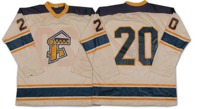
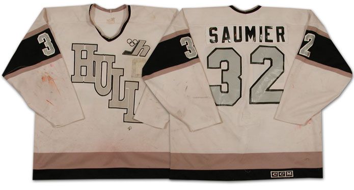
- In the 1970s, the Hull Olympiques of the QMJHL wore some fairly vanilla uniforms. However, they changed that up in the 1980s by bringing out the black-and-silver colour scheme that became famous thanks to Wayne Gretzky's trade to Los Angeles. As you may have heard, Luc Robitaille played for the Olympiques and Gretzky owned part of the Olympiques, so Bruce McNall made the change to the new colour scheme due to Robitaille's suggestion to make Los Angeles more attractive for Gretzky. Now you have some visual proof of how this change came about thanks to Marc Saumier's uniform.
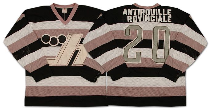
- In 1985, the Hull Olympiques decided to roll out a different road uniform by wearing some awesome stripes! I love the stripes on this jersey, even if it looks like a black-and-white television's test pattern.
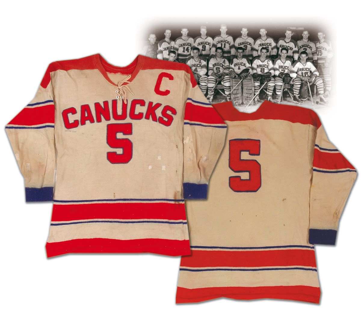
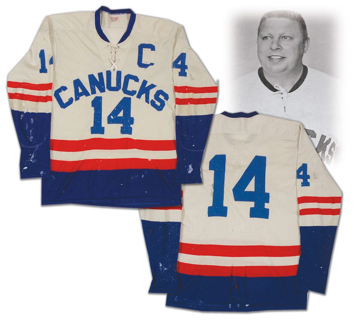
- The WHL gets a mention on this one as we get to see the Vancouver Canucks in their original form. The WHL Canucks wore this uniform in the 1950s, and they went with a colour change in the 1960s. Of course, Vancouver received an NHL franchise in 1970 so these jerseys weren't needed any longer, but there is some precedence to the Canucks wearing a name on the front of their uniforms. It seems that the trend of front numbers was more of a minor-league thing through the 1940s, 1950s, and 1960s, though. Take note, NHL. MINOR-league.
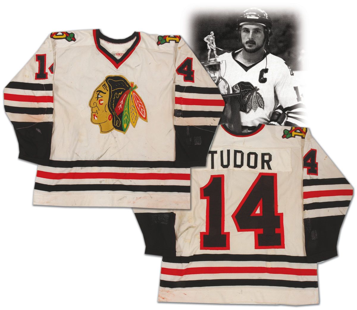
- It has been well-documented that NHL teams often name their minor-league affiliates after their own NHL franchise name. The Sherbrooke Canadiens, the St. John's Maple Leafs, and the Albany Devils are some well-known examples. Here is Rob Tudor's jersey from the 1978-79 season. If you inspect that jersey closely, you'll see two tomahawks crossed over a "D" on the shoulder. This is a Dallas Blackhawks uniform from the Central Hockey League!
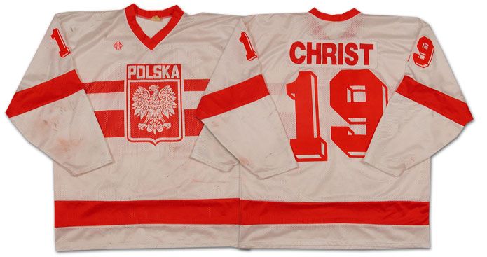
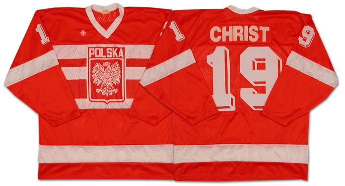
- International jerseys are always interesting. The 1988 Winter Olympics saw Poland compete in Calgary as a part of the ice hockey competition. One member of that team was a player by the name of Jerzy Christ. Yes, that is his real last name. He was born in Katowice, Poland, and played center for his home country. The highlight of his international career was when he scored both Polish goals in a 2-1 victory over reigning World Champion Czechoslovakia at the 1986 World Championships in Moscow, Russia!
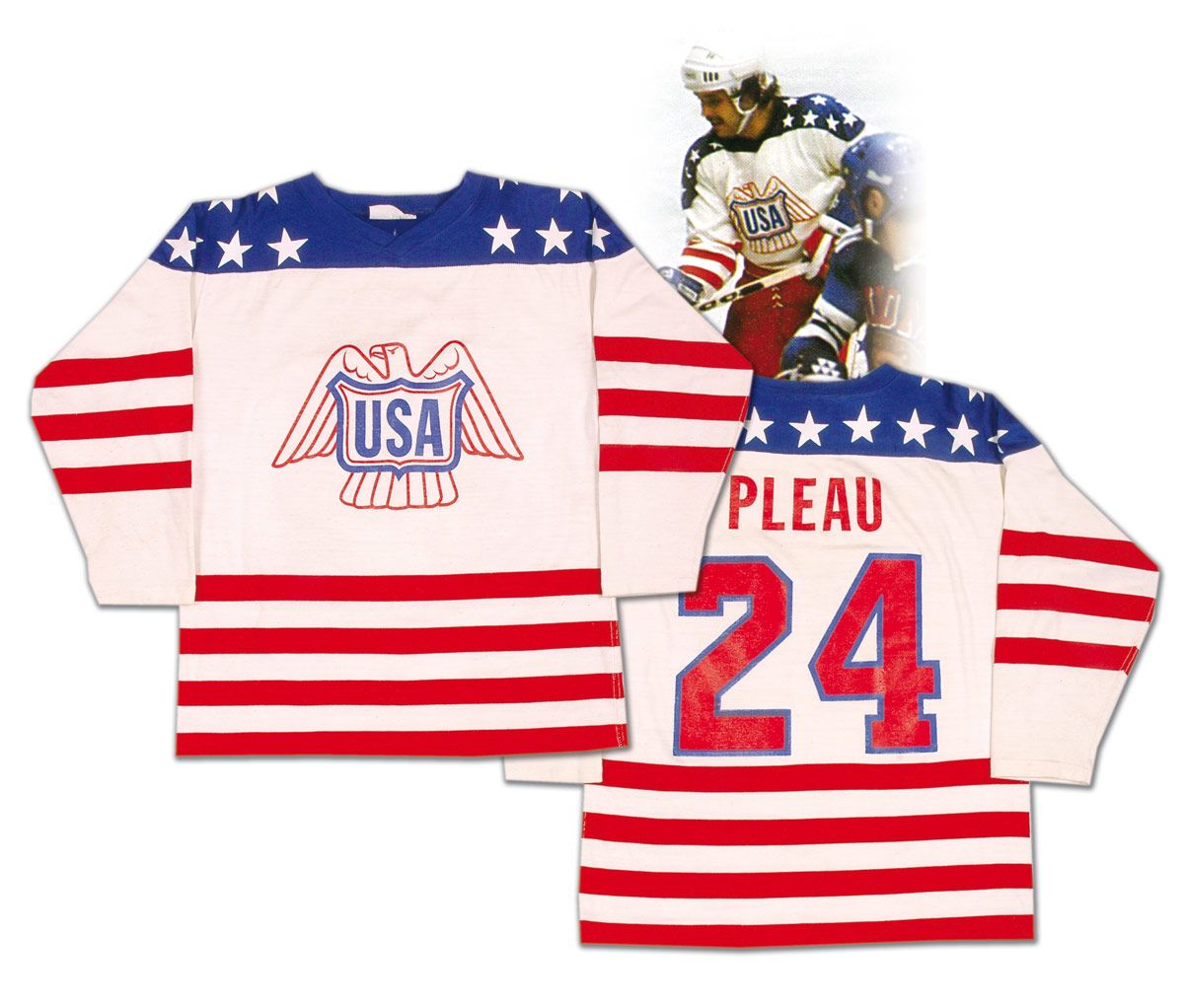
- Love this 1976 Team USA sweater. Larry Pleau wore this uniform at the 1976 Canada Cup where Team USA finished 1-3-1 and in fifth-place. Regardless of their standing, they wore a gorgeous sweater, and it really feels like a patriotic American uniform.
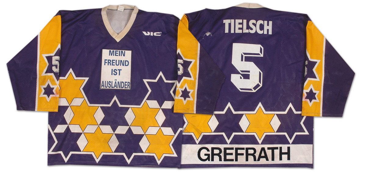
- We'll close this look at interesting jerseys with a glimpse into German hockey. Grefrath, a German city, played in the second-division of the German Eishockey League in the early-1990s, and wore these uniforms while on the ice. As you can see, there's no logo, but a message where the logo should be. Using a handy translator, the message states, "My friend is a foreigner" or "My friend is an alien". Is this the first time any team has ever used their uniform to convey a written message to its fans? Weird idea.
Until next time, keep your sticks on the ice!


No comments:
Post a Comment