


Celebrating Eighty-Five
 The New York Rangers worst-kept secret finally hit the stores and streets today as the Sean Avery-previewed Rangers alternate jersey made its debut in downtown New York City. However, there are some things that make this jersey slightly different than your average alternate jersey, and I'll try to spell them out here. In any case, you'll see lots of photos of the new look being worn by the New York Rangers.
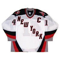
As seen in the Sean Avery picture above, the Rangers have gone with a darker blue and the words "New York" diagonally from left shoulder to right hip, similar to their regular jerseys. The jersey colour remind me of the Lady Liberty jerseys in how dark they are, so it remains to be seen how dark they actually are when on the ice as compared to their normal blue uniforms. However, the colour scheme gets a pass thus far.
Of course, the last time the Rangers wore "New York" diagonally down their jerseys was during their 9/11 tribute game on October 7, 2001. The Buffalo Sabres also did the same, but there has been at least one other time the Rangers have worn "New York". These jerseys obviously have nothing to do with that event, but the "New York" is a nice touch. While I would have loved to see Lady Liberty make a triumphant return, the use of "New York" gets a pass.
On the right shoulder, the Rangers will sport their 85th anniversary patch. The patch itself spells out exactly what it is for, and it has all the relevant details on it. There is one thing about the patch that makes it a little more important on this alternate jersey - it's the only place on the new uniform that actually has the Rangers' logo on it. While I get that the Rangers' iconic look is their diagonal lettering, they could still put their logo on the shoulder in place of the patch in the future. Instead, there is nothing on the left shoulder, and the Rangers' shield logo possibly will remain AWOL in future years. I'm going to give this a push until we see how the Rangers handle this in future years.
The font that the Rangers use on the back is different from their normal font on their everyday jerseys. The block lettering is fairly standard in the hockey world, so there's nothing major to report here - just a standard red-on-white block font for the number, and standard white for the name. The captaincy designations are a little different as they normalize the regular letters from their italicized state on the regular uniforms. They look slightly different due to the lack of shadowing on the letters, but the serifs and sizes are nearly identical. This gets a push as well as the shadowing was distinct as a New York Rangers feature. Now, they just look like everyone else.
I've never understood why teams insist on putting "features" inside jerseys. It's not like they can be seen on the ice, and chances are that no one cares about that feature if it's being hidden. The Rangers are guilty of two of these features: the inside of the collar, and the retired jersey number bottom hemline.
With the collar, I get that it's important to remind everyone that the team was established in 1926, but isn't that why the patch has been affixed to the shoulder? The patch clearly states "Est. 1926", so why do you need the collar to read the same? This is nothing more than designers adding additional flair for their own sake. This feature serves absolutely no purpose as far as I can see.
The hemline is even more puzzling. The Rangers are including all of their retired numbers on the inside of the hemline for fans that purchase the new uniform at the NHL Store or at Madison Square Garden. Why is this being offered? As you can see, Rod Gilbert had a heckuva time showing off his retired number tonight, yet the Rangers think this is a good idea. If I want a retired player's number, I'll put it on the back of a jersey. I don't need it on the inside of the bottom hem. And if I want to show my friends this "cool feature", they had better be printed upside down on the inside so they are easily readable when flipped up. This "feature" is the definition of stupid.
Overall, I like the look of the exterior of the jersey. It remains to be seen how dark the blue actually is once the Rangers take the ice, but idea of keeping the jersey simple is a great idea. I'm ok with the lace-up collar that the Rangers are using due to their history with it, so their overall look isn't diminished by their choice in collars. Lundqvist was even all "GQ Man of the Year" during his segment on XM Radio yesterday, and I have to say that the jersey does nothing to detract from his look.
My finals thoughts are these: great alternate uniform for the players, but ridiculous additions for the fans. The Rangers certainly get a pass for the look, but they need to tone down the flair a little. Otherwise, these are great alternate uniforms for the Broadway Blueshirts.
Until next time, keep your sticks on the ice!


No comments:
Post a Comment