


Classic Auctions Images - Part Two
 We're back with another installment of photos and commentary as we continue to look through the Classic Auctions website. As we saw yesterday, there are a number of incredible old photos and many jerseys with some unique features on them that are being showcased on the Classic Auctions website. That being said, here is the second half of the Classic Auctions images with some of my commentary thrown in for good measure, but I want to start with something I found that is very cool and completely unheard of for me.
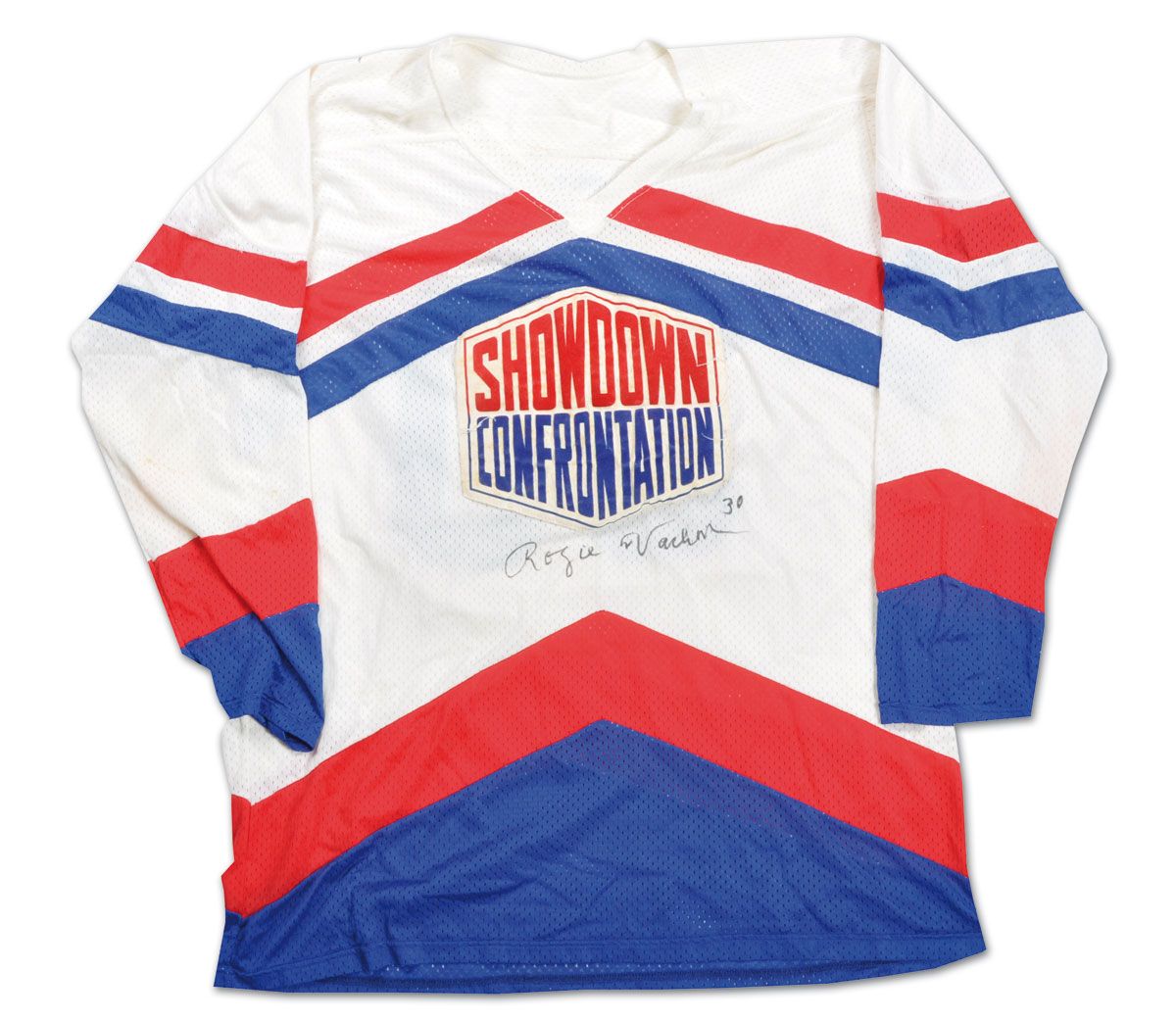
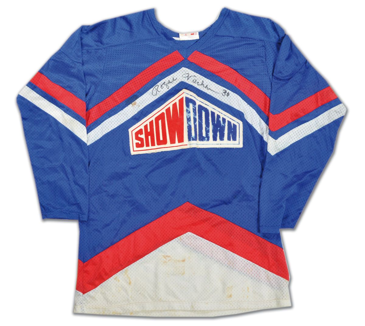
There's something to be said about some of the old promotional stuff that the NHL did to keep people in their seats. Does anyone remember the old "NHL Showdown" series between periods? Rogie Vachon was a participant, and he wore "Showdown" jerseys both at home and on the road. According to the Classic Auctions website, "Hockey broadcast intermissions throughout the 1970s featured the entertaining Showdown competition. Showdown began as a penalty shot tournament with NHL stars vying for cash prizes and bragging rights. Year-to-year variations such as skills contests, obstacle courses, and modified mini-games followed.... The L.A. Kings goalie's 'Fat Cats' won a 3-on-3 competition vs. Philadelphia goalie Wayne Stephenson's 'Sweathogs' to claim the $10,000 prize". Very interesting!
To prove that this isn't made up, here are the two parts of the 1978 Showdown between the Fat Cats and the Sweathogs.
Anyway, let's take a look at some of the stuff found on the Classic Auctions website.
- Rogie Vachon's Burger King jersey is up for grabs. If these jerseys weren't so damned expensive now, I'd totally add one to my collection.
- Moving to another goaltender, if anyone thinks that the Bruins haven't been in Fenway Park in the past, they're totally wrong! That's goaltender Tiny Thompson standing between two members of the Boston Red Sox. Thompson is credited as being the first goaltender to stop the puck by catching it, and it appears he got some pointers from the BoSox players!
- There's a good look at the 1926-27 Stanley Cup Champion Boston Bruins. The man pictured in the middle is Sprague Cleghorn. Two spots in on the right on the bottom row is a man synonymous with the Bruins. That's defenceman Edward Shore aka Eddie Shore! And the man in the suit in the top left? That's Manager Arthur Ross aka Art Ross!
- One year later, the 1927-28 Stanley Cup Champion New York Rangers would be photographed. The key in the photo is the man on the second row, two in from the left right beside the bowl of the Stanley Cup. That is 44 year-old Lester Patrick who is listed as "Mgr. Coach", but appears in a uniform. Why is he in uniform? Patrick played in the NHL Playoffs as goalie for the Rangers after regular goalie Lorne Chabot went down with an eye injury!
- We jump ahead to 1980-81 where the Philadelphia Flyers decided to change up the hockey world by wearing captaincy designations as white-on-orange-on-white. Another thing to note is how the sixes have that little piece missing as the loop closes on both the back number and the sleeve numbers. It's the first time I've noticed that on the Flyers' numbers for that era.
- I've been critical of the teams that put their city names outside of their logo on the front of the jerseys (Dallas and Vancouver), but the 1986-87 St. Louis Blues did that with their team name. So, if you were to literally read the front of that jersey, Rick Meagher would have been playing for the Blues St. Louis Blues. Which sounds dumb.
- I had asked before about the serifs on the Toronto Maple Leafs assistant captain designations from the 1980s, but have yet to receive an answer from anyone who hasn't basically said, "It is what it is". And they wore them both at home and on the road. However, I have now found that the serifs only appear on the alternate captain designations because Brad Marsh's last name doesn't have them despite the "A" on the front having the serifs. So what gives? What was the purpose of the serifs?
- In keeping with the Maple Leafs, the 1950-51 Stanley Cup Champion Leafs received rings to commemorate their victory as the best team in the NHL. However, in keeping with Maple Leafs budgetary requirements at that time, the rings were quite simplistic and very plain. Not exactly a very memorable way to tell the world you were the best at what you did.
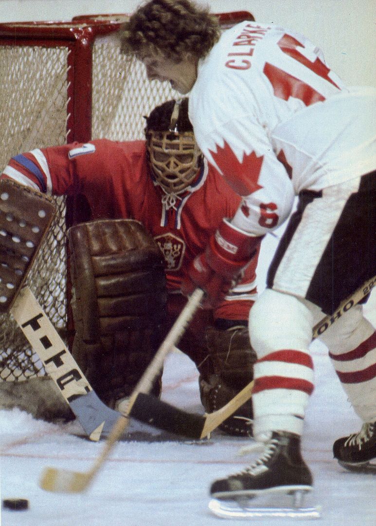
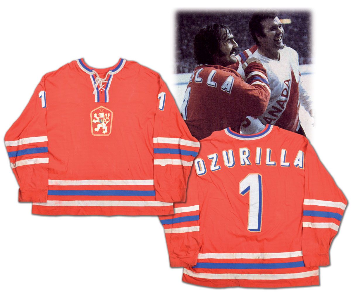
- The 1976 Canada Cup saw a few of the world's hockey powers come together in the tournament. The Soviets were there as were the Canadians, but the Czechoslovakians were one of the better teams at the tournament. Backstopped by Vladimir Dzurilla, the Czechoslovakians played extremely well to finish with the silver medal behind Canada. They wore these simple yet gorgeous sweaters to compete in, and they certainly made an impact on the hockey world that September.
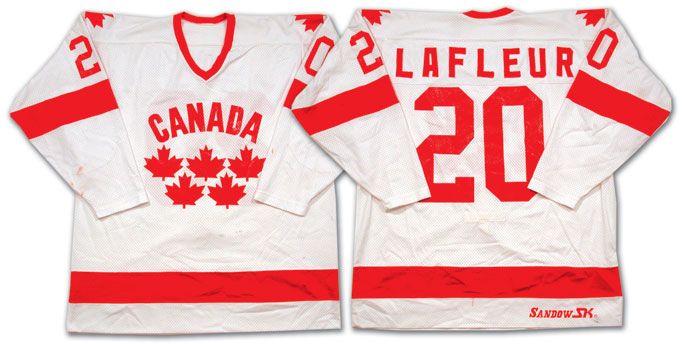
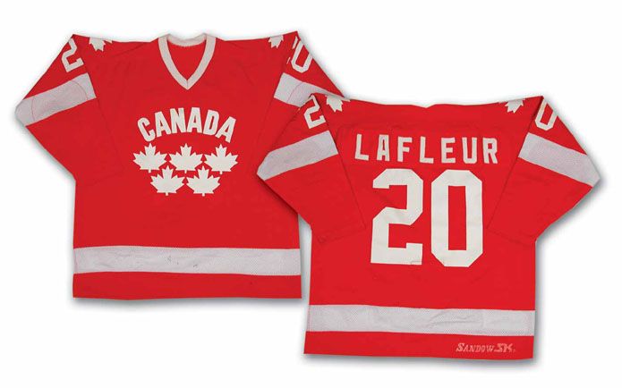
- The idea of "less is more" is certainly prevalent in the international hockey world. After being stunningly eliminated in the opening round of the 1981 NHL Stanley Cup Playoffs, Guy Lafleur took his talents to the 1981 World Championships. It was there that Canada wore these uniforms when playing as the home team and these uniforms when playing as the road team. I have to say that I really like them, and Hockey Canada might want to look at a design like this if they ever run into another logo controversy at the Winter Olympics.
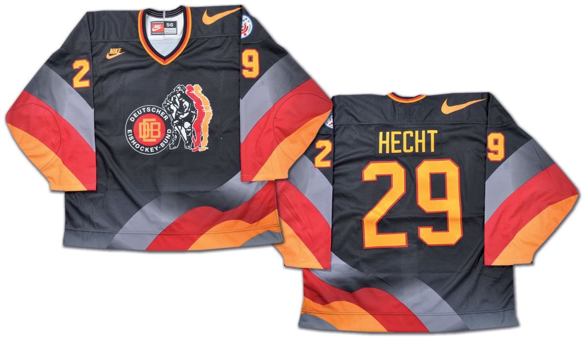
- I'm not sure what Nike was thinking when they designed the German uniforms for the 1996 World Cup of Hockey. That's a horrendous design with the giant swoosh on the shoulders, the shadowed player in the middle of the uniform, and the wavy hem stripe. Thumbs down from this writer.
- I wasn't aware of this, but Glenn Anderson's Hall of Fame induction night featured a horrific tribute jersey designed by sports artist Janet Deane. From the auction page, "Sports artist Janet Deane created this distinctive Anderson JAC (Jersey Art Collectible) jersey and brought a sample to the six-time Stanley Cup champion's Hockey Hall of Fame Induction ceremony in 2008. The Oilers great was so taken with the jersey that he collaborated with the artist to produce a limited edition of 300, of which this is number 236. Using Anderson's #9 Oilers jersey as a base, the artwork screened onto this "hockey card on a jersey" features highlights of Glenn's HOF hockey career, including his six Stanley Cup rings on the front of the upper left sleeve. Glenn has added his retired #9 to his blue marker signature on a JAC Hockey patch sewn on the bottom right front tail. The limited edition number "236/300" is written in fine blue marker on the right side of the patch. An "Anderson 9" patch, featuring the notation "Once an Oiler, Always An Oiler" and the team logo, is sewn on the left breast." Notice the part that I highlighted? Anderson actually commissioned her to make more of these! Seriously!
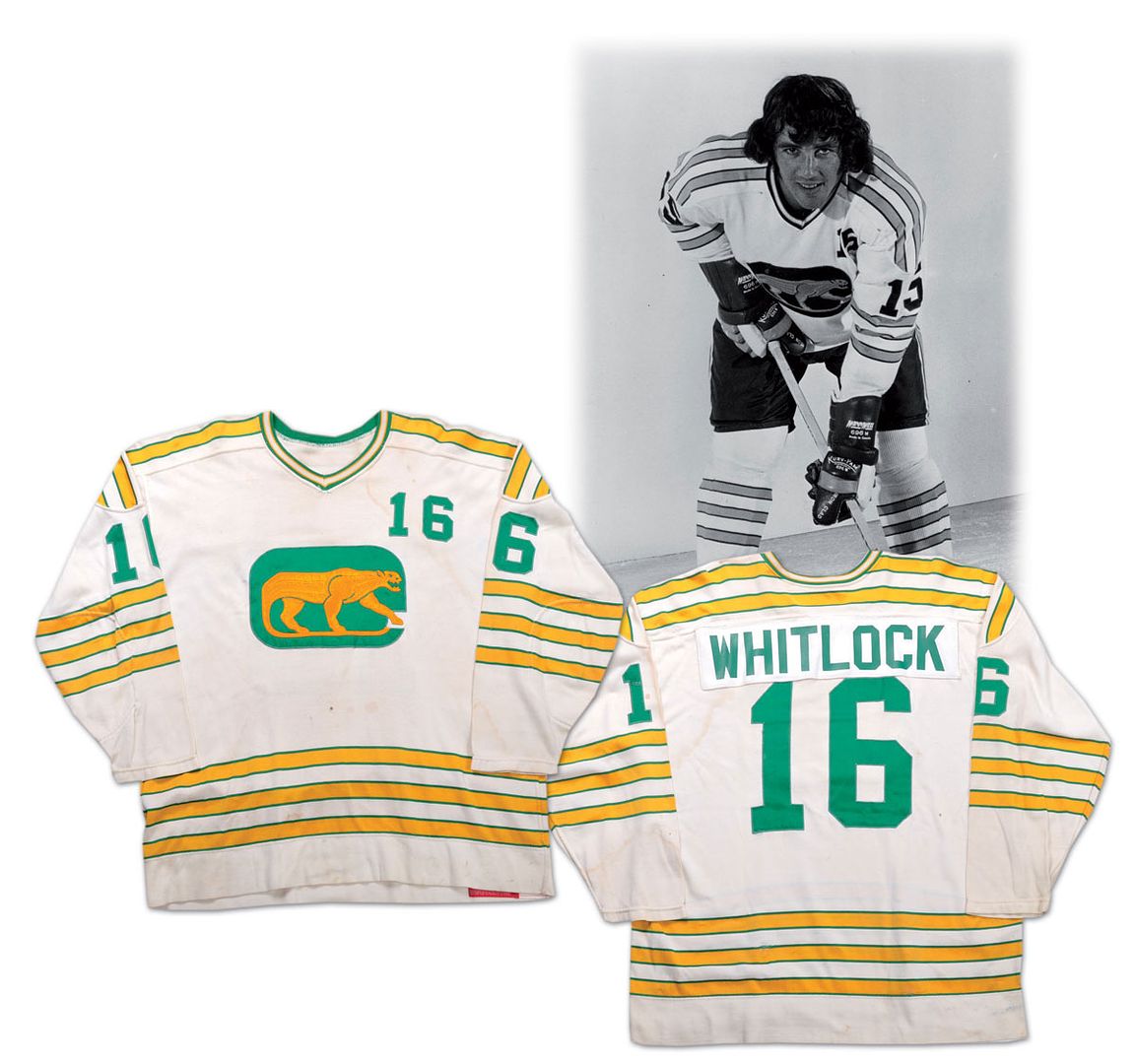
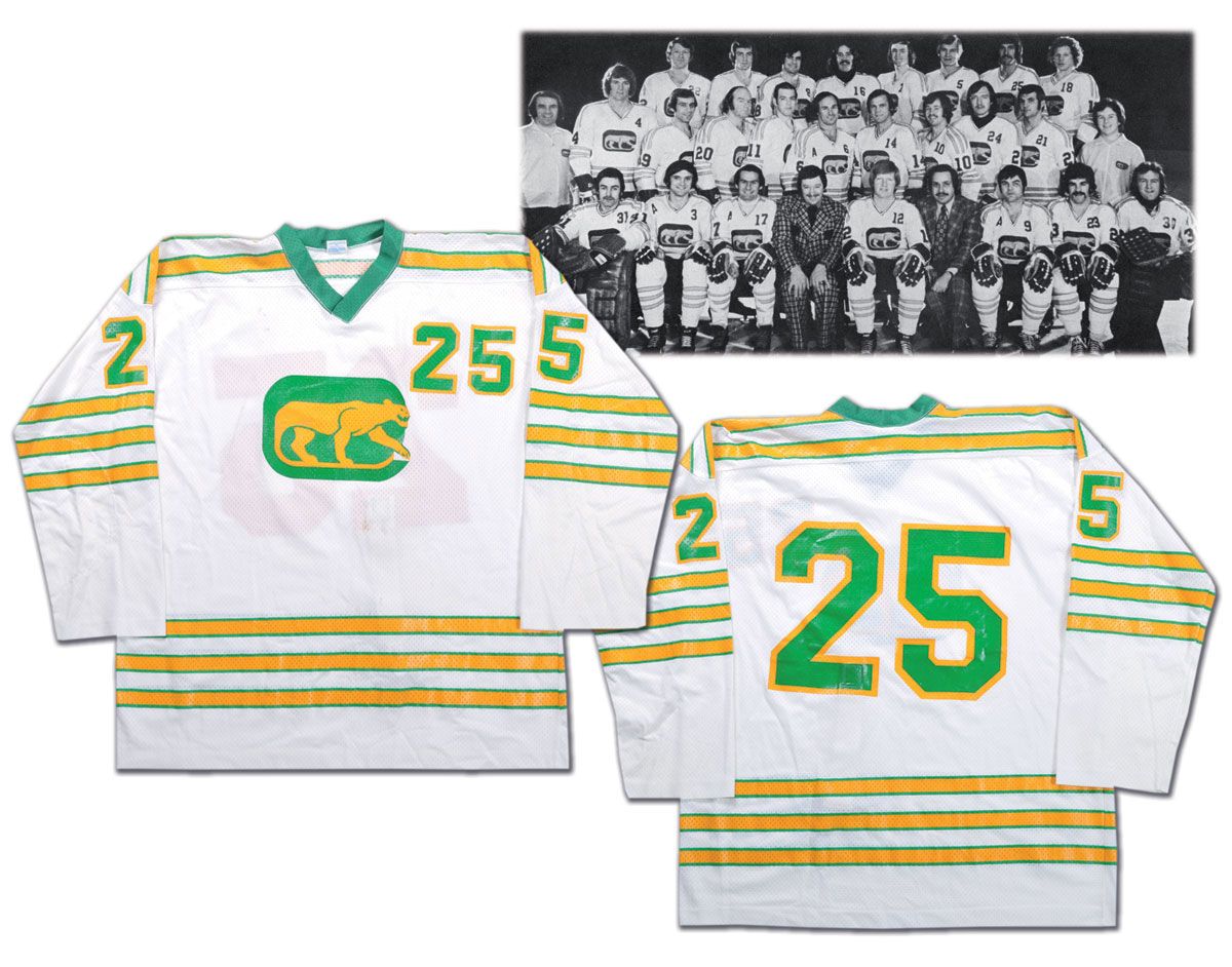
- And we finish today by taking a quick look at the Chicago Cougars from the WHA. In 1972-73, you can see that the numbers on the jersey have no outline. Also, note the width of the logo and placement of the numbers on the front. By 1974-75, the Cougars had outlined the numbers in yellow, shrunk the logo down, and moved the numbers from above the top right corner of the logo to beside the right corner of the logo. Now, some may say that those are insignificant changes, but they are glaring changes to me. Anytime the logo becomes less important than the number on the jersey, your team has problems.
Until next time, keep your sticks on the ice!


1 comment:
By the way, Dzurilla is the player wearing the team Canada jersey on the left just after he and Rogratien Vachon traded jerseys. Saw Gretzky in a USSR jersey once because of a similar situation
Post a Comment