The Tech Side Of HBIC
This probably won't mean much to you if you're just here reading, but I would like to comment on how Blogger changed thanks to Google's drive to make everything look the same across their platforms. Personally, the new design is lifeless and somewhat confusing. I suppose that Google can brand its properties any way it likes and that I simply use a service that they offer, but sometimes change for the sake of change is highly unnecessary. Anyway, I'll keep an eye on the nuts and bolts of HBIC, but I do want to look at a couple of things on this blog that you should influence.
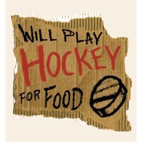
 First, the favicon? You know, the little image that appears beside the URL in the address bar above and looks like the image to the left? I think I need a new one that isn't pushing the Blogger name. I mean, Blogger's been a good service for the five years I've been doing this, but I think it's time that I start branding this blog a little more with my own brand. Granted, I'm not looking to brand like Nike or Reebok, but I think a favicon would be a good addition. In saying this, I'm open to suggestions. Remember that a favicon is a very small image, so creating widescreen images for a favicon would be a bad idea. Your suggestions are appreciated, so hit me with them in the comments!
Secondly, I've considered changing the banner a couple of times, especially with the Thrashers long gone and the Jets back in town, but I've decided to stick with the banner the way it is for now. It serves as a reminder of when this humble blog started, and I do appreciate hockey history. Perhaps I'll have a change of heart in the future, but I'm comfortable with the banner at this juncture.
Thanks to the improved stats that Google shows, I can now target key demographics more accurately with my stories. The vast majority of hits come from the United States and Canada, but would you believe that Germany is third? That surprised me because I don't recall a lot of articles that dealt specifically with German topics. Even more surprising is that the Netherlands and India were ninth and tenth respectively, not far behind hockey-centric places such as Russia, Sweden, and Finland. I like the new stats from Google.
There were reports this month that Google Chrome had overtaken Internet Explorer as the world's most popular browser for a short time, but my stats still show that I've had more people tune into HBIC with IE and Firefox than Chrome. The difference between Firefox and Chrome is less than 1%, but Internet Explorer is still ahead of both Firefox and Chrome by 13%. Safari, not surprisingly, is fourth, and Mobile Safari - iPhone's browser - is fifth. Strangely, I've had 267 hits this past month from a browser called "Iceweasel". Interestingly, I learned something new from my stats as I had never heard of Iceweasel before.
I took a look at the keywords that people use to reach my blog. I figured that "hockey blog in canada" would rank high, but it was second all-time since May 2009. So what was first? Amazingly, the name of Columbus Blue Jackets star Rick Nash was the top search that brought people to HBIC. Another player's name was third as Eric Lindros' name brought a large number of people to HBIC as well. Other players that gave HBIC some hits were Randy Carlyle (fifth) and Colton Orr (sixth). The most surprising keyword was that of "tim hurlbut". You might be wondering who that is. Well, he was the lead photo in this article. I was shocked that Tim's name would generate that much traffic!
I'm not in love with Google's push to change the look of Blogger as I had grown quite fond of the setup that they had previously. I'm not saying that I'll abandon Blogger for anywhere else just yet, but I'm going to have to play with the new settings and layout that they have introduced behind the scenes. Make sure you hit me with your ideas on the new favicon, though!
Until next time, keep your sticks on the ice!


5 comments:
In looking at the stats for my blog for keywords, the two that are at the top of the list are "Winnipeg Jets" and "Roman Turek." The latter is because I did an article on his history of masks, which combines two loves of mine: hockey and heavy metal music.
Funny, my Google stats show USA, Canada, Germany with 8 times more than Finland, Russia and the UK, while my tracker from FlagCounter.com shows USA, Canada, UK with Finland, Russia, then Germany and Sweden all relatively the same, with Germany certainly not miles above the rest. Wonder what gives?
For what it's worth, I HATE the new blogger interface which requires me to click twice for all the important tools that used to require a single click. Once again, an "upgrade" is NOT an "improvement".
I have to say that I'm not overly enthused by this new version of Blogger as well, Jeff. The added functionality makes it better in theory, but the overall is not so great. I'm going to see if I can live with it. Also, apparently my blog jumped from .com to .ca without my knowing. Thanks for the heads-up, Google!
Not that I have a site, but it's interesting to hear different stats about how people get to a website. Thanks for sharing.
The one HBIC technical issue that (minorly) irks me the most is that it opens a new tab when I click "Older Posts". It is a minor thing, but if I'm reading back for the past week or more, it can lead to 3+ tabs in the browser. I don't know if that can be modified to stay within the current tab, but I would certainly like that better.
As for the favicon, I think some variation of hockey sticks, mask, or the HBIC letters would be best. It doesn't have to be fancy or unique, but clarity and "rememberability" are key. I will see it most in my bookmarks list, so hopefully it's a good one!
Good comments, Sir Jaws! To be honest, I programmed the site to open a new window when clicking on links because of a previous complaint. When I linked something into the article, it would open in the same window. People didn't like that, so I made any link click open to a new window. I hear you on the number of tabs, though. I have that same problem!
Good favicon suggestions. I'll see what I can find!
Post a Comment