


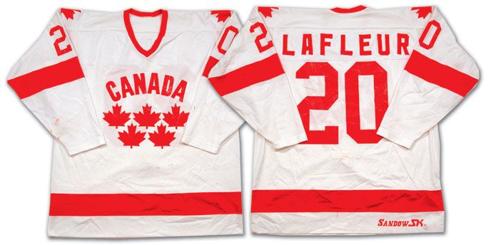
Oh-Em-Gee Canada

Unfortunately, it appears the Nike couldn't give a rat's ass about what that level of pride means to the Great White North. The above design proves that Nike has an eye for fashion, but little knowledge in the way of traditional hockey uniforms.
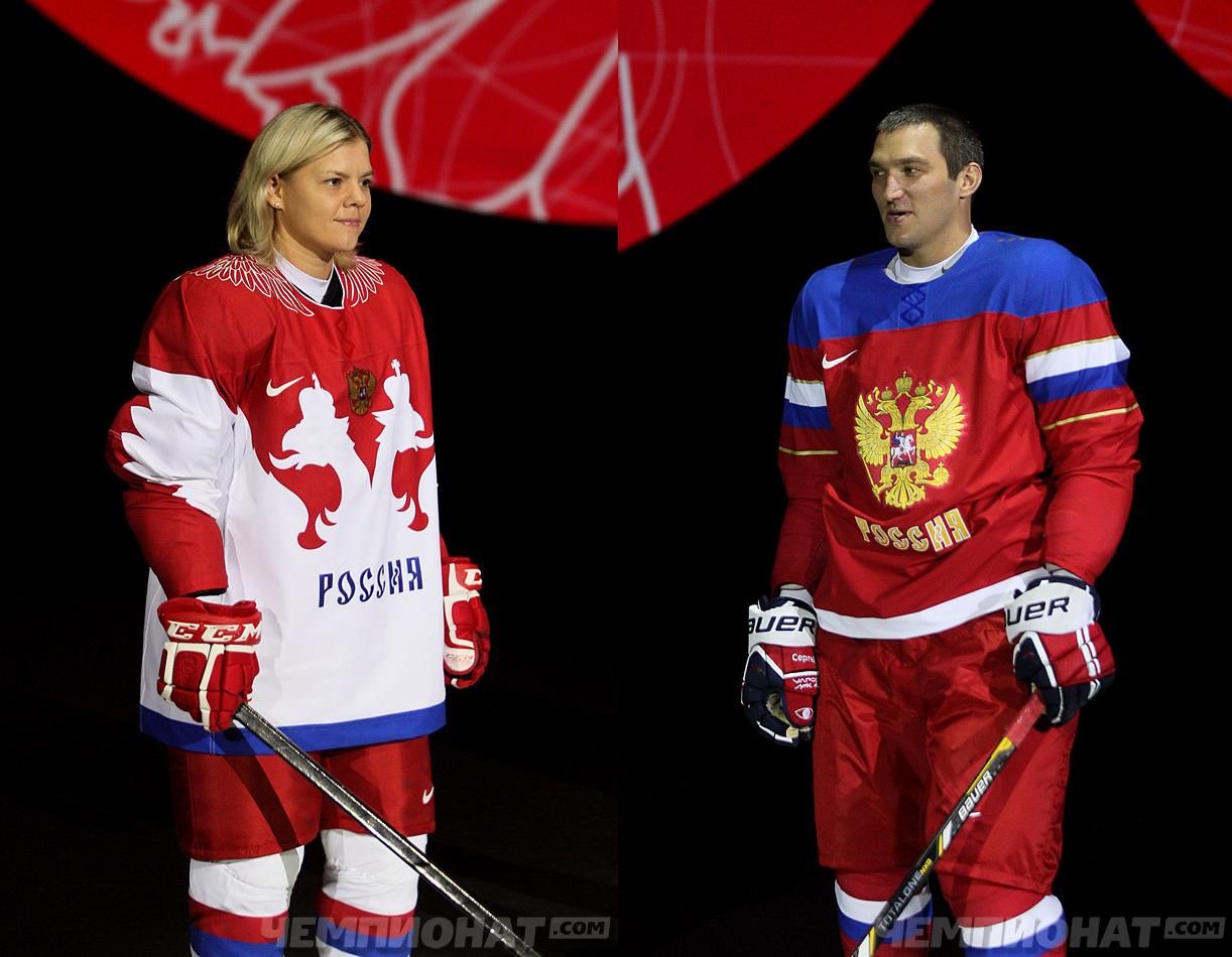
I'll start with a positive. There is no mistaking that these uniforms are those of the Canadian squad. The red-and-white color scheme is entirely Canadian-esque, and the maple leaf is unmistakably Canadian. If the white uniforms are simply the colors inverted, this would be a middle-of-the-road fashion uniform.
The problem is that the Olympics are not a fashion show unless you're wearing these exclusively for the opening and closing ceremonies. Hoe fantastic would Team Canada look in these uniforms while filing into the stadium for the 2014 Sochi Olympics? Dare I say that they may be one of the best-looking teams that would enter the stadium that night?
Where they falter is that they are NOT hockey uniforms in terms of their look or feel. Much like the Russian uniforms and American uniforms seen, the Canadian uniforms feel entirely incomplete. No hockey striping on the lower hem, no traditional should yoke to break up the uniform, and certainly a much more subdued feeling of pride over these uniforms. No, these shouldn't be the jerseys for the Canadian hockey team simply because they feel like fashion jerseys.
How this uniform's image got out was that Getty Images mistakenly published the photo of Jonathan Toews on its site before pulling the image. Unfortunately, the damage had been done, prompting Hockey Canada to respond with the following:
"Hockey Canada will unveil and launch the jerseys that it's men's, women's and sledge hockey teams will wear at the Olympic and Paralympic Games in Sochi on October 8. We look forward to telling the story and innovation behind the jerseys at that time."Sounds like Hockey Canada needs some time to justify and/or rationalize this new design if you ask me. Personally, I feel for Hockey Canada because it seems the photo leak isn't helping their cause whatsoever.
Allan Muir, a columnist with SI.com, said it ooked like Toews was wearing an "oversized pajama top." Twitter reactions were swift and brutal.
@JayOnrait IT LOOKS LIKE A PETRO CANADA STATION
— Bruce Arthur (@bruce_arthur) September 6, 2013
The new Team Canada jersey looks like a $20 pullover sweater available at your local airport's gift shop
— Lauren D (@lauren_dots) September 6, 2013
The alleged Team Canada jersey is dreadful. I honestly hope Sweden has banned Nike from its borders.
— Seth Rorabaugh (@emptynetters) September 6, 2013
@stevelepore Scarf with sleeves
— Tim Bowers (@TimBowers62) September 6, 2013
@jessespector My husband hasn’t seen the Team Canada ones. I described them as worse than Buffalo’s. I stand by that.
— Shannon Proudfoot (@sproudfoot) September 6, 2013

Until next time, keep your sticks on the ice!


1 comment:
It looks like a duty-free bag you get in Niagara...
I am NOT a fan of these paper-thin "performance" jerseys...no substance and they all have the feel of cheap-Canal St.-knockoffs...
I miss the old CCM days...
Post a Comment