


Forgetting The Slug
 I had every intention of writing about the Buffalo Sabres today as the club officially unveiled their new uniforms for the public's consumption. However, I am extremely honoured to have been contacted by Phil Hecken, Uni Watch Blog's right-hand man, who wanted to speak a little about Buffalo's new look. Who better to speak of Buffalo's new threads than a uniform-obsessed man who lives in New York? We'll get to the Sabres in a few minutes, but let's get to know Phil a little before moving on.
Phil Hecken is a long-time sports fan. He's a die-hard Mets fan, loves the Fisherman New York Islanders logo, got to witness the Islanders' dynasty during the early 1980s, and is undoubtedly one of the best men for the job when talking about uniforms thanks to his work under the tutelage of Paul Lukas on Uni Watch Blog. Without further adieu, here's Phil with some commentary on Buffalo's new look. My comments will follow!
On Saturday afternoon, the Buffalo Sabres unveiled their new third sweater/uniform as well as a new road jersey that is almost, but not quite, a mirror image of their home sweater. The home uniform is "technically" new as well, having been bumped up from their former third kit of last season. The unis were unveiled as a part of the celebration of the Sabres' 40th Anniversary.
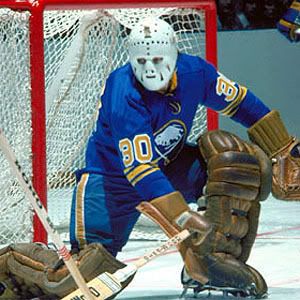
The big news, of course, is the old logo, derisively nicknamed the "Buffaslug" (for its uncanny resemblance to the vile garden denizen) is no more. The Sabres have reverted to a full-time fauxback uniform, with a nifty new third jersey.
The new royal blue uniform "celebrates the history of Buffalo hockey with a vintage white script across the chest inspired by the old Buffalo Bisons club," notes the Icethetics blog. "Beneath the script and set to the right side is the Sabres' 40th anniversary mark — the retro logo with 19 and 70 inside the blue circle."
The Buffalo script is reminiscent of the old Buffalo Bisons "bottlecap" logo (more information on the Bisons can be found here). The back of the jersey features a yellow nameplate with blue block lettering and an odd cross-stitched pattern, which is supposed to be evocative of vintage hockey sweaters.
Obviously, after the "Buffaslug," these uniforms are a MAJOR upgrade, and it's hard to find fault with anything about them. I'm not overly fond of the tiny front uni numbers nor the white piping on the home jersey, but other than that -- these are damn near perfect. As far as the new third, I LOVE the four yellow/gold stripes and the royal blue color, but the retro inspired wordmark doesn't need the overline and the 40th anniversary patch looks slightly out of place and purposely off-center (just not a fan of a wordmark and a logo on the front -- it might look better if moved the shoulder). But those are really minor quibbles -- the Sabres have totally scored a hat trick with these gorgeous new threads.
According to NHL.com, the Sabres will wear their new third jersey for the first time against the New York Rangers in their home opener on October 9.
Wow. Fabulous work, Phil! This is why I'm proud to feature readers' work - it's simply incredible!
First off, I can't say enough good things about the Sabres returning to their original logo. This is entirely how Buffalo should always be remembered for eternity. While I'm still not big on the small shoulder numbers, they can be overlooked when considering the magnitude of returning to the proper logo.
The alternate jersey is very baseball-like in its look, and reminds me a little of what the Minnesota Wild did with its alternate jersey. I'm still not sold on script names across the front of jerseys because it is meant for a logo, but the history that is associated with the Buffalo script is fairly important. Phil pointed this out, and I agree that the back font with the cross-stiches is a little odd. However, it is very unique, and will certainly be quite noticeable when worn for the first few games.
Overall, a big thumbs-up for the return to the old logo, so that means a thumbs-up for the new jerseys from me. Again, a huge thank you to Phil for his expertise in this field, and there will be more reader posts coming up this week!
Until next time, keep your sticks on the ice!


3 comments:
Glad to see the back of the Slug. The next team in most obvious need for an EDGE-cleanse is the Avalanche. Get that unipron out of Colorado and get the mountain hem back. I like the team but their home and roads are unquestionably in the bottom three with Dallas and Atlanta.
I enjoy reading your blog, thanks for writing it.
This new shirt is much sharper looking, the "slug" logo is one of the worst looking jersey's around.
It's really easy to commend the Sabres on the obvious upgrade.
HOWEVER, they could have done so much better. That road jersey is so close to being a thing of beauty. Why do they insist on foisting the gray armpits on us?
Really, why must there be any gray in the color scheme at all? It's bad enough they're only going with the royal blue on a part-time basis.
Post a Comment