


Newfoundland Growlers
Let's go to the marketing speak first.
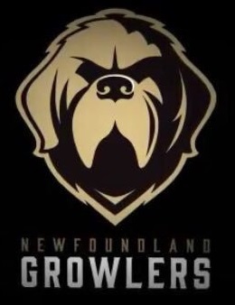
Our primary logo is a Newfoundland dog – a large working dog who is known for their size, strength, intelligence and loyalty. The dog in the logo is fierce and stoic to represent the pride and resilience of our province, and our reputation of never backing down from a challenge. pic.twitter.com/MkLqE6t2q4— Newfoundland Growlers (@NLGrowlers) May 22, 2018
The logo was designed by Idea Factory, a St. John's marketing company, who has worked with companies like Harley-Davidson Motorcycles, Suncor Energy, The Salvation Army, Marine Atlantic, and The Paint Shop among the numerous regional, national, and international companies on their portfolio. In other words, these guys know what they're doing, and I personally like the logo that Idea Factory came up with for the Growlers!
It's an understated logo, like the Golden Knights, that uses the shadows on the profile of the dog to really convey the imagery of fierceness and stoicism. Depending on the jersey colours and features on the jersey, this could be one of the ECHL's best-selling jerseys for some time. As stated in the press release,
"The colour palette was inspired by an iconic photo of Private Hazen Frazier with Sable Chief, a Newfoundland dog that served as the mascot of The Royal Newfoundland Regiment during WWI. The vintage tones compliment the dog's dark hues, creating a strong combination with a classic, universal appeal. Paired with a forged-style font, the hard edges and strong weight give it a stone-chiseled feel which lends itself well to the vintage style of the logo."I like the logo a lot, and the colours chosen by the team could given the Growlers one of the more unique looks in all of hockey.
Here's the video the team used today at the press conference.
Ok, count me in as one of the excited fans of the Growlers! I'm excited to see the uniforms they'll wear, and those will be unveiled later this summer as the first game for the Newfoundland Growlers in their inaugural season will be October 12 when they face off against the Florida Everblades at Mile One Centre. In saying all this, the question must be asked: what are your thoughts on the ECHL's Newfoundland Growlers?
Until next time, keep your sticks on the ice!


No comments:
Post a Comment