


Lowered Expectations

I wrote yesterday about how I hate this entire idea of "Reverse Retro" jerseys. It's nothing more than a cash grab by the NHL who likely will have to deal with another season of empty rinks when one considers how the pandemic is going. While I understand the need for revenue, the idea that the league would sign-off on all 31 teams getting these poorly-conceived, poorly-executed jerseys is astounding to me.
I need to be fair, though, as we saw a couple of decent designs in the first sixteen jerseys, so maybe there will be a few gems in the Eastern Conference. Once again, I'll go through and rate each of these uniforms based on their designs while offering up a potentially better choice the teams could have used from the past. I'll rate each of these uniforms, and explain why I don't like them. Sound good? Let's do this.

BETTER: 1991-92 throwback jersey
I actually don't mind Boston going back to a yellow uniform as they've worn them in the past, specifically from 1959 through to 1967 in terms of a minimalist sweater. I don't like the white cuffs that make it seem like the yellow sleeves are far too short and I could use a black shoulder yoke to add some contrast, but the old secondary Bruins logo on the shoulders is a nice retro touch first seen in 1976 on Bruins jerseys. My only hope is that they pair the jersey with black pants - the yellow highlighter look is not good.
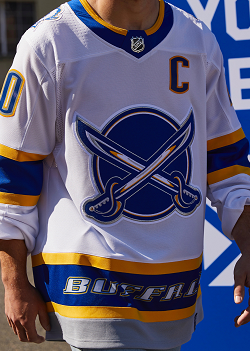
BETTER: 2000-01 alternate jersey
This jersey would have received a higher rating had it not been a complete replication of the 2000 to 2006 alternate jersey, had they used the bison head on the chest as opposed to the secondary crossed sabres logo, and had they removed "Buffalo" off the hem. The colours on this uniform are fantastic, but there are zero creative elements in the design. Are they only wearing it on the road being that it's white? It's respectable, but Buffalo can do better.

BETTER: 1992-97 road jersey
You're likely asking how I could rank this jersey so low, and it's pretty simple: they already have a green-and-white Whalers jersey in their closets. The better choice would have been the 1992-97 blue-and-silver jersey. Instead, we now have five total jerseys for the Hurricanes that include both a current and road jersey, both home and road Whalers jerseys, and a lame black alternate. Hurricanes owner Tom Dundon just keeps squeezing that Whalers rock for more blood, and it's starting to lose its charm.

BETTER: 2003-07 alternate jersey
It seems whoever was behind the red Blues jersey also was assigned the Blue Jackets who are now red? Why red? It makes no sense to have the BLUE Jackets wearing red. This jersey, however, is a direct replication of the first jersey that the Blue Jackets wore, but the red colour makes it irrelevant because the BLUE Jackets shouldn't be in red. If they used the original logo on the alternate they wore? I'd be fine with that. I'll never be fine with this colour-confused monstrosity.

BETTER: 1991-92 throwback jersey
Detroit, like Dallas, apparently is allergic to colour of any kind, so they just went ahead and removed it all from its uniform. I get there aren't a lot of things one can do with a red-and-white colour scheme, but there's a hundred years of history behind the Red Wings. All they could do is come up with gray and red font? If we're dipping into past sweaters, yes, they wore something like this from 1934 until 1961, but it at least had red stripes on the sweater for contrast. This is terrible.

BETTER: 2009-11 alternate jersey
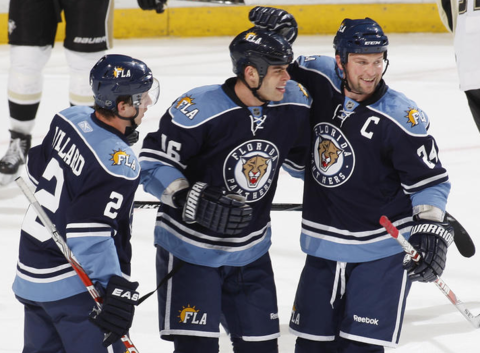
Like the Sabres, these would have ranked higher had the Panthers not messed up the striping on the sleeves and hems from the 2003 to 2007 home jerseys. That font is just way too huge too. It doesn't feel like the Panthers at all. I would have liked to see the double-blue alternate with the new logo on the front as a possibility, but I guess it wasn't retro enough to warrant a restyling. I will say that as an owner of an original Panthers navy jersey, this one makes me want to claw my eyes out.

BETTER: 2008-09 throwback jersey
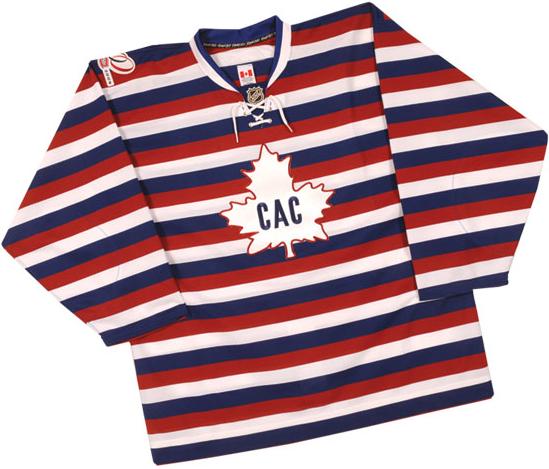
Make no mistake that it's still a little weird to see the Canadiens in blue, but this jersey actually works. It feels a little like the days when their AHL affiliate was the Hamilton Bulldogs, but the blue works with Les Habitants. The striping is perfect on this jersey, it rings true in the Montreal Canadiens aesthetic, and there isn't any superfluous garbage on the jersey. Of the entire lot of "Reverse Retro" jersey that the NHL introduced, this one is the best in this writer's opinion.

BETTER: 2008-09 throwback jersey
This jersey just misses a fourth star, but that's because the devil is in the details. First, the font is way too huge for a retro look. This needs a more block lettering-style font. Second, that green is just a shade too dark from what the retro Christmas jerseys looked like. Third, the crest in that picture looks like it's sitting way too low. At this point, it's a bad Photoshop job. If the Devils cleaned these details up, I'd bump them to a fourth star. Until then, it's three-star hell.

BETTER: 1997-99 road jersey
Remember in school when a kid in class would get a dressing down by the teacher for completely messing up an assignment and missing the entire purpose of the lesson? That kid is the New York Islanders. Rather than going with the Fisherman or some orange jersey, they went ahead and just handed in a design for a standard New York Islanders jersey. No fun, no crazy elements, nothing different from what they wore from 1998 until 2002. This is why we can't have nice things.

BETTER: 1999-07 alternate jersey
The Rangers get one full star for returning to the Lady Liberty logo that seemed to have been lost to history for so long. Where they lose marks is the terrible striping, the lack of a shoulder yoke for contrast, and the double-colour number as opposed to the triple-colour number they wore for so many years. This shouldn't be as hard as it seems - pay attention to the little details because they made the jerseys that much better from eras of the past!

BETTER: 2000-07 alternate jersey
As a fan of the 2D Senators logo, you won't hear me complain about its usage. I will complain about this jersey being way too red, though. Could a shoulder yoke not be tossed on there in either black or gold to break up that red planet? In fact, give me a black shoulder yoke and some gold accents, and this jersey would really work for me. As it stands, the minimalist design isn't really doing anything except searing itself on the back of my eyes.

BETTER: 2002-07 alternate jersey
I never noticed on the old jerseys how the shoulder yokes curl around the upper arms for the Flyers, but it's so pronounced on these jerseys! It looks so foreign! The long white sleeves really make no sense when there could have been some better striping used to break that up, and a white stripe to complement the black stripe on the hem would really make this jersey pop. I just can't stop staring at that torture device around the shoulders and arms on this jersey.
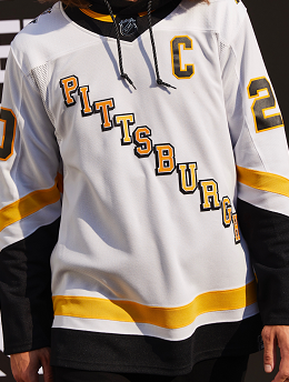
BETTER: 1992-97 road jersey
If I could award negative points, the Penguins would receive them. This jersey is so bad that I thought it was one of those cheap Chinese knock-offs that you might see being sold in a non-reputable store. It looks nothing like anything the Penguins have worn, and to imply that they're supposed to reference the 1992 to 1997 road jerseys is a total slap in the face. The only correct answer to "would you wear this jersey" is "kill me". Holy embarrassment, Batman.

BETTER: 1996-99 alternate jersey
If Tampa Bay looked at their current jerseys and asked if more white could be added to them, this is the end result. The stripes from the sleeves have been moved to the cuffs, the stripe on the hem was made bigger, and they added a white shoulder yoke. That's not creative design, that's laziness. While they did go back to the retro logo, it makes no difference on this uniform because it doesn't feel retro whatsoever. It just feels incomplete. Zero marks for that.

BETTER: 2017 Centennial Classic
I like the fact that the Leafs are using a retro logo on what feels like the Maple Leafs jersey template from the 1980s. That's how you squeeze the retro out of this experiment. Personally, I would have chosen the Centennial Classic logo, but that's my preference. I'm not sure we want the ghost of Harold Ballard waking up with the blue numbers on a blue jersey, but it worked in the Centennial Classic as well. A smaller hemstripe broken into two would be ideal, but the Leafs should look respectable.

BETTER: 1997-2007 black jersey
I was never a fan of these Capitals jerseys, but I will give credit to the Capitals for rendering them in red and using the fonts found on the jerseys from that era. That takes a little courage, and I'll reward them for that. I hate the captaincy letter on the right side of the body entirely, and the mismatched sleeve striping follows the diagonality of the jersey design, but a shoulder yoke would balance everything out. I'd love to see the eagle on the black jersey, but this one will work for the Capitals.
There you have it, folks. My thoughts on the Eastern Conference showed that the Canadiens will wear my favourite design while a handful of others from both conferences caught my eye for a number of good reasons. The teams that received zeroes, however, need to really examine the need for another jersey that will likely land in second-hand shops once they've run their courses. The NHL is a professional hockey league, and they're asking the players to dress like clowns in some cases.
Hopefully, this will be the first and last experiment like this. Quite frankly, I'd be embarrassed if I worked for the NHL and I was asked to promote these jerseys. When teams like Dallas and Vegas just introduced new alternate jerseys this summer, the NHL comes along and puts a dent into those sales with 31 clown suits. Nice job, NHL.
It's unlikely, but do you agree on any of my assessments? Am I way off? Should I just shut down the blog after these two articles? Lemme know in the comments and we can discuss!
Until next time, keep your sticks on the ice!


:format(jpeg)/cdn.vox-cdn.com/uploads/chorus_image/image/52552115/usa_today_9782958.0.jpeg)
No comments:
Post a Comment