It's somewhat hard to believe that the Anaheim Ducks are celebrating their 30th anniversary this season when one considers that I watched them draft Paul Kariya with their first-ever NHL Entry Draft selection following the expansion draft where goaltender Guy Hebert was the first player to be named as an "Anaheim Mighty Duck". Obviously, the eggplant and jade colours have come and gone over the years with champagne and orange filling in those voids, but Anaheim's announcement of a 30th anniversary jersey that they'll wear in 2023-24 had everyone hoping for a throwback to the original egpplant Mighty Ducks uniform or a spin on one of their many alternate jerseys that they wore when they were called "Mighty Ducks".
"As we enter our 30th Anniversary season it's exciting to reveal a new jersey our fans can be proud of," Ducks Vice President of Marketing Merit Tully said
in a statement today. "This jersey is a symbol of our journey the last 30 years, our successful history and a nod to our origins. It was designed internally in a collaborative effort by organizational departments up to ownership, and we are excited for our players to wear it with honor this upcoming season."
The jersey to the left is what the Ducks will debut on October 15, 2023 against the Carolina Hurricanes as the eggplant and jade returns to Anaheim for Season 30. The colours are phenomenal and the Ducks should have never abandoned their original colour scheme, but I dislike the metallic silver stripes that Adidas added to this jersey. It feels very out of place on this jersey, and overpowers the other stripes when looking at the sleeves. In low light like the image to the left, it's not as noticeable, but the image below has the stripes stand out awkwardly. I'm also not a fan of lace-up jerseys as they've been done to death, but that's just my own personal thing.
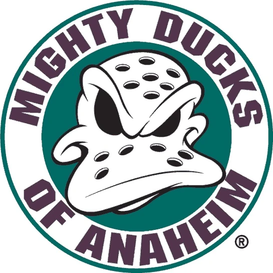
Aside from the metallic stripe, these jerseys are glorious when it comes to colours. The logo, though, is a lot of question marks because the Mighty Ducks wore that logo
as a secondary logo during their early days of the franchise, and I can't understand why the Ducks would elevate it to a primary logo when they could have used the original logo very easily or even
gone with a conceptual logo for the 30th anniversary. I certainly don't need the name in the circle bordering the duck mask, and the addition of the Ducks' current logo at the bottom screams insecurity when it comes to the current logo. There's a pile of problems with the logo on the chest, and I'd start to make it better by removing that circular border with all the unnecessary pieces on it.
The metallic stripes also possess an imprint of some of the history of the franchise. On the left arm, one will read that the Mighty Ducks were established in 1993 while the right arm stripe marks the rebranding as the Anaheim Ducks in 2006. Why one would put this on the sleeve of a jersey of a professional team's 30th anniversary jersey is beyond me, but this is something that should be on the neckline inside the jersey. If this jersey is only being used this season, the 30th anniversary is implied so the 1993 note is unnecessary. If it's not, having this history on the outside of the jersey is minor-league at best.
"It's a nice little token or metaphorical timeline as we like to describe it," Tully
explained to ESPN's Ryan S. Clark. "From a color standpoint, we wanted to hit the nail on the head. We're always understanding that our fans do love that old and original color scheme with the plum and the jade. As we've looked at the third jerseys in recent history along with our 25th anniversary jersey and the third jerseys we have worn, while historical in nature, this is a fresh new look."
Is it, though? It's their original colours with an old secondary logo. How is that "fresh" or "new" if we've seen both before?
Like their previous rebrand to the Ducks where they removed the fun, this jersey feels like a manufactured effort to simply sell more jerseys. People like the 1993 jerseys because they were vastly different from other hockey jerseys at the time in their colours, and those '93 jerseys certainly bucked the trend by having that very recognizable cartoon logo on the front. The colours may be back, but the fun still feels like it was missed as an ingredient in creating a memorable and unique jersey for three decades of NHL play.
When your newly-designed jersey gets a "meh" as a response, you might have missed on the assignment. There simply isn't enough good to outweigh the not-good on this jersey, and I'm not certain I'll be excited to see the schedule where they'll wear this uniforms. While second-overall pick Leo Carlsson was wearing it to greet fans in Anaheim via video tonight, social media was split as it seems this jersey is a true "love it or hate it" design.
It doesn't evoke memories of Kariya or Selanne, but it will serve its purpose as a jersey next season. I'm just hoping that the Anaheim Ducks don't drop the ball on other 30th anniversary moments.
Until next time, keep your sticks on the ice!


No comments:
Post a Comment