


Good, Bad, And Other Stuff
 Sometimes, people just do things right. Other times, things get so messed up, you're better to just scrap the whole idea and start from scratch again. Such is the case with the majority of the new NHL jerseys. For the most part, there have been atrocities designed by Reebok with input from the respective NHL teams who need help. Unfortunately, the teams that are now stuck with these crimes against the eyes are the ones who needed a small tweak or slight update. Instead, common sense was thrown out the window and replaced with sheer stupidity. Ladies and gentlemen, I present to you a team who has adopted stupidity like stupidity is its first-born, and a team who decided that traditional looks better and should be commended for it.
The Edmonton Oilers have been one of the classier teams since its arrival to the NHL in 1979. The Oilers shot to stardom wearing these gorgeous jerseys. The orange shoulder yoke contrasting against the blue jersey was an aesthetically-pleasing scene. The Oilers took steps forward in the 1990s, and their jerseys evolved with them. Gone were the orange shoulder yoke, and Vegas gold made its way into the jersey. The darker blue was still a good contrast, though. Of course, there was the highly-popular, Todd McFarlane-designed alternate jersey which, arguably, was the best of all the alternate jerseys to date. So you'd think that the Oilers would have a lot to work with when you think about their jerseys and their history, right?
Can someone please explain to me what the hell happened to the Oilers? Aprons on the Oilers? Why? I officially will never like the Oilers again. Ever.
The Oilers still have a highly-legible font, which is good when looking for a player to hex due to their ugly jerseys and terrible play. However, if you're being charged $50 to watch the Oilers play home games in their practice jerseys, I'd want my money back. The jersey really looks bad on the goalies who will be doing all the cooking at the next barbecue. What's up with the pants striping? Again, if striping accomplishes nothing aesthetically, get rid of it. It doesn't line up at all, so it should be removed.
The part that really grabbed me on the Oilers' jerseys, though, was the placement of the letter indicating the captain and alternate captains. We were told at the Red Wings' jersey unveiling that they couldn't have the "C" and "A" on the left side due to the seams on the jersey. In fact, the exact quote reads as follows: "[t]he letters had to be moved because the new jerseys are constructed of multiple panels, more so than the old models, and there wasn’t room for them above the tip of the Winged Wheel on the left side without hitting a seam". So what's the deal here, Reebok? Is the tail wagging the dog, or were we just fed a bunch or rhetoric? I smell manure, and it's coming from Reebok's corporate offices.
Honestly, Edmonton couldn't do much more to make these jerseys worse. They will fall down the list to somewhere near the bottom. At least the Florida Panthers threw a little colour into their jerseys. It appears that Edmonton's jerseys were designed in about five minutes.
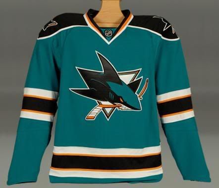
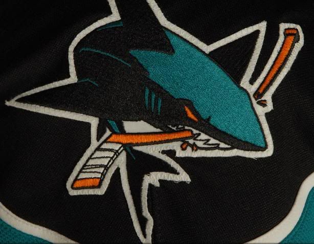
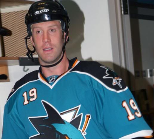
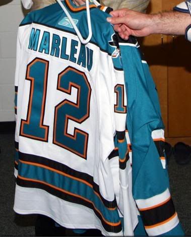
The San Jose Sharks, however, decided to go back to the future. The Sharks added hem stripes to their jerseys, and made the shoulder yoke traditional.
"Our goal was to produce a uniform that paid homage to our birth as a franchise while incorporating a few elements that are more 'now'," said President and Chief Executive Officer Greg Jamison. "The striping on the jersey is reminiscent to our first sweaters. We increased the size of the numbers and added them to the front of the sweater, which will help our fans in identifying our players more quickly and easily. On top of all that, we are excited by the new technological innovations made by Rbk."
Ok, besides the front number stuff, the home jersey and road jersey are gorgeous. The logo, as cartoonish as it is, looks good on the traditional-style jersey, and the shoulder logo is alright too. I'm not sold on the front numbers, though. To me, that's just overkill. Sometimes, you can do too much, and that's what those numbers suggest. The rear font on the jersey is highly-legible, though, making it easy to read and easy to identify players.
Overall, the jerseys on the players look great, and the Sharks could almost be mistaken for an Original Six team with this design. The Sharks will rank in the top 15 teams for sure, and may even break into the top 10. Well done, San Jose.
I'm going to try to follow up with Reebok in regards to their conflicting stories. I also have a few other questions, but we'll see what kind of answers I get back, if anything.
The Mark Bell piece has been put on hold for now. It will appear this week once I have time to re-edit it. There's a few things I want to change, and I need to make time to do that.
Until next time, keep your sticks on the ice!


5 comments:
Teebz -
I agree with most of your assesments so far. I have hated most of what has come out with a few exceptions. Namely the Bruins, Red Wings, Canadiens. The Senators and Coyotes are good efforts also. I'm young 30's and grew up watching the teams of the late 80's and early 90's, so the shoulder yokes are a requirement to me. Why is there such a movement to do away with them and hemline stripes? It's a big mistake in my book. By the way - any news on my Devils new look?
I can't stand it anymore. I can undersatmnd the NHL wanting to attract new fans, but they won't attract any new fans with these jerseys. In fact they'll continue to alienate what fans they still have. Thanks, Gary Buttman, I'm through watching.
Fear not, Duane. I feel that there may be more changes coming. I don't think there are many happy with Reebok, including the players themselves.
Jon, I'll have Devils pictures tomorrow! :o)
They look exactly the same, though.
I have followed your ramblings on the jersey and have never really understood the interest and how it has evolved, what the lines look like, how it's changed, but you know what?
I keep reading and I keep getting more interested. Nice work. Jerseys are a billion dollar industry, they spread the word and strangely, teams of clothing/jersey designers must get paid an enormous amount of money to design, test, create, start-over, etc, etc....and this is how they turn out?
I know it's good for the owners and the teams, but I fashion the most traditional approach to new designs; the players seem to go along with all the hoopla as well.
Thanks for caring. I also now watch Isaac Mizrahi. (kidding).
Dark
I'd love to delve into the mind of a person that would stop watching hockey because of jerseys :)
I hate a lot of them, but man, the product on the ice is too good to not watch just because I want to burn the fabric the players are wearing.
Also.. some of the jerseys (Panthers for one), when watched on players actually playing, look pretty ok.
Post a Comment