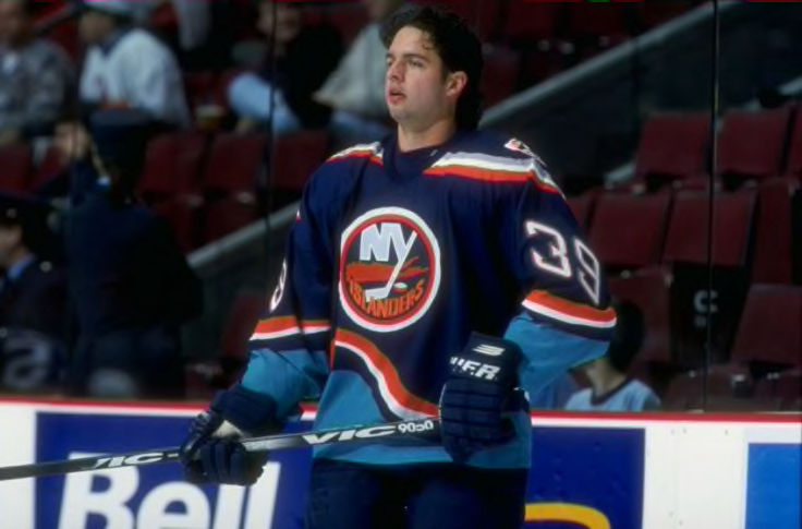
For those that are in the know, there are specific jerseys that collectors hunt for in terms of adding one of those rare or special jerseys to the closet. The jersey worn by Zigmund Palffy to the left is one of those jerseys as the New York Islanders wore that style of jersey for two seasons from 1996-98. Affectionately called "The Wave" by jersey aficionados, it combined the Fisherman jersey's sublimated wave design on the bottom hem and the funky font with the Islanders' classic logo. Because they were only worn for two seasons, game-worn jerseys are hard to come by, but even those sold retail are hard to find thanks to their short lifespan and the length of time since they were worn.
I bring this up today because this little piece of history caught my eye as I was scrolling through all the doomsday predictions for my local weather patterns with the impending blizzard on the way:
While that price is a little rich for my blood, there's no harm in taking a peek, right? Let's see this beauty in all its glory.
Immediately, I can sense that few people had their hearts flutter upon seeing this marvelous design to the right. The stripes are right, the logo is proper, and the shoulder patches all match up, but we need to hit the brakes quick because there are already problems with this jersey. Right off the bat, the number font on the sleeves is wrong when compared to
what Travis Green wore during that era. While the fighting strap and the embroidered CCM logo on the hem are correct in terms of checking the "authentic jersey" options, someone messed up the sleeves bad. That should be your first warning flag for this jersey, but I assure you there will be more which makes that $400 price tag completely outrageous.
And here's where the wheels come completely off. The Islanders never once wore block lettering with this jersey nor the Fisherman jersey, yet someone went ahead and put block letter font for the name and number on the back. As you can see on
Robert Reichel's jersey from that eras, the funky Fisherman lettering was used throughout the 1997-98 season. At no point did the Islanders revert back to their normal block lettering font while wearing this uniform. Quite frankly, it looks awful with the wave design leaving that huge gap below the "4", and that namebar is entirely out of position with the large gap above the "B" in Biron. I'm not sure who was responsible for this customization, but that person should never be allowed near one of these jerseys again.
What makes me laugh, though, is that Mathieu Biron did wear #34 in this font two seasons after the Islanders had mothballed this style of jersey! Biron was still a member of the QMJHL's Shawinigan Cataractes in 1997-98, so there's no chance he would have worn this jersey in his career. When he joined the Islanders in 1999-2000, they had already reverted to their classic design with the font pictured on this jersey, so clearly this jersey would require a significant amount of fixing if one were to buy it.
Are you willing to spend $400 USD on a jersey that likely requires another $150 worth of name and number changes? Unless you have money to burn, I would think that most reasonable people would opt out of this purchase. As a guy who is a bit of a jersey enthusiast, seeing this many glaring errors on a jersey's customization really makes me hope no one falls for this swindle at that price point.
For those asking, there was a #34 who played in "the wave" jersey for the Islanders between 1996 and 1998. He had a pretty significant moment in 1997 when he was named the Calder Trophy winner for 1996-97 as the best rookie. I'm, of course, talking about
Bryan Berard who wore "the wave" in his first full season in the NHL. Unfortunately, he never wore the block lettering font that is shown on the jersey above.
The moral of this story, folks? Caveat emptor when looking for good buys. As we've seen here, there's a lot of overpriced garbage out there.
Until next time, keep your sticks on the ice!


No comments:
Post a Comment