With the season coming to a close, my Sundays here on HBIC opened up with
The Rundown put into storage until next season. In having some spare time on my hands, I decided to switch back into creative mode in order to keep Canada West women's hockey in the conversation as we let the summer months elapse. As I was getting switching into creative mode, it dawned on me that every Heritage Classic has been played in a Canada West city outside of Saskatoon and Langley. We've talked about having an outdoor game at some point in Canada West hockey on
The Hockey Show, so this gave me a creative idea!
Before we get too deep into this, let me state unequivocally that none of what you see following this sentence is official in any way. In fact, I'd say the chances of never seeing what follows is virtually guaranteed, so don't start holding your breath. What I will say is that while so many outdoor games feature throwback or fauxback jerseys, we need to generate a few of those jerseys in Canada West for outdoor games as well. We know that MacEwan played in an outdoor game during the ACAC days, but they didn't have one made, meaning that this is essentially a blank slate when it comes to being creative.
For those asking, there were only two rules I wanted to satisfy: use a retro logo from the school's history, and use a primary jersey colour that the team already doesn't employ. If the second rule was already satisfied - Calgary and Saskatchewan already use black alternate jerseys, for example - the door was wide-open to use whatever colour I wanted. For teams who already skated in throwbacks -
looking at you, UBC - the door was open to be very creative.
All templates used for the designs were taken from the
NHL Uniform Database and its side project in the
WHA Uniform Database. Full credit for the templats goes to Andrew M. Greenstein, and his sites were invaluable in giving me historical insights on some of the uniform ideas. With that credit being given, let's get to the jerseys I've envisioned for potential outdoor games!
Edmonton hosted the first outdoor game in the NHL, so let's start in the Alberta capital with the Pandas and Griffins!
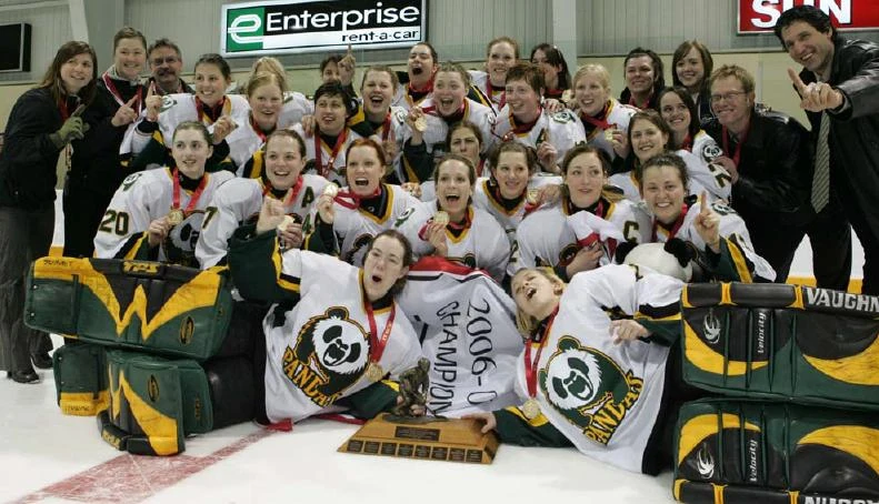
Harkening back to the days when U SPORTS was still called "CIS", the Alberta Pandas wrote their names all over the Golden Path Tropy year after year after year. From 2000 until 2007, the
Pandas won the Golden Path Trophy six times, and they often had black in their uniform. Combine that with more recent success in green-and-gold, and there needed to be all three colours in their scheme for an outdoor game. Add in the historical "Pandas" name under the panda logo, and this jersey nicely combines several historic elements for the Pandas if they were to take part in an outdoor game!
MacEwan presented a bit of a challenge when it came to historical logos because they seemed to only wear "Grffins" or "GMU" in previous historic iterations that I could find. The school officially rebranded as "MacEwan University" for all public communication and marketing purposes in 2013 after officially achieving university status in Alberta in 2009. MacEwan's first Canada West competitions come in 2014 in basketball, cross country running, soccer, and volleyball where the maroon and white are seen as school colours, but the blue is used throughout the
university's coat of arms and imagery prior to the maroon taking over. Because of this, the griffin head and the blue colour used by the academic side of the university are incorporated into the heritage jerseys used for outdoor games!
Calgary hosted the next outdoor games, so let's take a peek at the Calgary-based teams in the Dinos and Cougars!
I've always liked the Dinos' retro logo as it felt less cartoonish than their current logo, and it incorporated more of the black than the current logo does. Because of this, it was easy to add the black back to the heritage jersey while bringing the red-and-yellow along with it. We're better than the
interlocking "UC" that they once wore, but I'm not against that going on as a shoulder patch if needed. This Dinos uniform combines some of the
fun history that the men's side wore with the current look of the women's program. In short, I think it turned out well.
Mount Royal has always seemingly wore a navy blue jersey, so we're going with a bit of a "reverse retro" look here with the Cougars wearing a silver/gray jersey. The jersey uses the logo that the Cougars had for a few seasons between their ACAC days and their current look while emphasizing a more futuristic idea for as the Cougars look to continue their dominance shown over the past few seasons. While I'm not against the use of the
angry cougar logo for a shoulder patch, this jersey just felt right looking to the future rather than living in the past.
Vancouver played host to the next outdoor game, so let's bring the Thunderbirds and Spartans into the mix today!
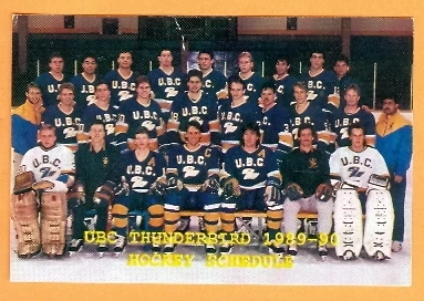
As stated above, the UBC Thunderbirds already wear a historic blue jersey, so I'm going with a "reverse retro" jersey for them! The yellow seems bright, but it works very well with the throwback logo that looks outstanding on the front of this uniform. Honestly, I kind of wish the
Thunderbirds would use that throwback logo more often - it really is unique in the sports world! The shoulder yoke and the side of the pants both have a V-shape design on them as the Thunderbirds call Vancouver home, and I like that little nod as to where they play.
Admittedly, I didn't want to have both BC-based teams in yellow, but the TWU women's team no longer wears yellow in its jersey scheme so it had to return. Not only will it return here, but it comes back in a big way with some amazing sleeve stripes, and that killer retro logo that the school wore for its teams from 2005
until the current look was adopted in 2007. Granted, there are some men-vs-women issues that the historic logo presents, but someone with more talent than I in graphic design can fix that problem fairly quickly. Nevertheless, I feel this jersey turned out pretty well with a nice historic touch.
Winnipeg hosted the next outdoor game chronologically, so let's welcome the Bisons to this dance!
I could have simply gone back to a
yellow jersey that the Bisons have worn historically, but where's the fun in that? Instead, we're going gold on this jersey with touches of brown and black for a
more historic look that the Bisons have worn. The logo is torn straight out of the Bisons Sports history books as well, and I like its futuristic feel that ties the past with the future. Using a colour such as gold that's unique to the Bisons also makes this uniform an option against any of the others shown here today as well. Whether it's worn at home or on the road, you know the Bisons are coming to play in these jerseys.
The final city to host an outdoor game in western Canada was Regina, so let's bring the Cougars and Huskies into the picture!
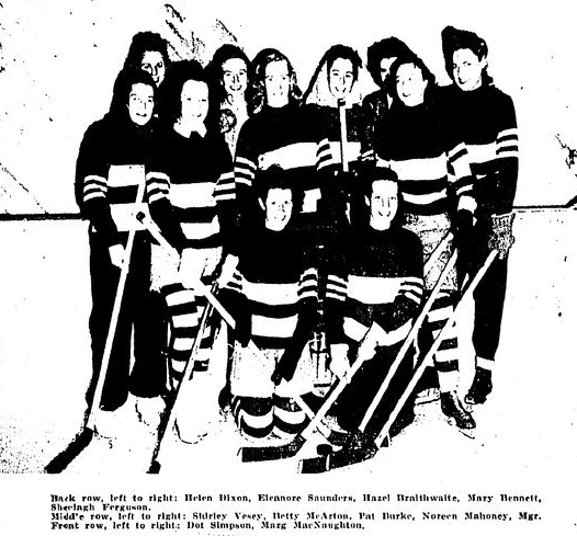
It took me a while to come up with a design for the Regina Cougars, but it finally came together after finding
this picture from the early-1980s Regina Cougars men's hockey team. That circular logo of the snarling cougar brought the above design together with the striping and the great yellowish colour that mimics that of the
old WHA Chicago Cougars. The historical aspects of this jersey suddenly work well together, and I think the final product stands on its own merits for the team. Personally, I'd want one of these jerseys if they existed in the Regina Cougars' wardrobe.
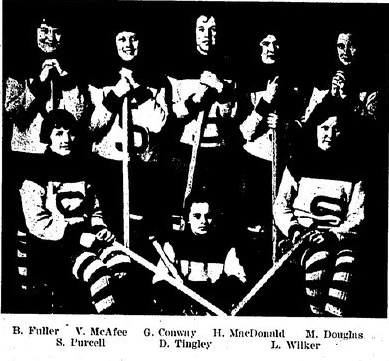
This is perhaps one of the more accurate historical mash-ups on this page. The Huskies have had women's hockey at their institution for a long time, so they have a number of elements to unpack. The "S" on the jerseys have been worn by a number of women's teams,
most notably in 1924-25. Sleeve stripes are
prominently featured by the 1932-33 team while wearing the heritage "S" logo. The sock stripes
come from the 1945-46 team who also wore the sleeve stripes as well. The bold green colour is what the team wears today, so that had to stay due to green being sorely underused in hockey. In short, the Huskies may have stripes all over, but they are true to their history in these uniforms while carrying their strong play into the future in the green-and-white. Simply put, I like this design.
Let me clear: I don't expect any of these uniforms to ever be seen in action, so take this as what it's meant to be: a fun way to honour the past of these teams with a nod to future fun if Canada West ever wanted to do an outdoor game or two. You may think some of these designs are garish or brutal; others may stand out as being eye-catching and fun. What this exercise was meant to do is to present some historical ideas for teams that you may currently follow.
I don't know how many people know about the historical logos seen on the UBC, Calgary, Manitoba, Regina, and Trinity Western jerseys above, but those logos existed for moments in time. There's some really fun and unique history behind these teams - MacEwan and TWU changing their logos recently, for example - and this article was meant to spur some comments about the historical aspects of the teams in a fun way.
What say you, readers? What jerseys stand out and which ones should be fired into the sun? Leave your comments below and we can discuss my fashion design skills (read: zero) when it comes to hockey! I'm looking forward to a few comments, and hopefully a few players will send me a message either here or via social media about these designs.
Until next time, keep your sticks on the ice!


No comments:
Post a Comment