


The Colours Of Hockey?

We'll start in the WHL where the Portland Winterhawks revealed their new look today. They introduced the new logos last season, and the jerseys followed this summer to complete the new identity.
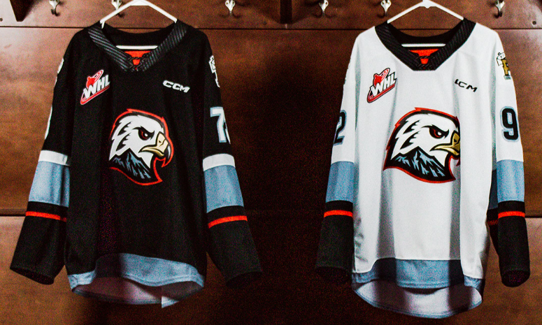
Before we get to my thoughts, I should note that this is the first time in Portland's 46-year history that they have their own unique identity. The original jerseys were very Chicago-esque thanks to a deal made between the owners of the Blackhawks and Winterhawks that saw the Winterhawks obtain a used set of Chicago Blackhawks jerseys in their first season of play. Eventually, the tomahawk-crossed "C" on the shoulders were replaced by the tomahawk-crossed "P" for Portland, and the Winterhawks stuck with the Chicago look until their rebrand last year.
Clearly, this is a major mark in the Winterhawks' history, so it seems obvious that the best options to forge a new identity are black and white. Excuse my sarcasm in that previous statement, but the Pacific Northwest is a region rich in colours and the Winterhawks chose their base colour for their dark jerseys to be black? Why black of all the options available?
According to the marketing rationale, "The dark jersey introduces black as the main color, allowing our primary logo to stand out as was intended when it was created" which seems like a fairly weak reason for choosing black. Other dark colours would achieve the same effect, yet black was the choice made. Other than that, no other reasons for a black jersey were given. No one will call it a mistake with the rebrand for the franchise, but I personally believe that the Winterhawks could have done better.
The "squall gray" colour that was added to the colour scheme is new, and we'll likely see an alternate jersey in that colour in the future for the Winterhawks. Personally, I don't hate it, but the base colours for the jerseys for the Winterhawks are literally black, gray, and white. We go from a stellar logo with all sorts of creativity built into it to the most bland and boring colours for hockey teams. That's quite the dichotomy in approaches to your identity, Winterhawks.

Overall, I still like the new logo that the Winterhawks are using, and the fonts are easily read. While they've opted to move away from Blackhawks red, they completely missed the bus when it came to all the other colour options they could have chosen. I'll never like the black jerseys and the new colour is nothing special, but the lgoo really does save the overall look of these jerseys. If we're ranking these jerseys on the GOOD-OR-DUMB options, they actually fall into the GOOD category for me by the slightest of margins. Again, I do like that logo, so the Winterhawks should continue to push that identity.
We're not done there, though, as we head ten-and-a-half hours south down the coast to San Jose, California where the San Jose Barracuda introduced the third jersey of the set they'll wear in 2022-23 today. If you missed the first unveilings, April 28 saw a rather ridiculous black jersey introduced while July 29 was the day the Barracuda introduced their new white jersey. With just a dark jersey remaining in the set to be unveiled, what would this design look like for fans?
Here is the "dark" jersey for the 2022-23 San Jose Barracuda.

I don't have a problem with the Barracuda moving away from the teal and using it as a shoulder yoke colour. If the Barracuda want to go with "steel gray" over teal, that's their choice. It creates more separation between them and the NHL's Sharks, and that should be the intention when it comes to growing the Barracuda's slice of the sports market in San Jose.
The font is legible on the jersey as well, and that's good for sitting in the nosebleed seats if one chooses to do so. Not that you'd need to do that since San Jose has one of the worst attendance records in the AHL, but the option is there if one wants it. I do question why they didn't follow the white jersey's contrasting name colour, though, as that continuity would work nicely across both jerseys. I guess I expect too much when it comes to design elements on uniforms.
These jerseys will work as "dark" uniforms just as well as they'll work as "white" uniforms. I can see San Jose wearing these in a number of different situations, so the versatility may prove useful. I just wonder where the creativty has gone in San Jose as both the Sharks and Barracuda seemingly have no one willing to make a splash with a unique, new look. Please excuse the pun.
If there's one good thing for these "Steel" jerseys, they have the logo on the front with the "SJ". Wearing one's primary logo is key for building an identity, and the Barracuda will sport the angry fish on their chests for one of their two main jerseys. Granted, the stupid "SJ" is still there as well, but at least the Barracuda have an identity in these jerseys.
The world isn't seen in blacks and grays, and hockey teams need to start realizing that. We have colour TVs for a reason, so let's start living life in colours once again. Hockey has red lines, blue lines, white ice, black pucks, and colourful personalities, so there's no reason for jerseys to be bland and lifeless.
Until next time, keep your sticks on the ice!


No comments:
Post a Comment