


The Rebels Were Born

The Rebels were an expansion franchise granted to Terry Simpson, long-time NHL head coach, in the summer of 1991 that would begin play in the WHL's Eastern Conference at the start of the 1992-93 season. Needless to say, there was a lot of work to be done between then and September 1992, so the team got to work immediately in fostering a relationship with the city of Red Deer by holding a "Name the Team" contest that ran from October 7 to 17, 1991. Yes, that's one month prior to the unveiling of the jerseys above.
Of all the submissions, "Rebels", "Renegades", and "Centurions" made the final cut that went to Red Deer management, and they ultimately selected "Rebels" to be the team name. It's at this point where I question why there was a rush to create a uniform with only weeks between the name selection and the jersey unveiling, but I wasn't the guy in charge out in Red Deer in 1991.
The original colour scheme, as stated on the photo's caption, were black, silver, and white. Those colours are still used today, but the Rebels have also added burgundy to their scheme since that unveiling. Beyond that, there haven't been many permanent colours changed or introduced to the Rebels' scheme since that 1991 unveiling.
The skate logo is a little weird for a team named the "Rebels", and this is why I'm confused as to why they had to rush to get these jerseys out in the public's eye. Had they simply worked on this logo a little more, we could have seen something great. Instead, we get something that's more suitable for a beer league or minor-hockey team than a WHL franchise.
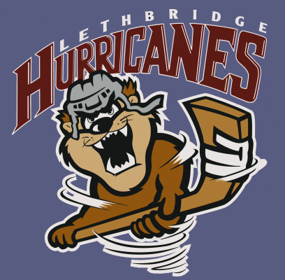
I know that there were some cartoonish logos in the 1990s - the Lethbridge Hurricanes and their Tasmanian Devil logo comes to mind - but did the Rebels have to start this trend of using cartoonish logos that barely made sense from a team-branding perspective? If you blurred the "Rebels" name in that logo above, I wouln't have any clue this was a "Red Deer Rebels" jersey because there's nothing that even remotely gives me that idea.
Beyond that faux pas, the striping and block font make it easy to read the numbers on the sleeves, and it feels like a hockey jersey based on stripe placement. Because of the thick stripes near the bottom hem, a shoulder yoke isn't necessary, and the contrasting numbers on the sleeve stripes keep things neat and tidy.
Overall, it's not a logo I'm certain the Rebels deserve, but it's the one they got for a number of years before they began making image upgrades. The jerseys are a classic hockey look, though, so they get the marks there for resembling a hockey team when they took the ice. We can't change history, though, and the Rebels look fine today in their burgundy gear, so the evolution of the Rebels certainly has seen them improve their brand over the last thirty years.
Ain't hockey history great?
Until next time, keep your sticks on the ice!


No comments:
Post a Comment