With all 32 teams in the NHL having a unique AHL affiliate, there are more and more teams that resemble their NHL squad in terms of team colours. Whether it be the Manitoba Moose, the Toronto Marlies, the Bakersfield Condors, or the Ontario Reign, I used to enjoy seeing the unique team identities of minor-league teams before the NHL started purchasing the controlling interests in AHL teams. It seems, though, that one NHL team may have taken things too far this off-season when it comes to having their AHL team look similar to it as the resemblance this season between the two will be uncanny.
You might be forgiven if the jersey on the right was mistaken for an Abbotsford Canucks alternate jersey due to its striking similarities to the green and white jerseys to the left of it, but what if I told you that the NHL Canucks will wear the jersey on the right this season? Because it's real, it's happening, and it's the new Vancouver Canucks reverse retro jersey!

If you recall, the Canucks decided to wade into their rich history of jerseys by bringing back the gradiant colour idea from the 1990s that no one liked on the first attempt at a reverse retro jersey. Personally, I don't think it was as bad as people made it out to be, but I'm also not a Canucks fans who had to live through the gradiant era. As someone jokingly pointed out to me, it's the Sprite can of hockey jerseys and how many people don't like Sprite? The Canucks could have signed a marketing deal with the Coca-Cola product and had some fun with "Sprite Nights", but none of that came to fruition. Call it a missed opportunity, I guess.
As the Canucks work to draft and develop a new set of players to help them rise through the Pacific Divsion standings, they may have taken the "reverse retro" concept a little far in putting all of their players into what appears to be an Abbotsford Canucks jersey. Be prepared for all the jokes about the Vancouver Canucks look like an AHL team thanks to this new design because the untrained hockey eye will certainly conflate the two logos.
What should be pointed out, though, is that this reverse retro design is a throwback to the 1962-63 Vancouver Canucks jersey worn by the former PCHL and WHL Canucks when they played in Vancouver. The logo, with the frayed pant legs and the less pronounced stick, is identical to what the '62-63 Canucks wore, and the stripe pattern appears to be similar to the '62-63 team. Here's that team.

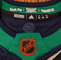
The Canucks, for what it's worth, even added the "1962" to the collar of this year's Reverse Retro jersey, so the connection to the old WHL days in the city of Vancouver is very real. And to be clear, I have no problem with the NHL Canucks pay tribute to the very team they eliminated with their own expansion into the NHL in 1970. For 25 years, the PCHL and WHL Canucks called the west coast city home as they won two PCHL championships and four WHL championships including in both 1969 and 1970 before the NHL came to town. The 1962-63 Canucks finished first in the WHL's Northern Division and were third-overall in the eight-team WHL, but they fell in the WHL semifinal to the Seattle Totems 4-3 after earning a bye in the opening round of the playoffs. They looked good in those sweaters seen above, though.
Again, where I struggle with this new reverse retro jersey is the use of Johnny Canuck on a Vancouver Canucks jersey after they chose to make that the identity of the Abbotsford Canucks. The Canucks are free to choose whatever logo they like for their reverse retro jerseys, but the Johnny Canuck logo is the Abbotsford Canucks' logo after they wore it for a whole season in their return to British Columbia. Yes, the logo they chose has some minor differences, but the Johnny Canuck logo stands for minor-league hockey whether it be AHL, WHL, PCHL, or any other "HL" at this point. Why would you want you NHL club to look like it's a minor-league club?
Sometimes, NHL teams try way too hard to find something that people will like. For all their efforts in trying to make the old reverse retro jersey and this new reverse retro jersey seem cool, it just feels like the Canucks have no idea what actually is cool. Or what its fans want. Or what looks remotely good as a logo on the front of a jersey. Chalk this one up to "
DUMB" in the "is it good or dumb" test because every single player on the NHL Canucks has worked his tail off to make sure he's not AHL-bound.
Welcome to the minor leagues of jersey design, Canucks.
Until next time, keep your sticks on the ice!


No comments:
Post a Comment