


Classic Auctions Strikes Back
 There's another auction happening over at the Classic Auctions website, and this one has another boatload of interesting hockey jerseys in it. Thanks to my love of hockey history, I really enjoy scouring the Classic Auctions website for any old hockey jerseys and info, and this site is becoming a treasure trove for the memorabilia they continually bring to light. Classic Auctions might just be the best site on the Internet for old hockey artifacts! Here is the latest installment of items I found interesting on the Classic Auctions website!
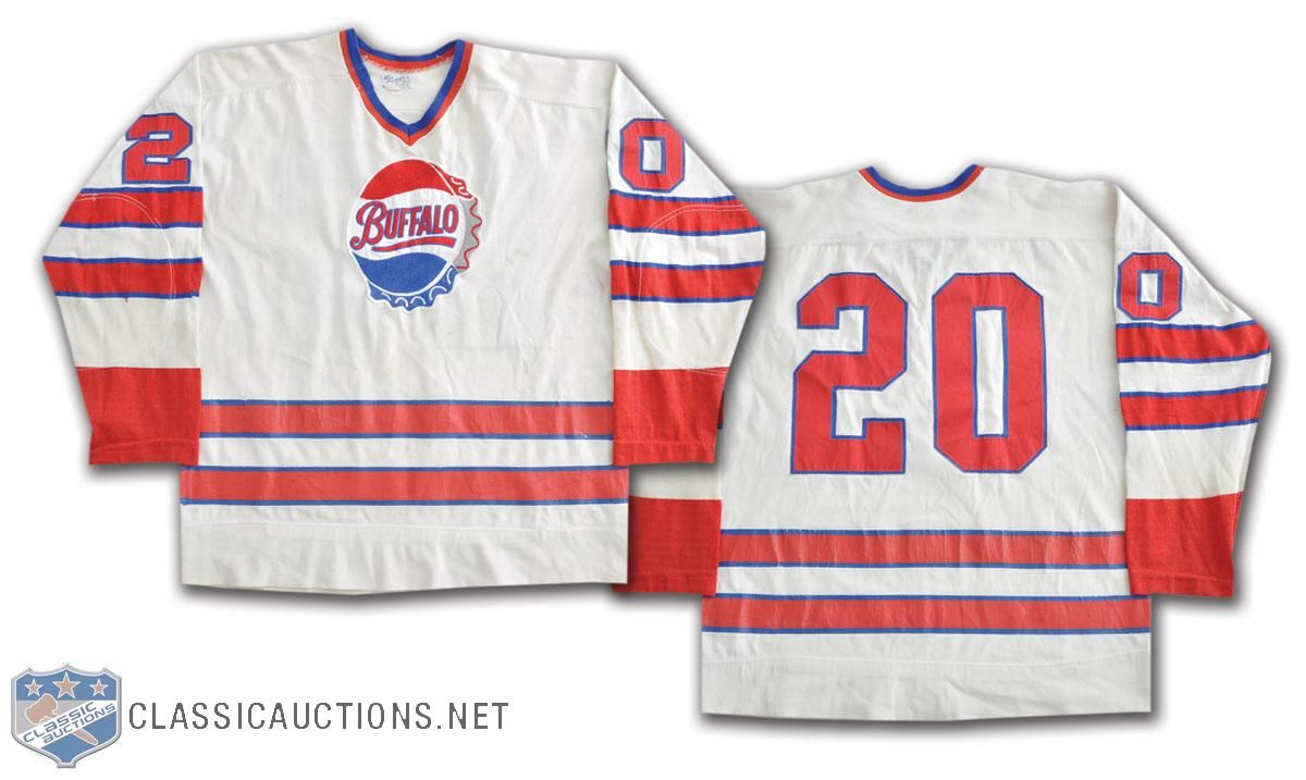
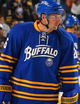
- We'll start in the AHL where we get to see the Buffalo AHL franchise's jersey. This 1969 Buffalo Bisons jersey had the old bottle cap logo, and the "Buffalo" written on the cap was the inspiration for the Buffalo Sabres alternate jersey pattern. You might be asking how the Bisons got a bottle cap for a logo, and I can tell you that the team's owner also owned a Pepsi franchise! Nothing like a little cross-promotion, right?
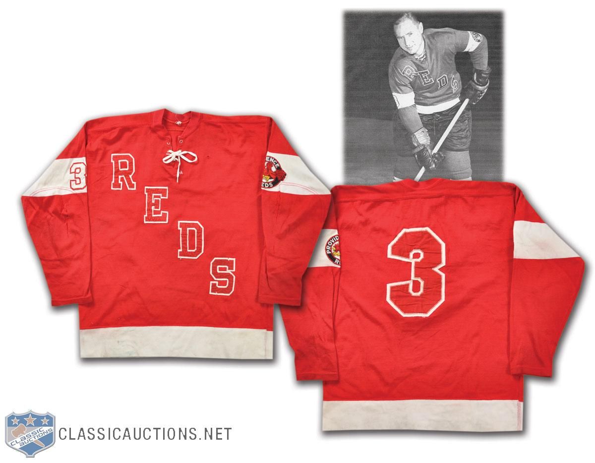
- The Providence Reds were a fairly successful AHL franchise, and it helped that former Bruin Fern Flaman joined the team from 1961-64 to keep the AHL club competitive. I'll admit that I'm not a big fan of red numbers and letters on a red jersey. The left sleeve stripe has the Reds' flying rooster logo, meaning that the TV numbers were on the right sleeve only!
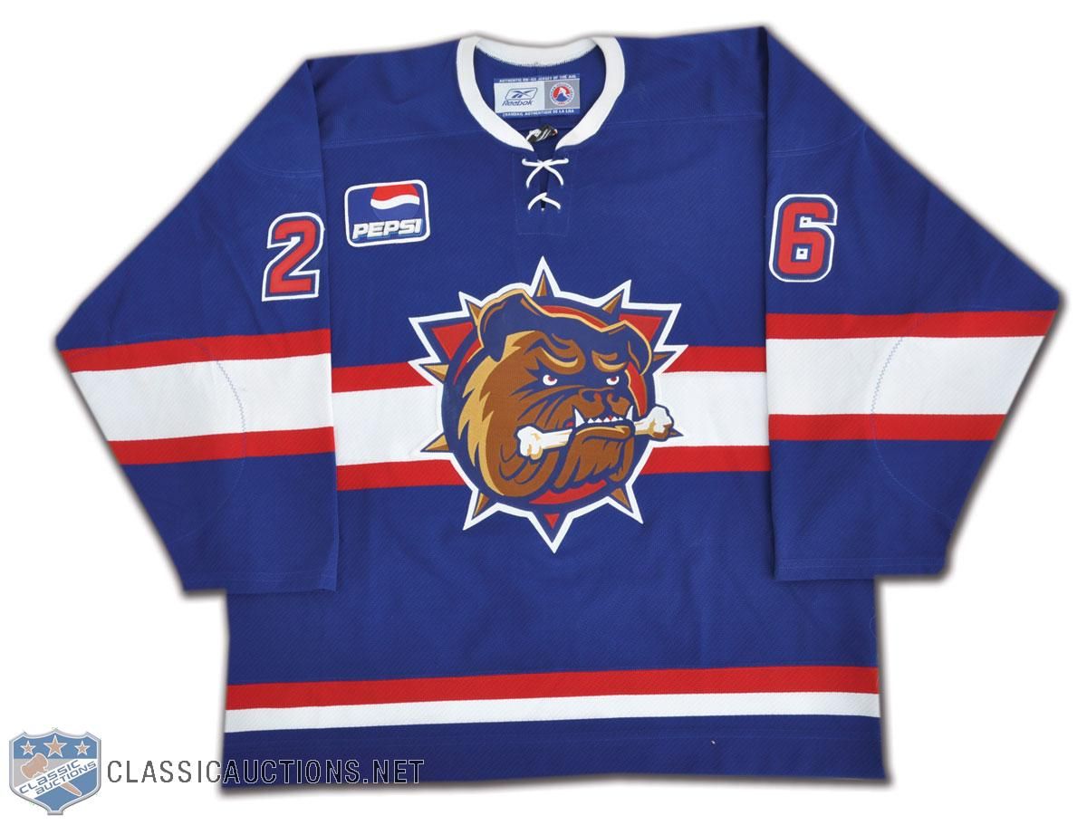
- I had totally forgotten about this, but do you remember when the Hamilton Bulldogs wore blue on the road? The Bulldogs didn't switch to their familiar Montreal colours until the 2003-04 season. Honestly, I kind of like the blue Bulldogs better than the red Bulldogs. Maybe they need to bring this jersey back as an alternate?
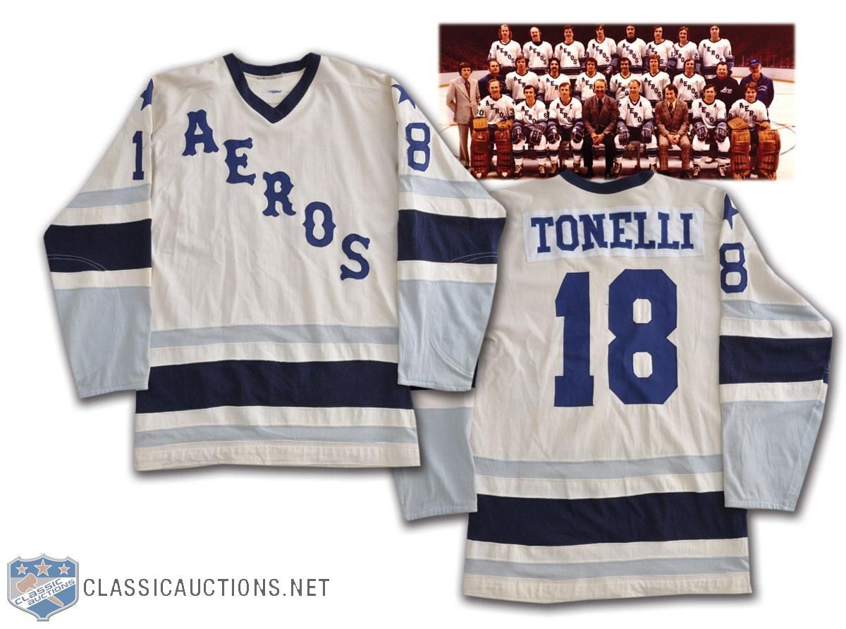
- We'll jump over to the WHA now, and if you had read the reviews on the WHA DVDs, you'd know that I spoke of former Islander legend John Tonelli getting his start with the WHA's Houston Aeros. While I didn't provide any proof that Tonelli was actually there in the article, I now have hard evidence that Tonelli was indeed an Aero! Thanks to the WHA's rule of drafting players at the age of 18, Tonelli started his professional hockey career in Texas!
- Because I love their logo and because of this goaltender's legacy, I present to you Gerry Cheevers' Cleveland Crusaders jersey. I still can't believe that Cheevers made the jump to the WHA, but the pay was much better than what he was receiving elsewhere, so I guess that made the move easy. He didn't stay in Cleveland long, though.
- A little movie history is available in this auction as you can pick up an Eskimos jersey from the movie Mystery, Alaska! This Alaska Eskimos jersey was worn by Thunder Bay native Kevin Durand in his role of "Tree" Lane. You may recognize Durand from other roles such as Blob from X-Men: Origins, Little John in Robin Hood (with Russell Crowe again), or Martin Keamy from TV's Lost. Pretty cool jersey if you ask me!
- I've been trying to piece together rosters from the 1995 lockout teams of the NHLPA 4-on-4 Challenge. We have another member of Team Quebec today as Luc Robitaille skated with the team! The more I see these blue NHLPA jersey, the more I like them!
- How many red-white-and-blue international teams are there? Well, if you check the 1955 World Championships, Team Canada would be included! This Canada sweater was worn by captain George McAvoy at the 1955 tournament. It seems a little weird seeing the maple leaf in blue, but I really like the design of this sweater.
- If we jump ahead to the 1977 World Championships, it seems as though Canada took the maple leaf a little more seriously. Guy Charron's jersey has the maple leaf outlined a number of times. Another curious addition is the "Canada" name on the shoulders - was there another team with a giant outlined maple leaf at the tournament?
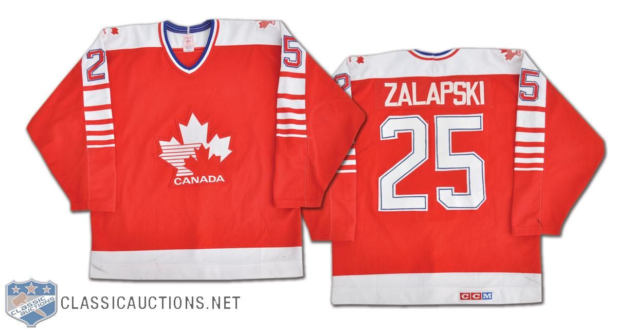
- Once Hockey Canada started to direct Canada's efforts internationally, the jerseys began to improve. Zarley Zalapski's jersey from the early-1980s is a good example of this. One note: check out the "P" in Zalapski's name. Doesn't it seem weird that the lower portion of the loop doesn't match the middle horizontal line in the "S"? It just looks off to me.
- We're all familiar with the Tre Kronor, but Sweden's success as a hockey nation might have coincided with their change in uniforms. Here is a Sweden jersey worn by Ulf Samuelsson from the early-1980s as well. Love the polar bear - an animal not found in Sweden - and the "Tre Kronor" name on the jersey. I guess it didn't mean the three crowns on Sweden's uniforms - it was actually the name of Sweden's team!
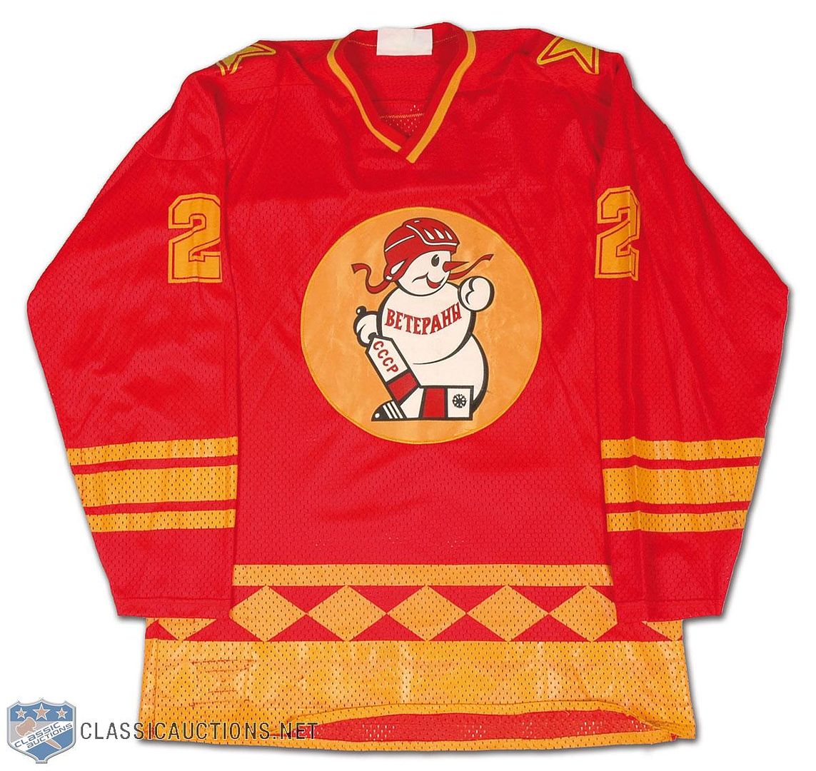
- Speaking of another jersey that has an odd logo, check out the USSR's choice of jersey for the Izvestia Tournament in 1980! The Izvestia Tournament was the biggest European tournament in hockey during the 1970s, and always featured the best of the best in Europe competing for the Izvestia Cup. Most countries used it as a warm-up for the World Championships in the spring. The USSR won the 1980 tournament with the snowman on the front of their jerseys, and Vladislav Tretiak was named the best goalie at the event.
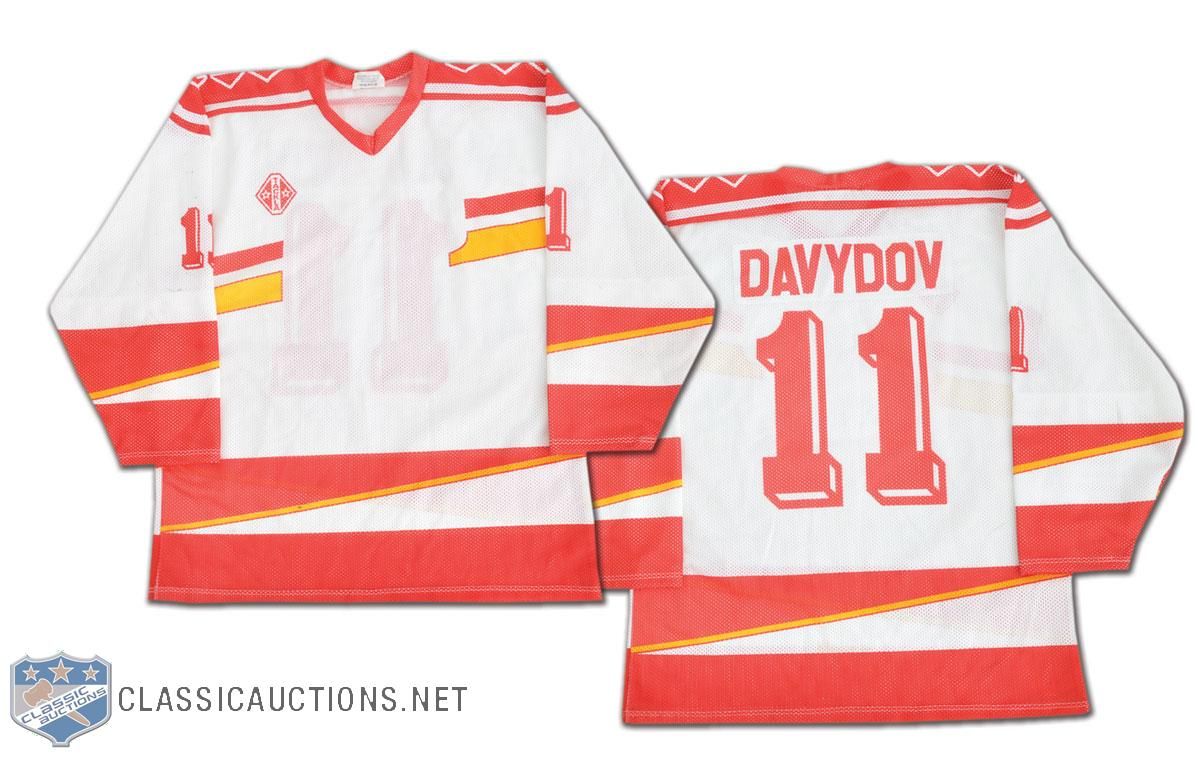
- We move to another odd jersey from a mostly-Russian team. The 1992 Albertville Olympics saw the Unified Team take part after the break-up of the Soviet Union. Six of the fifteen former Soviet states took part as a unified team: Russia, Ukraine, Kazakhstan, Belarus, Uzbekistan, and Armenia. Because they didn't have a flag or national symbol to compete under, the Unified Team's ice hockey team wore these jerseys. Evgeni Davydov and the Unified Team took gold in 1992 with a 3-1 win over Canada in the gold medal game in these rather unique uniforms!
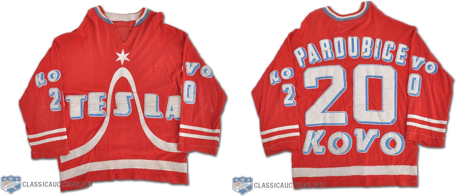
- From the international, we move into individual teams from hockey-playing countries. We'll start with an HC Pardubice jersey from the Czech Extraliga in the 1970s. Now, I first thought that the "Tesla" name written on the front was for acclaimed engineer Nikola Tesla, but I knew that he was Serbian by birth. Instead, the "Tesla" stands for "TEchnika SLAboproudá" - "low voltage technology" in Czechoslovakian. Tesla was the state-owned power company during the Czechoslovakian Communist regime, and they sponsored all sorts of sports from hockey to basketball to soccer. It's interesting to see the city name on the back where the name usually is, though.
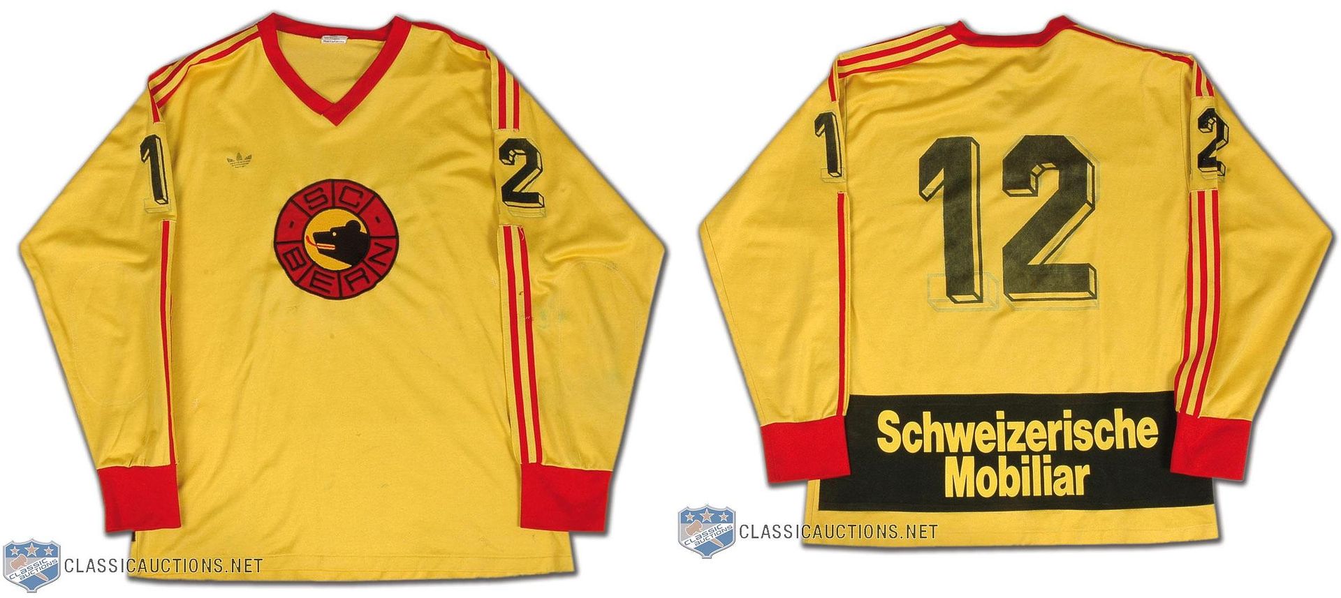
- Swiss league's SC Bern makes an appearance with this rather blank uniform from the 1980s. For all the complaining that I do about Reebok and Nike logos plastered on hockey jerseys today, it appears that SC Bern was one of the first teams to wear a corporate chest logo as the adidas logo is present.
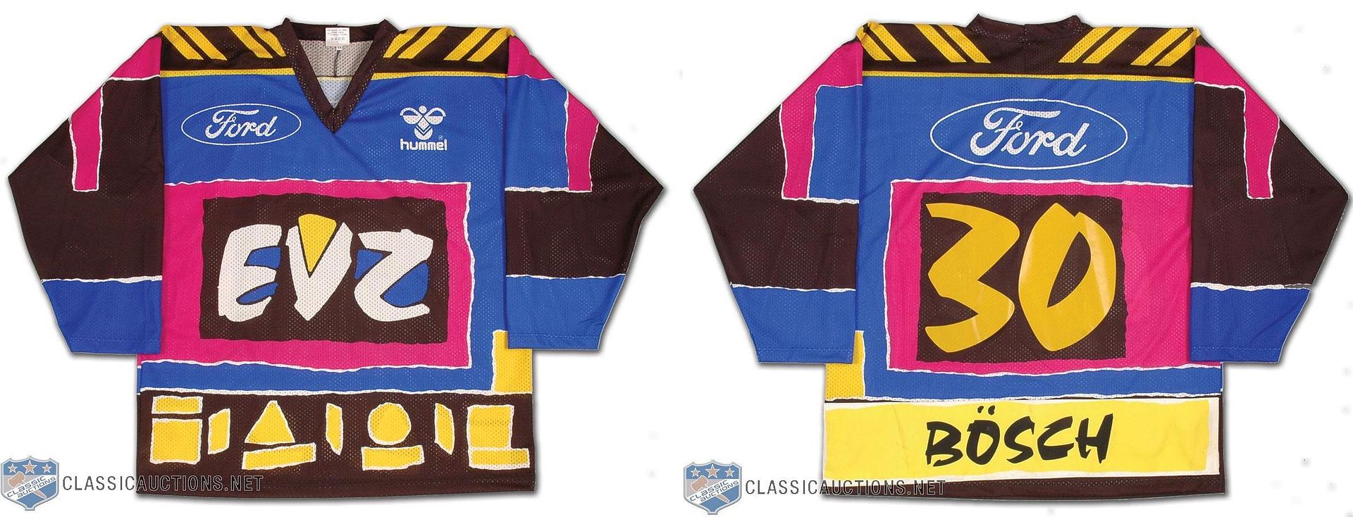
- Another Swiss league team in EV Zug makes an appearance for their 1995-96 jersey that looks all sorts of wrong for a hockey team. The patterns, the fonts, the colours... who thought this thing up? It's absolutely hideous! For the first time in history, I might actually ask that more advertising be placed on a jersey simply to cover up the jersey's design!
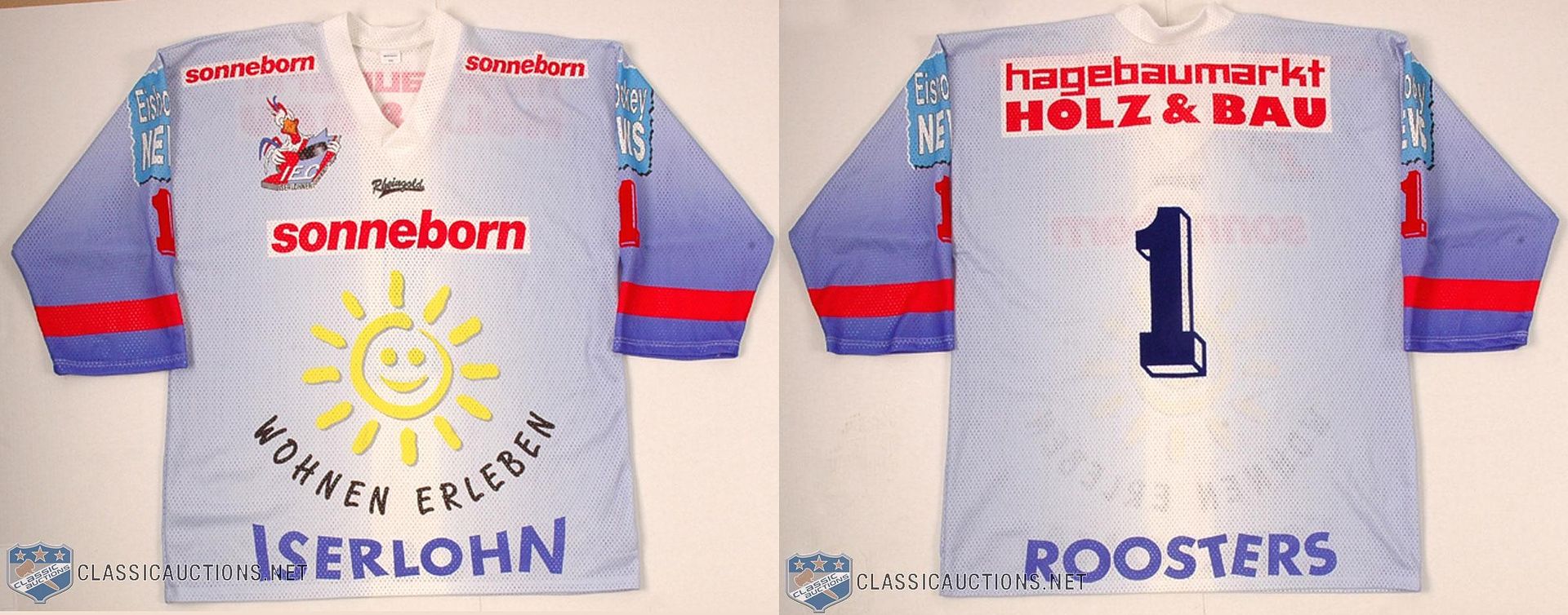
- We head into Germany for the 1990 jersey worn by the Iserlohn Roosters. The sunshine face logo is not the team's logo, so this jersey seems to be all about the advertisers and less about the team. The small rooster logo is actually the team's logo!
Until then, keep your sticks on the ice!


No comments:
Post a Comment