


Not Thankful For New Threads
 Well, it's Thanksgiving today in the United States of America, so I'm going to lead this article off right with a big "HAPPY THANKSGIVING" for all those who stop by from the USofA. Good neighbours are hard to find, so have a safe and happy Turkey Day! Unfortunately, the rest of this article won't find you much to give thanks for since it has some unhappy images of hockey uniforms. These aren't gimmick, one-time, minor-league jerseys either, although one of them will be worn only once this season. The problem, however, is that both looks seriously lack any sort of creativity and traditionalism for them to even be considered good looks. While one is definitely better than the other, you might be better just sticking to NFL football today than worrying about these two teams.
Let's start with the one-game jersey. The Philadelphia Flyers introduced their Winter Classic jersey for the 2012 NHL Bridgestone Winter Classic taking place at Citizens Bank Park in Philadelphia. The home team's uniform will look a lot like their current home uniform despite the colours being messed up.
From the release, "Designed by Reebok, the jersey’s primary color is the team’s current recognizable orange with secondary colors black and a vintage off white. The Flyers primary front crest and player numbers are executed in rich felt black and vintage white appliqué."
So what do I like about the uniforms? The colours are alright. I can live with the Flyers being in orange because they've done it before, and it's infinitely better than a black uniform. Had the Flyers brought this look back, I might have burned Citizens Bank Park to the ground. The numbers will be easily visible on January 2, so that's also a plus.
There are some things I can do without. I'm really starting to tire of the tie-up collar. Does every single team need a tie-up collar on at least one of the jerseys? Also, let's give the contrasting name bar a rest for a while, Flyers. In 1980, Bobby Clarke didn't have a contrasting name bar. Fred Shero coached the Flyers without contrasting name bars. Let's try something different for this game, ok?
Also from the release, "The heritage stripping[sic] is inspired from a sock design worn by the Flyers in the late 1980's". While it's true that the sleeve stripes do look like the socks worn by the Flyers from 1984 until 1997 (late-1980s?), the hem stripe does not. It's missing the lower black stripe. So the heritage striping is incomplete, and only the sleeves have the proper sock striping. Just in case you're keeping track at home, this might be the first NHL uniform to be based on a team's former hosiery!
Overall, I'm not thrilled about this uniform. The Flyers could have honoured the former team that called Philly home in the Philadelphia Quakers, but that's not happening. We could have seen the current Flyers honour the Stanley Cup champion Flyers from 1974 and 1975 by wearing uniforms from that era, but that's not happening either. Overall, nothing to be overly excited about, so this is a PUSH at best.
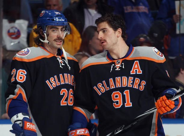
And then we get to Philly's competition from last night. The New York Islanders debuted their new black alternate uniform against the Flyers last night, and they looked as hideous as they did during the unveiling last Wednesday. I'm almost certain that this will be the worst-selling jersey in Islanders history.
First, why is John Tavares' alternate captain "A" so huge? I'll go on record as saying that if you have two different fonts on your uniform, it's an automatic fail. That "A" looks way out of place compared to the "Islanders" name written across Tavares' chest. In fact, it's almost as big as the numbers below "Islanders". Does anyone involved with the Islanders franchise have any sort of design sense at all?
Secondly, the font on the back is the same as Tavares' "A", but it's very un-Islanders. The added serifs are not good, and the Isles already had a good look in their block lettering. While change is nice, there are certain things that get associated with a look, and the serifs, again, look out of place on the Islanders.
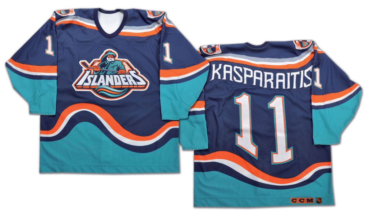
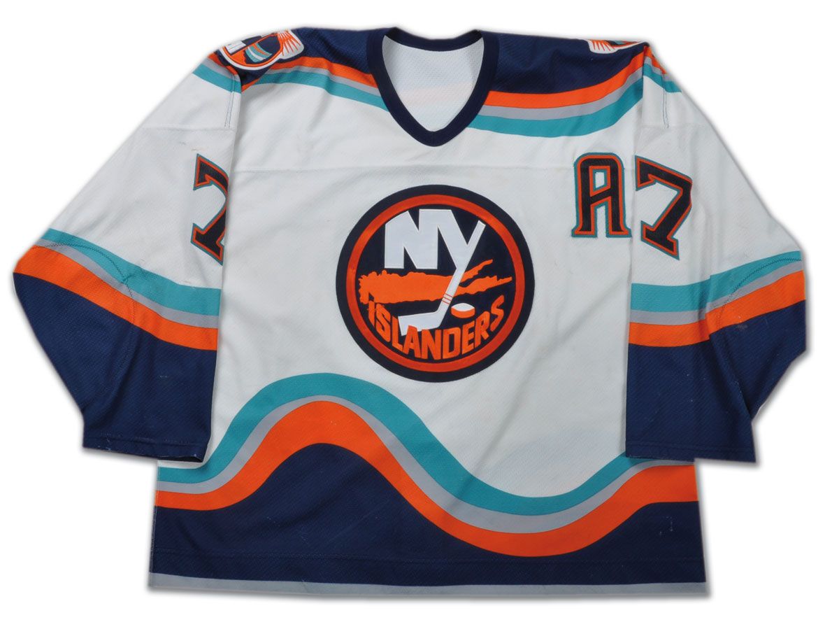
Thirdly, WHY DO THE ISLANDERS NEED A BLACK UNIFORM AT ALL?!? There was this orange alternate that Alexei Yashin wore. It's better than black. There were the Fisherman jerseys that have attained a cult status. They are better than black. There was the hybrid wave-jersey-traditional-logo jersey that transitioned the Isles from the Fisherman back to their normal uniforms. Again, much better than black. There is NOT ONE REASON the Islanders had to go black with this alternate jersey. Yet here we are.
The only members of the franchise that looked good in the new black duds? The Ice Girls. But I'll go on record here stating that it has less to do with what colour they are wearing, and more to do with what they are wearing. Angela King designed the new look for the Ice Girls, adding more sequins, a belt and patches on both shoulders. The letters NYI fall off of the left shoulder, while the Islanders logo is on their right.That's right - the Ice Girls has an actual designer design their outfits while the Islanders had a front office employee do theirs. Is there any wonder why they look horrible?
I'm not going to beat up on the Islanders any longer. Instead, enjoy your turkey and stuffing and all the other delectable delights set out before you on this magical Turkey Day. If you're not celebrating the US Thanksgiving holiday, enjoy your day, meal, or whatever it is you may be doing. No hockey tonight means a quiet night for me, but I'll be back tomorrow in full force.
Until then, keep your sticks on the ice!


No comments:
Post a Comment